Widgets
Widgets allow to monitor and administer systems in different graph types from a View.
#Types
Here are 14 types of widgets.
"Display perfdata on customizable bar graphs. "
Bar graphs can be used to display various datas. One of the possible use shown here is to display the delta of disk operations for a specified time frame. This will give us a bar graph representing the history of the disk operations in terms of space freed or being taken at a given time.
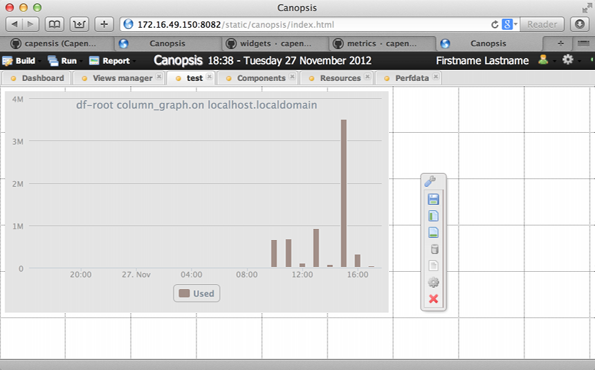 figure 1 |
 figure 1 |
 figure 1 |
Compare values in a pie or a categorized bar graph. Diagrams widgets are different from Line and bar graphs width in that they only display one value (the last one) per metrics at a given time. Diagram are useful to compare few metrics between themselves. The Figure 1 below shows the delta of resources usage on a given host for a specified time frame. We can see disk, memory and swap usage for a delta of 15mn and a time interval of a day.
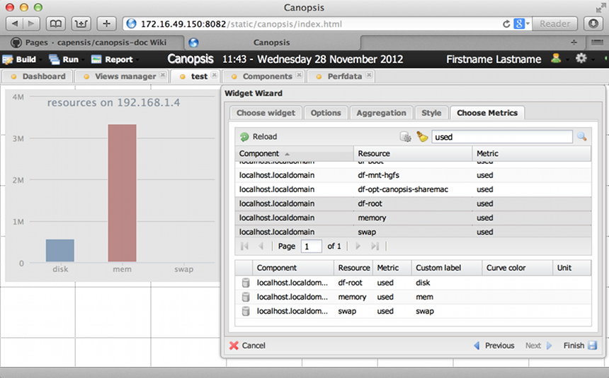 figure 1 |
"Display live stream" Soon.
"Display Gauge."
Various metric can be shown with the gauge widget. the screenshot below displays the total used memory and the amount of idle cpu time on a given host.
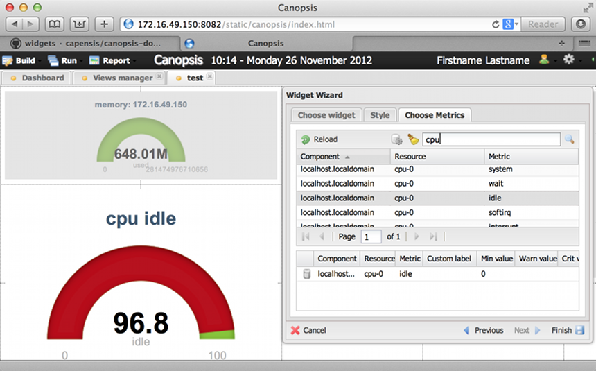 figure 1 |
"Display perfdata on customizable graphs."
Line graphs are roughly the same widgets as the Bar graphs. They are both used to display an historic of data for a given component or resource. Choosing between the two is just a matter of preferences for curves instead of bars and few other render options that are specific to each other. Functionality wise they are the same.
"Display list of inventory items selected by the provided filter"
Allow to display a list according to a set of defined mongo filters.
Filters use a field name (from event specification) a condition and a value.
For example a filer like the following: state is equal 2 would show a list of all events where a given component or resource state is critical.
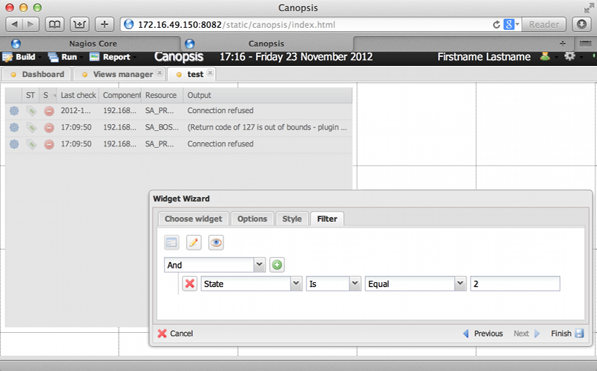 figure 1 |
Soon.
"Display list of metrics sorted by value"
Perf. Top is typically used to display the "mosts / lesses" cases. The most used disks, the most used cpus, or inversely the less used disks and cpus. For doing so it uses a customisable mongodb filter as shown in figure 1 below. The filter used here is: metric is equal used (see Canopsis Build menu > perfdata for a list of all available metrics)
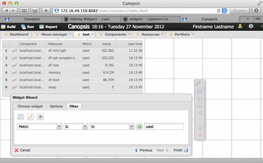 figure 1 |
Soon.
"Display the live stream of events."
The Stream widget displays in real time the components or resources sate changes.
This is taken from the AMQP exchange "canopsis.alert" which monitor the change of state of a given component or resource as defined by the event publishers (Nagios, Graylog, etc).
For example, if Nagios sees a state change (from 0 to 3) in an element it monitors, this event is pushed to canopsis.alert and end up being displayed in our stream widget.
 figure 1 |
"Display a message with a html template."
This widget primary purpose is to display an arbitrary string of text.
It can also display html code and event variables. The list of variables can be seen on Event specification page, Event structure paragraph. Possible uses of the text cell widget are: add labels on our custom Views, display some html frame (like twitter, icinga etc..) or print variables from the inventory tab as shown on the grabs below. You can use for example {output} to display output of a resource, or directly use {perfdata:%metric_name%:value} ( {perfdata:cps_sel_total:value} ) to display a specific perfdata.
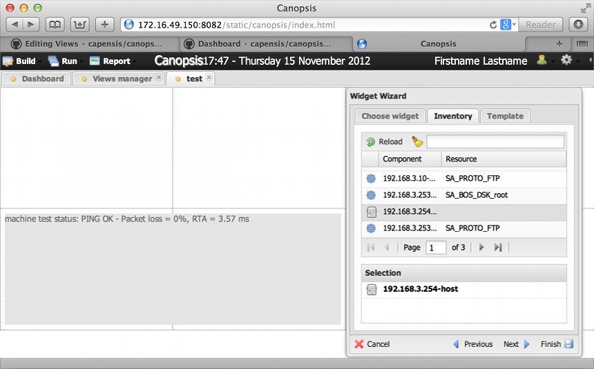 figure 1 |
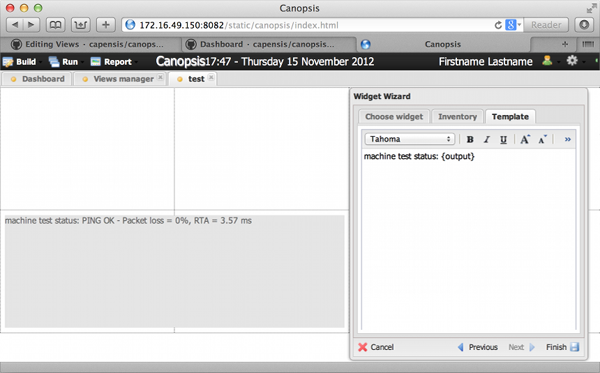 figure 2 |
Soon.
Soon.
"Display selector state SLA as weather icons" Soon.
"Display a calendar with events (ics-like and regular Canopsis events)" This widget allows to display events in different types of calendars :
- Monthly view
- Agenda week view
- Agenda day view
- Basic week view
- Basic day view
There is two ways to display events on a calendar :
- Stacked : events are shown on a per-day basis on the calendar, in one bubble. When the bubble is clicked, a popup is shown with an extended view of all these events
- By source: Calendar-types events can be shown not stacked, directly on the calendar. Displayed events have to be of calendar type (see calendar event specification)
The widget is highly customizable. Thus, it is possible to vary a lot how information is managed by a lot of means :
- By specifying a color for each source of events, and a color for stacked events
- By changing the size of events on the calendar
- By showing or hiding weekends
- By specifying which information about stacked events has to be shown on the popup
- By changing the way calendar header is displayed
- By making the calendar editable, or read-only.
The calendar widget manages incoming events with the websocket technology. From an user point of view, it mostly means that the widget will not need to get refreshed periodically, and will show selected events as they come into Canopsis.
When the widget is set as editable, it is possible to send and edit events directly from it.
To add an event, click on the calendar where you want it to be (you also can select a range for the event). A popup will appear, asking you to fill information about the new event, with title and source arguments required.
To edit events, click on the event you want to edit, then modify event information at your convenience.
When events are added or edited, it is sent to canopsis over AMQP. It appears on the calendar only when it has been processed by Canopsis.
Calendar events may also be reccurent : it is possible to repeat any calendar event according to what's known as rules (see icalendar specification). Event rule can be specified in the new/edit event window.