KeyMagic 1.0.2 — new icon

✨ New icon
KeyMagic gets a proper piece of artwork — keycaps on a brass rail with an orange slider, rendered in 3D.
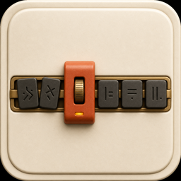
It appears on your desktop and Start-menu shortcuts, in Programs & Features, on the installer banner, and across the README.
The tray keeps a simpler mark — on purpose
The new artwork was tested at the sizes Windows actually renders it. From 48px up it looks great. At the 16px the notification area uses, the row of keycaps blurs into a single indistinct shape, and its cream body loses contrast against a light taskbar.
So the tray keeps the swap-arrow glyph, recoloured to the artwork's rust palette so the two read as one family. Slack, Dropbox and Discord ship the same split, for the same reason: a 16px tray icon is a different design problem from a 256px app icon.
The control panel accent moves from indigo to rust to match.
No functional changes. If 1.0.1 works for you, this is purely cosmetic.
✨ آیکون جدید
KeyMagic حالا یک اثر گرافیکی واقعی دارد — کیکپهایی روی ریل برنجی با یک اسلایدر نارنجی، رندرشده بهصورت سهبعدی.
این آیکون روی میانبر میزکار و منوی استارت، در Programs & Features، روی بنر نصبکننده و در سراسر README دیده میشود.
آیکون سینی سیستم عمداً سادهتر مانده
اثر جدید در همان اندازههایی که ویندوز واقعاً رندر میکند تست شد. از ۴۸ پیکسل به بالا عالی است. اما در ۱۶ پیکسلی که سینی سیستم استفاده میکند، ردیف کیکپها به یک لکهٔ نامفهوم تبدیل میشود و بدنهٔ کرمرنگش روی نوار وظیفهٔ روشن کنتراست خود را از دست میدهد.
بنابراین سینی سیستم همان نشان فلش تبادل را نگه میدارد، اما با پالت زنگاری همان اثر تا هر دو یک خانواده به نظر برسند. Slack و Dropbox و Discord هم دقیقاً همین کار را میکنند: آیکون ۱۶ پیکسلی سینی، مسئلهٔ طراحی متفاوتی از آیکون ۲۵۶ پیکسلی برنامه است.
رنگ تاکیدی پنل کنترل هم از بنفش به زنگاری تغییر کرد تا هماهنگ باشد.
هیچ تغییر عملکردی ندارد. اگر نسخهٔ ۱.۰.۱ برایتان کار میکند، این فقط ظاهری است.