Repository navigation
Design Tokens
All design decisions of a project live in srl.config.json in the project root. You never write colors, font sizes or breakpoints by hand – you define them once as tokens and use them everywhere.
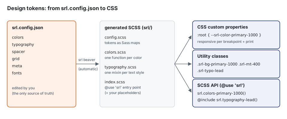
srl.config.json
      │  srl beaver (runs automatically in `npm run dev` and on build)
      ▼
srl/config.scss        → tokens as Sass maps
srl/colors.scss        → one function per color       colors-primary-1000()
srl/typography.scss    → one mixin per text style     typography-paragraph()
      │
      ▼  every output (app, ldd, pdf, word, xbrl) includes init-root + core-styles
:root { --srl-… }      → CSS custom properties (per breakpoint)
.srl-…                 → utility classes (see Utility Classes)
In your SCSS you only need:
@use 'srl';

.my-box {
  @include srl.typography-paragraph();
  color: srl.colors-primary-1000();
  @include srl.spacer-margin-top(400);
}
After changing
srl.config.json, the dev server regenerates everything automatically. Runnpx srl beaverby hand only outside the dev server.
"colors": {
  "colors": [
    { "name": "primary-1000", "color": "#F05000" },
    { "name": "on-primary-1000", "color": "#ffffff" },
    { "name": "shade", "color": "#6C757D" }
  ]
}| Generates | Example |
|---|---|
| CSS variable | --srl-color-primary-1000: #F05000 |
| SCSS function |
srl.colors-primary-1000() → var(--srl-color-primary-1000)
|
| Utility classes |
.srl-color-primary-1000, .srl-bg-primary-1000
|
Conventions:
-
on-<name>is the text color to use on top of<name>..srl-bg-primary-1000then also setscolortoon-primary-1000. -
shade: if a color namedshadeexists, the colorsshade-50…shade-950are generated from it automatically, unless you define them yourself.
Each entry is a text style:
{
  "name": "paragraph",
  "font-family": "Inter",
  "font-size": 16,
  "line-height": 1.5,
  "font-weight": 400,
  "letter-spacing": 0,
  "text-transform": "none",
  "color": "black-1000",
  "margin-top": 0,
  "margin-bottom": 0,
  "media": {
    "print": { "font-size": "9pt" },
    "up":    { "desktop": { "font-size": 18 } },
    "down":  { "phone-ls": { "font-size": 15 } }
  }
}- Unitless numbers are pixels and are converted to the build's unit:
remfor app/editor/pdf,ptfor Word. -
line-heightwithout a unit becomesem. -
colorrefers to a color name fromcolors. -
mediacan contain the following keys:-
print, or any breakpoint name on its own: applies only in that range -
up.<breakpoint>: applies from that breakpoint upwards -
down.<breakpoint>: applies up to that breakpoint
-
| Generates | Example |
|---|---|
| CSS variables |
--srl-typo-paragraph-font-size, -line-height, -font-family, -font-weight, -font-style, -letter-spacing, -text-transform, -font-color, -margin-top, -margin-bottom
|
| SCSS mixin |
@include srl.typography-paragraph(); or with margins srl.typography-paragraph(true)
|
| Utility class | .srl-typo-paragraph |
Because the values are CSS variables, you can override a text style locally:
.my-teaser { --srl-typo-paragraph-font-size: 1.25rem; }"spacer": {
"100": { "size": 8, "media": { "print": { "size": "4pt" } } },
"400": { "size": 32, "media": { "print": { "size": "16pt" }, "up": { "desktop": { "size": 40 } } } }
}| Generates | Example |
|---|---|
| CSS variable | --srl-spacer-400 |
| SCSS |
srl.spacer-get(400), @include srl.spacer-margin-top(400) … |
| Utility classes |
.srl-mt-400, .srl-pa-100, .srl-gap-200 … |
If no print value is set, the screen value is also used for print.
Margin groups define the vertical spacing between neighbouring components:
"margins": {
  "group": {
    "text": {
      "all": 200,
      "title-h2": 800,
      "image": 800
    }
  }
}
This reads as: after an element with class .srl-margin-group-text, the next element gets margin-top: spacer 200. If the next element is a .srl-title-h2 or .srl-image, it gets spacer 800 instead.
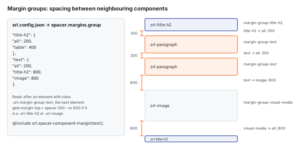
-
allstands for any following element (*). - Plain names become
.srl-<name>. Values that start with.,#,[,:or*are used as selectors as written.
To apply a group, give the component the class and include the mixin in its SCSS:
<p class="srl-paragraph srl-margin-group-text">…</p>@include srl.spacer-component-margin(text);The mixin also handles nested containers, the aside container, XBRL wrapper elements and the PDF split elements (-first / -last).
For one-off rules you can pass a map instead of a group name:
$margins: (
  ('.srl-lead', '*'): 1600,
  ('.srl-lead', '.srl-button-container--search'): 400,
);
@include srl.spacer-component-margin($margins);"grid": {
"breakpoints": { "print": 0, "phone-pt": 0, "phone-ls": 576, "tablet-pt": 768, "tablet-ls": 992, "desktop": 1200, "desktop-large": 1400 },
"containers": { "phone-pt": { "padding": 16 }, "desktop": { "padding": 32, "max-width": 1354 } },
"columns": { "print": 8, "phone-pt": 4, "tablet-pt": 8, "desktop": 12 },
"gutter": { "print": { "column-gap": "16pt" }, "phone-pt": { "column-gap": 16 }, "desktop": { "column-gap": 32 } }
}-
breakpointsare minimum widths in px. The breakpoint with0(besidesprint) is the base and is not wrapped in a media query. - For
gutter, usegapfor both directions, orrow-gap/column-gapseparately.
| Generates | Varies per breakpoint |
|---|---|
--srl-container-max-width, --srl-container-padding
|
✔ |
--srl-gutter-columns, --srl-gutter-column-gap, --srl-gutter-row-gap
|
✔ |
--srl-breakpoint-<name> |
|
Mixins srl.grid-media-up(desktop) … |
see SCSS Mixins and Functions |
Free-form settings for components, such as table paddings, list marker widths, quote characters or PDF margins. No CSS is generated from them. Components read them in SCSS:
@use 'sass:map';
@use 'srl';

$quote-open: map.get(srl.$meta, quote, quote-open);

// or with the helper functions
@if srl.is((pdf, margin)) {
  margin-top: srl.get((pdf, margin, top));
}
Put project-specific component settings here instead of hard-coding them in component SCSS.
"fonts": {
  "font-base-path": "src/assets/fonts",
  "fonts": ["Inter"]
}
Each entry is a folder below font-base-path that contains a styles.json. @font-face rules are generated from it.
Each build adds system.build (app, editor, pdf, word, xbrl) and system.environment. Use them to write output-specific SCSS:
@if srl.$system-build == 'pdf' {
  break-inside: avoid;
}
Because Word does not support CSS variables, srl.system-root-style() and all token functions return the resolved value in Word builds (print values first) instead of var(--…).