Repository navigation
SCSS Placeholders
Placeholders (%name) are reusable rule sets that you apply with @extend. Unlike mixins, they do not duplicate CSS: all selectors that extend a placeholder are combined into one rule.
They live in the project under src/assets/scss/placeholders/. srl init copies them there and you can change them. All files in that folder are loaded automatically through srl/index.scss, so @use 'srl' is enough:
@use 'srl';

.srl-my-component {
  @extend %srl-grid-base;

  &__inner {
    @extend %srl-regular-width;
  }
}
You can add your own placeholder files to the folder; they are picked up automatically. Keep the %srl- prefix for shared ones. Placeholders only work within the same output (@extend cannot reach across separately compiled files). This is fine for component SCSS, because all component files of a target are compiled together.
Most grid placeholders contain separate code for each output: CSS grid for app/editor, flex widths for PDF, fixed columns for XBRL and a plain block for Word.
| Placeholder | Use |
|---|---|
%srl-grid-base |
Outer element of a component: container width + 12-column grid (PDF: flex column, Word: block) |
%srl-grid-reset |
Removes the grid from a nested element (no padding/margins, full width, block) |
%srl-trim-margins |
First/last child without outer margin |
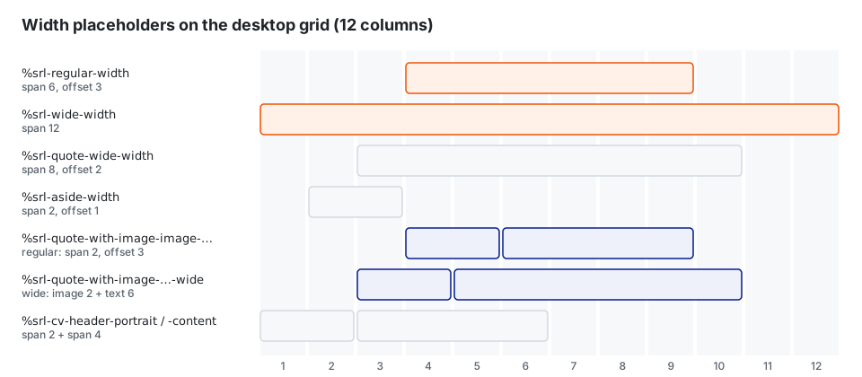
Apply to the inner element of a component inside %srl-grid-base:
| Placeholder | Desktop (12 cols) | Tablet landscape | Tablet portrait | Mobile | XBRL | |
|---|---|---|---|---|---|---|
%srl-regular-width |
6, offset 3 | 8, offset 2 | 8 | 4 | 6 cols | 6, offset 3 |
%srl-wide-width |
12 | 12 | 8 | 4 | 8 cols | 12 |
%srl-aside-width |
2, offset 1 | 2 | 8 | 4 | 2 cols | 2, offset 1 |
These match the Width property of the components (width-reduced: Regular / Wide, width-all: Regular / Wide / Full).
| Placeholder | Use |
|---|---|
%srl-quote-wide-width |
Quote without image, wide (8 cols, offset 2) |
%srl-quote-with-image-image-regular-width / …-text-regular-width
|
Quote with portrait, regular width: image column (2) / text column (4) |
%srl-quote-with-image-image-wide-width / …-text-wide-width
|
Same for wide width: image (2) / text (6) |
%srl-cv-header-portrait / %srl-cv-header-content
|
CV: portrait column (2) / content column (4) |
@use 'srl';

.srl-my-box {
  @extend %srl-grid-base;

  &__inner { @extend %srl-regular-width; }
  &.srl-wide &__inner { @extend %srl-wide-width; }
}A grid with named lines that lets single children "break out" of the content width up to the browser edge. It takes effect from desktop upwards.
| Placeholder / mixin | Use |
|---|---|
%srl-breakout-grid-base |
Outer grid with lines full-start · content-start · col … · content-end · full-end
|
%srl-breakout-grid-inner |
Child as a subgrid between content-start and content-end
|
@include srl-breakout-grid-from-to($from, $to) |
Spans a child between two lines, default full-start / full-end
|
Used by the startpage components (hero-video, teaser, teaser-quote).
All buttons are controlled by CSS variables. Variants only change these variables.
| Placeholder | Use |
|---|---|
%srl-button |
Base button: button-text typography, height 3.5em, pill shape, border, hover/focus/active states, icon size |
%srl-button--primary |
Primary color, white text |
%srl-button--secondary |
Secondary color |
%srl-button--white |
White button (for dark backgrounds) |
%srl-button--transparent-white / --transparent-black
|
Transparent, white/black text, border on hover |
%srl-button--ghost |
Looks like text (no background, border or padding; inherits font) |
%srl-button--icon |
Round icon-only button (49 × 49) |
%srl-button__switch |
Parent controls the button state (uses srl.button-switch('.srl-button')) |
.srl-my-cta {
  @extend %srl-button;
  @extend %srl-button--primary;
}
Adjust a single button through the variables:
| Variable | Meaning |
|---|---|
--srl-button-color, --srl-button-bg-color, --srl-button-brd-color
|
Default state |
--srl-button-hover-*, --srl-button-focus-*, --srl-button-active-*
|
States (-color, -bg-color, -brd-color) |
--srl-button-height, --srl-button-padding-inline, --srl-button-gap, --srl-button-brd-size, --srl-button-brd-radius, --srl-button-image-size
|
Size and shape |
Active state: .srl-active, [aria-expanded="true"], [aria-selected="true"] or [aria-current="page"].
| Placeholder | Use |
|---|---|
%srl-decoration-line |
Short grey line above the element (80px, in PDF 80pt × 1pt) with top padding |
%srl-decoration-line-reset |
Removes it again |
Used by the link component.
| Placeholder | Use |
|---|---|
%srl-icon-base |
Font Awesome base styles (same as fa.base()) |