Short/Fast actions on bottom screen#805
Short/Fast actions on bottom screen#805David-Development merged 3 commits intonextcloud:masterfrom emasty:master
Conversation
Prepared app for fast-actions in the bottom screen area.
Started with implementing a fast actionf or mark all article as read.

Signed-off-by: emasty <emasty@gmail.com>
Signed-off-by: emasty <emasty@gmail.com>
Signed-off-by: emasty <emasty@gmail.com>
|
I think this change requires a min API level of But I think the project already requires it due to the use of XML icons. I could not get the original code to run in an emulator < API Level |
|
@emasty thank you for contributing and for providing a video to it! I would love to ping @jancborchardt, @AndyScherzinger and @tobiasKaminsky in to get some ui/ux feedback. The code looks good to me! |
|
@emasty do you remember which other actions were available in Google Reader for fast actions? I’d say the main issue right now is that since there is no text label, it’s unclear what the action actually does. If we have labels, like the FABs where you tap and then a list of actions gets shown with text, then I’d say we can definitely just have that as default, no setting, and also have other actions in there (whatever Google Reader had)? |
|
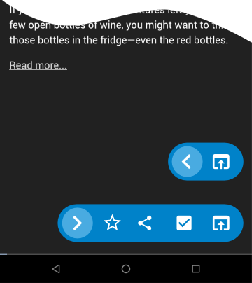
@jancborchardt there were two mark as read options in gReader. One with an optional menu and one to mark all items as read. You can see a video here (unfortunately, it did not record the taps): I fully agree that it might be disturbing without text if there would be more options behind one button. Otherwise, I personally prefer meaningful icons before text. For nextcloud-newsreader I would leave it with the one action "mark all as read" for the article view. For me, the "common actions" are too hard to access in nextcloud-newsreader for my daily workflow (refresh, screen, open, mark as read). I often end up pressing the wrong options as everything (common actions & rare actions) is mixed in one list in an options menu. Other users seem to have the same issue as #802, #788, #789 indicate. Faster and direct access within reach for common options and visual distinction (e.g. usage of icons) would help me a lot. For the detail-article view I see more common actions, but their impact is not as critical as "mark all as read". Therefore I am currently working to add short actions as a bar in detail-view. I think a "fail-proof" animation (aka swipe) is not required here. Not sure though if the bar should be collapsible or not. Direct access
Slide out
|
|
→ Moved comment to #808 (comment) :) |
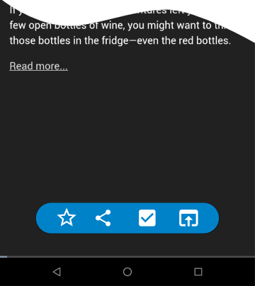
What it does:
Demo video: https://drive.google.com/file/d/1dwYcCa0q7WeB-wY7HxsNYwhKLGNrmz6a/view
It accomodates growing screen sizes and more interaction within direct reach of the users hand. Fast actions were a feature of gReader which I used a lot when screening news feeds. More functions could follow.