08. Analytical Findings
- Analyze historical sales data to identify patterns and trends.
- Develop customer segmentation models based on purchasing behavior.
The relevant code is in Subgroup A Q1 EDA
| Historical Average Orders | Value |
|---|---|
| Avg Orders per Day | 59 |
| Avg Orders per Month | 1795 |
| Avg Orders per Year | 21538 |
| Year | Number of Orders | Year on Year Growth (%) |
|---|---|---|
| 2015 | 12676 | - |
| 2016 | 12691 | 0.12 |
| 2017 | 13224 | 4.20 |
Monthly Orders over Time
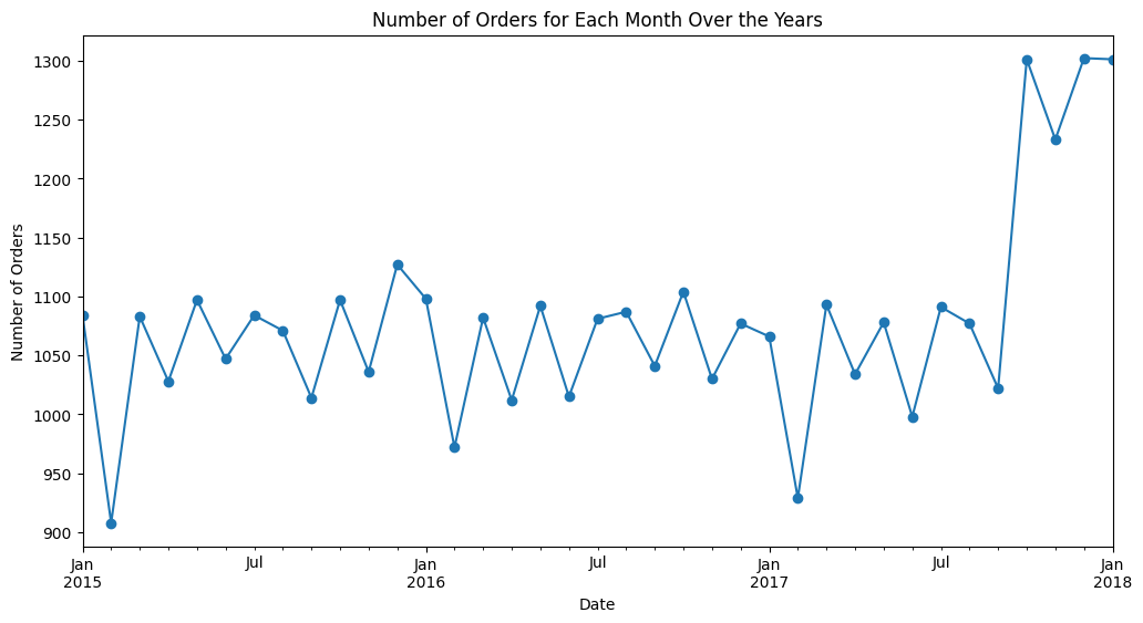
From the monthly orders over time plot, we can see that the number the orders spiked sharply in October 2017 and maintained until January 2018 (which is the end of this dataset)
The last part is removed when doing seasonal decomposition of the monthly orders so that the trend detection will not be affected
Seasonal Decomposition of Monthly Orders over Time

These are some seasonal components we observe from the trend:
- Lower order counts every February
- The number orders will increase in a month and decrease in the following month in repetitive patterns, except in July and August
- The order counts stays relatively constant in July and August
The lower order counts every February could be due to the fact that February has 2.5 lesser days than every other months of the years. From the plot of monthly orders over time, we can also see that there is around 120 to 150 less orders every February compared to usual which tallies with 2.5 * 59 = 147.5, where 58 is the average number of orders per day.
The number orders will increase in a month and decrease in the following month in repetitive patterns because the months usually have 31 days followed by 30 days in repetitive patterns. The order counts stays relatively constant in July and August because both July and August have 31 days. Therefore, the seasonal component in the month order counts is mostly related to the number of days in each month. Below is a table showing the number of days every month, for your reference.
| Month | Number of Days |
|---|---|
| January | 31 |
| February | 28 or 29 |
| March | 31 |
| April | 30 |
| May | 31 |
| June | 30 |
| July | 31 |
| August | 31 |
| September | 30 |
| October | 31 |
| November | 30 |
| December | 31 |
To investigate the increase in montly order counts from October 2017 onwards, we plotted the monthly order counts by category.
Monthly Orders over Time by Category

We have 3 categories of products, Clothing, Electronics and Home Appliances.
The plot suggests that the increase in orders from October 2017 onwards is due to the increase in Clothing products orders. We also observed that the orders in Electronics and Home Appliances categories decrease from then onwards.
Since the 3 category of products shows different trends over time, we plotted 3 seasonal decomposition plots, one for each categories' monthly orders over time to better understand their trends.
Seasonal Decomposition of Clothing Monthly Orders over Time

Seasonal Decomposition of Electronics Monthly Orders over Time

Seasonal Decomposition of Home Appliances Monthly Orders over Time

The seasonal component of the monthly orders of the Clothing category is similar to that of the overall seasonal components of monthly orders. However, that is not true for the seasonal component of the monthly orders of the Electronics and Home Appliances category. Since the number of monthly orders for Clothing category is always much higher than the other 2 category, we can conslude that the overall seasonal component of monthly orders is mostly contributed by the seasonal component of the monthly orders of the Clothing category.
The seasonal component of the monthly orders of the Electronics category shows this trend:
- Increase from February to June
- Decrease from June to October
- Increase from October to December
- Decrease from December to February
The uppermost graph in the seasonal decomposition of the monthly orders of the Home Appliances category doesn't seem to follow any trends so the seasonal graph in the seasonal decomposition may not be accurate.
We can see that monthly orders increase from October to December for Electronics and it could be because November and December is when more than 1 sales happen within a month and people generally place more order during that period of time. The Singles' Day sales is on 11th November, Black Friday sales is on 29th November, Cyber Monday sales is on 2nd December and Christmas sales is on 25th December.
Furthermore, people are generally more likely to buy during the end of the year because that is when most people receive the 13-months bonus (or holiday bonus) from their companies (Indeed Editorial Team, 2024) so they would have more disposable income to spend, especially for Electronics products which can be more expensive.
After analysing sales trends over time and possible factors that may have influenced it, we will take a look at the distribution of customers in the different customer segments. For the definition of each customer segment, you may refer to Customer segment labels
| Customer Segment | Number of Customers | Percentage of customers |
|---|---|---|
| Discount seekers | 62,122 | 62.12% |
| Loyal High Spenders | 723 | 0.72% |
| Occasional Shoppers | 32,303 | 32.30% |
| Tech-Savvy Users | 27,150 | 27.15% |
| Single-Category Shoppers | 72,854 | 72.85% |
| Long-Tenured Non-Buyers | 9,206 | 9.21% |
We can see that most of our customers are Discount Seekers and Single Category Shoppers. From the customers' perspective, it is expected that they want promotions and lower prices when they make purchases, thus many of them are Discount Seekers. As for Single-Category Shoppers and other categories, we will outline some of the possible reasons behind their behaviours.
These are some possible reasons that customers belong to each segment
-
Discount seekers
- Behavior: These customers mainly purchase during promotional periods or use more coupons than others
- Reason: These customers are motivated by discounts and cashback opportunities to make purchases
- so that they can maximize the value for their money OR
- they have a tendency to make impulse purchases when they see offers
-
Loyal High-Spenders
- Behavior: These customers regularly spend on the platform, showing consistent engagement and loyalty.
- Reason: Our products are of quality and satisfy the customers' needs, so the customer got used to buying and using our products over time.
-
Occasional Shoppers
- Behaviour: They make occasional purchases and their app usage is less than average.
- Reason: They may shop around on different platforms, not forming a deep connection with any single one.
-
Tech-Savvy Users
- Behaviour: These customers engage frequently with the app and has visited our site using various devices.
- Reasons :
- The customers prefer making online purchases OR
- Our app is easy to use
-
Single-Category Shoppers
- Behavior: These customers have a strong preference for products from a specific product category and only bought products from that category
- Reasons :
- These customers may have specific interests or needs that are well met by one particular category. OR
- Routine Purchases: They may be repurchasing items they regularly use from this category, especially if it’s a necessity.
-
Long-Tenured Non-Buyers
- Behaviours: they’ve been registered for a long time but haven't converted to buyers
- Reasons :
- Price comparison: They could have registered initially to compare prices but found better deals elsewhere, particularly if your pricing isn’t competitive. Or they have always been comparing and our price has always been not competitive
Based on the possible reasons of the behaviours behind each customer segment, the company can efficiently allocate resources and design initiatives, like promotions or marketing strategies, that address key customer motivations, contributing to overall customer satisfaction and loyalty.
- Overall churn rate is 23.55%
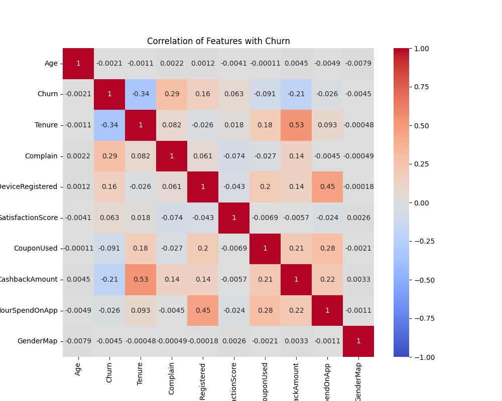
- Features with strongest correlations with churn (in decreasing order):
Tenure,Complain,CashbackAmount, andNumberOfDeviceRegistered. - Churned customers tend to have short tenure (<2 years), make complaints, limited cashback received (~$125–$150)
- Other similar traits observed were: moderate satisfaction scores (3), having 3, 5, or 6 registered devices and using fewer coupons (0–2).
-
Correlation Matrix:
- Strongest correlations with churn:
Tenure,Complain,CashbackAmount, andNumberOfDeviceRegistered. Moderate correlations observed withCouponUsedandSatisfactionScore. - Highly likely that the features with strong correlation to churn are the key features for churned customers and to identify at-risk customers
- Strongest correlations with churn:
-
KDE Plots:
- Tenure: Churned customers concentrated for 0–3 years; non-churned customers more evenly distributed. With its strong correlation with churn, it is likely that this is a key feature of churned customers
- CashbackAmount: Peaks around $125–$150 for churned customers, indicating a possible threshold for customers to churn.
- Age: Similar distributions for churned and non-churned customers, suggesting it is not an important factor in predicting churn.

-
Bar Plot Distributions (Categorical Features):
- NumberOfDeviceRegistered: Higher proportion of churned customers observed for 3, 5, or 6 devices, suggesting that users with multiple devices might be more prone to churn
- SatisfactionScore: Moderate scores (3 and 4) are more common among churned customers, hence indicates that moderate satisfaction doesn’t guarantee retention.
- Complain: Churned customers report complaints at a higher rate, indicating dissatisfaction among churns likely to make them churn.
- CouponUsed: Churned customers frequently use 1 coupon, followed by 0 and 3. Incentivizing coupon use may aid retention.
- Payment Method: No significant differences observed between churned and non-churned customers, suggesting it is not an important factor in customer retention.

-
Pie Chart (Gender):
- Gender has minimal impact on churn, supported by nearly identical churn rates for male and female customers.

- Churn Rate: The overall churn rate is 23.55%.
- Identifying At-Risk Customers: Combining insights from predictive modeling (Random Forest with feature importance analysis) and data analysis (correlation, visualizations, and segmentation), we identified key customer traits associated with a higher likelihood of churn. Customers with the following traits are classified as at-risk: short tenure (<2 years), complaints lodged, and limited cashback received (around ~$125–$150).
-
Analyzing Current Retention Strategy (A/B Testing):
Conducted an A/B test by dividing 500 customers into two groups—those who received the email (treatment) and those who did not (control). By comparing churn, purchase, and engagement rates between these groups, we aim to assess the campaign’s impact on customer retention.-
Email Campaigns:
- Treatment group (email recipients) showed higher purchase and open rates but minimal impact on churn reduction.
- Limited data on other strategies prevents comprehensive evaluation.
- Proposed Next Steps: Implement alternative retention strategies (as proposed below) and collect more data to test its effectiveness or potential impact.
-
Email Campaigns:
-
Onboarding and Engagement for New Customers:
- Insight: New customers (tenure <2 years) have higher churn rates.
- Action: Implement onboarding programs, such as tutorials, additional welcome discounts, and app engagement incentives, to enhance early user experiences and encourage prolonged use of the e-commerce platform, aiming for a tenure of over 2 years.
-
Improving Complaint Resolution:
- Insight: Churned customers report complaints at higher rates.
- Action: Enhance customer support with personalized solutions, quicker resolutions, and follow-ups, to ensure that customers are not as inclined to make as many complains and in turn lead to churning.
-
Cashback Incentives:
- Insight: At-risk customers receive <$150 in cashback.
- Action: Introduce tiered cashback incentives especially to these customers to encourage spending and repeat purchases.
- Evaluate the ROI of different marketing channels.
We used the campaigns dataset to analyze the most effective marketing channels using campaign information, including channel types, costs, revenues, and speicifc features such as personalisation and discounts. The data was cleaned and preprocessed to ensure accuracy in analysis. The initial dataset included data across four marketing channels. Following data cleansing and processing, which involved filtering incomplete data points and aligning strategic focus, we refined the dataset to focus on three key channels: mobile_push, email, and multichannel.
- ROI was calculated using the formula: ROI = ((Total Revenue - Total Cost)/Total Cost) * 100
-
Costs calculations: Our analysis includes Channel-specific costs were calculated baseed on distinct formulas that consider both fixed and variable costs, leveraging pricing information from leading service providers
-
Pricing References:
- Mobile Push: Uses Onesignal's Growth Plan pricing, with a per-recipient cost and a monthly flat fee
- Email: Applies a sclable cost structure suitable for both small and large campaigns using Onesignal's Growth Plan pricing
- Multichannel: Presenting combined costs for strategies utilizing all channels
-
Pricing References:
- Feature Impact Analysis: The influence of subject features (e.g., saleout, deadlines) was accessed within each channel
- Email Channel: Achieved the highest ROI of 65.85%, indicating strong customer engagement and cost-effectiveness
- Mobile Push Channel: Recorded an ROI of 58.50%, showcasing significant revenue generation with effective cost management
- Multichannel: Displayed a negative ROI of -46.01%, suggesting higher expenses than revenue generated
A barplot (ROI by Marketing Channel) depicting ROI by marketing channel is available to illustrate comparative performance.
ROI by Marketing Channel
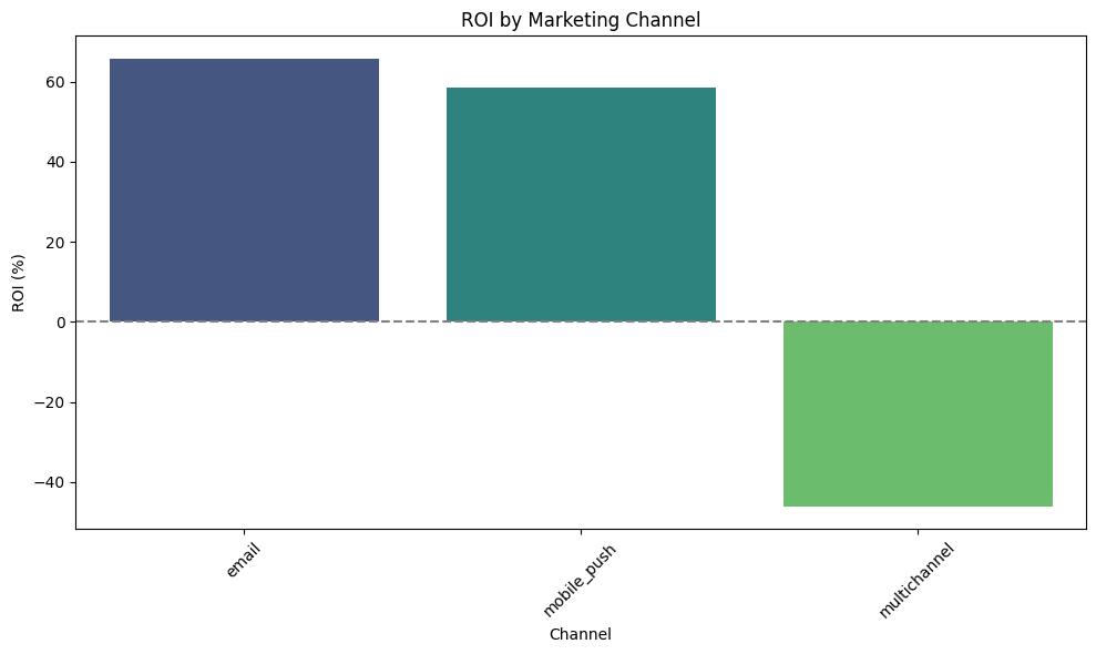
The evaluation of marketing channels based on their ROI and subject features presents clear distinctions in performance, highlighting successes and areas needing strategic attention, particularly the role of features like "saleout," "discount," "deadlines," "emoji," and "bonuses" in influencing effectiveness.
-
Email Channel: Highest Efficiency and Profitability
- Performance Overview: The Email channel exhibits the highest ROI at 65.85%, underscoring its efficiency and profitability. This remarkable performance indicates robust revenue generation with relatively modest costs. Features such as "saleout", "discount" and "deadlines" contribute significantly to its success, enhancing engagement and conversion rates.
- Reasoning: The high ROI suggests that email marketing strategies are well-aligned with customer expectations and behaviours, capitalising on the extensive reach and personalisation capabilities inherent to this channel. The strategtic use of urgency-inducing features like "saleout" offers further leverage, creating not only a sense of urgency but also encourages immediate response, thus maximizing click-through and conversion rates.
-
Mobile Push: Strong Engagement and Revenue Generation
- Performance Overview: With an ROI of 58.50%, the Mobile Push channel also demonstrates strong performance. This positive result reflects effective resource allocation and compelling engagement strategies. Critical features such as "emoji", "discount", "saleout" and "bonuses" play a pivotal role in augmenting user interaction and driving significant revenue relative to costs.
- Reasoning: Although slightly less efficient than email, Mobile Push channel excels in immediacy and personalized user interaction. The inclusion of bonuses acts as a powerful consumer incentive, promoting loyalty and enhancing engagement. Additionally, emojis and saleouts add an element of appeal and urgency, which strengthen emotional connectivity and drive timely actions. This channel's adaptability ensures high interaction rates, though there remains room for optimization in feature deployment to further refine user outreach and maximize engagement.
-
Multichannel: Limited Data Insight
- Performance Overview: The Multichannel channel presents a negative ROI of -46.01%, but it's important to note that this is derived from a singular data point in the dataset. Such a limitation necessitates cautious interpretation, as broader insights into its performance are restrained by insufficient data.
- Reasoning: The singular data point for multichannel means the channel's overall efficiency is not comprehensively represented. This single entry likely reflects an instance where high costs were not offset by sufficient revenue, pointing to possible strategic pitfalls, but wider conclusions cannot be drawn without additional data.
- Feature Impact: Key features such as "saleout" and "discount" have been instrumental in elevating engagement and conversion rates across channels. These features introduce a sense of urgency, trigger quicker consumer decision-making, and add tangible value to the customer proposition, thus increasing attention and interaction. Their strategic deployment can significantly bolster marketing effectiveness by aligning offer timing and content with consumer expectations.
Based on the ROI analysis of marketing channels, Email emerges as the most effective channel, yielding the highest ROI at 65.85%. This indicates that email marketing combines cost-efficiency with high engagement, particularly when utilizing features like "saleout" and "discounts" to create urgency and enhance conversion rates. Mobile Push follows closely with an ROI of 58.50%, benefiting from its immediacy and high engagement capabilities, though it requires continuous optimization of engagement features like "emoji" and "bonuses" to match email's effectiveness.
The Multichannel channel, however, shows a negative ROI at -46.01%, but the limited data available for this channel suggests that a broader dataset would be necessary to draw more comprehensive insights.
This analysis reveals that maximizing ROI may involve focusing on the strengths of Email and Mobile Push channels, while refining feature deployment for further engagement. Strategic adjustments, such as refining multichannel cost structures and further enhancing feature-specific impacts, can improve overall channel effectiveness, making marketing spend more efficient and targeted to high-conversion channels.
Through these insights, businesses can allocate resources more effectively by prioritizing email and mobile channels, capitalizing on targeted features, and refining multichannel approaches for future campaigns.
- Analyze the impact of various promotional campaigns on sales.
We want to identify the most effective marketing campaigns by analysing various promotional efforts' impacts on sales using data-driven insights.
-
Main Table: We merged the Campaigns and Messages tables on the
campaign_idcolumn to create a comprehensive dataset combining campaign characteristics with purchase outcomes. -
Feature Extraction and Engineering:
- Extracted temporal features such as hour, month, and day of the week from the
sent_atcolumn for detailed analysis. - Calculated conversion rates and purchase volumes for each campaign
- Conversion Rate (%) = (Number of purchases/Total number of messages in campaign) * 100
- Purchased volume is determined by the total number of purchases in each campaign.
- Extracted temporal features such as hour, month, and day of the week from the
- Data Visualisation: We created visualizations including bar charts and line graphs to explore conversion rates, purchase volumes, and feature importance.
- Predictive Modelling: We utilized a Random Forest Classifier to identify key features impacting purchase likelihood and evaluated the model's performance using accuracy metrics to assess prediction quality.
- Conversion Rate by Campaign: Campaigns leveraging precision-targeted approaches, such as campaign ID 8015, achieved the highest conversion rate despite delivering fewer messages. This suggests that by precisely targeting a smaller, more relevant audience, the campaign effectively engaged recipients and maximized conversion potential. This strategy highlights the efficacy of targeted marketing, delivering impactful results by focusing on quality interactions over quantity.
- Purchased Volume by Campaign: Campaign 18223's high volume showcases successful broad reach strategies despite lower conversion rates. This approach underscores how achieving scale can be crucial for increasing total sales figures, demonstrating that a wide-reaching strategy can effectively complement targeted efforts to achieve comprehensive market impact.
- Random Forest Model: The model achieved an accuracy of 99.97%, indicating high prediction success. This high accuracy suggests potential class imbalance, as the model might predominantly predict the majority class. Further evaluation with precision and recall metrics may be required to ensure balanced performance.
-
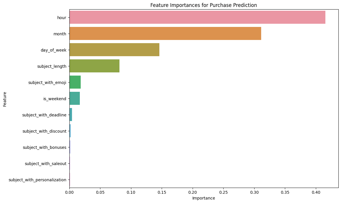
Feature Importances:
- Visualisation: Barplot of feature importance
-
Interpretation: "hour" of extracted from
sent_atcolumn emerges as the most critical feature, followed by "month" and "day_of_week". This indicates that specific sending times substantially enhances purchase probability.
Feature Importance
-
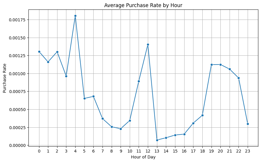
Hourly Purchase Rates:
- Visualisation: Line chart of average purchase rates by hour
- Interpretation: We identified peak engagement hours at 4AM and 12PM, which suggest the optimal times for message delivery. These hours likely correspond with early risers and lunchtime breaks, when individuals are more available to engage with their devices.
Average Purchase by Hour
-
Monthly Purchase Rates:
- Visualisation: Bar chart of average purchase rates by month
- Interpretation: We identified peak engagement to be in February and June. The February peak may align with New Year purchases and celebrations such as Valentine's Day. The June peak may be attributed to Mid-Year Sales and an increase in activities related to summer vacations.
Average Purchase by Month

Our analysis identifies both targeted and broad-reach campaigns as effective strategies, depending on the business objective. Precision-targeted campaigns (e.g., Campaign ID 8015) are highly effective in converting a smaller, more relevant audience, highlighting the power of personalization and relevance. Conversely, campaigns with broader reach (e.g., Campaign ID 18223) demonstrate success by maximizing purchase volume, indicating that large-scale exposure can complement targeted strategies to achieve extensive market impact.
Key insights from feature importance analysis emphasize the "hour" feature as the most influential predictor of purchase likelihood, with peak engagement observed at 4AM and 12PM. These findings suggest that delivering messages at optimal times could significantly enhance conversion rates. Additionally, peaks in February and June reveal opportunities for leveraging seasonal trends in marketing strategies, aligning campaigns with New Year, Valentine’s, and Mid-Year Sales for greater impact.
While the Random Forest model achieved high accuracy (99.97%), potential class imbalance may require additional evaluation using precision and recall metrics to validate the robustness of predictions. Further, enhancing model performance by addressing class imbalance could improve predictive insights, offering a balanced view of campaign success across diverse customer segments.
In conclusion, data-driven insights reveal that blending precision-targeted and broad-reaching campaigns can drive sales, with optimal timing and seasonal trends further enhancing marketing campaign effectiveness. These findings offer actionable strategies for maximizing engagement, purchase volume, and overall campaign impact, ensuring a data-driven approach to effective, customer-centered marketing.
Analysis revealed clear seasonal trends. Adjusting inventory levels to align with these seasonal patterns can improve product availability without overstocking, thereby reducing holding costs during off-peak times.
For essential and high-demand products, safety stock levels were calculated based on demand variability. This approach minimizes stockouts, which are costly both in terms of lost sales and customer satisfaction, while keeping safety stock levels manageable.
Setting dynamic reorder points based on demand forecasts and lead times ensures orders are placed just in time to maintain stock levels, reducing holding costs without risking stockouts. This threshold helps automatically trigger restocking before inventory falls below critical levels, maintaining a consistent supply.
Time-series chart predicting future demand given past historical sales data. From the visualization, the model predicts a gradual resumption of customer demand after a sudden drop in October 2017.

Inventory levels over time graphs tracking daily inventory levels against the reorder threshold and safety stock levels. They visually indicate when stock levels dip below thresholds for each category, showing when restocking is triggered and how inventory levels adjust over time. It can be observed that reorder timings delayed due to the demand setback in October 2017 to minimize ordering and holding costs.


The inventory optimization models and analyses align well with the objective of minimizing costs while ensuring product availability:
- Cost Optimization: By balancing ordering and holding costs and using demand forecasting to set reorder points, our approach reduces overall inventory costs.
- Availability Assurance: Dynamic reorder thresholds and safety stock levels tailored to demand variability ensure product availability, supporting customer satisfaction. We can adjust stock levels before high-demand periods, ensuring availability during peak seasons while reducing stock during slower periods to control holding costs.
- Supplier Monitoring: Dynamic reorder points based on demand forecasts and lead times allow us to maintain stock availability without incurring excessive holding costs, ensuring orders are placed just in time.
In order to gain insights into optimal pricing of our products, we investigate the Price Elasticity of Demand (PED) value of a product.
PED measures how sensitive the quantity demanded of a good is to a change in its price. A high PED value indicates that consumers will significantly reduce their purchases if the price rises or increase them if the price drops.
-
Electronics have the most elasticity, followed by Home Appliances and then Clothing.
-
Competitor's prices and sales volume during both promotional and non-promotional periods are the most important factors impacting pricing decisions.
- Bar chart showing the number of products in each elasticity category.
We can see that most products (92%) are elastic.

- Density plot of inelastic PED values across categories.
Home Appliances only has one inelastic product, hence it is not shown in the density plot below.
For inelastic products, the PED values for Electronics are more uniformly distributed as compared to Clothing. The uniformity in Electronics may reflect consistent consumer reliance on certain products despite price changes, likely due to perceived necessity or lack of substitutes. The less uniform PED distribution in Clothing indicates that some items are essential with stable demand, while others are more discretionary, making demand less uniformly inelastic across clothing products.

- Bar chart plot of SHAP values.
We can see that price comparison index (ratio of our business price to competitor's price), promotional sales volume and non promotional sales volume are the most important factors during price strategies.

With our insights from data visualisation and modelling, these are pricing strategies to maximise revenue.
-
During promotional periods, applying a higher discount on Electronics would likely drive a significant increase in demand and hence, maximising revenue.
-
For less elastic products such as Home Appliances, apply a tailored discount based on seasonality and competitor's pricing. This is to keep our profit margins reasonable while still driving an increase in demand.
-
For inelastic products, we should focus on value-added promotions (e.g., loyalty rewards, free gifts), instead of monetary discounts. As discounts are not likely to drive demand for inelastic products, we should focus on maintaining the demand.
-
Due to the importance of competitor's pricing in determining our optimal prices, we should keep track and even forecast our competitor's prices. This can help us to anticipate and plan for any price changes more timely.
- Supplier Performance Variability: Merging the Orders Table and Products Table enabled a detailed analysis of supplier effectiveness. A significant disparity was observed in delivery timelines across suppliers, particularly in the electronics category.
- Late Deliveries: Analysis of shipping and order dates revealed that delayed deliveries were more prevalent in regions with high order volumes, particularly for electronics products.
- Order Quantity Patterns: Variations in order quantities across product categories highlighted potential inefficiencies in predicting demand, which could lead to delays in order fulfillment.
- Box Plots: Actual vs. Scheduled Shipping Days: median and IQR(Q3-Q1) of actual shipping days > scheduled days, indicating inefficiencies in order fulfillment and potentially negative impact on customer satisfaction.

- Supplier Performance Analysis:
- The bar chart indicates that there are 14 Electronics Suppliers and 3 Home Appliances Suppliers are underperforming.
- Are Electronics and Home Appliances harder to transit, leading to this result? Ans: No. As mentioned before, every categories have 50%-55% late delivery risk, so we cannot tell the difference of each categories' difficulty in transit.

- Order Fulfillment Process Analysis: Based on the geospatial heatmap, we can confidently say that regional challenges is one of the factors leading to high late delivery percentages in several countries.
- Customs Clearance Issues: Zimbabue, Hungría, and Guinea have complicated customs procedures such as lengthy processing times, strict regulations, or lack of resources at customs facilities, which can impede timely delivery.
- Inconvenient Transportation: Papúa Nueva Guinea and Kyrgyzstan often have remote areas that are difficult to reach, leading to longer delivery times. Infrastructure issues such as poor road conditions or inadequate logistics networks, can exacerbate these delays.
- Political and Economic Factors: Venezuela and Democratic Republic of the Congo may face political instability or economic challenges that affect their logistics and supply chain operations.
- Natural Disasters and Weather Conditions: Senegal is country prone to natural disasters or adverse weather conditions, they may experience interruptions in logistics and transportation, further delaying deliveries.
- Local Regulations: Regulatory environments can vary significantly between countries. Some countries like Peru, Níger, and Bulgaria may have more stringent import/export regulations that slow down the delivery process, contributing to high late delivery rates.

- Bar Chart of Percentage of High-Risk Countries by Region
- After applying logistic regression model, the bar chart below showing high-risk countries by region in descending order, allow us to narrow down or tackle these markets of suppliers' one by one.

-
Analyze supplier performance and identify bottlenecks: Analysis revealed that electronics suppliers are the primary contributors to late deliveries. Bottlenecks were further observed in different regional challenges such as complex custom clearance, natural disasters, political and economic instability and etc.
-
Strategies to Improve Supply Chain Efficiency:
-
Expedite customs processes with priority shipping in high-delay regions
- Focus on countries with lengthy customs clearance processes by investing in priority handling and fast-track options
- Example: Partner with local customs brokers in countries like Zimbabwe and Venezuela to streamline entry procedures
- Example: Utilize bonded warehouses near major ports to expedite goods transfer and avoid customs delays in specific regions
-
Strengthen partnerships with reliable regional carriers
- Enhance partnerships with regional carriers that have established routes and efficient networks in remote areas
- Example: Collaborate with established carriers in Papua New Guinea to navigate difficult terrain and improve delivery times
- Example: In politically sensitive regions such as Venezuela, work with carriers experienced in handling complex local conditions
-
Implement flexible shipping schedules for volatile regions
- Allow for dynamic scheduling to accommodate sudden changes in high-risk areas, improving delivery adaptability
- Example: In regions like West Asia, introduce flexible shipping options that adjust routes based on real-time data on political or weather conditions
- Example: Build a buffer into delivery timelines for regions with potential disruptions, reducing overall late delivery rates
-
Monitor and assess high-risk areas continuously
- Utilize predictive models to keep track of high-risk regions and allocate resources based on changing risk levels
- Example: Regularly evaluate the logistic regression model to update high-risk countries and adjust strategies as necessary
- Example: Use insights to forecast delays in South America and East Africa, and prioritize these areas in supplier engagement
These targeted strategies are designed to reduce delays, improve efficiency, and ultimately enhance overall supply chain performance.
1. What is the potential of using natural language processing to analyze customer reviews and feedback?
From our analysis of customer reviews, we concluded that:
-
Sentiment analysis distribution: There is an overwhelming number of positive reviews, compared to negative and neutral reviews, as seen in the visualization below.
-
Common issues: Some more common issues extracted from neutral and negative reviews revolve around the quality of the product, such as its inability to work and slow performance issues. Words highlighting these issues found in the reviews include “Useless”, “Ultra-Slow” and “Slow”. Other notable issues include that customers may find the product to be underwhelming and inferior to the original product, and they are dissatisfied with the overall product delivered, calling it “Pathetic” or “Bad” in their reviews.
-
Common feedback: While our dataset did not specifically contain a column talking about customers’ feedback, we can extract feedback from the reviews using natural language processing (NLP) techniques. Here, we used SpaCy, a Python-based NLP task and a list of keywords to search for possible mentions of improvements the customers want in the product they bought. Our analysis has found just a few improvements, such as lowering the price and improving the quality of the product. If we refer to the list of common issues, common suggestions should be to improve the quality and performance of the product generally, so that it will meet their expectations and not think of it as “underwhelming”.
Pie chart: Displays customer review sentiment distribution, showing clearly the percentage of positive, neutral and negative reviews.

Common Issues extracted:
['Useless', 'MDR XB50AP.,boAt', 'Comparison', 'Slow', 'USB Cable', 'Sansui', 'Substandard Copy', 'Pathetic', 'less than 500', 'Bad', 'Ultra-Slow', 'Design', 'ANC', 'CHEAP', 'TWS', 'Doesnt', 'MI 5 Tab', "Don't"]
- How Can We Rack Up A Higher Percentage Of Positive Reviews?
- As we already have the knowledge of common issues and feedback generated from the reviews, we can invest in solving the most common issue, which is the quality and performance of products. Poor quality usually arises from a lapse in quality control checks from the manufacturer’s side, or delivery issues causing a part of the product to be damaged or is subjective to the customer (they may be cynical). On our end, we should ensure more rigorous quality control checks are carried out. Additionally, strict measures should be taken to ensure a smooth delivery process, including handling of products from the manufacturer to the delivery rider.
- How Should We Increase Our Competitiveness In The E-commerce Industry/Market?
- Judging from the massive positive support we get from our customers through the reviews they left on our platform, we already have a following. To retain our customers and expand our business, consider not only improving based on customers’ feedback and suggestions, but also implement sentiment analysis on customer reviews left on our competitors’ platforms. This is a wild take that may not be implemented, but with the techniques we have for analyzing customer reviews and assessing their common issues and feedback, we can improve on aspects that may be issues for our competitors, making us more appealing to their customers and attracting them to use our platform instead.
Concluding Thoughts: Implementing sentiment analysis on customer reviews is important in relaying information to us about how customers feel about using our platform to buy products. Furthermore, we uncover common issues and suggestions our customers have, and in turn, we improve our platform by taking respective measures.
2. What are the key insights about product features, quality, and customer satisfaction from customer review analysis using an LLM?
From our analysis, we found that:
-
Customer Satisfaction: In general, a large majority of customers enjoy the product enjoyed the product, with less than 7% sharing a negative sentiment. A fair number, a little more than 7% of customers, share mixed feelings.
-
Product Features: Many customer reviews did not mention product features. Among those who mentioned, almost all of our customers are satisfied with their product features.
-
Quality: While a little more than half of our customers did not talk about the quality of the product delivered, those who mentioned the quality of the product bought shared a similar sentiment distribution to the first aspect. Many of these customers find that the quality of their products is good, while an approximately similar percentage (~7%) of customers think their product quality is poor.
A dashboard image showcasing insights about each aspect

- Which Aspect Should We Focus On Improving The Most?
- There is not a definite answer to this but based on the insights we extracted from our analysis, quality is an area that needs improvement. While a large majority of our customers enjoy their products, a fair number find the quality to be lacking. Product features were not a prominent aspect mentioned in the reviews, but quality was. To improve customer satisfaction, we have to improve the average quality of the products the customers purchased on our platform.
Concluding thoughts: Aspect-based sentiment analysis is a powerful tool to determine how many of our customers enjoy their product in a certain aspect, and how many do not in another aspect. It separates the good features from the bad, allowing us to address the more frequent issues first to boost customer trust.
From both bonus questions, majority of our customers enjoy using our platform to purchase online goods. Quality is the biggest issue we face. Since we are the bridge between a manufacturer and a customer, a possible solution we can implement are to enforce more frequent and strict quality control checks; if a product is faulty, it should be immediately exchanged with a working one from the manufacturer. This is why strong relationships between us, customers, and manufacturers have to be forged for smooth services.