Meeting notes July 2019 onwards
- Chunk size, x, y minimum and maximum ranges can be supplied by user
- Argparse function now called in ragavi binaries
The earlier MS was split based on correlation resulting in a ~350GB MS. And an attempt to plot it, with predefined y-axis ranges, still reveals that a significant amount of time is spent in the datashader aggregation stage and eventually the error below resulted.
 File "/home/andati/virtual_envs/ragavi3/lib/python3.6/site-packages/dask/compatibility.py", line 130, in reraise
    raise exc
  File "/home/andati/virtual_envs/ragavi3/lib/python3.6/site-packages/dask/local.py", line 233, in execute_task
    result = _execute_task(task, data)
  File "/home/andati/virtual_envs/ragavi3/lib/python3.6/site-packages/dask/core.py", line 118, in _execute_task
    args2 = [_execute_task(a, cache) for a in args]
  File "/home/andati/virtual_envs/ragavi3/lib/python3.6/site-packages/dask/core.py", line 118, in <listcomp>
    args2 = [_execute_task(a, cache) for a in args]
  File "/home/andati/virtual_envs/ragavi3/lib/python3.6/site-packages/dask/core.py", line 119, in _execute_task
    return func(*args2)
  File "/home/andati/virtual_envs/ragavi3/lib/python3.6/site-packages/dask/array/core.py", line 4224, in concatenate3
    result = np.empty(shape=shape, dtype=dtype(deepfirst(arrays)))
numpy.core._exceptions.MemoryError: Unable to allocate array with shape (4096, 4, 158469) and data type float64
Limiting the visualisation to only a single correlation, predefined y ranges and selecting every 10 channels for plotting produced a result. However, it took ~50 min for datashader to perform it's aggregations on this dataset.
- Added progress bar to ragavi-vis
- Improved documentation to ragavi. May be ready for Read the Docs
This was done using a ~1.7T Measurement Set and the test ran to completion. However, some difficulties were encountered:
- Calculating minimum and maximum values from this dataset took ~25 minutes
- After execution of
ragavi-vis, there was no HTML output. This should not be the case as a default name is given to the output file in the absence of a custom name. Investigation ongoing
- Expose chunk size as command line option
- Expose x and y minimum and maximum ranges as command line options to alleviate 2 data passes
- Move call to
argparsehelp outside the main function to reduce help loading time - Split large MS and test it
- Implemented some features required for the visibility plotter
- Created a new binary for the plotter under the name
ragavi-vis. - Ragavi ready for release with the new visibility plotter.
Testing was done for all the combinations of x and y.
The following were plotted for each test
- All correlations
- All fields
- All spectral windows
- All channels
For Measurement sets with sizes ~1GB, ~6GB and ~40GB, with an aim of estimating:
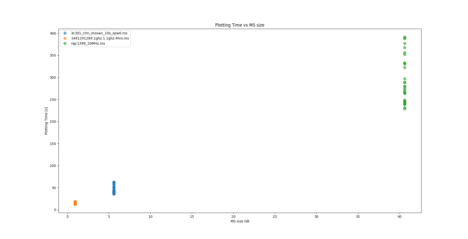
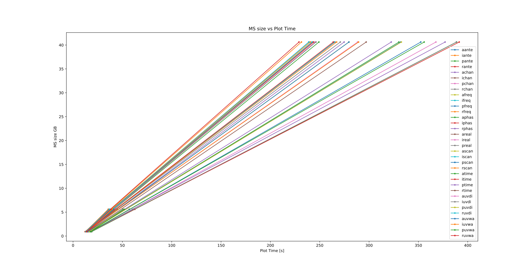
- Amount of time each combination takes (for each combination of x and y) to be plotted
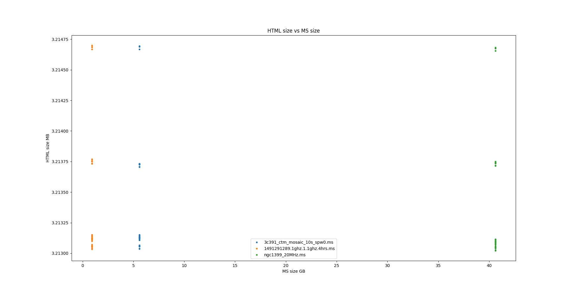
- Corresponding sizes of the output HTML files with respect to input MS
- Approximate time taken to plot MS with different sizes
| Output file size vs input MS size | MS size vs plotting time | Time fo each plot with each ms |
|---|---|---|
 |
 |
 |
- Test ragavi-vis with a large dataset
- Add a progress bar
- Remove underscores from command line switches
- Implemented suggested features on the visibility plotter testing and fixing ongoing
- Have 2 binaries for the different parts of ragavi: gain plotter and visibility plotter
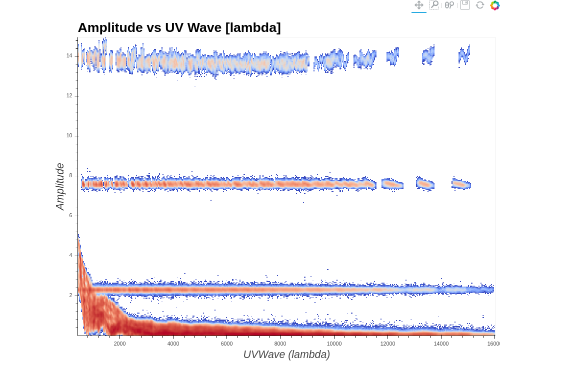
- Combine the grid plots into a single plot**
Currently
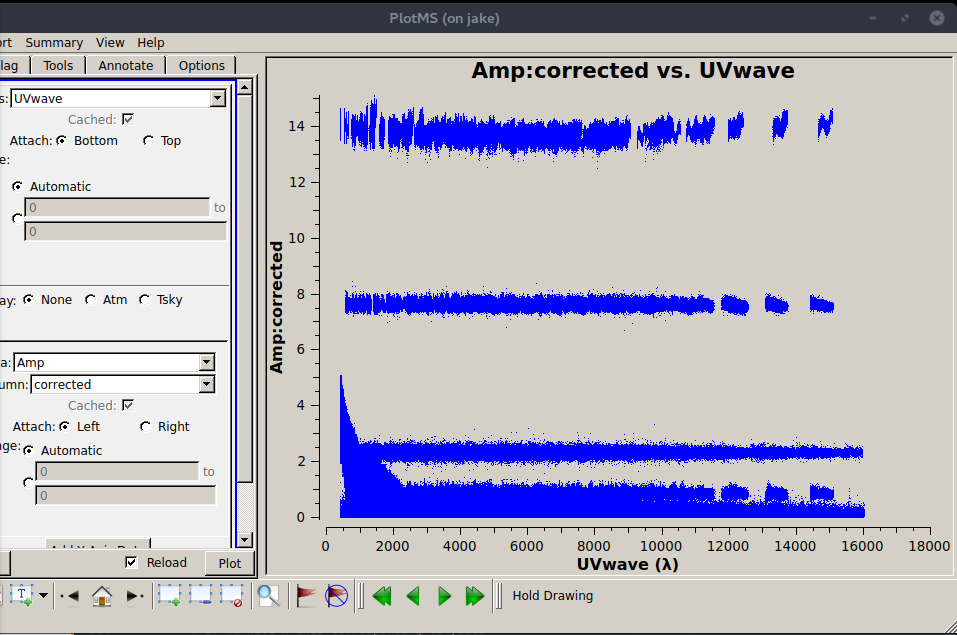
| casa | ragavi |
|---|---|
 |
 |
- Finish up!
Scan_vs_chunk plots
- Still working on the data groupings but the rest of the enhancements have been implemented and fixes made
Current status of the plot:

The data used here is calibrated data from this tutorial. Color bar seems smaller and crowded because height of the colorbar depends on the number of rows in the grid and I chose to have 1 frequency chunk containing all the frequencies. The circles seem almost identical in size but are not, I presume because of the use of the natural log to derive their radius and so their differences are really small.
- Finish up on the visibility plotter
- Add this feature: a possibility of grouping by antenna, baseline, uvdistance vs frequency chunk and time chunk for this the scan vs chunks plot
With the radius==σ and area==σ^2
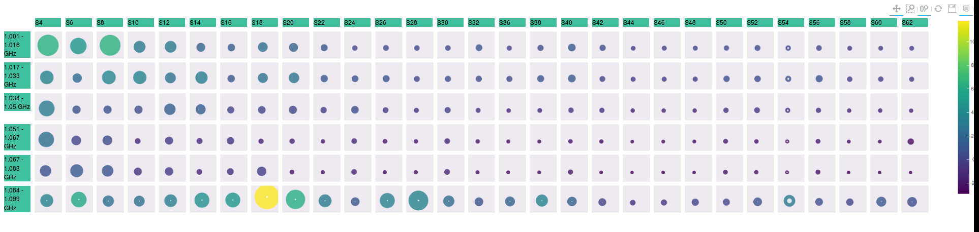
With the radius== |ln{σ}| and 6 frequency chunks
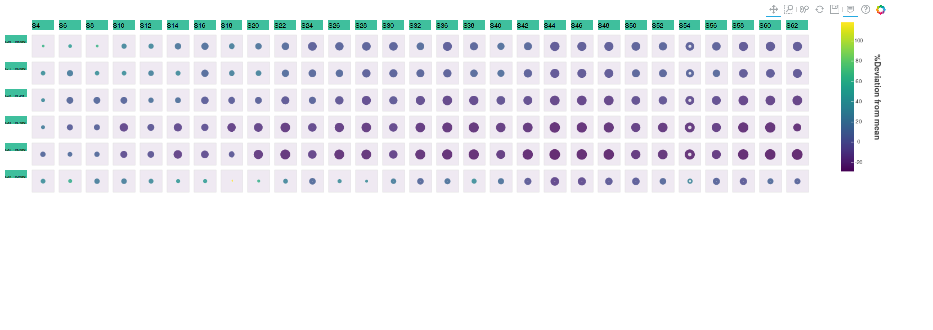
With the radius== |ln{σ}| and 40 frequency chunks
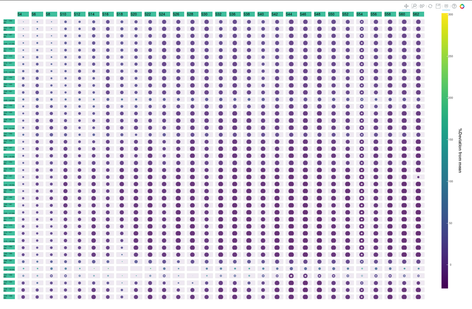
For scan_vs_chunk plot
- Change label backgrounds to white
- Only put the central frequency as chunk label
- Change color bar to log scale
- Add sigma ellipses to the amplitude vs phase plot
- Have a possibility of grouping by antenna, baseline, uvdistance vs frequency chunk and time chunk for this plot
For antenna vs antenna
- Have different types of stats shown on each pair of plots for a single baseline and provide options for this choice.
Overall
- Have a TAQL query option
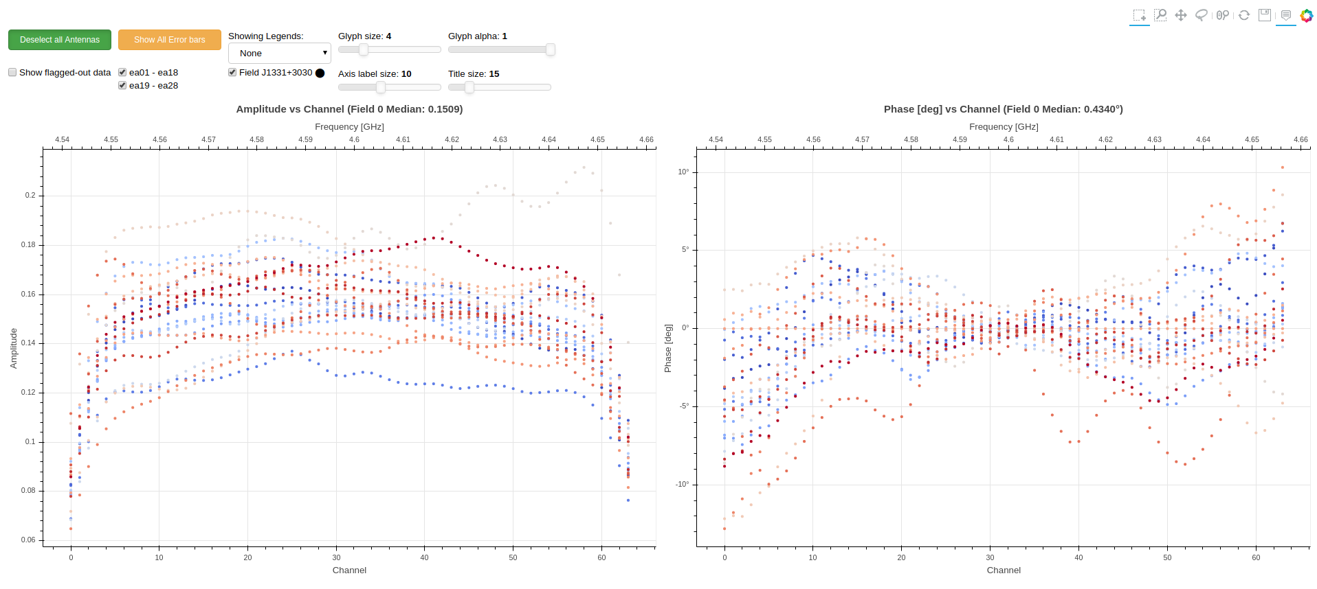
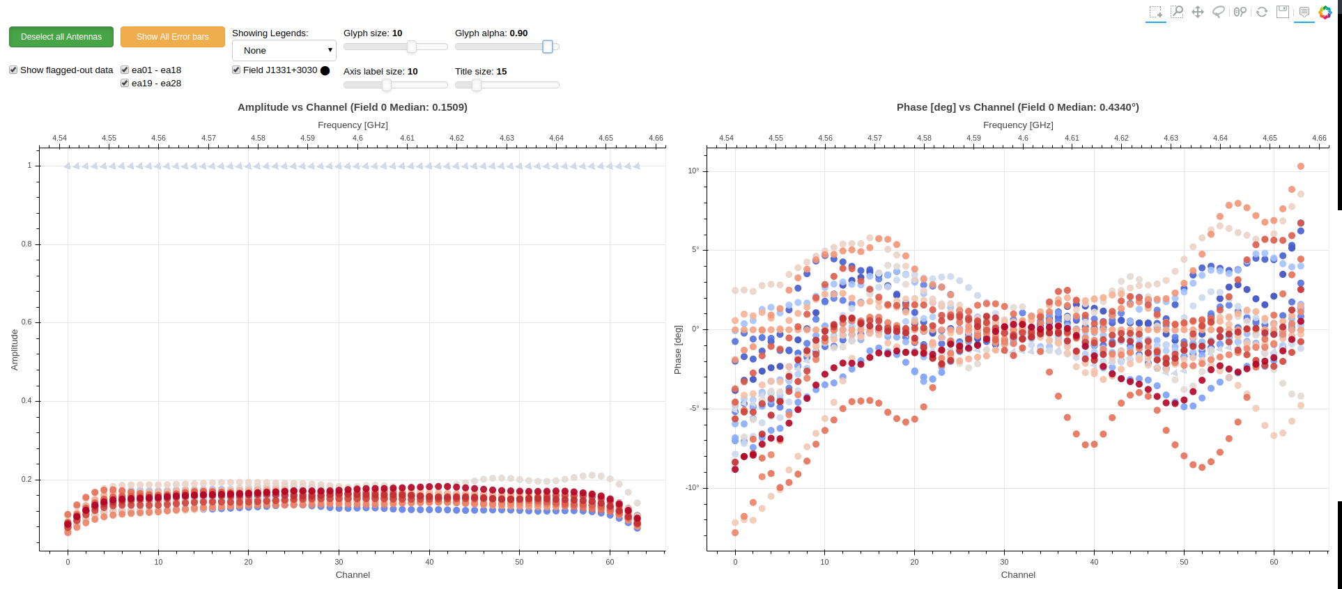
- Glyph alpha selectors discovered not to be malfunctioning. Alpha of the glyphs was not changing due to over-plotting
- Error bars are now represented by whiskers
- Option of showing flagged data flag moved from a button to a checkbox
- Flagged data is denoted by triangles rotated at an angle. No outline because this would mean adding an outline to all the data where flagged data appears
- Legends are now linked
Showing only data that is not flagged out
 Including data that is flagged out
For the scan_vs_chunk plot
- Put scans on the x-axis and chunks on the y-axis
- Reduce the sizes of the box containers of the plot
For thesis
- Move section 2.1 to chapter 3
- Move section 2.2 to chapter 4
- Rename chapter 4 to Pipeline visualisation tools
For ragavi
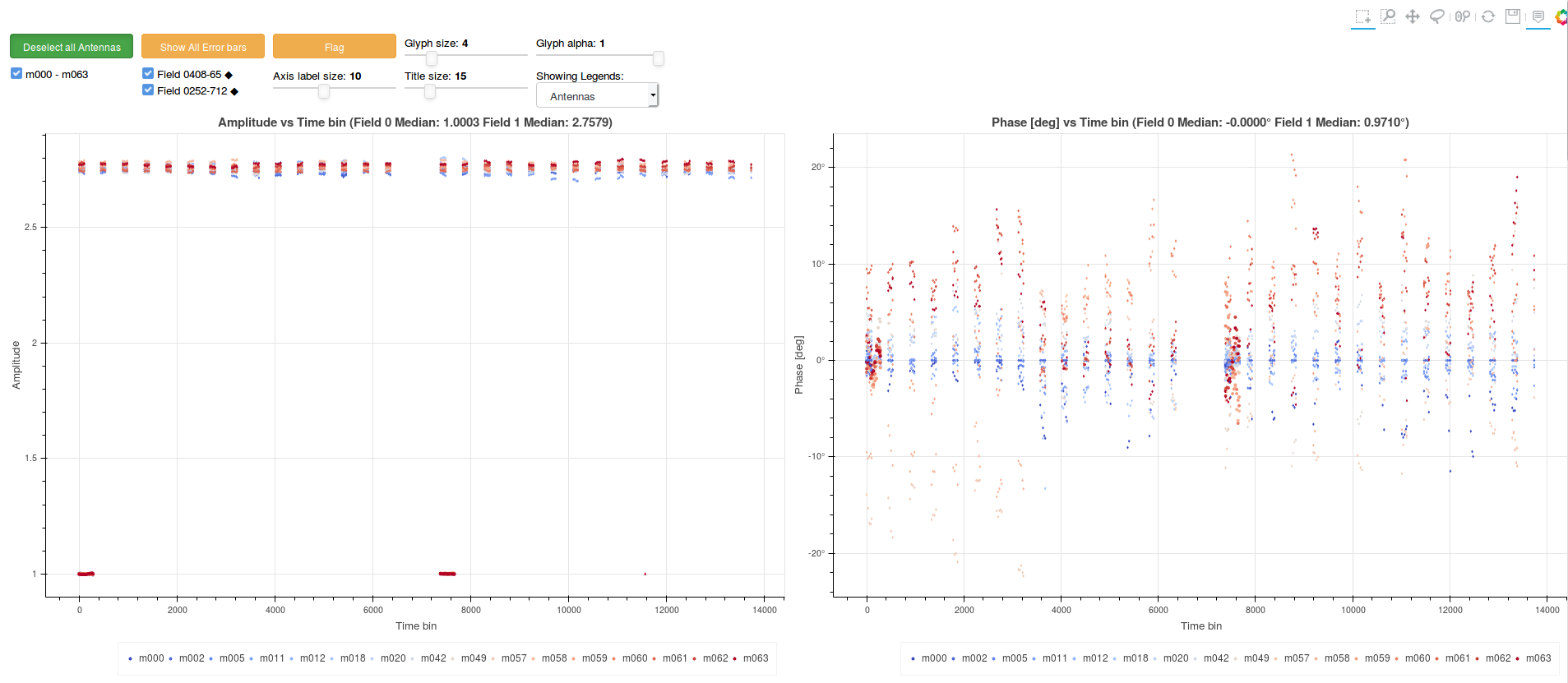
- Time axis labels changed
- Medians moved to plot title
- Automatic plot scaling enabled
- Control sizes were reduced
- Flag button implemented
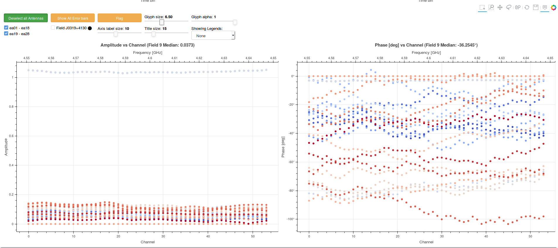
- Now supports D-Jones tables
- Legends moved to bottom of plot
Ragavi current status is:
Add for the newly supported table
For thesis
- Trello board and outline done.
- Investigate flagging callback malfunction
- Fix glyph alpha selection
- Add outline to flagged data
- Refine error bars
- Field selector and glyph alpha selector were implemented
- Different fields denoted with different markers
- Controls were re-organised
-
fieldsflag now fully optional
- Add font size selector
- Add field marker to field label.
- Reduce size of smaller font
- Change time axis labels from "Time [s]" to "Time bin"
- Re-organise controls
- Reduce control sizes
- Display medians on plot title
- Develop way to show flagged and un-flagged data
- Enable automatic plot Scaling
- Create a
trelloboard for thesis - Develop a thesis outline
Ragavi now plots multiple fields on the same. For each different field, depending on the field id, a line of width==field_id is added to the marker. i.e. field 0 will have a outline line of width=0, field 1: width=1 etc as shown below
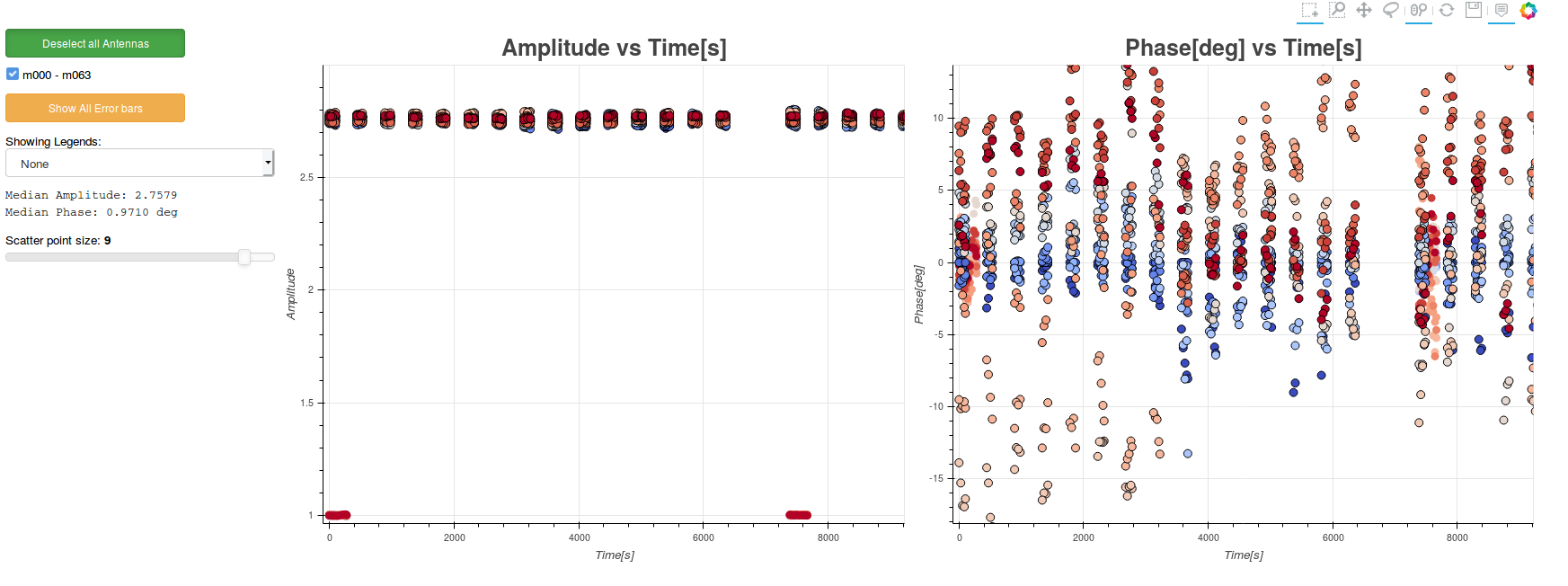
For ragavi
- Add a field selector, glyph alpha selector to the selection panels
- Denote different fields with different markers
- Make the
fieldsflag optional and plot all fields on the same plot by default
For the visibility plotter:
- Have ability to toggle flagged data
- Include time in the waterfall plots
- Have an ability to show a subset of the antennas. In batches maybe...
- Have a selector for real and imaginary as well