Meeting notes through June 2019
The Real vs Imaginary plot currently being plotted on a grid, whose axes are ANTENNA1 and ANTENNA2, and each "cell" of the grid, corresponds to a single baseline of the data and contains a real vs imaginary plot of this baseline. It also included some ellipses showing
This poses challenges :
- For a large number of baselines, the plot becomes too busy and bulky to render on the web-browser.
- Given that for 16 antennas there are already 120 baselines, the plots are too many and too small to be seen clearly because they are being datashaded making infinitely small and vague for the "Not so large" data. A wrong approach was taken and therefore steps to correct it are as follows :
The current plot should be divided into 2 plots:
- One plot showing the mean and standard deviation
$\sigma$ of each baseline for all the time and frequency. - The second plot conforms to the specs:
- Chunk amplitude vs phase plot into frequency and time bins.
- Is User to specify bin_size/ number of bins for time and frequency chunking?
- Have a Time-frequency grid plot of n_time_bins x n_frequency_bins
- For each of the bins, plot amplitude vs phase
- Show the
$\sigma$ ,$2\sigma$ and$3\sigma$ on the plot for each of the chunks. - Field should remain specifiable in the command line.
The following plot was generated
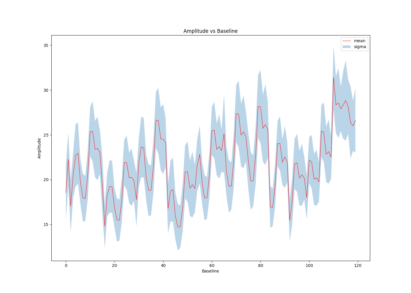
However, this plot was not the intended one and was due to the earlier specification for this plot which was plot showing the mean and standard deviation of each baseline for all time and frequency.
Specifications for plot 1 thus changed to:
- A waterfall plot displaying variations in both time and frequency for each single baseline for amplitude in one diagonal and phase in the other diagonal.
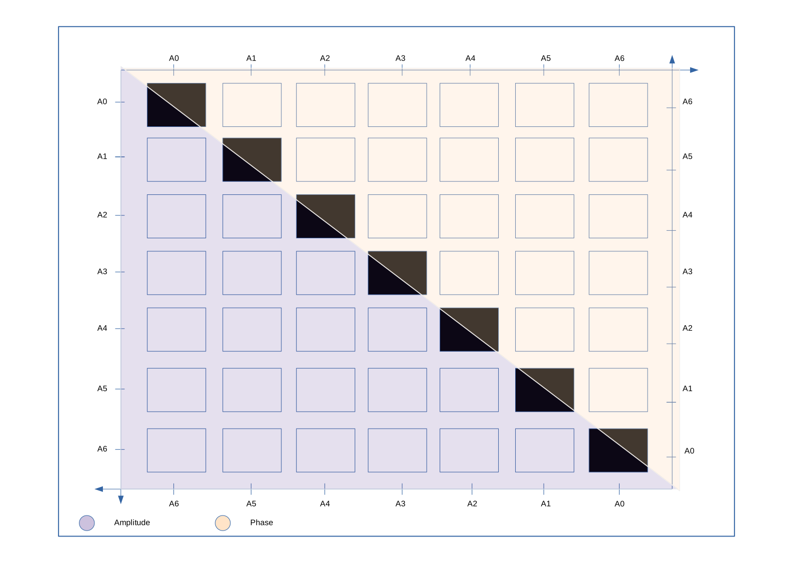
Updated specifications for plot 2:
- Have a grid of n_scans x n_frequency chunks
- Each item on the grid to display the amplitude vs phase plot of that scan and frequency chunk.
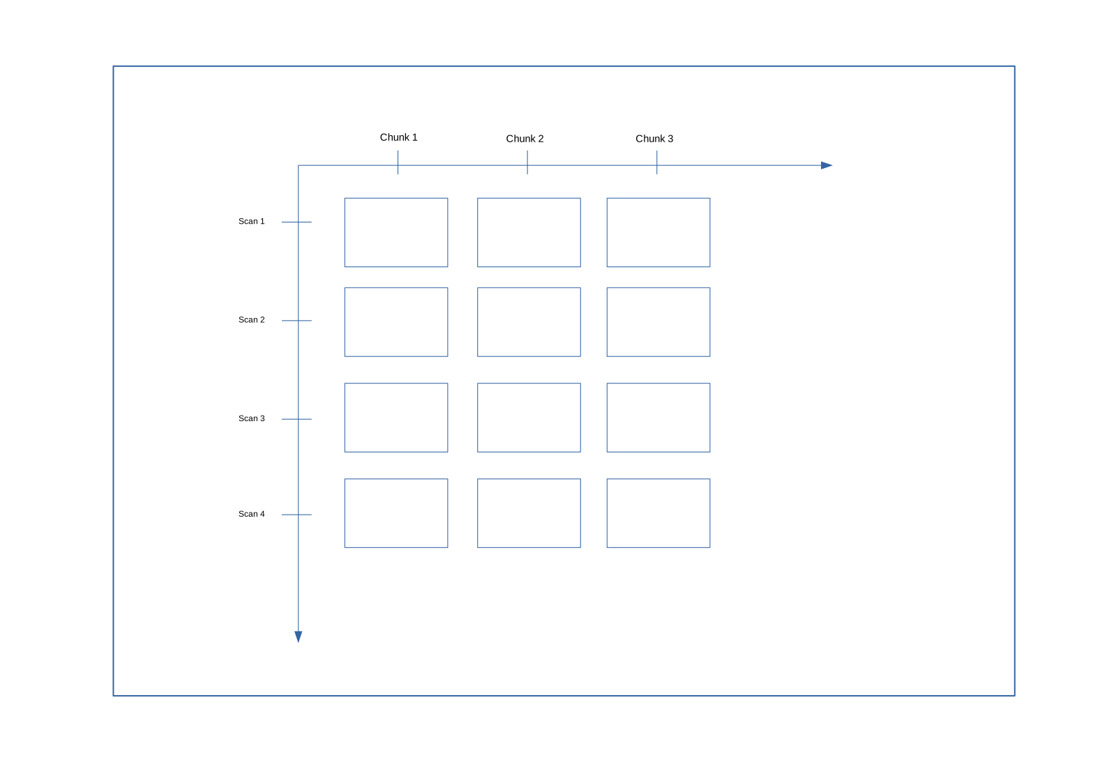
Waterfall plots were generated using bokeh. This was however, "impractical" because rendering plots for all baselines was too computationally intensive and caused browser to crash. The same applies for the scan vs frequency chunk grid plot.
Plot 1 specifications therefore changed to:
- A plot showing the median and standard deviation for each single baseline over time on one diagonal and over frequency in the other diagonal for both amplitude and phase.
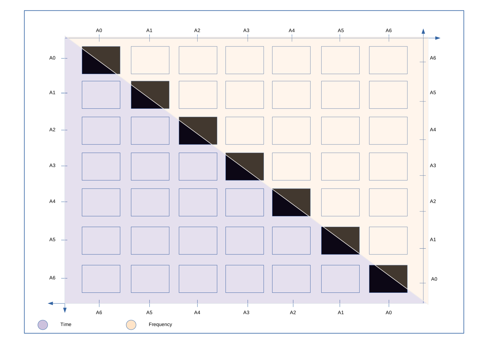
This will give a summary for each baseline and reduce the computing need for rendering all data for that specific plot.
- On clicking a single item on the grid, a waterfall plot with the data for that specific baseline in all time and frequency should appear.
Plot 2 specifications:
- Each item on the grid displays the mean and variance for both amplitude and phase.
- Variance to be displayed as a circle of radius == variance, while mean represented by a color.
- On click on an item on the grid, a plot of amplitude vs Phase for that specific frequency chunk and scan should appear.
The plot below was generated as per the previous plot 1 requirement.
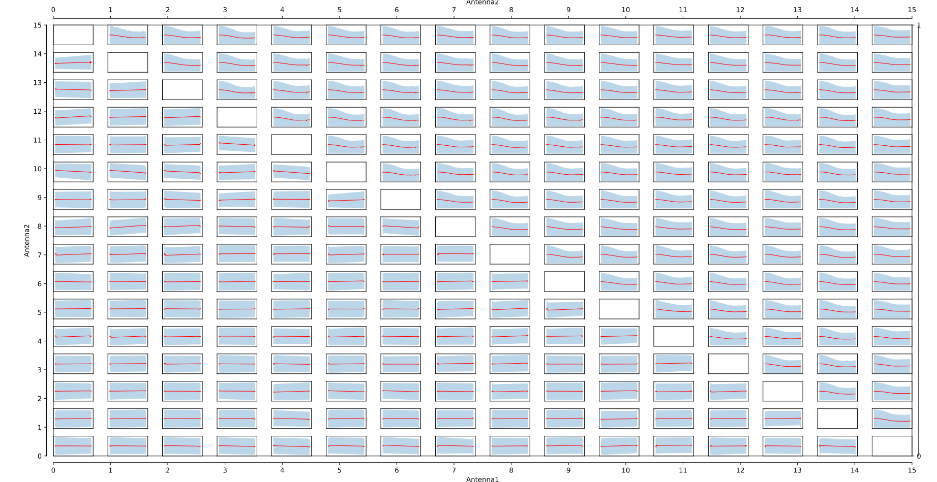
Showing the mean and variance of amplitude over time and over frequency in the different diagonals.
The implementation action on click of a grid element was still under investigation
The same was done for phase. These plots were done in matplotlib as options for bokeh were explored.
- Plotting tool for plot 2 was still under constructIon.
A problem was encountered during data processing for plot 2. It was necessary to bin the data into frequency chance and a viable solution was to partition the dask array into the required specified chunks. The problem was assigning bin numbers to each partition thereafter.
- Continue with the previous task.
- Meeting adjourned to the 17th of May
- Only show the axes on the extreme edges
- Add a color bar to the plot
- Add the on click action
The following plot was generated
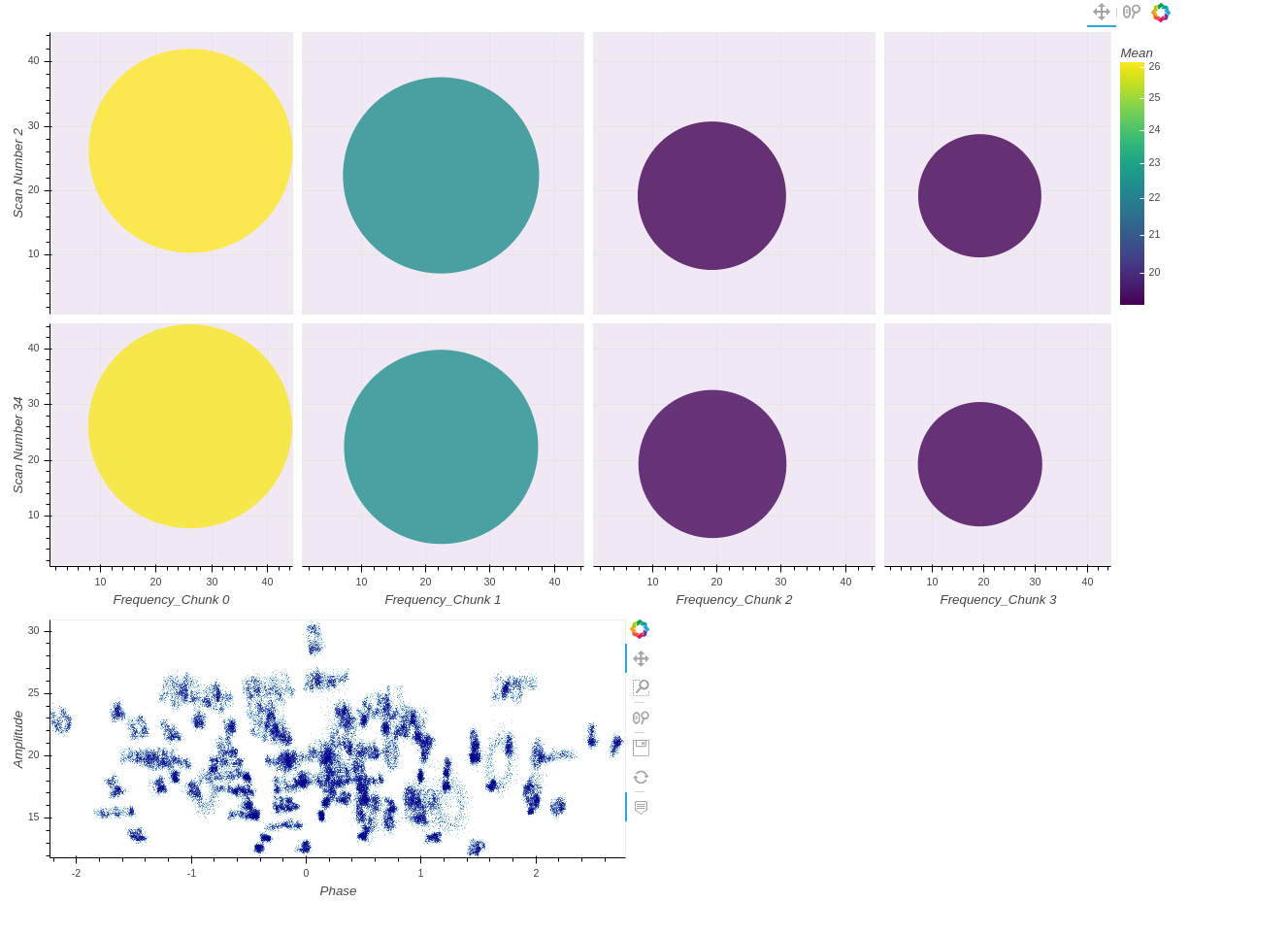
Onclick action on the plot is active but still buggy, the correct plot is not being rendered. This however required the use of the bokeh server to enable the use synchronisation between the plot and python callbacks generating the plot with the full data. The color bar was limited in size because it was "not possible" to add a long color bar for a grid plot in bokeh, as the grid layout is currently manually organised.
- Add the frequency ranges for showing the start and end frequency for each of the available chunks.
- Ensure correct amplitude vs phase plot is produced
- Center all the plots to a universal median i.e the median of the available medians to avoid the shifting of plots.
- Make bounding box of the plots dynamically change in size depending on the number of items in a grid.
- Add an S.I. unit to the color bar.
- Onclick function now working
- Plots centered on the central median of the mean of the data
- Colors and color bar now showing the deviation from the central mean.
For scan vs frequency chunk plot:
- Represent percentage of flagged data on top of the variance.
- Display percentage data flagged on hover tooltip.
- Represent percentage deviation from median mean in color bar instead.
- Reduce plot size to fit on screen
- Represent variance as ellipse instead with median across frequency chunk and median across each scan
- Make scale logarithmic
For antenna1 vs antenna2 plot:
- Test with a large dataset
The script for ant1 vs ant2 was tested on a larger dataset and resulted in

This dataset had 60 antennas and the lower diagonal is represents averages in amplitude over frequency and upper diagonal represents averages in amplitude over time.
Suggested changes from the previous meeting were implemented, with the exception of the ellipse and resulted in:

For the same number of scans and
 for a larger number of scans.
Meeting was adjourned to the 6th of June.
- Write up Technical Specification of plots supported.
- Replace lines with scatter plots in the antenna vs antenna plot.
- Compare amplitude to median amplitude.
- Make circle size logarithmic.
- Fix scaling of antenna vs antenna plot
- Square the radius of circle denoting flagged data
- Change labels on delay plot from
amplitudetodelay (ns) - Plot all fields available in the same plot
- Make field flag optional
- Plot all correlations be default unless otherwise
- Finish up the grid plots
Meeting Adjourned.