Themes 5.5e
The current default (and only) theme — a modern D&D 5.5e (2024 core rulebook) appearance.
All fonts are third-party, licensed and attributed in THIRD-PARTY-LICENSES.md:
- Bookinsanity, Mr Eaves Small Caps Reloaded, Scaly Sans (+ Caps) — Solbera's D&D 5e font collection, CC BY-SA 4.0.
- Solbera Imitation Tweak — same collection, used for the drop-cap letter opening a page's first paragraph.
- Walter Turncoat — a standalone Google Fonts release (Apache 2.0), unrelated to the Solbera collection.
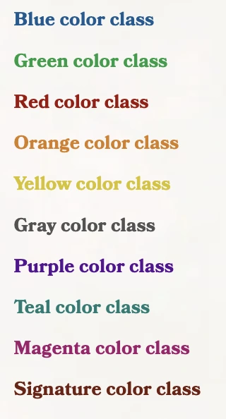
Ten named colors, used as a class wherever a "colorable" element below accepts one: blue, green, red, orange, yellow, gray, purple, teal, magenta, and signature (the theme's own accent — also what you get with no color class at all).
Not every element below accepts a color — each section says whether it does.
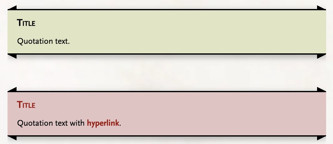
The default blockquote: a bold title, then text. Colorable with any of the ten colors. Add .color-links alongside a color to also color any Markdown links inside it — off by default, since a link usually already reads fine in its normal link color.
> **Title**
>
> Quotation text.

> **Title**
>
> Quotation text with [hyperlink](https://example.com).
{.red .color-links}
> Text to read aloud.
{.read}

> Text on parchment.
{.paper}

> Flavor text.
{.flavortext}

> Quotation text.
{.large-quote}

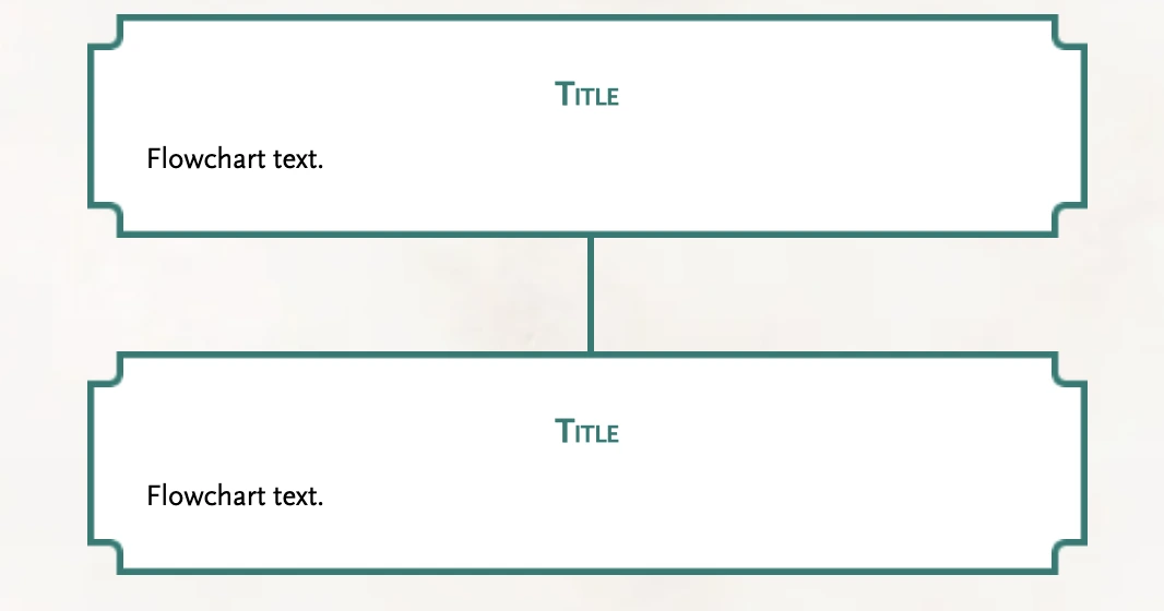
Two in a row connect automatically into a sequence:
> **Title** {.text-center}
>
> Flowchart text.
{.flowchart .teal}

> **Title** {.text-center}
>
> Flowchart text.
{.flowchart .teal}
| Column 1 | Column 2 |
| --- | --- |
| Value 1 | Value 2 |
| Value 1 | Value 2 |
| Value 1 | Value 2 |
| Value 1 | Value 2 |
{.orange}
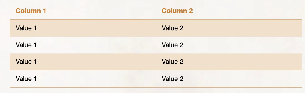
.color-links works here too, same as a blockquote.
Roll Table Title {.table-title}

| [2d6](/roll/2d6) | Result |
|:---:|:---|
| 2 | Result A |
| 3-4 | Result B |
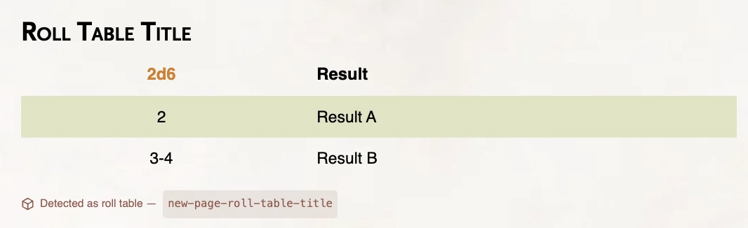
See Roll Tables for how detection works.
Wraps a word or phrase rather than a whole element:
**Blue color class**{.text-blue}

**Green color class**{.text-green}

**Red color class**{.text-red}

**Orange color class**{.text-orange}

**Yellow color class**{.text-yellow}

**Gray color class**{.text-gray}

**Purple color class**{.text-purple}

**Teal color class**{.text-teal}

**Magenta color class**{.text-magenta}

**Signature color class**{.text-signature}
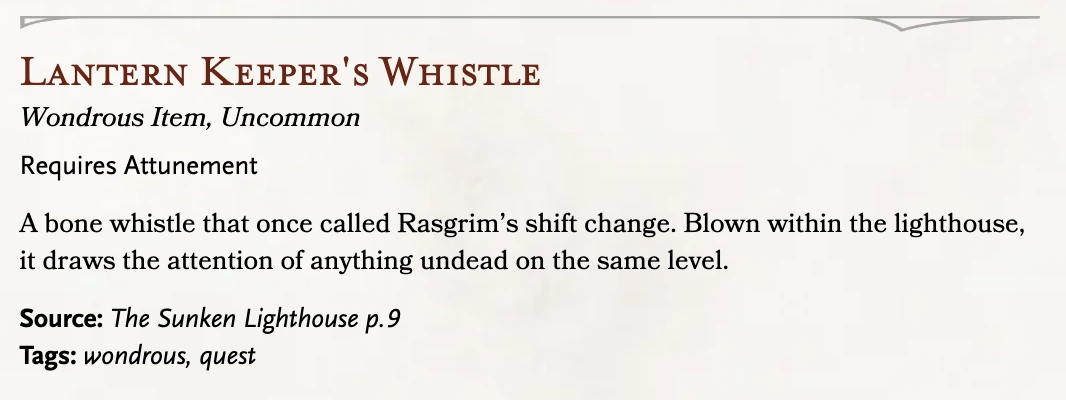
name: "Lantern Keeper's Whistle"
type: "wondrousItem"
rarity: "uncommon"
attunement: true
descr: "A bone whistle that once called Rasgrim's shift change."
sources:
  - name: "The Sunken Lighthouse"
    page: 9
tags: ["wondrous", "quest"]
name: "Barnacle Crawler"
size: "M"
type: "beast"
alignment: "UU"
ac: "14"
hp: "18"
…
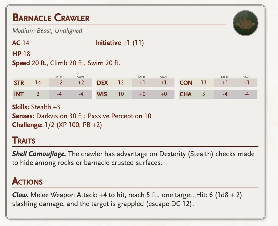
Add a color class on the fence (```monster {.teal}) to recolor it, and .two-column for a denser layout on a longer stat block. See Monsters.