Repository navigation
Widgets Text and Interactive
Text readouts, buttons, lists and checklists. Each option table below is generated from pyEFIS's instrument registry, the same records the configurator's Properties panel shows; see Widget Reference. The flight plan page is on Navigation.
type: |
What it is | Interactive |
|---|---|---|
static_text |
A fixed label. | no |
value_text |
A plain readout of one FIX key. | no |
button |
A pushbutton that shows data, changes with conditions and fires actions. | touch and knob |
listbox |
A table of your own lists; selecting a row writes FIX keys. | touch and knob |
checklist |
A scrolling challenge-and-response checklist. | knob and buttons |
For a number that turns yellow or red at its own limits, use
numeric_display instead of
value_text.
A label drawn once and never updated: a title, a unit, a caption.

Static Text · palette category text
| Option | Configurator label | Default | Values | What it does |
|---|---|---|---|---|
text |
Text | Text |
the fixed text to display | |
alignment |
Alignment | AlignLeft |
AlignLeft, AlignCenter, AlignRight
|
horizontal text alignment within the widget |
font_mask |
Font mask | empty | widest string the text reserves space for (sizing) |
Two more attributes work from YAML: font_ghost_mask, a dim "unlit segment"
string drawn behind the text, and font_ghost_alpha (default 50, of 255).
- type: static_text
  row: 0
  column: 0
  span: {rows: 10, columns: 40}
  options:
    text: OIL
alignment: AlignCenterA readout of one FIX key. It follows the key's quality flags: grey when the
value is old, bad or failed, red while it annunciates, and xxx when it has
failed. It applies no warning or alarm colours of its own.
Value Text · palette category text
| Option | Configurator label | Default | Values | What it does |
|---|---|---|---|---|
dbkey |
FIX key | empty | FIX key | FIX-database key whose value is displayed |
font_mask |
Font mask | empty | widest string the text reserves space for (sizing) | |
number_format |
Number format | empty | Digit mask: blank = as-is; 000 = 089 (rounded, zero-padded); 000.0 = 089.0 (with decimals) | |
prefix_text |
Prefix text | empty | static label drawn before the value (e.g. HDG, CRS) | |
prefix_font_family |
Prefix font | Open Sans |
DejaVu Sans Condensed, DejaVu Sans, DejaVu Sans Mono, B612, Inter, Roboto, Open Sans
|
font family for the prefix label |
prefix_font_percent |
Prefix font size (%) | 50 |
1 to 100, step 1 | prefix height as a percent of the widget height |
prefix_color |
Prefix colour | #ffffff |
colour | colour of the prefix label |
value_color |
Value colour | #ffffff |
colour | colour of the data value (good/normal state) |
border_color |
Border colour | #ffffff |
colour | colour of the box border |
border_width |
Border width (px) | 0 |
0 to 20, step 1 | box border thickness in pixels; 0 = no border |
border_opacity |
Border opacity (%) | 100 |
0 to 100, step 1 | box border opacity |
bg_color |
Background colour | #000000 |
colour | box background fill colour |
bg_opacity |
Background opacity (%) | 0 |
0 to 100, step 1 | box background opacity; 0 = transparent (no fill) |
With Prefix text set, the label is drawn in its own font, size and colour
before the value, so prefix_text: HDG with dbkey: HEAD reads HDG 114.
The optional box (border and background) is drawn at the instrument's bounds;
with both its width and opacity at 0 there is none.
- type: value_text
  options:
    dbkey: HEAD
    prefix_text: HDG
number_format: "000"A button is an instrument, not the menu. It can show data, change its colour and label as data changes, and fire actions: switch screens, set FIX values, change units, step a checklist. On the stock screens, the EMS button turns red when an engine item annunciates and takes you to the EMS screen.


With a transparent background a button can sit invisibly over another instrument, for example trim up and down over a trim bar.

Button · palette category control
| Option | Configurator label | Default | Values | What it does |
|---|---|---|---|---|
text |
Text | empty | button label (use \n for two lines) | |
type |
Type | simple |
simple, toggle, repeat
|
simple = click; toggle = on/off state; repeat = auto-repeat while held |
dbkey |
FIX key | empty | FIX key | backing touchscreen-button key (TSBTN...); the configurator assigns it automatically |
bg_color |
Background colour | #101418 |
colour | button fill colour |
fg_color |
Text colour | #00ffff |
colour | button label colour |
transparent |
Transparent background | off | on / off | draw no fill so what is behind the button shows through |
hover_show |
Show only on hover | off | on / off | hide the button until the pointer is over it |
config |
Config file (legacy) | empty | path to an external button YAML; blank = use the fields above |
There are two ways, and both take the same fields.
-
Inline, as the configurator writes it: the fields are the instrument's
own options. It needs at least a
dbkey; the configurator assigns one. -
In a separate file, as the stock screens do:
config:names a YAML file relative to the configuration directory.
- type: button
  row: 70
  column: 75
  span: {rows: 15, columns: 10}
  options:
    config: buttons/trim-up-invisible.yaml
Without either, pyEFIS stops with button needs options: either 'config:' (an external YAML) or inline fields including 'dbkey:'.
| Field | Default | Meaning |
|---|---|---|
type |
simple |
simple, toggle or repeat. Anything else is an error. |
text |
required | The starting label, usually replaced by a set text: action. Use \n for two lines. |
dbkey |
required | A boolean FIX key tied to the button's state; a physical button can drive it too. {id} in the key is replaced with the display's nodeID, so one file serves several displays (TSBTN{id}12 becomes TSBTN112). |
condition_keys |
none | More FIX keys the conditions watch and can use. |
conditions |
none | The when / actions rules, below. |
bg_color, fg_color
|
see the table above | Starting colours. |
transparent |
off | No fill. |
hover_show |
off | Clear HIDEBUTTON when the pointer is over the button. |
repeat_delay, repeat_interval
|
300 ms each | Repeat timing, repeat buttons only. |
type |
Behaviour |
|---|---|
simple |
Fires its actions when pressed, or when dbkey goes from false to true. |
toggle |
On and off; fires on both. The button and dbkey stay in step. |
repeat |
Like simple, but repeats while held. |
conditions: is an ordered list of rules. Each has a when: and actions:.
The first rule that matches runs its actions and stops the list, unless it has
continue: true.
condition_keys: [CHT11, CHT12]
conditions:
  - when: "SCREEN eq 'EMS'"
    actions:
      - set text: PFD
      - set bg color: lightgray
    continue: true
  - when: "CHT11 gt 220 or CHT12 gt 220"
    actions:
- set bg color: red- A string
when:is a pycond expression:eq,ne,gt,lt,and,or, and[ ]for grouping. - A boolean
when:on a toggle button matches the button's state. On other buttons,trueandfalseboth always run.
Conditions are evaluated when the button is shown, when it is pressed, when
dbkey changes (unless it is bad, or the button is hidden), and when any
condition_keys value, quality flag or aux value changes.
What a condition can use:
-
dbkeyand eachcondition_keyskey, by name, for its value. - For
condition_keysonly:KEY.old,KEY.bad,KEY.fail,KEY.annunciateandKEY.aux.<name>. -
DBKEY, the button's own state;CLICKED, true when a press started the evaluation;SCREEN, the screen's name; andPREVIOUS_CONDITION, the result of the last stringwhen:in this pass (false at the start).
The same names work as {NAME} in set text:. The starting text: is filled
in before the conditions first run, so the built-ins do not resolve there.
Each entry under actions: is action: argument. Names are not
case-sensitive.
| Action | Argument | What it does |
|---|---|---|
show screen |
screen name | Go to that screen. |
show next screen / show previous screen
|
any | Step through the screens, wrapping. |
set value |
KEY,value |
Write a FIX value. |
change value |
KEY,delta |
Add to a FIX value, held within its range. |
change value wrap |
KEY,delta |
Add to a FIX value, wrapping through its range: HEADBUG,-1 goes from 0 to 359. |
sync value |
DEST,SOURCE |
Copy one FIX value to another: HEADBUG,HEAD. |
toggle bit |
KEY |
Invert a boolean FIX value. |
set instrument units |
NAMES:command |
NAMES is a comma list of FIX keys, unit groups (Temperature, Pressure, Altitude) or *; command is toggle or a unit name (Pressure:hPa). |
set egt mode |
normalize, peak, lean, reset peak or normal
|
Drive the EGT bars set up for it. See Engine Monitoring. |
set airspeed mode |
empty, or 0, 1, 2
|
Step the airspeed_box through TAS, GS, IAS, or pick one (0 TAS, 1 GS, 2 IAS). |
checklist next item / checklist previous item / checklist toggle item / checklist next unacked / checklist next list / checklist previous list / checklist reset
|
a checklist's hmi_group, or empty for all |
Drive a checklist. |
flightplan page |
fpl, dto or catalog, then optionally the hmi_group
|
Open a page of the flight plan. |
flightplan direct to |
an ident, or empty | Start a Direct-To; empty opens the Direct To page. |
activate menu |
menu name | Open a menu. |
activate menu item |
number, from 1 | Press a menu item. |
set menu focus |
a menu target | Move the menu's focus there. |
exit |
any | Quit pyEFIS. |
evaluate |
Python expression | Runs it with Python's eval. |
menu encoder is accepted but does nothing.
Style actions change the button itself:
| Action | Argument | What it does |
|---|---|---|
set bg color / set fg color
|
a colour name or #rrggbb
|
Change a colour. |
set text |
text, with {NAME}
|
Change the label. |
button |
disable, enable, checked, unchecked
|
Change its state. |
Anything that is not an HMI action, or an HMI action that fails, falls through to the style actions. A misspelt action name, a screen that does not exist or a bad argument therefore does nothing, silently.
Avoiding loops. Do not have a button's actions change its own dbkey; use
button: checked or unchecked. Avoid chains where button A triggers B and B
acts on A. Disabling a button only blocks presses; its conditions and actions
still run, so use CLICKED to tell a press from a data change.
A table of your own lists: radio frequencies, waypoints, anything. When the pilot selects a row, it writes FIX keys. It adds rows to switch lists and to sort, including by distance from the aircraft.
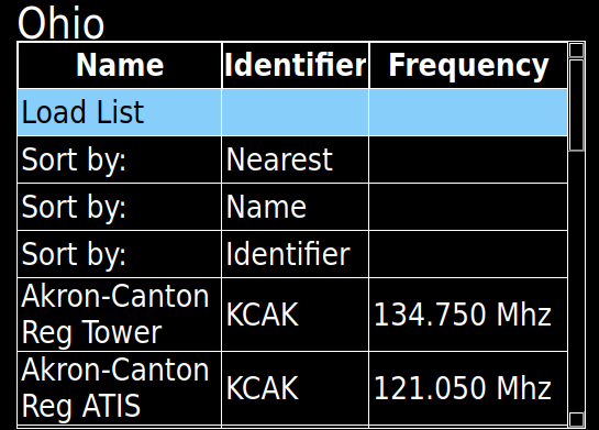
Listbox · palette category list
| Option | Configurator label | Default | Values | What it does |
|---|---|---|---|---|
lists |
Lists | unset | selectable lists -- list of {name, file} entries |
The configurator has no list editor; write the list files by hand. Each entry
in lists: has a name, shown as the title, and a file, relative to the
configuration directory. The screen builder's replace: map works in the list
files, so {radio_id} style placeholders are filled in as in includes.
- type: listbox
  options:
    encoder_order: 28
    lists:
      - name: Favorites
        file: lists/radio/favorites.yaml
      - name: Ohio
        file: lists/radio/ohio.yaml
With more than one list, a Load List row lets the pilot switch. Every list should have the same columns: the column layout is taken from the first list.
display:
  location: true          # offer "Sort by: Nearest" (needs a valid position)
  columns:
    - name: Name
      sort: true          # offer "Sort by: Name"
    - name: Identifier
      sort: true
    - name: Frequency
list:
  - Name: John Glenn Int. Tower
    Identifier: KCMH
    Frequency: 132.700 Mhz
    lat: 39.9969467
    long: -82.8921592
    set:
      COMACTFREQSET{radio_id}: 132700
COMACTNAMESET{radio_id}: "{Name}"-
display.columns: each column'snameis both its header and the key every row must supply.sort: trueadds a Sort by row for it. -
display.location: true: adds Sort by: Nearest, by distance fromLAT/LONG, shown only while the position is valid. Rows withoutlat/long(or with 0) go last. -
list: one map per row. -
set:: written to the FIX database when the row is selected.{Column}is replaced with that row's text in a column. Other keys, such aslat, are not substituted unless they are columns.
Sorting by a column compares the raw values, so numbers sort as numbers. A touch selects a row with a double-tap.
A scrolling challenge-and-response checklist. It reads no FIX keys, and what
has been acknowledged is kept only until pyEFIS restarts. A missing or
malformed checklist shows No checklist.
Checklist · palette category list
| Option | Configurator label | Default | Values | What it does |
|---|---|---|---|---|
checklists |
Checklists | unset | inline checklist set: a list of checklist objects, each {id, title, category, sections|items} (challenge/response items) | |
hmi_group |
HMI group | empty | optional name so a Button's 'checklist ...' actions can target this checklist; blank = every checklist on the screen | |
text_color |
Item colour | #ffffff |
colour | colour of an un-acknowledged item's challenge text |
response_color |
Response colour | #00ffff |
colour | colour of the challenge-response value (the right-hand text) |
done_color |
Acknowledged colour | #00ff00 |
colour | colour of an item once it has been acknowledged |
current_color |
Current-row colour | #ffaa00 |
colour | highlight colour of the current row while the encoder is controlling the checklist |
section_color |
Section colour | #aaaaaa |
colour | colour of section subheaders and the progress line |
The checklists are written inline under checklists:, as a list or as
{checklists: [...]}:
- type: checklist
  options:
    hmi_group: main
    checklists:
      - id: before-takeoff
        title: Before Takeoff
        category: normal          # normal, abnormal or emergency
        sections:
          - title: Engine
            items:
              - {text: Mixture, response: RICH}
- {note: Check mags at 1800 RPM}-
categorycolours the header: green for normal, amber for abnormal, red for emergency. - A checklist has
sections(each with atitleanditems) or plainitems. - An item with
text(and an optionalresponse) can be acknowledged; anotecannot.
With the knob, turning moves the cursor and a push acknowledges the item and
moves to the next one not yet done. Buttons drive it with the checklist ...
actions above.
button, listbox and checklist can be reached with the knob; give each an
encoder_order to set the order the orange highlight visits them. The stock
configurations number them in blocks by include (for example 100011).
- A button fires when highlighted and pushed. A disabled button is skipped.
- A listbox takes the knob when pushed: turning moves the row, pushing selects it. It keeps the knob while you use its sort and list rows, and lets go when you select a data row.
- A checklist keeps the knob until the knob's timeout.
How the knob is wired is on Customizing Beyond the Configurator.