Repository navigation
Understand Output
This page documents the output file formats generated by Mess by default for CPU and GPU runs. Use --no-profile to discard measurement files after the run instead of retaining them for plotting.
When running ./build/bin/mess, Mess creates a measuring folder (configurable with --folder) with the following structure:
measuring/
├── bw/                        # Raw bandwidth measurements
│   ├── bw_100_0.txt           # Bandwidth for Ratio 100%, Pause 0
│   ├── bw_100_10.txt          # Bandwidth for Ratio 100%, Pause 10
│   └── ...
├── lat/                       # Raw latency measurements
│   ├── lat_100_0.txt          # Latency for Ratio 100%, Pause 0
│   └── ...
├── plotter.txt                # Intermediate file for the plotter
└── processed/                 # Final processed results (generated by Plotter)
    ├── memory_curves.csv      # Compact results in CSV
    ├── memory_curves.json     # Compact results in JSON
    ├── memory_curves.pdf      # Vector plot of curves
    └── memory_curves.png      # Raster plot of curves
The bw/ and lat/ directories contain the raw counter values collected directly from the hardware (via perf, likwid, or vtune).
These are NOT the final bandwidth/latency numbers; they are the raw counts (e.g., bytes transferred, cycles incurred) for each specific run configuration.
The filename format is [type]_[ratio]_[pause].txt.
Note: Do not use these files directly for plotting unless you are debugging the raw counter behavior. Use the files in
processed/instead.
The processed/ folder contains the corrected and aggregated bandwidth-latency curves.
Important: This folder is NOT generated by the Mess C++ binary directly. It is generated by the Plotter Python utility, which processes the raw
.txtfiles.With profiling enabled by default, Mess attempts to run the plotter automatically. If this fails (e.g., missing Python dependencies), this folder might be empty or missing. You can always run the plotter manually later.
The Plotter reads the raw .txt files, filters outliers, calculates the actual Bandwidth (MB/s) and Latency (ns), and applies corrections (like subtracting overheads).
For more details on how to run it manually or configure it, see Plotter.
| File | Description |
|---|---|
memory_curves.csv |
Aggregated data table containing Bandwidth and Latency for every Ratio and Pause value. |
memory_curves.json |
The same aggregated data in JSON format, easy to parse for other tools. |
memory_curves.pdf |
High-quality vector plot of the bandwidth-latency curves. |
memory_curves.png |
PNG image of the bandwidth-latency curves, suitable for quick viewing. |
The most important file for quick analysis is processed/memory_curves.png.
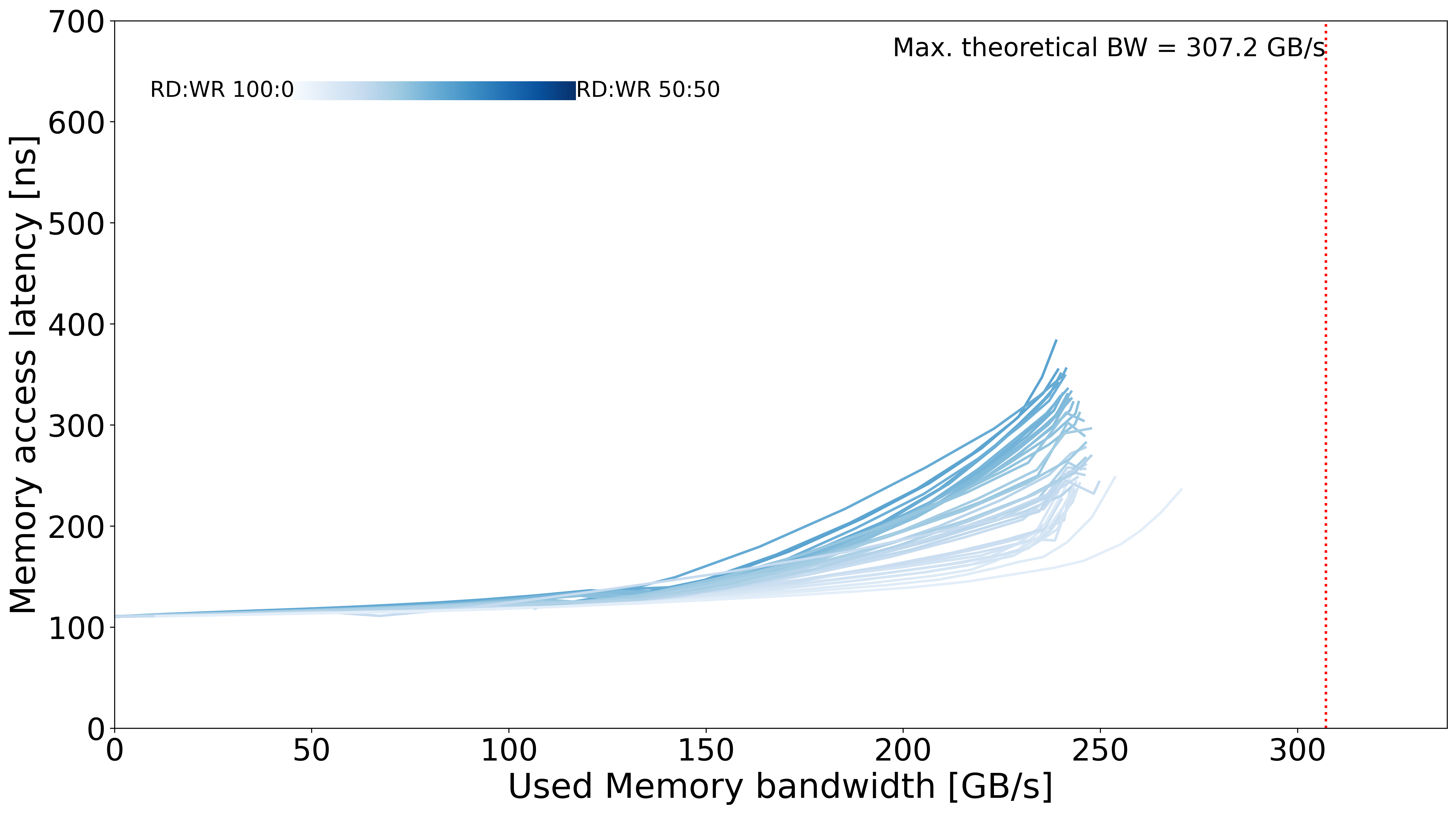
Example of a healthy bandwidth-latency curve set
- X-Axis: Bandwidth (MB/s or GB/s)
- Y-Axis: Latency (ns)
- Bandwidth-latency curves: Each line represents a different Read/Write ratio (e.g., 100% Reads, 66% Reads, 0% Reads).
A typical healthy bandwidth-latency curve will:
- Start at low latency (bottom-left).
- Move to the right as Bandwidth increases.
- Shoot upwards (increasing Latency) as the system reaches saturation.
Anomalies to look for:
- Flat lines: Could indicate a measurement error or capped frequency.
- Unexpected drops: Thermal throttling or background interference.
- Mess Benchmark - Generating output
- Plotter - Visualizing output
- Mess Profiler - Profiler output format