Dashboards and Printing
Consulting work rarely ends at the table. Somebody analyses, and then somebody has to show it — in a steering committee, as an appendix, on a slide. These two features cover that last stretch.
Optional and declarative, like everything else domain-specific: a DASHBOARD export in
src/domain.js. Leave it out and the view does not exist — no toggle appears, nothing in the
interface changes.
export const DASHBOARD = {
  tiles: [
    { type: 'stat',  measure: 'count', label: 'Action items', caption: 'in this file' },
    { type: 'stat',  measure: 'count', filter: (r) => isOverdue(r), label: 'Overdue' },
    { type: 'stat',  measure: 'effort', filter: (r) => !isDone(r), label: 'Open effort' },
    { type: 'donut', groupBy: 'status' },
    { type: 'bar',   groupBy: 'area', measure: 'effort', label: 'Effort by area' },
  ],
}
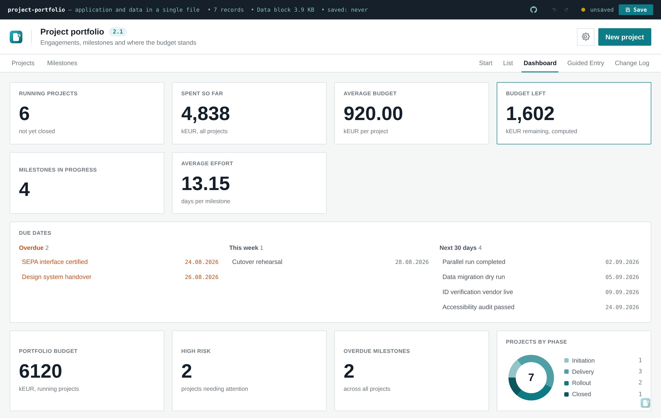
A List / Dashboard switch appears at the top right, next to the entity tabs if there are any.
| Type | Shows | Needs |
|---|---|---|
stat |
one large number | measure |
bar |
one horizontal bar per category |
groupBy, measure
|
donut |
the same data as a ring with a legend |
groupBy, measure
|
Common options:
-
measure—'count'(how many records) or a field key whose values are summed. A calculated field works here too, so a tile can total something like a risk score without that score ever being stored. -
filter(record)— narrows the set before measuring. This is how "Overdue" and "Open effort" above are built out of the samecount/effortmeasures. -
groupBy— an enum field. Categories keep the order declared in the schema'svalues, soopen → in progress → waiting → donereads as a progression rather than alphabetically. -
label,caption— free text; without a label the tile names itself from the schema. -
entity— only relevant with multiple entities; defaults to the entity currently being viewed.
Bars are CSS widths. The ring is a single SVG <circle> with stroke-dasharray — with a
circumference of exactly 100 (radius 100 / 2π ≈ 15.915), each segment's length is its
percentage, so there is no geometry to compute.
That is a deliberate trade. Chart.js or D3 would multiply the size of a file that has to survive an email gateway, in exchange for chart types this tool does not offer. If a tool genuinely needs scatter plots or time series, that is a good moment to ask whether it should be an openToolbox file at all — see when the shape doesn't fit.
Category colours are derived from the tool's own accent colour (Settings → Colors), as a run of shades. Two consequences worth knowing:
- A rebranded tool recolours its dashboard by itself. There is no second palette to maintain, and no risk of the charts clashing with the rest of the interface.
- The shade direction flips in dark mode. On a light background the run goes light → dark; on a dark one, dark → light. Without that flip, one end of the range disappears into the background — which is exactly what the first version did, and what the test suite now asserts against.
Semantic colours (the red used for overdue, the green for done) are deliberately not used for categories: a neutral category tinted red reads as a warning it isn't.
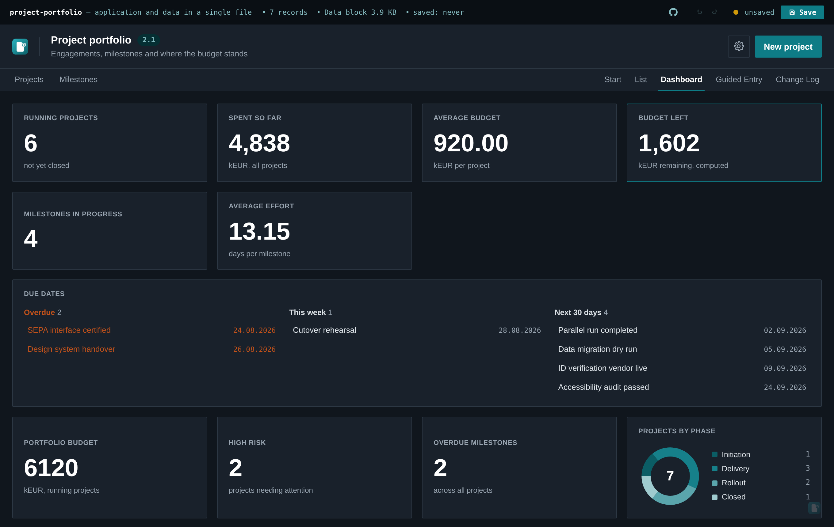
Tiles report on their entity's full record set — not the filtered table view. A tile can belong
to a different entity than the one currently open, so "sometimes filtered, sometimes not" would be
unpredictable. If you want the numbers for a subset, express that subset as the tile's filter,
where it is visible in the schema rather than dependent on what someone last clicked.
The most common reason anyone opens one of these tools at all is to see what's late. dueDate on a
schema, set to a field key, turns that into a widget at the top of the dashboard:
export const SCHEMA = {
  // …
  dueDate: 'review',   // a plain `date` field, or a `computed` one — same as `totalField`
}
Unlike the tiles above, this needs no DASHBOARD export. Fälligkeitssteuerung is common enough
on its own that it shouldn't wait on someone also having built stat tiles — the widget appears the
moment any entity declares dueDate, with or without a dashboard otherwise. A domain that never
mentions it sees exactly its previous dashboard, unchanged.
Three groups, and an empty one simply doesn't render:
| Group | Range |
|---|---|
| Overdue | before today |
| This week | Monday through Sunday of the current local calendar week |
| Next 30 days | the 30 days after that Sunday |
The boundaries are fixed in this version, not a setting — one more knob is one more thing to explain
to a recipient who only wants to know what's late. A record where isDone(record) is true is
excluded from every group; finished work isn't due, and flagging it red would train people to ignore
the flag. Comparisons run on local calendar dates, parsed from the field's ISO string — not on
the UTC instant new Date('2026-08-20') would give you, which lands on the previous day everywhere
west of Greenwich and would put the wrong item in the wrong bucket without ever throwing an error.
With multiple entities, the widget
aggregates across every entity that declares dueDate — an overdue milestone and an overdue action
item can show up in the same list. Clicking an entry switches to that record's entity and opens it,
the same navigation a reference chip uses.
The numbers a steering committee asks first — how many records are there, what do they weigh in
total, what is the average score — should not have to be counted by hand or recomputed in a
spreadsheet. A schema declares them directly with a metrics list; each entry becomes a tile at
the top of the dashboard, above every other widget:
export const SCHEMA = {
  // …
  metrics: [
    { op: 'count', filter: (r) => !isDone(r), label: 'Open risks' },
    { op: 'sum',   field: 'impact', label: 'Total impact', caption: 'across all risks' },
    { op: 'avg',   field: 'impact' },   // default label: "Ø Impact score"
  ],
}
Like dueDate, a declaration alone unlocks the dashboard view — no DASHBOARD export needed.
A domain without any metrics sees exactly its previous dashboard.
Exactly three operations exist, and each declaration is one of them:
| Operation | Shows | Notes |
|---|---|---|
count |
number of records | optional filter(record), same semantics as the stat tiles |
sum(field) |
total of one numeric field | the field must be number (or computed) |
avg(field) |
mean of one numeric field | fixed at two decimal places |
There is deliberately no fourth form — no expression string, nothing that gets evaluated. The file is passed around by hand, and a declaration that could carry code would make every recipient of it an executor. New shapes join the catalog in the framework or they don't exist.
Details worth knowing:
-
Labels fall back sensibly. Without a label,
countcarries the entity's plural andsum/avgprefix the field's label (Σ,Ø).captionis free text. - Computed at render, never stored. Values are calculated locally over the entity's full record set — nothing enters the records or the embedded data block, the same posture as calculated fields.
-
Formatting follows the interface language. Integers stay integers, the decimal separator is
localized (
9.08in English,9,08in German), and the average of an empty set renders as a dash rather than an invented zero. - Clicking a tile jumps to that entity's list — keyboard included. In this version unfiltered: pre-filtering waits until search and filtering can carry it, so a tile never implies a narrower count than the one it actually performs.
Rejected declarations are named, not hidden
An invalid declaration — an unknown operation, a missing field, a non-numeric target for sum or
avg — is not silently skipped. It shows up as its own rejection tile between the valid ones,
with the reason in the interface language, while the valid declarations keep working. A metric
that quietly switches itself off gets noticed only when somebody misses the number; naming the
rejection turns that from a silent data loss into a visible typo.
Both views carry a print stylesheet, so Ctrl/Cmd+P gives a usable PDF with no export step —
the browser is the PDF writer.
What drops away: the file bar, the sidebar, the search row, the chat dock, the watermark, the view switch, and every button. What stays: the title, and the table or the tiles.
Three details that make the difference between "prints" and "prints properly":
-
Table headers repeat on every page (
display: table-header-group) and rows avoid breaking across a page boundary. A five-page table whose column headings appear once is unreadable. - Dashboard tiles avoid breaking across pages.
-
Colour is forced on (
print-color-adjust: exact) for bars, rings and status pills. Browsers strip background colours when printing, on the assumption they are decoration — here they carry the information, and a white bar chart is a blank rectangle.
This is the cheapest feature in the whole tool by a wide margin — a few dozen lines of CSS — and the one most likely to decide whether the analysis makes it into the meeting.