Dashboards and Printing
Consulting work rarely ends at the table. Somebody analyses, and then somebody has to show it — in a steering committee, as an appendix, on a slide. These two features cover that last stretch.
Optional and declarative, like everything else domain-specific: a DASHBOARD export in
src/domain.js. Leave it out and the view does not exist — no toggle appears, nothing in the
interface changes.
export const DASHBOARD = {
  tiles: [
    { type: 'stat',  measure: 'count', label: 'Action items', caption: 'in this file' },
    { type: 'stat',  measure: 'count', filter: (r) => isOverdue(r), label: 'Overdue' },
    { type: 'stat',  measure: 'effort', filter: (r) => !isDone(r), label: 'Open effort' },
    { type: 'donut', groupBy: 'status' },
    { type: 'bar',   groupBy: 'area', measure: 'effort', label: 'Effort by area' },
  ],
}
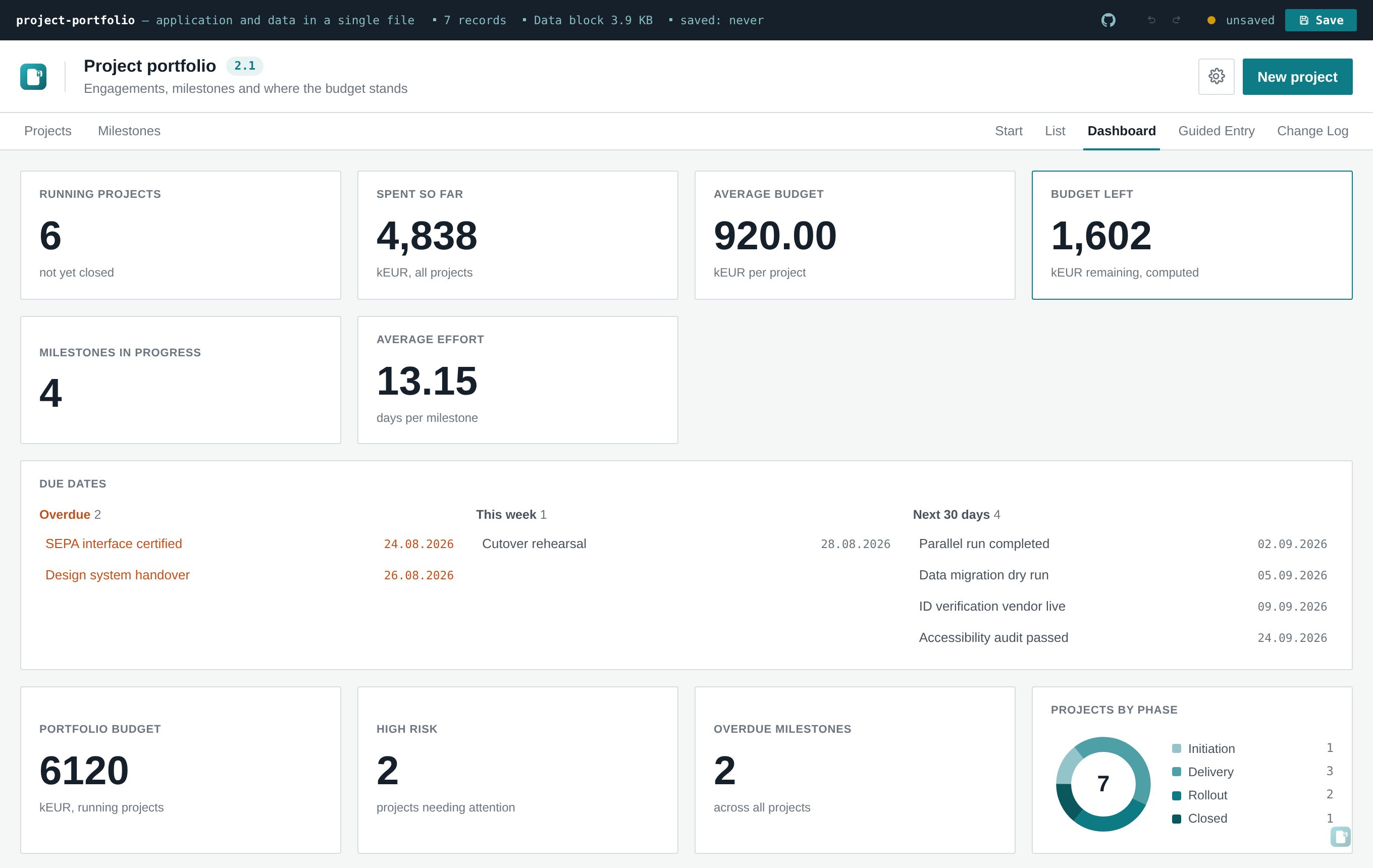
A List / Dashboard switch appears at the top right, next to the entity tabs if there are any.
| Type | Shows | Needs |
|---|---|---|
stat |
one large number | measure |
bar |
one horizontal bar per category |
groupBy, measure
|
donut |
the same data as a ring with a legend |
groupBy, measure
|
Common options:
-
measure—'count'(how many records) or a field key whose values are summed. A calculated field works here too, so a tile can total something like a risk score without that score ever being stored. -
filter(record)— narrows the set before measuring. This is how "Overdue" and "Open effort" above are built out of the samecount/effortmeasures. -
groupBy— an enum field. Categories keep the order declared in the schema'svalues, soopen → in progress → waiting → donereads as a progression rather than alphabetically. -
label,caption— free text; without a label the tile names itself from the schema. -
entity— only relevant with multiple entities; defaults to the entity currently being viewed.
Bars are CSS widths. The ring is a single SVG <circle> with stroke-dasharray — with a
circumference of exactly 100 (radius 100 / 2π ≈ 15.915), each segment's length is its
percentage, so there is no geometry to compute.
That is a deliberate trade. Chart.js or D3 would multiply the size of a file that has to survive an email gateway, in exchange for chart types this tool does not offer. If a tool genuinely needs scatter plots or time series, that is a good moment to ask whether it should be an openToolbox file at all — see when the shape doesn't fit.
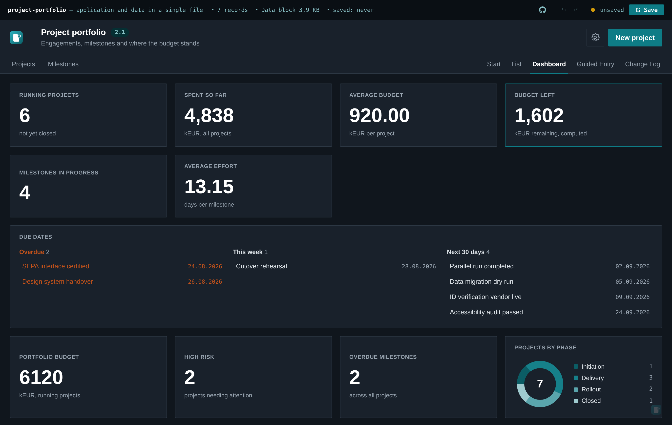
Category colours are derived from the tool's own accent colour (Settings → Colors), as a run of shades. Two consequences worth knowing:
- A rebranded tool recolours its dashboard by itself. There is no second palette to maintain, and no risk of the charts clashing with the rest of the interface.
- The shade direction flips in dark mode. On a light background the run goes light → dark; on a dark one, dark → light. Without that flip, one end of the range disappears into the background — which is exactly what the first version did, and what the test suite now asserts against.
Semantic colours (the red used for overdue, the green for done) are deliberately not used for categories: a neutral category tinted red reads as a warning it isn't.
Tiles report on their entity's full record set — not the filtered table view. A tile can belong
to a different entity than the one currently open, so "sometimes filtered, sometimes not" would be
unpredictable. If you want the numbers for a subset, express that subset as the tile's filter,
where it is visible in the schema rather than dependent on what someone last clicked.
Both views carry a print stylesheet, so Ctrl/Cmd+P gives a usable PDF with no export step —
the browser is the PDF writer.
What drops away: the file bar, the sidebar, the search row, the chat dock, the watermark, the view switch, and every button. What stays: the title, and the table or the tiles.
Three details that make the difference between "prints" and "prints properly":
-
Table headers repeat on every page (
display: table-header-group) and rows avoid breaking across a page boundary. A five-page table whose column headings appear once is unreadable. - Dashboard tiles avoid breaking across pages.
-
Colour is forced on (
print-color-adjust: exact) for bars, rings and status pills. Browsers strip background colours when printing, on the assumption they are decoration — here they carry the information, and a white bar chart is a blank rectangle.
This is the cheapest feature in the whole tool by a wide margin — a few dozen lines of CSS — and the one most likely to decide whether the analysis makes it into the meeting.