Repository navigation
Plotting
On this page:
- Handling of single-species cells
- Color palettes
- Side-by-side maps
- Configuring the legend
- Adding to existing plots
- Dynamic plots
- fastPoints
- Saving figures
Link back to the table of contents.
The main plotting function in the epm package, plot.epmGrid, has quite a few options. Let's explore some of them.
By default, plotting is done with the tmap package. However, if use_tmap is set to FALSE, then hexagon-based grids are plotted with the plot function from the sf package, and square grids are plotted with the plot function from the terra package. The reason for relying on tmap by default is that plotting polygons is much faster than with sf on some machines, and default behavior in tmap leads to aesthetically good-looking maps. But tmap is not a requirement, and if you do not have it installed, epm will automatically switch to non-tmap plotting.
The main disadvantage with using tmap is that the plot cannot be added to or easily modified (as implemented -- the tmap package in of itself provides lots of customization). Disabling use of tmap opens up some more flexibility.
For some diversity metrics, the metric doesn't make sense for cells with certain numbers of taxa, such as a single species. For instance, morphological disparity or pylogenetic mean nearest neighbor can only be calculated for grid cells with 2 or more taxa. Of the metrics implemented in the gridMetrics() function, the plot.epmGrid function already knows which of those does and does not make sense for single-taxon grid cells. Therefore, if the argument minTaxCount = 'auto' (the default), it will gray out those single-taxon cells (or color them with whatever color is specified for the argument ignoredColor).
But if a diversity metric is calculated with the customGridMetric() function, then the plot function will not recognize it. Therefore, you should make your own determination and specify minTaxCount to be whatever value makes sense.
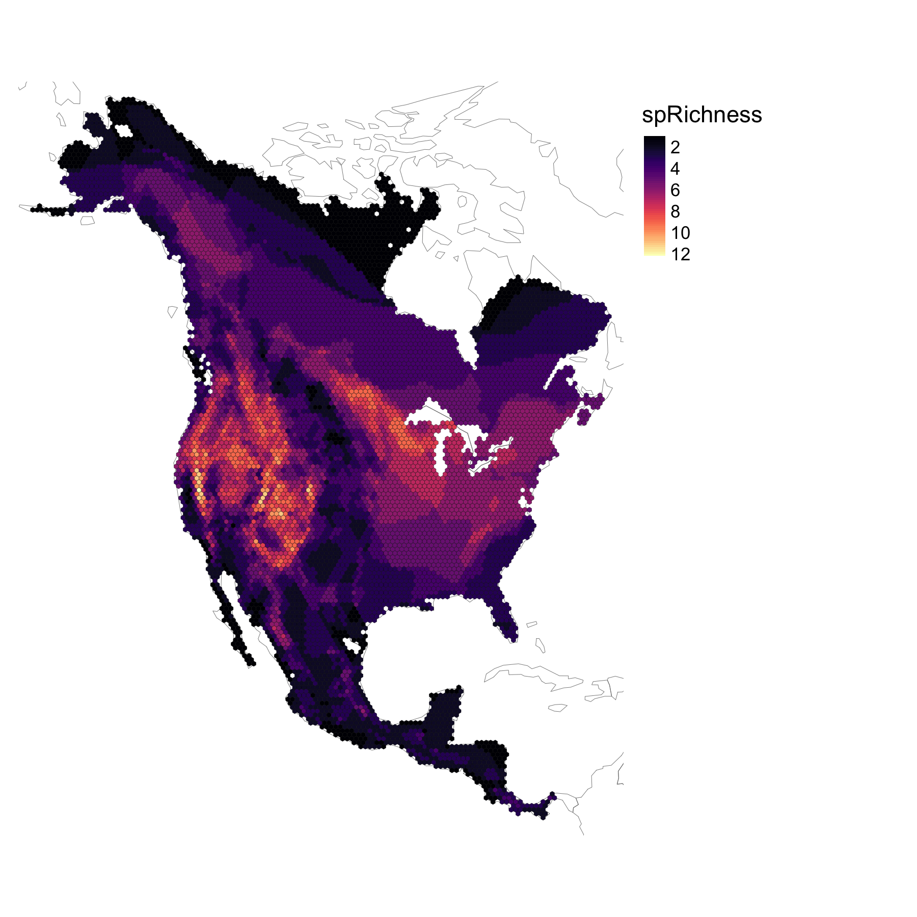
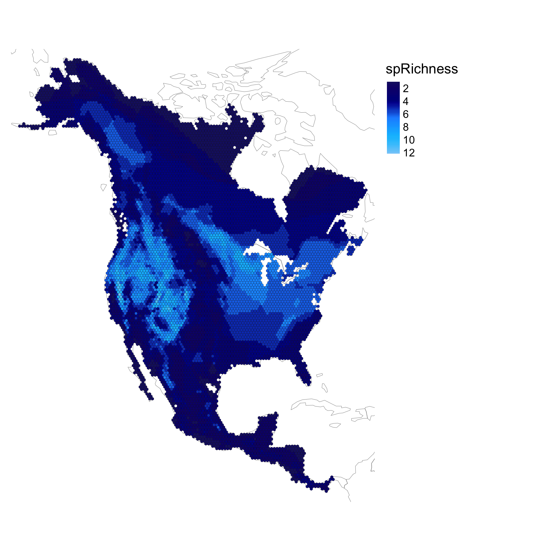
It is possible to take advantage of color palettes available in other R packages, or to create your own by providing a set of named colors.
For instance, the viridis package provides some popular color palettes. In fact, the default palette implemented in plot.epmGrid is a trimmed version of the turbo palette from viridis.
# with existing color palette
library(viridis)
plot(squirrelEPM, col = magma(100))
# with a set of named colors
plot(squirrelEPM, col = c('midnight blue', 'dark blue' ,'dodger blue', 'deep sky blue', 'light sky blue'))
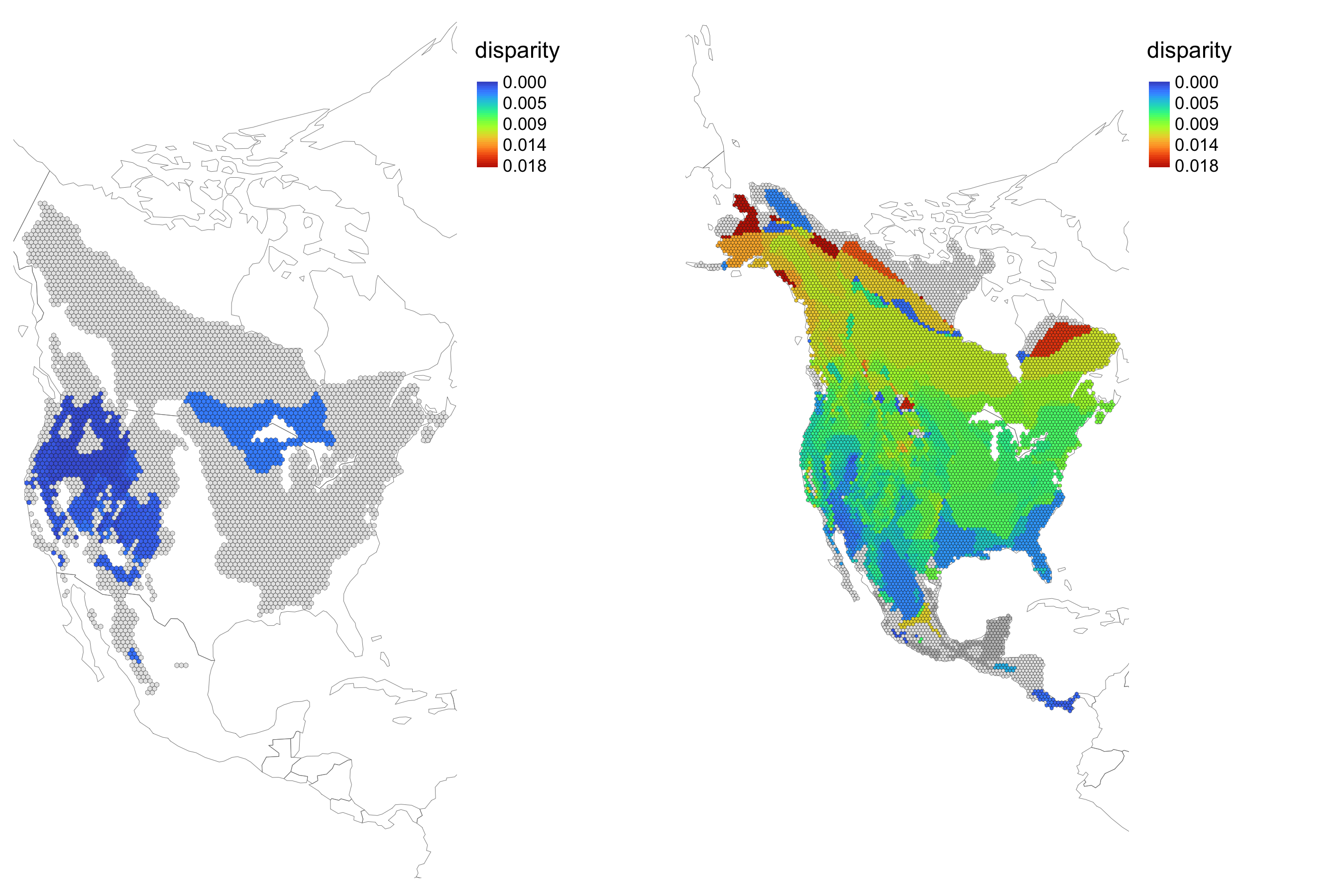
You may want to plot multiple maps together, and you also may want the color scheme to reflect the global min and max across multiple maps.
The function getMultiMapRamp() will return the overall min and max, given a set of input objects.
For example, let's say we are interested in plotting side-by-side comparisons of morphological disparity for the genus Tamias and for squirrels as a whole.
We can use the dropSpecies() function to create a subset of an epmGrid object.
# find the taxa that are in the epmGrid object but that are not Tamias, and drop them
tamiasEPM <- dropSpecies(squirrelEPM, setdiff(squirrelEPM[[4]], grep('^Tamias_', squirrelEPM[[4]], value = TRUE)))

tamiasDisparity <- gridMetrics(tamiasEPM, metric = 'disparity')
squirrelDisparity <- gridMetrics(squirrelEPM, metric = 'disparity')

globalminmax <- getMultiMapRamp(tamiasDisparity, squirrelDisparity)
Now globalminmax is a vector of the global min and max values.
> globalminmax
[1] 0.00000000 0.01847288
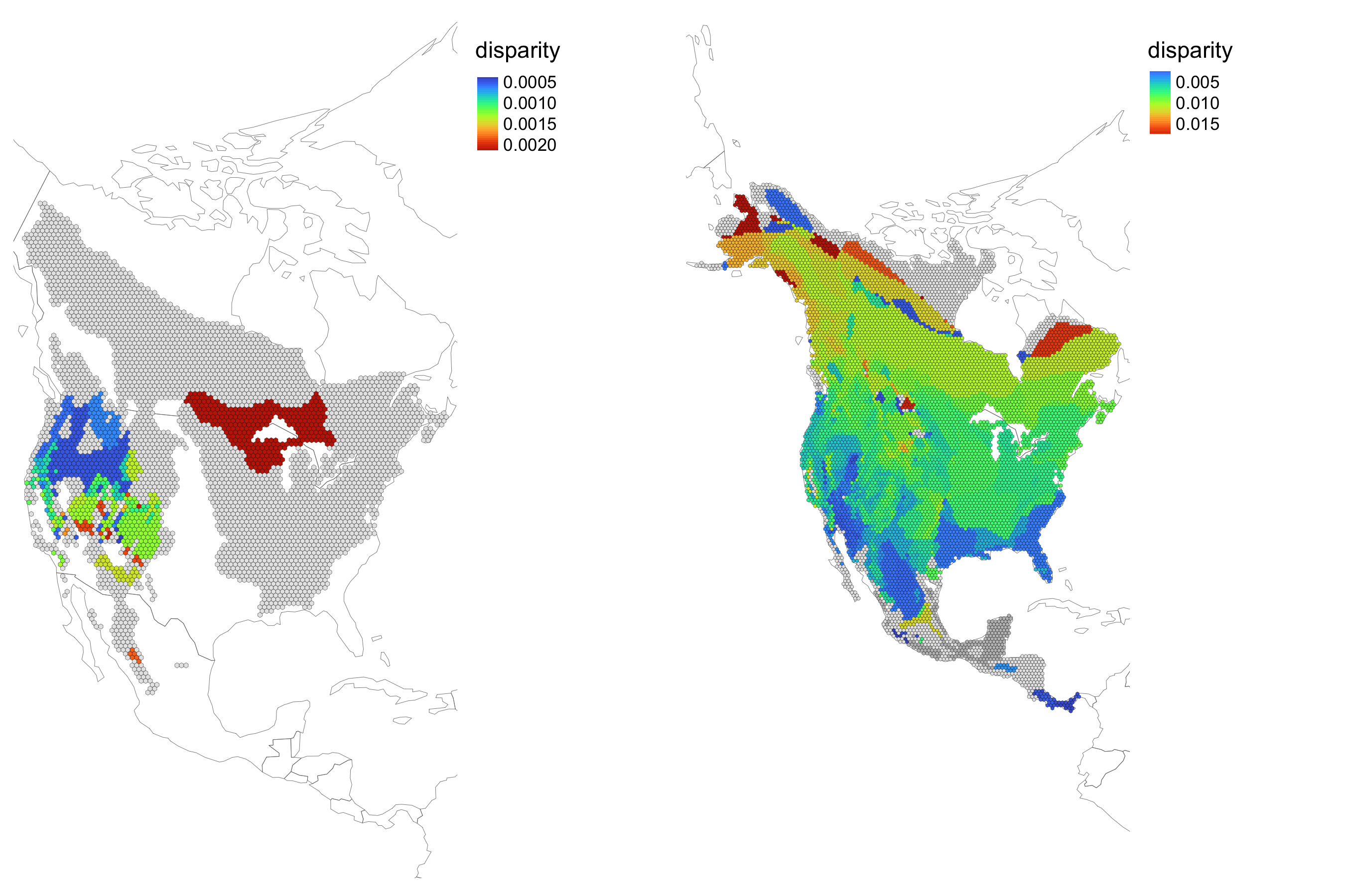
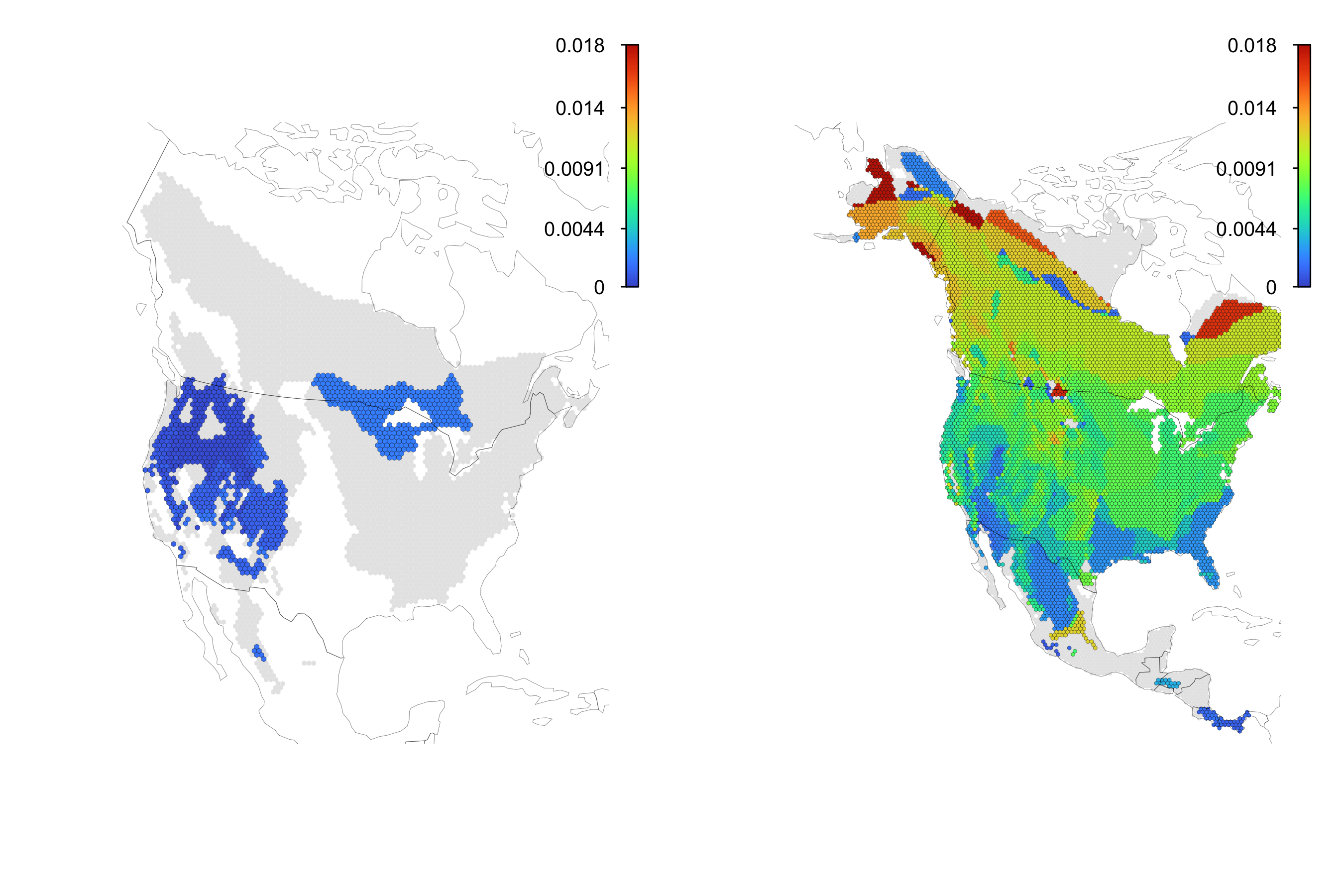
Now let's plot the two maps side by side. If we did not bother with the global min and max, it would be hard to interpret these two maps because the colors are not comparable.
# with tmap
## without standardizing the color scheme
map1 <- plot(tamiasDisparity)
map2 <- plot(squirrelDisparity)
tmap::tmap_arrange(map1, map2)
But if we include the global min and max, then this is much more clear.
# with a standardized color scheme
map1 <- plot(tamiasDisparity, colorRampRange = globalminmax)
map2 <- plot(squirrelDisparity, colorRampRange = globalminmax)
tmap::tmap_arrange(map1, map2)
# without tmap
par(mfrow = c(1,2))
plot(tamiasDisparity, colorRampRange = globalminmax, use_tmap = FALSE)
plot(squirrelDisparity, colorRampRange = globalminmax, use_tmap = FALSE)
When plotting an epmGrid object, if you rely on plotting with tmap (the default), then the legend is not modifiable. However, if use_tmap = FALSE, then you have more flexibility. For complete flexibility, you can omit the legend in the initial plot, but then add the legend afterwards.
You can choose exactly where the legend should go, how many tick marks it should have, its size, etc.
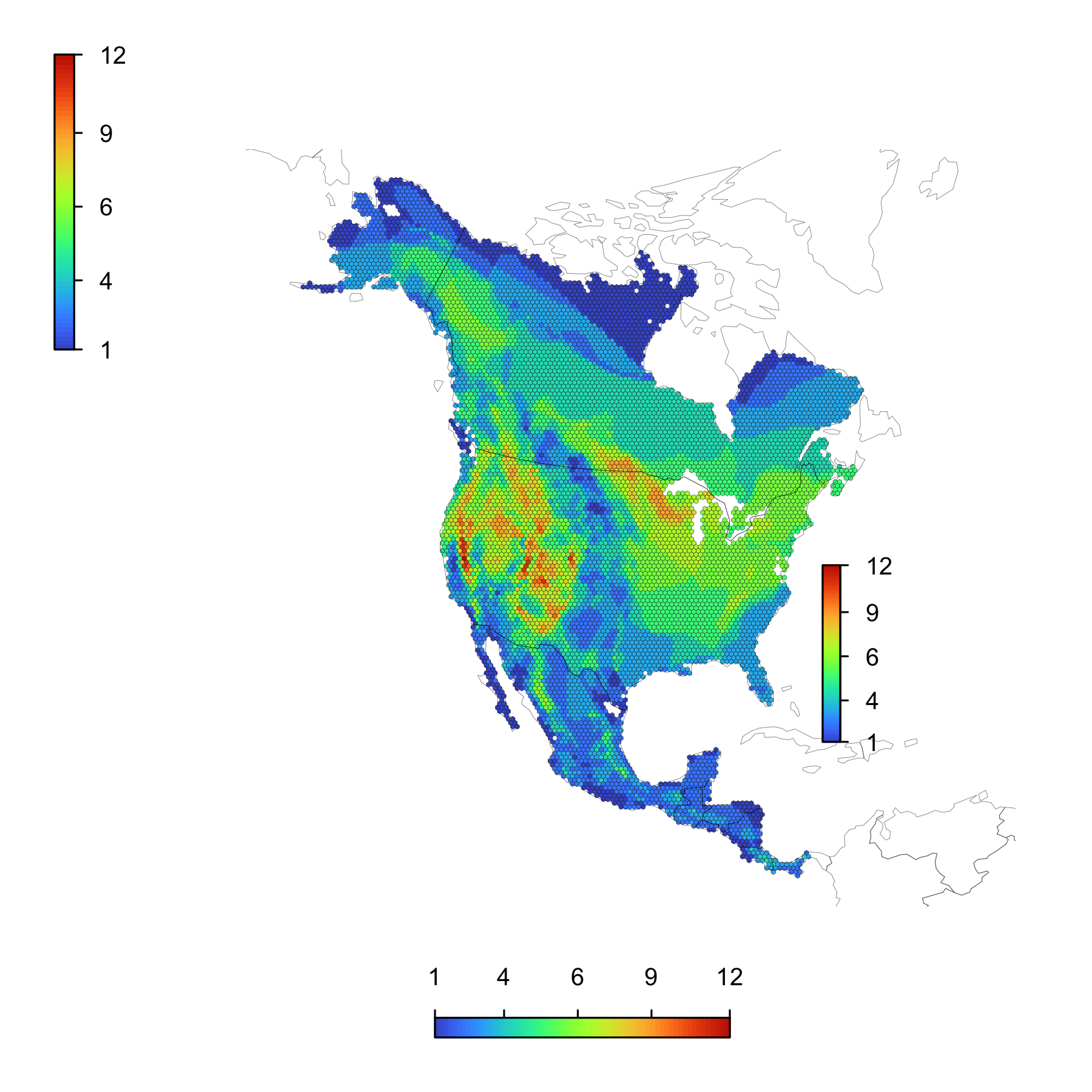
The easiest way to have control over the legend is to plot the epmGrid object with use_tmap = FALSE and legend = FALSE, and to assign the plot to a variable. The map will still plot as usual, but a few details will be saved to the variable to make it more convenient for the legend, which comes next. Next, with the function addLegend(), you will supply the epmGrid object and the variable that contains key details, namely whether or not the epmGrid object was log-transformed, the color palette used, min and max values for the color scheme, what was specified for minTaxCount.
xx <- plot(squirrelEPM, use_tmap = FALSE, legend = FALSE)

addLegend(squirrelEPM, params = xx, location = 'bottom')
addLegend(squirrelEPM, params = xx, location = 'topleft')
addLegend(squirrelEPM, params = xx, location = c(2.1e6, 2.3e6, -2e6, 0), side = 4) # c(minX, maxX, minY, maxY)
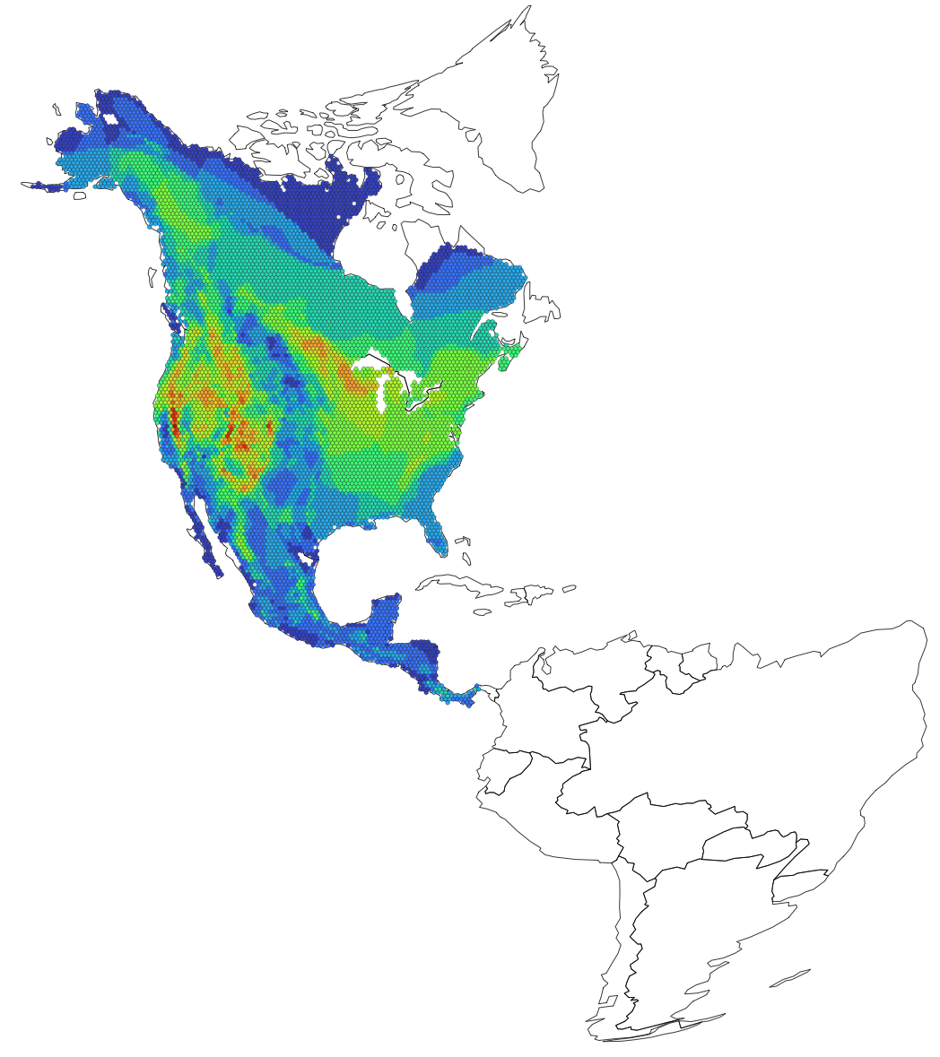
It is possible to plot an epmGrid object on top of an existing plot. This again requires not using the tmap plotting functionality.
# for this example, we will pull out a hidden worldmap
worldmapEA <- st_transform(epm:::worldmap, attributes(squirrelEPM)$crs)

plot(worldmapEA, lwd = 0.5)
plot(squirrelEPM, add = TRUE, lwd = 0.1)
If you have the tmap package and you set basemap = 'interactive', then the plot will open up in your web browser on a dynamic basemap, and you will be able to pan and zoom.
Although this was implemented mainly to facilitate testing and debugging, there is an additional argument called fastPoints. In some cases, plotting an epmGrid object with hexagonal cells and with use_tmap = FALSE is incredibly slow (when plotting to the graphics window -- it is fast if saving the plot to file).
If fastPoints = TRUE, then rather than plot the hexagonal polygons, colored points are plotted instead, which is much faster. The main use case is if you are experimenting with different plotting options (for example, different color schemes, legend details, etc) and you are generating the plot repeatedly. This speeds up that process, and when you are ready to plot the final version, switch back to fastPoints = FALSE.
This is not epm specific but more general R advice, but you can save graphics as pdf's, jpeg's, png's, tiff's and probably other formats as well.
For epmGrid objects, if the grid system is made up of square grid cells, then you may run into issues trying to save a pdf (the grids may look blurred on Macs, for example). PNG, JPEG or TIFF might make more sense.
For hexagonal grid cells, pdf's will allow you to zoom into your saved figures without running into pixelation issues, but for plots with a very large number of cells, the pdf could become quite large.
These options are worth experimenting with and exploring to gain an understanding of what makes the most sense for particular purposes.
# Saving a pdf of a figure
pdf('squirrelEPM_Test.pdf', width = 6, height = 6)
plot(tamiasEPM)
dev.off()

# Saving a jpeg
jpeg('squirrelEPM_Test.jpg', width = 6, height = 6, units = 'in', res = 300)
plot(tamiasEPM)
dev.off()

# save a png with a transparent background
png('squirrelEPM_Test.png', width = 6, height = 6, units = 'in', res = 300, bg = 'transparent')
plot(tamiasEPM)
dev.off()