Themes and Appearance
Two different questions live in this app and they are deliberately kept apart.
How the app looks to you — the theme, the background, the editing paper, the interface scale. That is this page, and none of it reaches the presenter.
What the presenter sees — typeface, size, weight, margin, colours, edge dimming. That is the Settings panel, and it travels inside the project.
The first belongs to the machine you are sitting at. Sending a .valendo to a colleague never changes the app they open it in.
Ctrl+Shift+P, or the palette button in the header — beside the interface-scale control, because those two answer the same question.
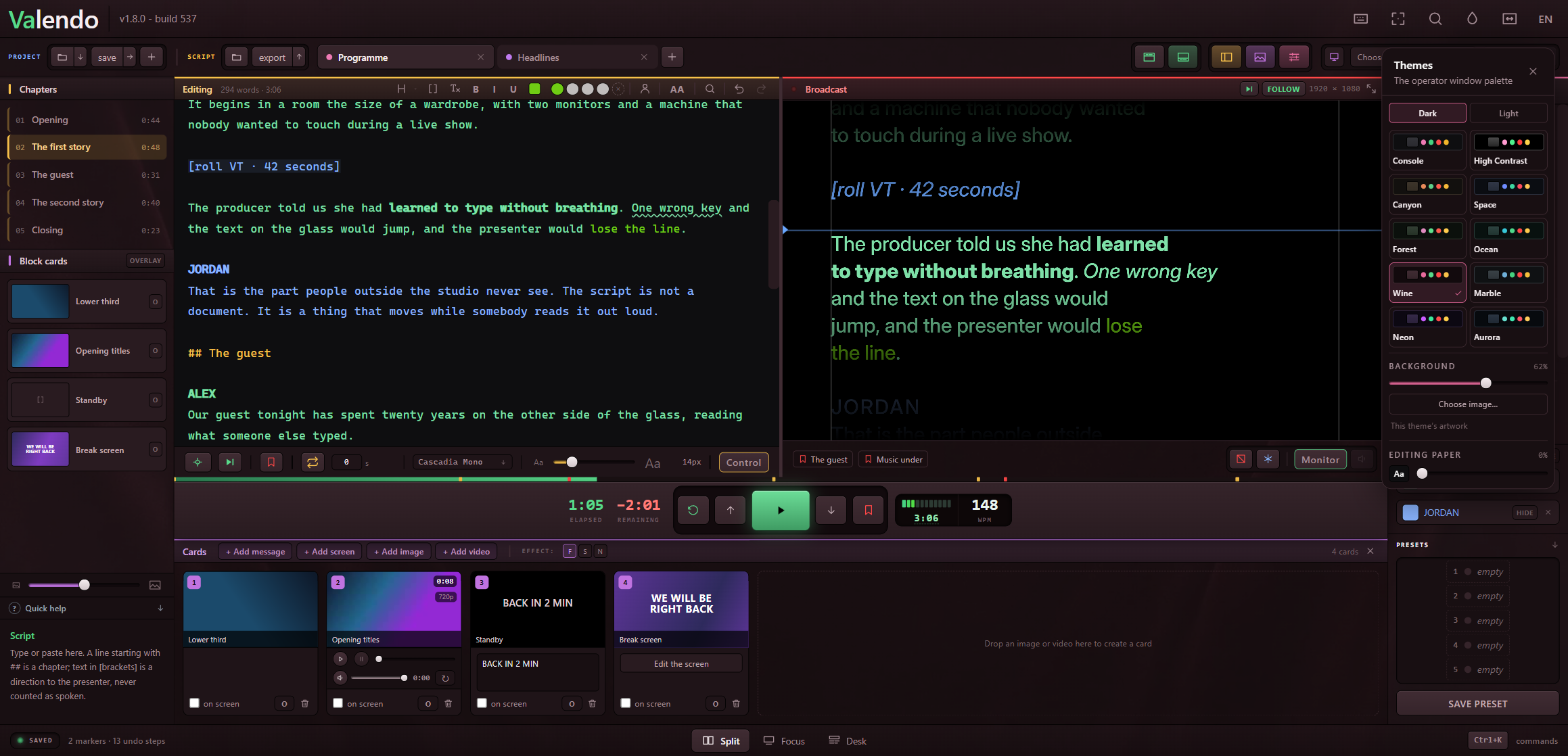
Ten dark and ten light, split by a tab, in a two-by-five grid. A grid rather than a list because comparing palettes means seeing them together; a list would make you scroll past nine to remember the tenth.
| Dark | Console · High Contrast · Canyon · Space · Forest · Ocean · Wine · Marble · Neon · Aurora |
| Light | the same ten names, rebuilt for a light room |
Console is the app as it has always looked, and High Contrast is its opposite; the two hold the first row in both modes because they are the two you already know before choosing anything. The names are proper nouns and read the same in all six languages.
The panel opens on the mode you are already in. Someone on a light theme who comes to change palette wants the light ones — opening on dark would cost a click every time and, worse, show ten tiles with theirs not marked.
Eighteen of the twenty carry their own artwork. It is drawn behind the chrome and nowhere else: the script editor, the Broadcast panel and the presenter's screen stay opaque in every theme.
That is not an oversight to be fixed later. A texture behind the text you are typing during a live show makes the typing harder, and a Broadcast preview that lies about its own background stops being useful for the one thing it exists to do — check what is going out.
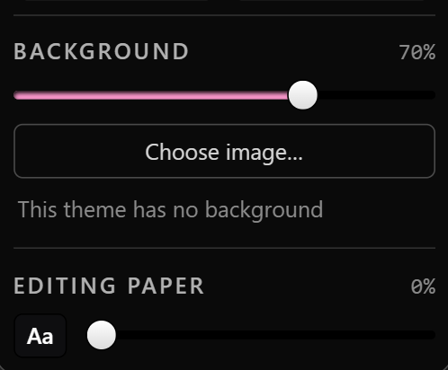
The slider decides how much comes through. At 0 the app is exactly what it was before themes existed. As you come down, the artwork fades and desaturates together — a background that only gets darker keeps its colour cast and starts tinting the 8-pixel labels sitting on it.
Choose image… points it at a file of your own. The file is copied inside the app, into its own folder — deliberately not the one card images live in, because that folder is swept of anything no card points at, and a background kept there would vanish the first time you opened a project.
The one control on this panel that is not part of the theme, and it is here because this is where you decide how the app looks, and because the question only makes sense next to the other one: having chosen the desk, do you want the text you type to match it or to contrast with it?
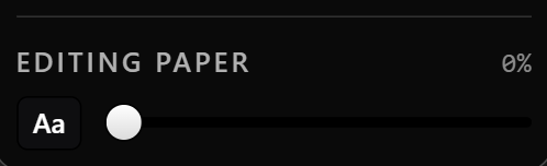
It runs from the near-black the editor has always used up to a paper grey. The middle is where the good answers are — a charcoal around 15, a light grey around 80.
The ink flips from white to black partway along, which is why there is a live swatch beside the slider showing the real paper and the real ink. A number alone could not warn you about the turn.
One thing to know if you go far up the scale: presenter colours do not move with the paper. They are chosen against a dark chrome, and a light green picked there is hard to read on light paper. Either keep the paper dark, or pick presenter colours with the contrast filter on (see Presenters).
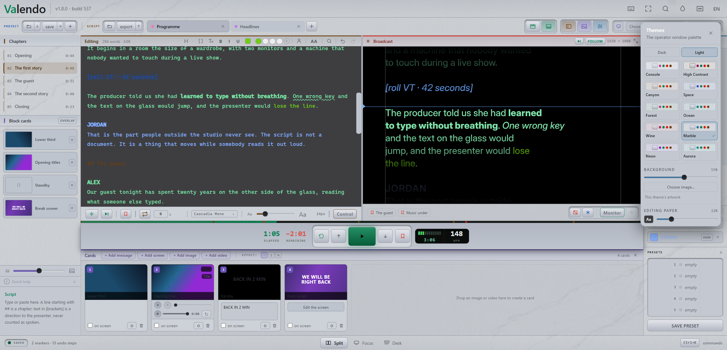
The first attempt at light mode was an ordinary light interface, and it was rejected on sight: an operator sits in a dim room facing this screen for hours, and a white panel there is a flash in the face. The whole light set is built downward from a grey ceiling, and the artwork for the eight light themes was calibrated against a brightness band by search, not chosen by eye.
Themes may change green (rolling), red (on air) and amber (attention). That was allowed on purpose — without it a genuine high-contrast theme is impossible.
It comes with a rule: a palette in which those three stop being distinguishable does not ship. Separation is measured on lightness, not hue, so the three stay apart for someone who does not separate green from red. Every built-in theme is checked against it, and the same check runs on the artwork: a background that would push the faintest label below its contrast floor fails the build rather than shipping quietly.
Ten typefaces travel inside the app, so the choice draws identically on Windows and on macOS — Inter, Cascadia Mono, JetBrains Mono, iA Writer Quattro, Atkinson Hyperlegible Next, Lexend, IBM Plex Sans, Literata, Newsreader, Alegreya.
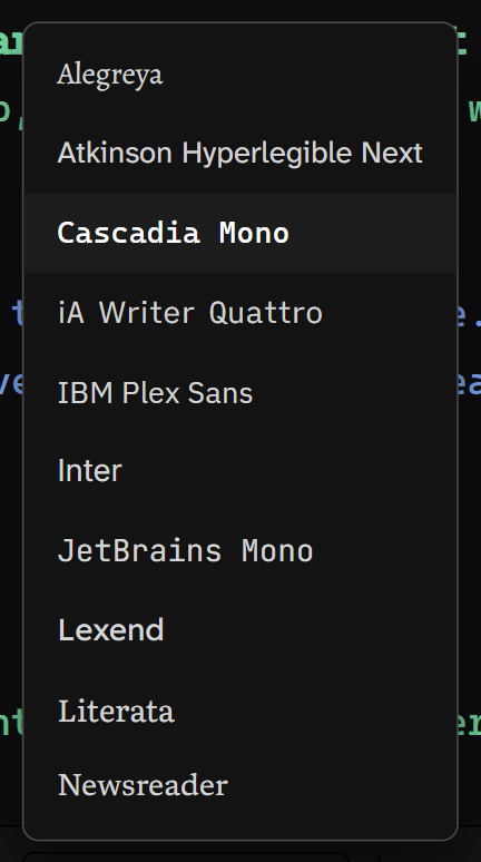
Each name in the list is set in its own face. That is the point of the list, and it is something the system's own dropdown cannot do.
The editor and the presenter's screen have separate lists, because they answer different questions: what is comfortable to type in for two hours, and what reads at three metres on a mirrored glass.
A strip under the output's typeface list draws the font's own name in the real colours of the output, at the real weight, with the real ALL CAPS setting — and it redraws while you are still dragging the slider.
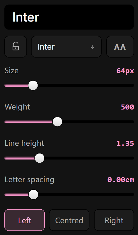
The Settings panel is grey on grey and the presenter's screen is white on black. A stroke thickens in that contrast; a weight judged in the panel's light is a weight judged wrong.
Hovering an item in the list redraws the strip in that face without changing anything, so you can walk down all ten comparing instead of making ten changes and ten undos.
A whole set of output settings saved to one of eight slots and brought back with a click: the studio look, the church look, the outdoor-in-daylight look.
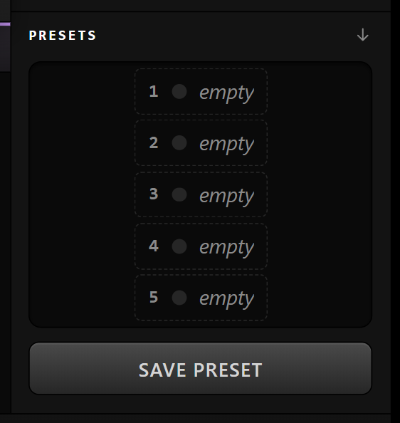
Each slot takes a name and a colour, and one can be starred as the one a new script starts from.
Ctrl+Alt+= and Ctrl+Alt+-, or the control in the header. It scales the whole console — keys, labels, panels — not just text, and it is remembered per machine.
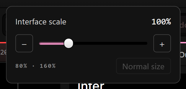
It is on Ctrl+Alt rather than the plain Ctrl+= that most apps use for zoom, because here that pair already belongs to the presenter's type size — the one an operator changes every session, against this one, changed once per monitor.
The theme, the background, its strength and the editing paper live in the machine's own settings file, next to the interface scale — not in the workspace and not in the project.
That is also what makes the window open already wearing the theme: the file is read synchronously, before the first frame is painted. The app state arrives over an asynchronous channel, which is to say after the window is already on screen, so a theme read from there would show as a black window that turns light a moment later.