Rings and Indicators
Simple Mouse Cursor has three configurable ring positions around your mouse:
- Inner Ring — closest to the cursor
- Main Ring — the middle position
- Outer Ring — furthest from the cursor
Each position can display a different visual or gameplay indicator, allowing you to build a layout that works for you.
For example, the default setup uses:
Inner Ring → GCD
Main Ring → Main Ring
Outer Ring → Cast
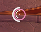
Simple Mouse Cursor showing the central reticle and configured cursor rings.
Disables that ring position.
Use this if you want a simpler cursor with fewer visual elements.
Displays the standard cursor ring.
This acts as a permanent visual marker around your mouse and is useful if your main goal is simply making the cursor easier to find.
Displays the standard Main Ring together with your Global Cooldown indicator.
This gives you a visible cursor marker while also showing GCD progress in the same ring position.
Displays the standard Main Ring together with your cast or channel progress.
This gives you a persistent cursor marker while displaying casting information in the same ring position.
Displays your Global Cooldown.
The global cooldown is the short delay triggered after using many abilities. The ring provides a visual sweep around your cursor while that cooldown is active.
This can be particularly useful during combat because you can see when another ability will become available without looking away from your cursor.
Displays the progress of your current cast or channel.
The indicator appears while you are casting or channelling an ability and disappears when the cast ends, is cancelled, or is interrupted.
Displays your character's current health around the cursor.
The indicator changes colour as your health falls, making it easier to notice when your health is getting low without constantly looking at your normal unit frame.
At higher health it appears light, changing through warning colours towards red as your health becomes lower.
Displays your character's current primary power resource.
Depending on your class and specialisation, this could include resources such as:
- Mana
- Rage
- Energy
- Focus
- Other primary power types
The ring fills or empties as your available power changes.
By default, the Power ring uses its normal blue colour.
Enable Use Power Type Color for Power Ring in the addon settings if you want the ring to match your character's current primary resource, such as Mana, Rage, Energy, or another power type.
Displays both your Health and Power together.
The two indicators are shown at slightly different sizes so that both can remain visible around the same cursor position.
This is useful if you want both resources available at a glance without using two separate ring slots.
There is no single correct setup.
A simple starting point is the default:
Inner Ring → GCD Main Ring → Main Ring Outer Ring → Cast
From there, you could replace an indicator depending on what information matters most to you.
For example:
- Healers or mana users may prefer a Power indicator.
- Players who want more awareness of incoming danger may find Health useful.
- Players who mainly want to stop losing their cursor may only need the Main Ring.
- A minimal setup could disable one or more ring positions entirely.
Changes are applied immediately, so you can experiment with different combinations until you find one that feels comfortable.
Simple Mouse Cursor allows the same indicator to be selected in more than one ring position.
For the clearest and most predictable layout, it is generally best to use each indicator only once.
If you want several pieces of information visible at the same time, assign a different indicator to each ring or use one of the combined options such as Main Ring + GCD, Main Ring + Cast, or Health and Power.
Ring colours, overall size, transparency, and other visual options are covered in Reticle & Appearance.
Animated Main Ring effects and the cursor trail are covered separately in Effects.