Repository navigation
Reference Health Connect UX
Status: External Health Connect design reference. This is background material, not OpenVitals implementation policy.
Your app's user interface (UI) should focus on articulating the benefits of using Health Connect, and explain key concepts in a way that enhances user knowledge of what an integration entails.
Your user experience (UX) should adhere to three guiding principles:
- Consistency: Verify that flows are aligned throughout the integration process.
- Transparency: Be up front in explaining how Health Connect works alongside your app.
- Clarity: Help users access Health Connect through your app.
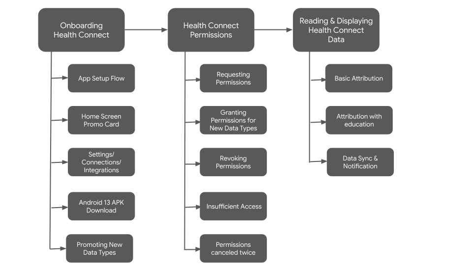
At a high-level, the UX flow can be broken down into the following stages:
Product icons should be used on a white or a very light gray background. You may also use the icon on a black background if necessary.
Note
Note: All product icons should have a transparent background when placed on a solid background.

Download the following icons:


Generated from docs/reference/design/health-connect.md. Edit it there; changes made here are overwritten.