Styles and resources
Right-click → ✂ Extract style… turns an element's local property values into a keyed
Style in the page's resources: a dialog proposes a key ({Type}Style) and pre-selects the
style-able values (content-ish ones like Text are listed but unchecked). Applying builds the
style, clears the extracted local values, re-points the element at {StaticResource key} —
live, with undo — and writes the <Style> block into <Page.Resources> (creating the section
when missing) with the element's attributes swapped for the resource reference.
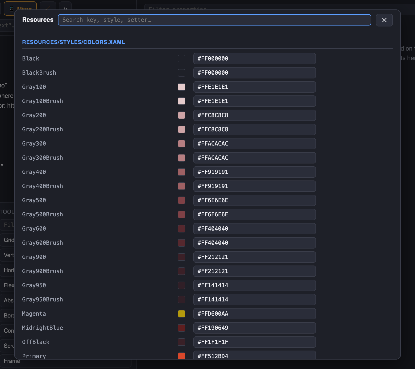
The 🎨 Resources button opens a popup over the panel listing every reachable resource
dictionary — application, merged files, and the presented pages' own dictionaries — with a
search box over keys, styles and setters. Colors and brushes get swatches and are editable;
scalar resources (x:Double, x:String, booleans, Thickness, CornerRadius) are
editable too; and each Style expands into its setters, editable inline (the style re-applies
to its live consumers immediately). Every change is also recorded for the sync tool, which
patches the owning dictionary file — located by x:Key, no line anchors — or the page file for
inline page resources. DynamicResource consumers update live; StaticResource references were
resolved at inflation time and show the new value after the page is rebuilt.
📚 Cookbook — a top-level view of the web panel, 📚 Cookbook in the ⋯ row of the on-device
panel, or MauiInspector.ShowCookbook() — turns the app's design system into a gallery you check
at a glance: after a global style edit, after a theme switch, before a release.
-
Colors — every
Colorand brush resource as a swatch with its hex and dictionary file. -
Typography — every font registered with
ConfigureFontsas a type specimen (alias · file), plus the keyedLabel/Spanstyles rendered on sample text. -
Styles — every keyed style rendered on an instance of its
TargetType(BasedOnand setter count in the caption); implicit styles for pages and Shell are listed with their setters. -
Controls — every toolbox control, built-in and your own, with its implicit look — stacked with a disabled twin, so the
Disabledvisual state gets checked too. -
Templates —
ControlTemplates with placeholder content,DataTemplates without data. -
Images — every bundled image (
MauiImage) plusImageSource/FontImageSourceresources. -
Scalars & shadows —
x:Double,Thickness(drawn as insets),CornerRadius,Shadows on a card.
The samples render on the device, on a real page pushed modally, so implicit styles,
AppThemeBindings and DynamicResources behave exactly as on any screen of the app — and the
whole inspector works on that page: long-press a tile to inspect it, the tree lists it, the mirror
shows it. One section shows at a time, 20 tiles per page in a virtualized list (chips and
‹ › on the device, chips in the panel), so a design system with hundreds of controls stays
smooth — nothing accumulates when you switch. Tap a tile to open the sample on a page of its
own, laid out at the full screen width (or at the width the control declares); ▤ in its
header opens the property sheet underneath — the control's own bindable properties first, the
inherited sections (Layout, Appearance, Text…) folded in an accordion, every value editable live.
Controls that draw on their data context — {Binding Colors[…]}, localized texts, a view
model's services — look bare outside the app; give the samples the same context the screens
would: options.Cookbook.BindingContext = () => new DesignTimeViewModel();. The backdrop
behind the samples follows the app's implicit page style; when your pages paint their own
background (a transparent page style, a gradient) set options.Cookbook.LightBackground /
DarkBackground (or Background for a brush) so the tiles and the web previews get the real one.
In the web view every tile is a PNG captured on the device — headlessly: the samples render
on an off-screen stage that is logically part of the presented page (so its styles, resources and
theme apply), and nothing appears on the device screen. Click a tile (or ⤢ Open) for a
full-width capture of the sample alone, with ▤ Properties unfolding its sheet; the gallery page
only shows on the device when you ask for it — 📱 Open on device in the panel, or ▤ Panel →
📚 Cookbook on the device — and then the captures come from the tiles on screen and ⌖ Inspect
selects a sample in the tree (properties, style, write-back). 🎨 Edit opens the Resources popup on the key,
⧉ copies {StaticResource Key}, and the state picker forces any visual state the sample
declares (PointerOver, Focused…). The theme buttons switch the whole app between system / light /
dark (Application.UserAppTheme). Tiles re-capture after every edit made from the panel or the device.
📌 Baseline → Δ changed is the regression check: click Baseline, edit a global style or a color resource, and the tiles whose pixels changed get an amber ring — hover shows the before image, Δ changed only filters the rest away. What was supposed to change did, and nothing else.
Recipes — samples you author yourself. A DataTemplate keyed Cookbook.<Section>.<Name> in
any resource dictionary becomes a tile with exactly that content, in a section named after the key:
<DataTemplate x:Key="Cookbook.Buttons.Primary and secondary">
    <HorizontalStackLayout Spacing="8">
        <Button Text="Save changes" Style="{StaticResource PrimaryButton}" />
        <Button Text="Cancel" Style="{StaticResource SecondaryButton}" />
    </HorizontalStackLayout>
</DataTemplate>
Real markup, hot-reloadable, editable from the inspector with XAML write-back like any page.
Bindings inside a recipe have no data context — set BindingContext in the template (an
x:Static design-time object works) when the sample needs data.
Controls are instantiated with their parameterless constructor. Which ones appear is a matter of two prefix lists — matched against the full type name or the control's XAML file path, so a namespace and a folder work alike:
options.Cookbook.IncludedControls.Add("MyApp.Controls.DesignSystem.");   // only the current design system…
options.Cookbook.IncludedControls.Add("Views/New/");                     // …or everything under that folder
options.Cookbook.ExcludedControls.Add("MyApp.Controls.CameraPreview");   // a constructor that starts hardware
Move the legacy controls into a namespace (or folder) of their own and list only the new one — nothing else needs naming. A constructor that throws just shows the exception on its tile.
The other sections answer to IncludedResources / ExcludedResources the same way — prefixes of
a resource key, of its dictionary file, of an image or font file name, or of a style's target type,
optionally scoped to one section with section::
options.Cookbook.IncludedResources.Add("Resources/Styles/DesignSystem/");   // only these dictionaries…
options.Cookbook.IncludedResources.Add("Resources/Images/2.0/");             // …and the images from this folder
options.Cookbook.IncludedResources.Add("typography:Brand");                  // fonts whose alias starts with Brand
options.Cookbook.ExcludedResources.Add("colors:Gray");                       // minus the gray ramp in Colors
options.Cookbook.ExcludedResources.Add("styles:Legacy");                     // keys starting with Legacy, Styles only
options.Cookbook.ExcludedResources.Add("scalars:*");                         // a whole section
Bundled images keep only their file name in the app package, so the package ships a build target
that records each MauiImage's source path (Resources/Images/2.0/beer.svg) in an embedded
manifest — that is what the folder prefix matches. It is imported automatically with the package
reference; set <MauiInspectorImageManifest>false</MauiInspectorImageManifest> to opt out.