WYSIWYG editor
Properties are half the story — the inspector also edits the structure of a running page:
add controls, delete them, reorder, reparent, wrap and unwrap, copy & paste — live on the
device, recorded in the edit history with full undo/redo, and (with the
Sync tool running) written back into
your .xaml sources as real, compilable markup.
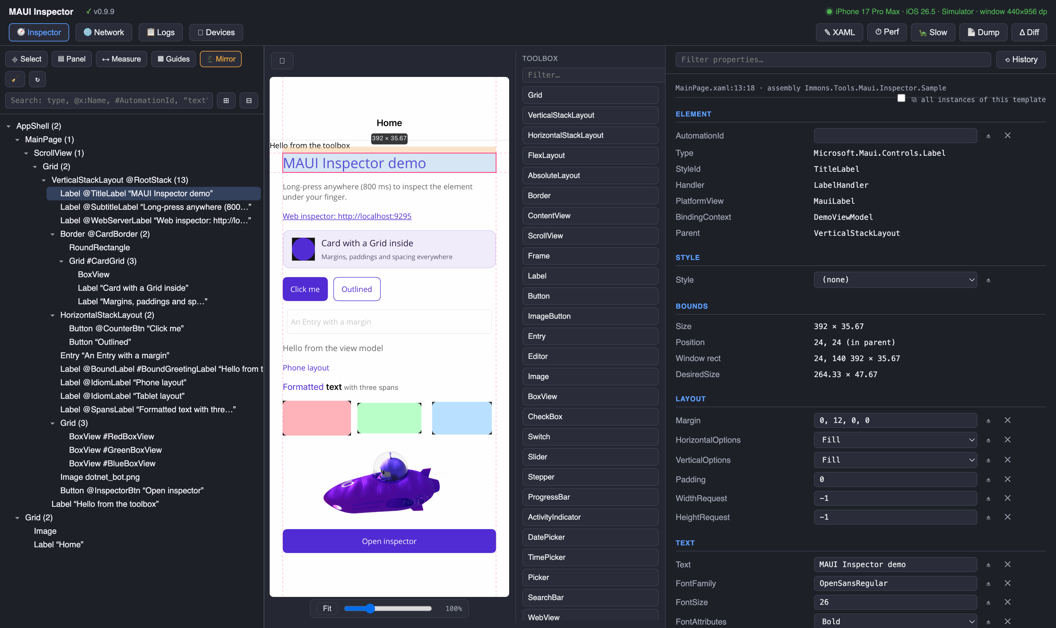
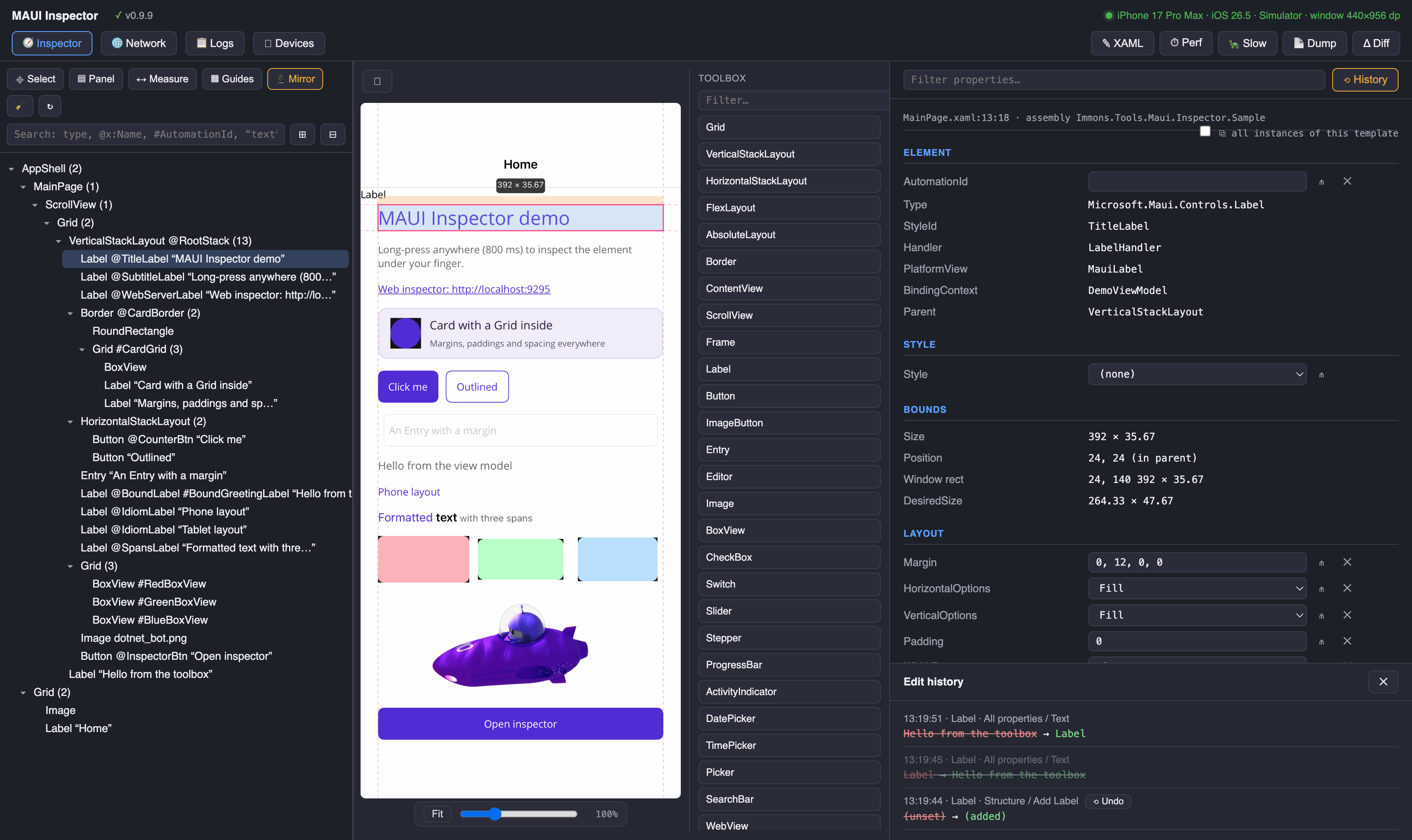
Turn on Mirror and a toolbox appears next to the live screenshot: every MAUI built-in plus
your app's own controls, discovered by reflection (public View subclasses with a
parameterless constructor — marked custom). Drag a control onto the mirror: while you drag,
the container that would receive the drop is outlined with its type name, and the drop position
follows the cursor (above/below the neighbouring children in stack layouts).
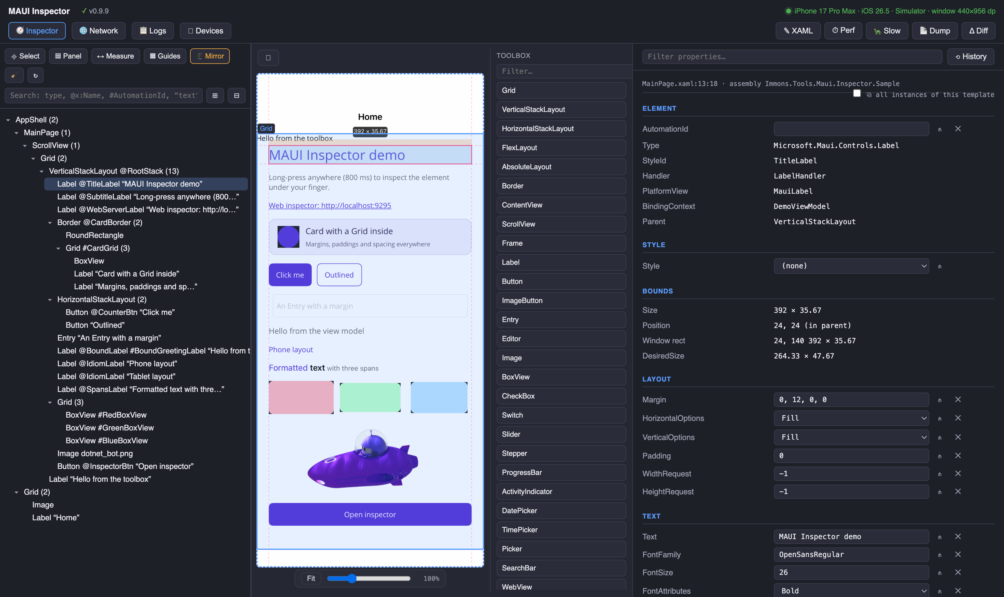
The ⛶ button expands the mirror into a full column — tree, mirror and properties side by
side — and 🗗 docks it back. The Fit button, zoom slider (25–300%, or pinch/Ctrl+scroll)
and drag-to-pan keep big tablet screenshots manageable; clicking, right-clicking and dropping
all stay accurate at any zoom, pan and device rotation. The mirror starts automatically when
the panel opens, and on Android it captures the real GPU frame of every window (modal pages
live in separate dialogs there), so what you see is exactly what the device shows. Frames are
JPEG-encoded off the UI thread with captures never queueing up behind a slow one, so the
running app stays smooth while the mirror streams.
With Select mode off, clicking the mirror forwards the tap into the app itself — like a
remote-desktop client. On Android a real touch event is injected (buttons, list rows, entries —
everything reacts); on the other platforms the tapped element's own handlers are triggered
(TapGestureRecognizer, buttons, switches, checkboxes). Flip Select back on and clicks select
elements again. Rotating the device clears the selection — adaptive layouts rebuild on rotation,
so a kept selection would point at a stale element.
While a toolbox drag is in flight, snap lines show how the drop position relates to the
container's children. The selection gets alignment pins reflecting its
HorizontalOptions/VerticalOptions, and selecting a Grid overlays a grid designer:
drag the row/column lines to resize tracks (written as absolute dp), or use the +row/+col
buttons on the mirror. The </> button above the properties shows a live XAML preview of
the selection — the exact markup a copy/paste or write-back would produce.
Right-click a tree row — or right-click directly on the mirror (the element under the cursor is hit-tested and selected) — for the full set of operations:
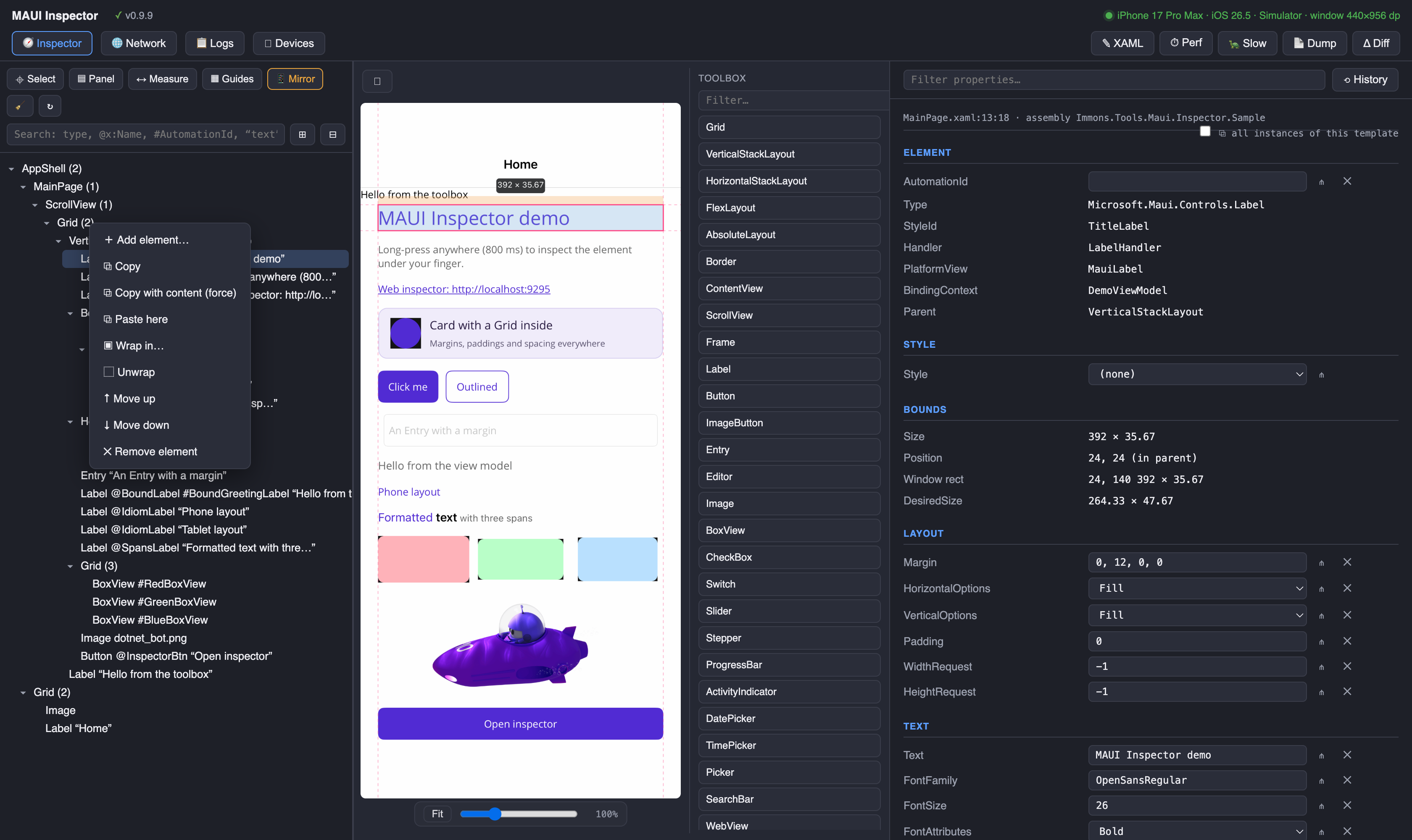
- Add element… opens a searchable catalog with a one-line description of every control.
- Copy / Copy with content (force) / Paste here — see below.
- Wrap in… puts the element inside a new container (Grid, Border, ScrollView, …) chosen from the same catalog, filtered to containers. The wrapper lands in the XAML around the element's markup, indentation included; editing the wrapper's properties rewrites only its opening tag.
-
Unwrap pulls the element one level up: if it was its parent's only child the parent
container disappears (your
<Grid><VerticalStackLayout/></Grid>becomes just the stack); with siblings present, the element moves out to the grandparent instead. - Move up / Move down reorder within the parent — dragging rows in the tree does the same, including dropping into a different parent (edges = before/after a sibling, middle = into the container).
- Remove element — also on the Delete/Backspace key.
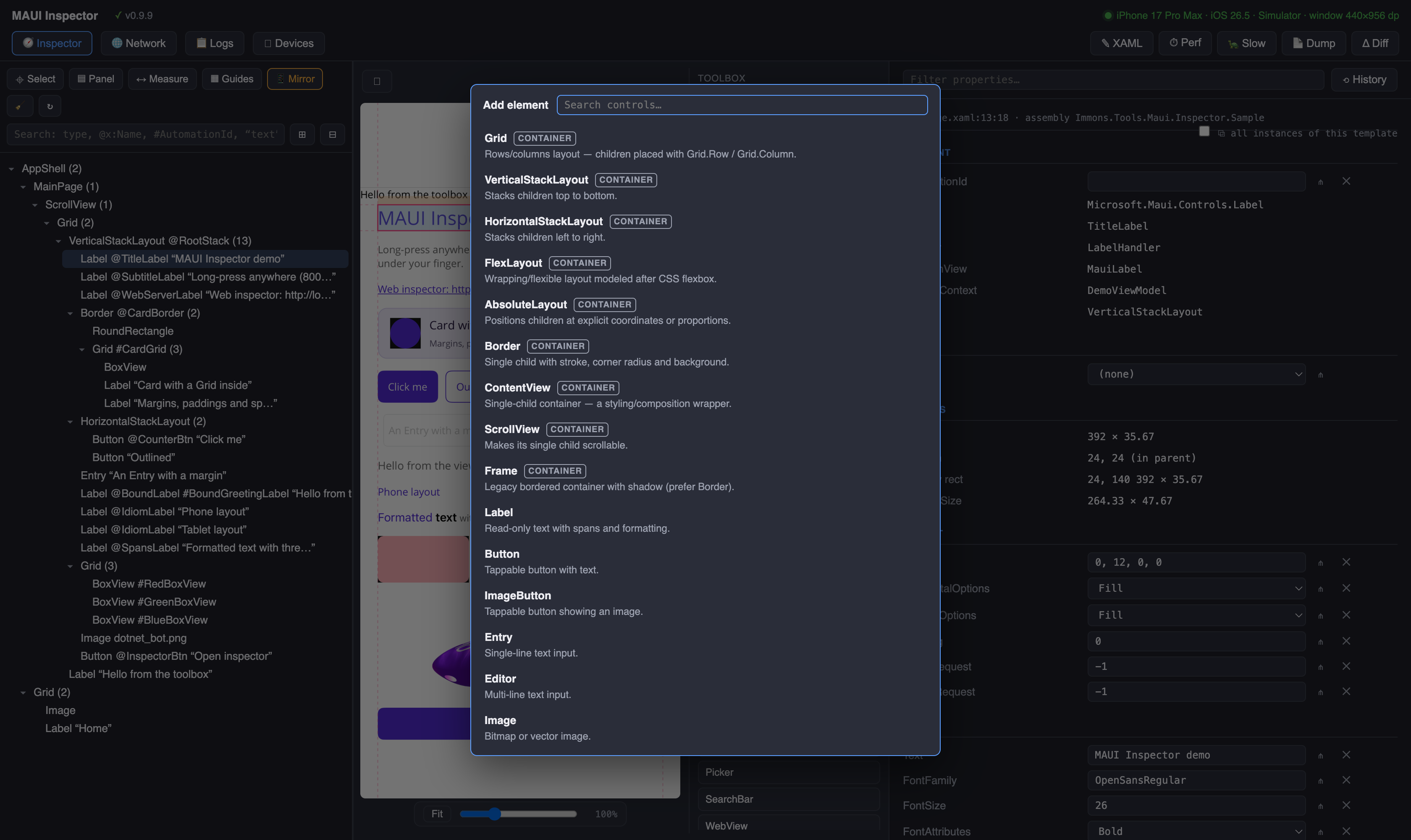
Ctrl/Cmd+C copies the selected element — its non-default property values and its whole
subtree; Ctrl/Cmd+V pastes into the selection (or its nearest container ancestor). The pasted
markup is written to the XAML as a complete nested block, custom controls included: their
xmlns: declarations are added to the root element automatically, reusing prefixes the file
already has. Custom controls are treated as leaves by default — their internal visual tree
belongs to them and is not duplicated. For wrapper-style controls that carry your content, use
Copy with content (force) (Ctrl/Cmd+Shift+C).
Every edit — properties and structure alike — lands in the Edit history. Ctrl/Cmd+Z walks
the chain backwards like a classic editor: undone entries are struck through and leave the
chain, so repeated undo keeps going deeper instead of re-doing itself. Ctrl/Cmd+Shift+Z (or
Ctrl+Y) re-applies the most recently undone entry; making a new edit clears the redo branch.
- With the SQLite storage package, structural edits survive app restarts: pending adds (with their edited attributes), removes, moves and wraps are re-applied when the page loads, matched by XAML source identity — until the sync tool has written them into the sources and they become plain markup.
- The sync tool applies structural operations with the same in-place, no-reformat policy as attribute edits: inserts are anchored to their parent and neighbours, later edits upsert the same snippet instead of duplicating it, moves relocate the element's exact span (re-indented for its new depth), and undo restores the removed text verbatim. Structural operations are only served to an updater that declares support for them, so an outdated tool can never misapply them.