Repository navigation
Widget Designer
Home · App settings · Log viewer widget
Open the full app settings grid and choose Settings → Widgets from the grid menu. The designer uses the interface supplied by Better Logic Library. Use Designs for layout, formatting and dimensions; use Themes for colors. A dashboard widget can use any combination.
- Under Designs, select a built-in starting point such as Journal. Built-in items are read-only. Choose Duplicate to copy it, or New to start a new custom item.
- Give the copy a distinct name, for example
Kitchen log. Expand Designer help if needed. Select a row, column, or element to highlight it in the preview and open its options. For example, select Message to adjust its text size. Drag a selected element within its grid to change position or move it to Unused. - Use the light and dark previews to check legibility. Use Undo and Redo to compare edits, then Save.
- Edit your dashboard widget, choose
Kitchen logunder Design, and leave Theme on Default to verify just the layout change.
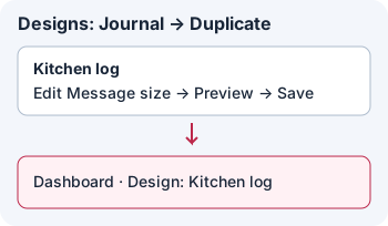
Illustration: duplicate and save a layout first, then select that saved design on the dashboard.
- Select Themes, choose Default, and Duplicate it.
- Name the copy
Kitchen colors. Select Widget to edit the frame and general colors, or select an element such as App / Group to change its text color and background. App default keeps the standard appearance; where offered, choose a severity-based, named or custom#RRGGBBcolor. - Check both preview modes, Save, then pick
Kitchen colorsas the dashboard widget's Theme without changing its design.
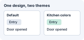
Illustration: the selected design stays the same when you change only the theme.
- Widget bar: frame width, corner radius and padding on each side. Leave the border at the default or choose a borderless frame explicitly.
- Search and filters, Day separator, and Paging: independent optional arrangements of up to two rows. Search and paging controls can have their own height, padding and corner radius. A design cannot enable controls that the dashboard widget has turned off.
- Log cards: up to ten rows and five columns per row. Set column spans, alignment and spacing. Place Timestamp, Severity, Message, App / Group, Facility, Hostname, and any of Border 1–4 as needed. Set each border's side and thickness independently.
- Text: change size, font, line height, case, weight, italic or spacing where available. Timestamps can stack at spaces; the log timestamp and separator date each have BLL format choices. The dashboard's own timestamp format takes precedence if set.
- Day separator: position its Date and Line independently of card layout. Put the line behind, above or below the date, and choose its thickness, pattern and theme color.
- Theme: set widget surfaces, text and borders; a second background color can make a gradient. Individual elements can have their own color and background, depending on the element.
Built-in designs: Default, Compact, Journal, Console, Aurora, WidgetKeeper. Built-in themes: Default, Default (Syslog), Ocean, Forest, Sunset, Console, Aurora, WidgetKeeper. Most built-in themes keep Homey's background; Console supplies its own.
Switching items, tabs or opening Templates can prompt you to discard unsaved work. Use Save first. Deleting a saved custom item takes effect after confirmation; choose another design or theme on any affected widget.
Next: share or install a TWF.