Metagenomic Visualizations
In R, we'll first create a directory to work in, then load some libraries we'll use:
dir.create("~/meta_viz")
setwd("~/meta_viz")

library(tidyverse)
library(vegan)Get the data
We'll be using species abundance data (from MetaPhlAn) from subjects in the HMP cohort. The metadata lists has samples as rows, while the species abundance data has bugs and samples as rows and columns respectively. This code block reads them from a github repository into R as data frames:
bug_df   = read_tsv("https://raw.githubusercontent.com/andrewGhazi/physalia/main/data/bugs.tsv")
metadata = read_tsv("https://raw.githubusercontent.com/andrewGhazi/physalia/main/data/metadata.tsv")
Take some time to examine these objects.
- How many subjects are included in this dataset?
- How many of them are CD, UC and non-IBD?
- How old are the subjects on average?
- Which cohorts do they come from?
Format species abundance data
vegan needs the abundance data in the form of a matrix, so here we take the bug_df, move the "bug" column to rownames, change it to a matrix, then transpose:
bug_mat = bug_df |>
  column_to_rownames("bug") |>
  as.matrix() |>
  t()
Ordination: PCoA with Bray-Curtis distance
dist_mat = vegdist(bug_mat)

cmd_res = cmdscale(dist_mat,
                   k = (nrow(bug_mat) - 1),
                   eig = TRUE)

str(cmd_res)
Extracting information of the first two PCs
Here we extract the coordinates of each
pcoa_df = tibble(PC1 = cmd_res$points[,1],
                 PC2 = cmd_res$points[,2])
Plotting the samples
Now we run the first minimal plotting command. Note the structure of the command:
-
ggplot()takes two inputs: a data frame and an "aesthetic mapping" created byaes() - A graphical element (a "geom") is added to the ggplot with a plus sign
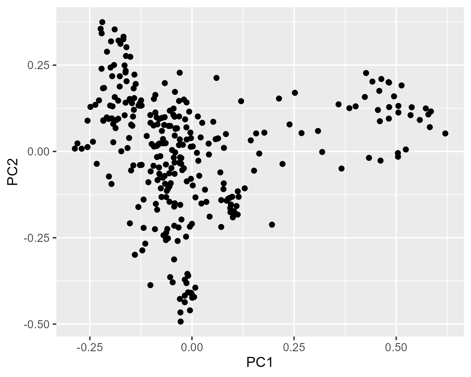
p = ggplot(pcoa_df, aes(x = PC1, y = PC2)) +
        geom_point()
p
Through the rest of these tutorials, we'll have the expected plot hidden under these little collapsible arrows. Even if you're not running all of the code as you go along, think about what the expected result should look like before you see the "answer":
Click to view plot
Adding metadata to the plot
pcoa_df has the points listed in the same order as the original metadata, so we can just bind the columns of the two data frames together without worrying about a fancier join.
pcoa_meta = bind_cols(pcoa_df, metadata)

pcoa_meta
Color by diagnosis
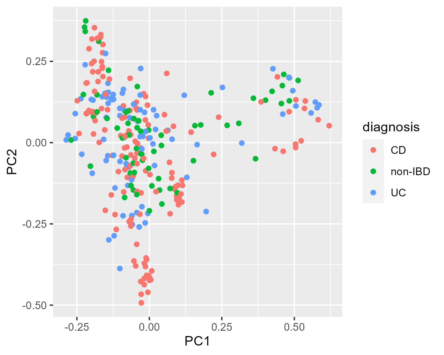
Which metadata would be the most interesting to plot? Let's try mapping the color of each point to the diagnosis value.
p_diag = ggplot(pcoa_meta,
                aes(x = PC1, y = PC2, color = diagnosis)) +
           geom_point()

p_diag
Click to view plot
Color by age
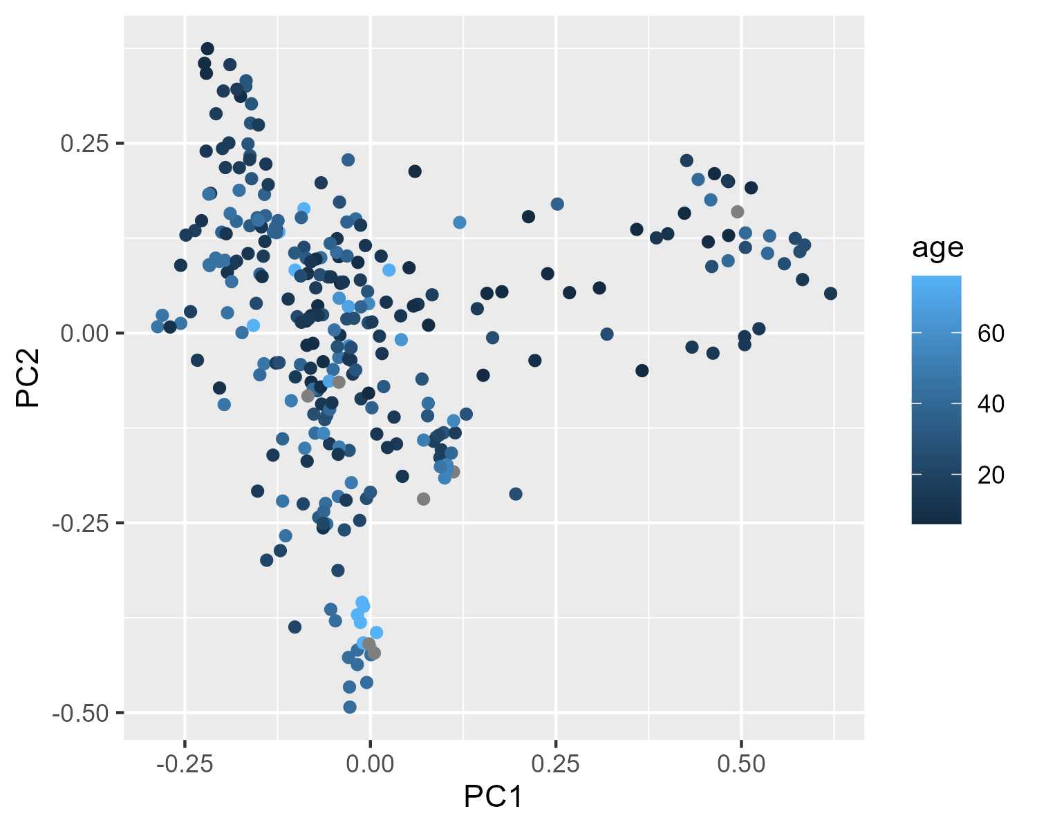
Here we try mapping age (a continuous variable) onto the color of each point.
p_age = ggplot(pcoa_meta,
               aes(x = PC1, y = PC2, color = age)) +
          geom_point()
p_age
Click to view plot
Plot customization
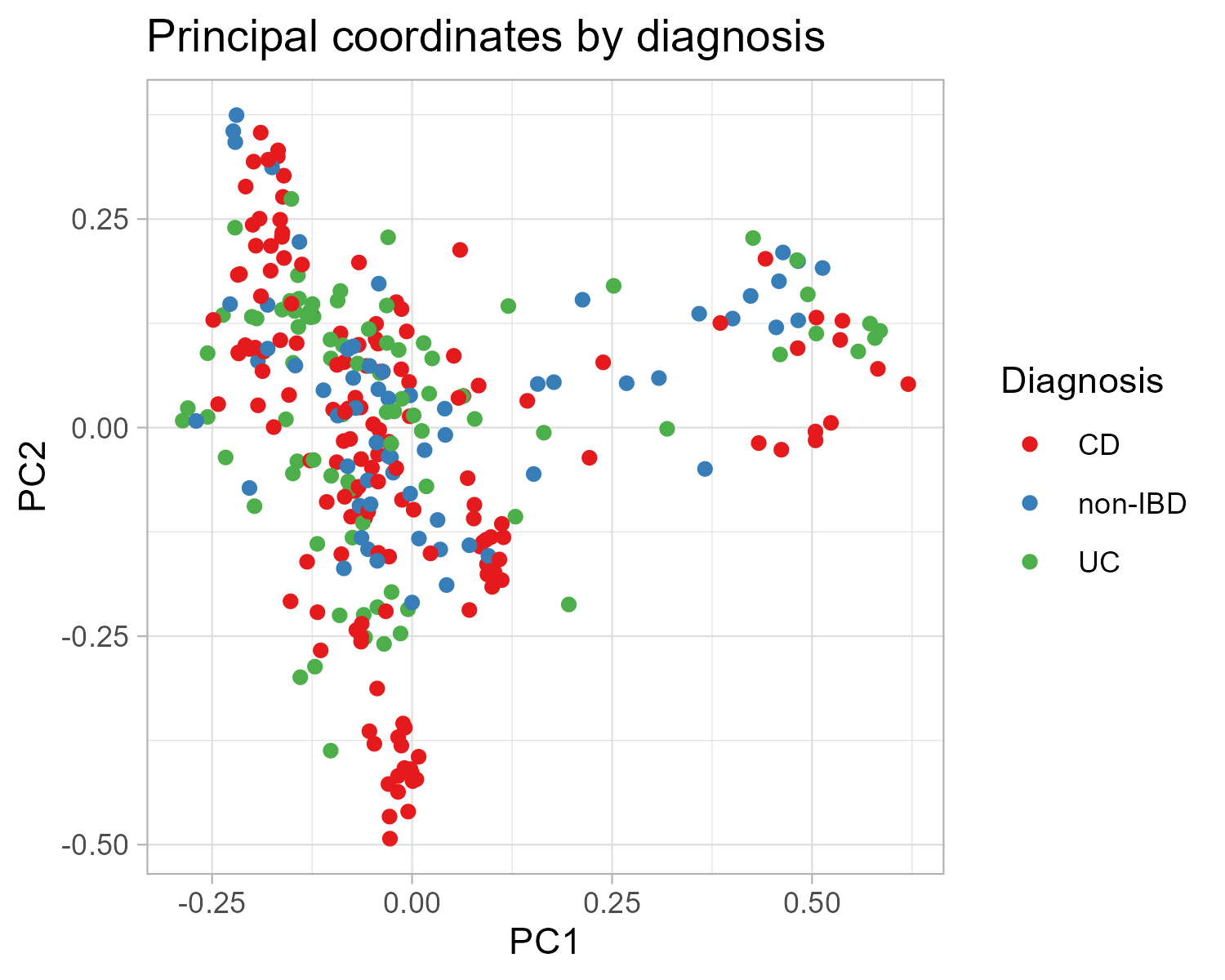
There are many ways to customize ggplots. Themes change the overall style of the non-data elements of the plot. Different color scales change the color values that are used.
Here we add a few tweaks to our diagnosis plot. Make sure to print the plot p after each step to see what each new component changed.
p = p_diag + theme_light()

p = p + scale_color_brewer(palette = "Set1")

p_final = p + labs(color = "Diagnosis",
                   title = "Principal coordinates by diagnosis")

p_final
Click to view plot
Once you're happy with a plot, you can save it with ggsave():
dir.create("~/meta_viz/outputs")
ggsave(filename = "outputs/pcoa_plot.png",
       plot = p_final,
       width = 5,
       height = 4)
Question
- We've already mapped the color of each point to the subject's diagnosis. What other aesthetic mappings does
geom_pointaccept?
Highlight inter-individual variation: Color by subject
This dataset contains multiple observations for some individuals over a period of time. How many subjects are there and how many time points does each subject have?
n_distinct(pcoa_meta$participant_id)
occurrence = table(pcoa_meta$participant_id)
print(occurrence)
There are too many subjects to assign each one its own color. Therefore, we will only highlight samples from subjects with more than 10 time points, and bin everything else into a separate category. We'll do this by creating a new color variable and adding it to the tibble. First we determine who has enough observations gets a color. Then we flag each observation with either the subjects identifier or "short" to indicate which observations come from subjects with short longitudinal periods.
enough_timepoints = occurrence >= 10

pcoa_meta = pcoa_meta |>
    mutate(gets_a_color = enough_timepoints[participant_id],
           color_id     = case_when(gets_a_color ~ participant_id,
                                    TRUE         ~ "short"))
Use the new color_id column to color points.
p = ggplot(pcoa_meta, aes(x = PC1, y = PC2, color = color_id)) +
        geom_point(aes(shape = diagnosis), size = 3)

my_col_individual= c("H4008" = "firebrick",
                     "H4009" = "cadetblue",
                     "C3013" = "darkslategray",
                     "C3017" = "sandybrown",
                     "C3011" = "coral3",
                     "P6009" = "cornflowerblue",
                     "short" = "grey80")

p = p + scale_color_manual(values = my_col_individual)
# ^ Look at p after this step

p = p + labs(color = "Subject",
             shape = "Diagnosis",
             title = "PCoA with Bray-Curtis at species level") +
        theme_bw() +
        theme(plot.title = element_text(size = 15, hjust = 0.5, face = "bold"))

ggsave(plot = p,
       filename = "outputs/biplot_part1.pdf",
       width = 7,
       height = 5)
Click to view plot

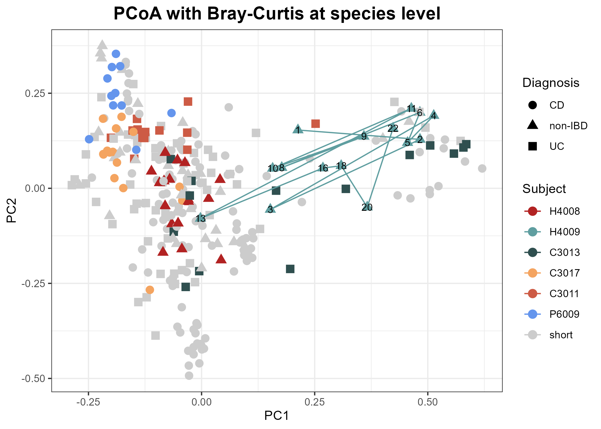
Adding time course information for some subjects
Next we will connect all samples from a particular subject and add time point numbers to the plot. We choose a subject, create a smaller data frame dedicated to their time-course, then add a path connecting their points on the principal coordinates plot.
subject1 = "H4009"

subj_df = pcoa_meta |>
    filter(participant_id == "H4009") |>
    arrange(time_point) |>
    mutate(time_label = factor(time_point, levels = time_point))


p_time_course = p +
    geom_path(data = subj_df) +
    geom_text(data = subj_df,
              mapping = aes(x = PC1, y = PC2,
                            label = time_point),
              size = 3,
              color = 'black')

ggsave(plot = p_time_course,
       filename = "outputs/biplot_part2.pdf",
       width = 10,
       height = 7)
Click to view plot
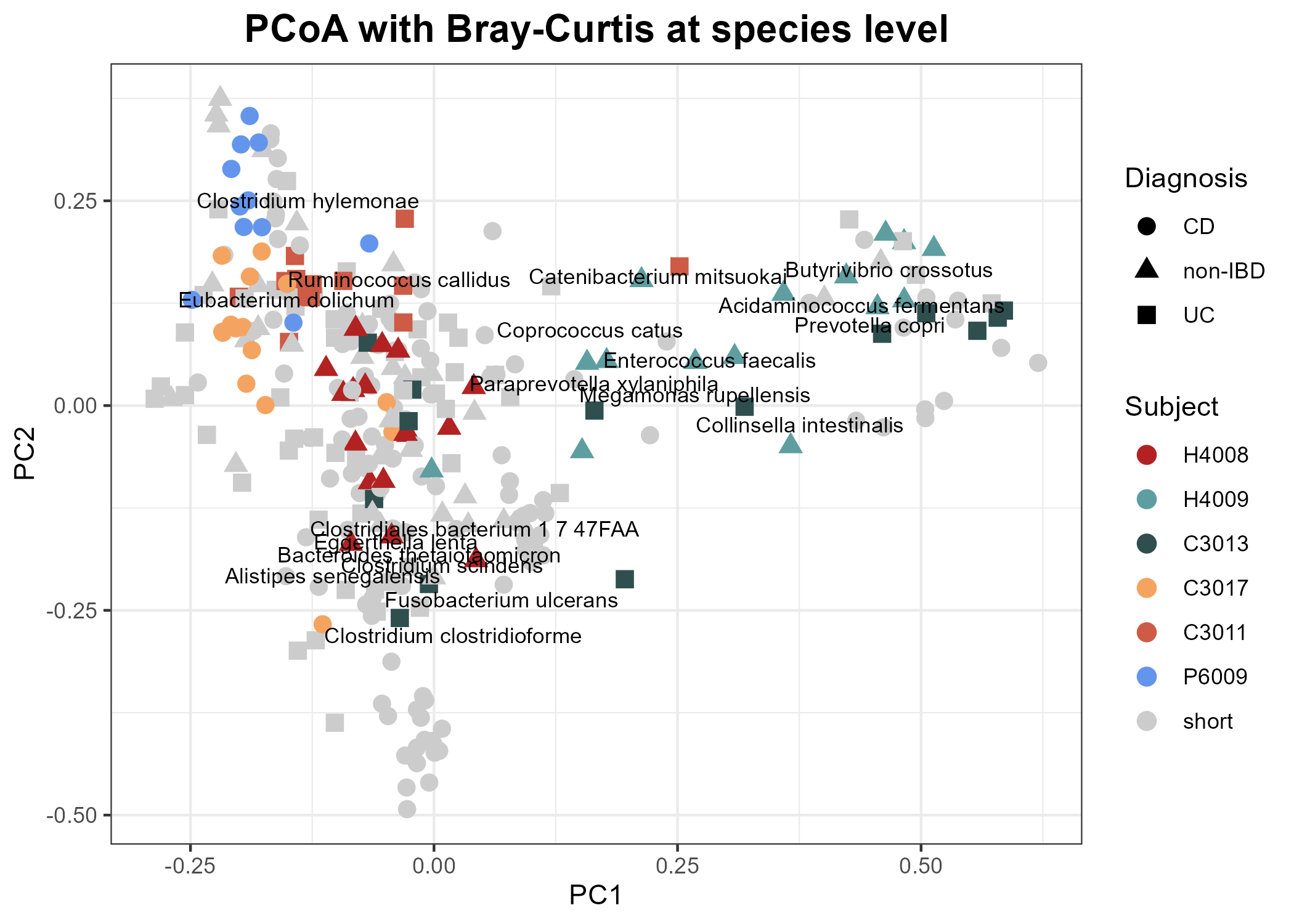
Biplots: Add species information to the PCoA
Now we want to turn this into a biplot and indicate which species are driving the variation in the taxonomic composition by using the Weighted Averages Scores for Species: wascores()
?wascores
wa_data = wascores(cmd_res$points[,1:2], bug_mat) |>
    as_tibble(rownames = 'species')

wa_data
There are too many to show on the plot all at once, so we'll select a subset of particular interest.
We will use the plot we created previously but without the time-course information. Then we layer on the information from the subset of species we have selected. We'll pick out the species of particular interest by name:
species_list = c("s__Collinsella_intestinalis",
                 "s__Eggerthella_lenta",
                 "s__Bacteroides_thetaiotaomicron",
                 "s__Paraprevotella_xylaniphila",
                 "s__Prevotella_copri",
                 "s__Alistipes_senegalensis",
                 "s__Enterococcus_faecalis",
                 "s__Clostridium_clostridioforme",
                 "s__Clostridium_hylemonae",
                 "s__Clostridium_scindens",
                 "s__Clostridiales_bacterium_1_7_47FAA",
                 "s__Butyrivibrio_crossotus",
                 "s__Coprococcus_catus",
                 "s__Ruminococcus_callidus",
                 "s__Catenibacterium_mitsuokai",
                 "s__Eubacterium_dolichum",
                 "s__Acidaminococcus_fermentans",
                 "s__Megamonas_rupellensis",
                 "s__Fusobacterium_ulcerans")

wa_species_subset = wa_data |>
    filter(species %in% species_list) |>
    mutate(species = gsub("_", " ", str_remove(species, "s__")))

p_species = p +
    geom_text(data = wa_species_subset,
              aes(x = V1, y = V2,
                  label = species),
                  color = "black",
                  size = 3)

p_species

ggsave(plot = p_species,
       filename = "outputs/biplot_part3.pdf",
       width = 7,
       height = 5)
Click to view plot
We will use a subset of the MetaCyc metabolic pathways (based on HUMAnN2) from the 78 samples that were part of the HMP2 pilot study and compare DNA versus RNA alpha diversity (Gini-Simpson index) of MetaCyc metabolic pathways. We will only consider pathways that were detected in both data types.
Read in the raw data:
MGX_pwys_raw = read_tsv("https://raw.githubusercontent.com/andrewGhazi/physalia/main/data/mgx_pwys.tsv")
MTX_pwys_raw = read_tsv("https://raw.githubusercontent.com/andrewGhazi/physalia/main/data/mtx_pwys.tsv")
ratio_pwys_raw = read_tsv("https://raw.githubusercontent.com/andrewGhazi/physalia/main/data/ratio_pwys.tsv")

MGX_pwys_raw$Pathway[1:3]
Note that the taxonomic information is This code block removes rows without defined taxa and/or with unmapped/unintegrated pathways:
MGX_pwys = MGX_pwys_raw |>
  separate(Pathway,
           into = c("pwy", "taxa"),
           sep = "\\|") |>
  filter(!(pwy %in% c("UNMAPPED", "UNINTEGRATED"))) |>
  filter(!(is.na(taxa) | taxa == "unclassified"))

MTX_pwys = MTX_pwys_raw |>
  separate(Pathway,
           into = c("pwy", "taxa"),
           sep = "\\|") |>
  filter(!(pwy %in% c("UNMAPPED", "UNINTEGRATED"))) |>
filter(!(is.na(taxa) | taxa == "unclassified"))- Note the warning message we get. Where does it come from? Is it okay?
- How many unique pathways, taxa, and pathway:taxa combinations do we have?
We will define a function that we can apply to the metagenomic and metatranscriptomic data that calculates the alpha diversity of a pathway in a given sample:
alpha_div = function(pwy_data) {

  relative_pwy = pwy_data |>
    mutate(across(c(-pwy, -taxa), ~ .x / sum(.x))) |>
    mutate(across(c(-pwy, -taxa), ~ replace_na(.x, 0))) |>
    select(-taxa) |>
    group_by(pwy)

  if (nrow(relative_pwy) == 1) {
    res = relative_pwy |>
      summarise(across(.fns = ~ if_else(sum(.x) > 0,
                                        0,
                                        -1)))
  } else {
    res = relative_pwy |>
      summarise(across(.fns = ~ if_else(sum(.x) > 0,
                                        diversity(.x, index = 'simpson'),
                                        -1)))
  }

  sample_values = res |> select(-pwy) |> unlist()

  all_null = all(sample_values == -1)

  if (all_null) {
    return(NULL)
  } else {
    return(res)
  }

}
Now we apply the function to the data:
MGX_a_div = MGX_pwys |>
  group_split(pwy) |>
  map(alpha_div) |>
  bind_rows()

MTX_a_div = MTX_pwys |>
  group_split(pwy) |>
  map(alpha_div) |>
bind_rows()- Now we will compute the mean alpha-diversity taking all samples into account where the pathway was detected in at least 20% of the samples
threshold = round(0.2 * (ncol(MGX_a_div) - 1))

summary_MGX_a_div = MGX_a_div |>
  pivot_longer(-pwy,
               names_to = 'sample_id',
               values_to = 'alpha_div') |>
  group_by(pwy) |>
  mutate(n_detected = sum(alpha_div >= 0)) |>
  filter(n_detected > threshold) |>
  summarise(mean_alpha_div = mean(alpha_div[alpha_div >= 0]))

summary_MTX_a_div = MTX_a_div |>
  pivot_longer(-pwy,
               names_to = 'sample_id',
               values_to = 'alpha_div') |>
  group_by(pwy) |>
  mutate(n_detected = sum(alpha_div >= 0)) |>
  filter(n_detected > threshold) |>
summarise(mean_alpha_div = mean(alpha_div[alpha_div >= 0]))- Alpha diversity plots
We will compare the mean alpha-diversity for each pathway on the RNA level (y-axis) and DNA level (x-axis). Each point will represents one pathway.
But first, which pathways are detected on DNA AND RNA level?
mean_alpha_div_df = inner_join(summary_MGX_a_div,
                               summary_MTX_a_div,
                               by = "pwy",
                               suffix = c("_mgx", "_mtx"))
Now, plot.
g = ggplot(mean_alpha_div_df,
           aes(x = mean_alpha_div_mgx,
               y = mean_alpha_div_mtx)) +
        geom_point() +
        theme_bw()

g = g +
    geom_abline(intercept = 0, slope = 1, color = "grey") +
    labs(x = "DNA",
         y = "RNA",
         title = "Alpha-diversity of pathway stratification",
         size = "Log mean\nRNA/DNA ratio") +
    theme(plot.title = element_text(size = 16, face = "bold", hjust = 0.5),
          axis.title.x = element_text(size = 15),
          axis.title.y = element_text(size = 15))

g

ggsave(plot = g,
       filename = "outputs/AlphaDiv_DNA_vs_RNA_simple.pdf",
       width = 5,
       height = 5)
Click to view plot

- Now we want to color the points by the log mean RNA/DNA ratio of each pathway
mean_ratio_df = ratio_pwys_raw |>
  filter(pwy_species %in% mean_alpha_div_df$pwy) |>
  rename(pwy = pwy_species) |>
  pivot_longer(-pwy,
               names_to = "sample_id",
               values_to = "ratio") |>
  group_by(pwy) |>
  summarise(log_mean_ratio = log(mean(ratio)))

mean_alpha_by_ratio = mean_alpha_div_df |>
  left_join(mean_ratio_df, by = "pwy")

g = ggplot(mean_alpha_by_ratio,
           aes(x = mean_alpha_div_mgx,
               y = mean_alpha_div_mtx)) +
    geom_abline(intercept = 0,
                slope = 1,
                color = "grey",
                lty = 2) +
    geom_point(aes(color = log_mean_ratio),
               size = 3) +
    scale_color_viridis_c(end = .9) +
    theme_bw() +
    labs(x = "DNA", y = "RNA",
         title = "Alpha-diversity of pathway stratification",
         color = "Log mean\nRNA/DNA ratio") +
    theme(plot.title = element_text(size = 16, face = "bold", hjust = 0.5),
          axis.title.x = element_text(size = 15),
          axis.title.y = element_text(size = 15),
          legend.position = c(0.2,0.75),
          legend.background = element_rect(color = "grey"),
          legend.title = element_text(size = 12),
          legend.text = element_text(size = 12),
          legend.text.align = 1)
g

ggsave(plot     = g,
       filename = "outputs/AlphaDiv_DNA_vs_RNA.pdf",
       width    = 7,
       height   = 5)
Click to view plot
