User Guide Dashboard
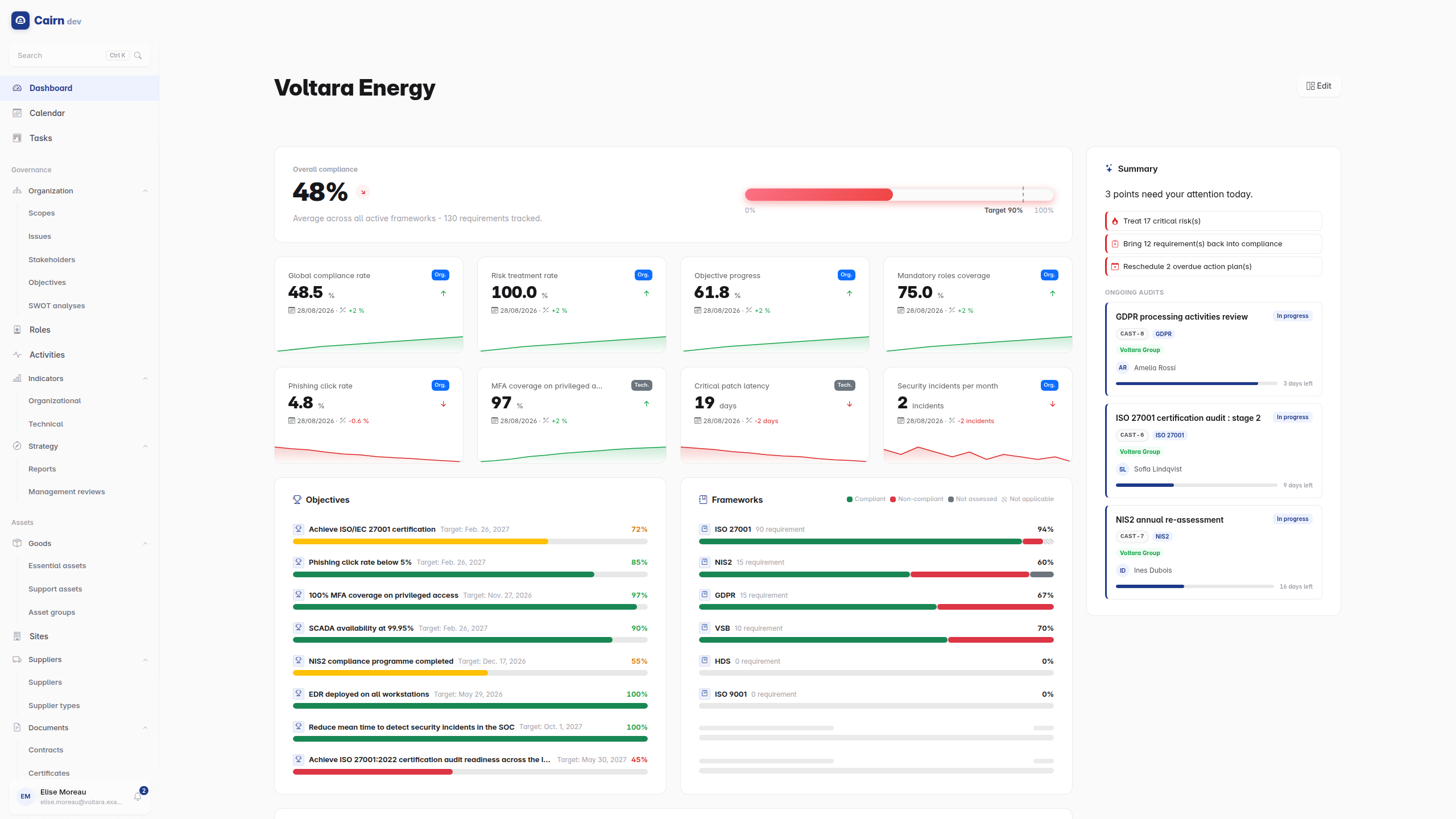
The home page is a grid of widgets you arrange yourself. There is no "default view" you are stuck with : the layout is yours, saved to your account, and it follows you to any device.
Out of the box it answers the questions a security manager opens a GRC platform to ask.
| Widget | Answers |
|---|---|
| Overall compliance | Where are we, on average, across active frameworks, against the target |
| Summary | Cairn's briefing of the day, if Ask Cairn is on |
| Frameworks | Which framework is dragging the average down |
| Indicator | One KPI, with its trend and an optional sparkline |
| Objectives | What is in play, and how far along |
| Priority risks | The worst untreated residual risks |
| Upcoming deadlines | Reviews, audits and target dates in the next 30 days |
| Ongoing audits | Shown only while an audit is actually running |
| Notification deadlines | Statutory clocks that are late or still running, with the incidents behind them |
| Risk treatment flow | How treatment moves risks from their current to their residual level |
| Current risks / Residual risks | The probability x impact heatmaps, before and after treatment |
| Section | A heading, to group the rest into labelled sections |
Two behaviours are deliberate and worth knowing.
A widget with nothing to show hides itself. The ongoing audits tile is absent when no audit is running, rather than showing an empty box. In edit mode it reappears, so you can still find and remove it.
Counts respect your perimeter. Everything on this page is filtered to your scopes. Your dashboard and your colleague's can differ, and both are correct.
Enter edit mode from the dashboard header. The grid comes alive.
Move a tile by dragging its handle. Resize it from the aspect-ratio button : each widget offers a set of sizes, expressed as width by height. A tile's content is fitted to the size you give it, so a taller list widget shows more rows rather than growing a scrollbar. Remove a tile with the minus button; it goes back to the gallery rather than being destroyed.
Add a tile from the "Add a widget" gallery, grouped by category.
Configure a tile from the gear, where the widget supports it. Four do : Overall compliance (its target line), the progress-bar lists (their sort order, including a manual one), the Indicator (which KPI, and whether to draw the chart), and Section (its title).
Leave edit mode and the layout is saved.
Two widgets are reusable : you can place as many as you want, each with its own settings.
Indicator is the important one. Rather than one widget listing all your KPIs, you place one tile per KPI you actually care about, sized and positioned where it makes sense. A row of four single-KPI tiles across the top is a common and effective arrangement.
Section is a bare heading, full width, sitting directly on the page background with no card around it. Use them to split a long dashboard into labelled bands : "Compliance", "Risk", "This week". They cost half a row.
On wide screens some widgets sit in a narrow rail down the right-hand side : upcoming deadlines, priority risks, ongoing audits, the daily summary. They are designed for that width, and rail tiles ignore their width setting while they are there.
The rail has a top and a bottom half. When the screen narrows and the layout collapses to one column, the top rail moves above the main grid and the bottom rail below it, so what you put in the top rail stays the first thing you see on a phone.
Remove everything you do not want and add back what you do. There is no reset button, because there is no single arrangement to reset to. A newly shipped widget is added to your dashboard automatically on your next visit, so you see new capabilities without having to go looking for them.