ref(compactSelect): Small improvements - #46642
Conversation


 github-actions
Bot
added
the
Scope: Frontend
github-actions
Bot
added
the
Scope: Frontend

| // Focus on search box if present | ||
| if (searchable) { | ||
| searchRef.current?.focus(); | ||
| return; | ||
| } | ||
|
|
There was a problem hiding this comment.
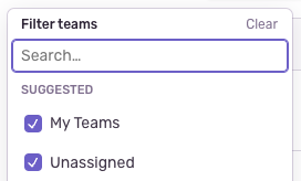
If present (searchable is true), the search box will receive focus when the menu opens. Otherwise, the list box will receive focus.
| const showClearButton = useMemo( | ||
| () => selectedOptions.flat().length > 0, | ||
| [selectedOptions] | ||
| ); | ||
|
|
There was a problem hiding this comment.
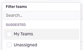
The clear button will be hidden if no option has been selected:

| export interface SelectOption<Value extends React.Key> extends SelectValue<Value> { | ||
| /** | ||
| * Whether to hide the checkbox/checkmark. Available for backward compatibility only. | ||
| * If true, an alternative selection state indicator must be present. | ||
| * | ||
| * @deprecated | ||
| */ | ||
| hideCheck?: boolean; | ||
| } |
There was a problem hiding this comment.
It is now possible to hide the leading checkbox. This feature was added specifically for page filters, which use a hybrid selection pattern.
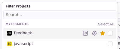
The prop for this, hideCheck, is marked as deprecated to discourage further use. (If there's a better, more tailored way to restrict usage, pls tell me!).

There was a problem hiding this comment.
Hmm, it's not ideal to say it's deprecated, as that implies we want to try to remove it.
There was a problem hiding this comment.
Yeah I agree. Not sure what else to do though. @deprecation was a decent choice because VSCode will add a strikethrough over the name, so at least it'll grab people's attention when they try to use it.
I could also just add a warning in all caps in the prop description, but there's a much lower chance of people seeing it.
There was a problem hiding this comment.
Lol I tagged an org called Deprecation trying to write @deprecation
| : listState.selectionManager.selectionMode === 'multiple'; | ||
|
|
||
| const {rowProps, gridCellProps, isSelected, isDisabled} = useGridListItem( | ||
| const {rowProps, gridCellProps, isSelected, isDisabled, isPressed} = useGridListItem( |
There was a problem hiding this comment.
Using react-aria's isPressed prop to track press states (the value is passed to InteractionStateLayer). This is better because the :active pseudo-class is activated even when the user presses on a child interactive element.
Before —— pressing on the bookmark star activates the whole option's press state, which is confusing because it suggests that the option will be selected (it won't)

After —— pressing the bookmark star doesn't trigger the option's press state

|
|
||
| li[role="rowgroup"]:hover &, | ||
| li[role="presentation"]:hover & { | ||
| opacity: 1; | ||
| pointer-events: all; | ||
| } |
There was a problem hiding this comment.
Section toggle buttons ("Select All") will show up when hovering over the section, including the section header.
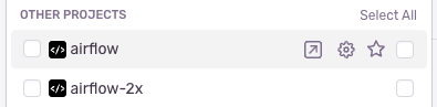
Before, the buttons will only show up if one of the section's options have focus.
There was a problem hiding this comment.
Also I would be OKAY if we changed he UI for this and moved the checks to the left
There was a problem hiding this comment.
Decided to keep the checkboxes on the right side because of the page filters' weird hybrid selection mode. Here, the primary selection mode is singular. It's only when you click on the checkbox that the secondary selection mode — multiple — applies.
Having the checkbox on the right, trailing side works better, I think, because that's where we put secondary actions. Putting it in the left, leading side might confuse the user into thinking that the primary selection mode is multiple.
| export interface ControlProps extends UseOverlayProps { | ||
| export interface ControlProps | ||
| extends Omit< | ||
| React.BaseHTMLAttributes<HTMLDivElement>, | ||
| // omit keys from SingleListProps because those will be passed to <List /> instead | ||
| keyof Omit< | ||
| SingleListProps<React.Key>, | ||
| 'children' | 'items' | 'grid' | 'compositeIndex' | 'label' | ||
| > | ||
| >, | ||
| UseOverlayProps { |
There was a problem hiding this comment.
Adding React.BaseHTMLAttributes<HTMLDivElement> so we can attach HTML props, like onKeyDown, to CompactSelect. These props will be passed to the ControlWrap element.

Fix `CompactSelect` tests that failed when
#46642 was merged.
3 participants


A few small improvements to
CompactSelect. See comments for more details.