Fix color picker mode buttons#67967
Conversation
|
I think this is ok. @KoBeWi ? |
|
I think the old buttons are better. It's more clear which one is active. |
|
@KoBeWi My bad, I used the lower contrast (which I'm using in light mode) for demonstrating the dark mode.
If this is still not clear enough, then this is a problem with the editor's pressed button style. Don't really want to argue over three obviously broken buttons, but they do look out of place even among the tab bars, so they're inconsistent both with tab buttons and normal buttons. Though I don't see a point in giving them a tab button appearance, as mentioned is the OP. |
|
Well I tested it and compared myself. I don't think it's button style problem, because we don't really have tab-like buttons like this anywhere else and this style was never meant to be used this way. Hence why tabs style is used - because technically these buttons are "tabs". Not sure why the tab style looks bad on light theme. You should have the same problem with scene tabs, no? We could gather more feedback on this matter, but personally I prefer the current style. Or we could come up with some new style. |
And it is already used incorrectly. Regular tabs: I cannot find tabs styled like the latter anywhere in the editor.
More like radio buttons. ;)
No, everything else looks perfectly fine.
I'm obviously all for removing these style overrides for the time being as they are already do not function properly, and coming up with a new style can take quite some time. It doesn't hurt the usability more than it hurts now, and actually fixes the problem for light theme users. |


|
I think this change is actually quite nice. A good improvement in the style of the buttons. |
|
The buttons don't update their look when the theme changes. They probably look fine if you restart the editor after changing the theme (or create a new color picker). But there is currently no code that reacts on NOTIFICATION_THEME_CHANGED to update the overrides on these buttons. Edit: By the way, calling This is what needs to be fixed if we want to preserve the look. But also, these classes were omitted when I was moving all control nodes to the new theme cache approach, because they were being reworked at that moment. So the whole theming code here needs to be improved. From the looks of it, fetching of theme properties is all over the place. |
These three buttons have been an eyesore for me for the last couple of weeks.
The changes are trivial, and theme override for these buttons seem unnecessary in any case (they aren't really attached to a tab container), not to mention that it makes them look barely readable in the light mode (yes, I'm using it wherever I can because of eyesight reasons).
EDIT: That icon on the shape popup button? Yes, dark/light mode icons are already broken in various places, so it needs to be fixed globally, not just in the color picker.
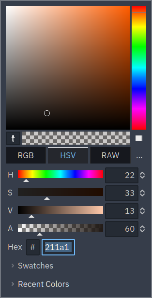
Before
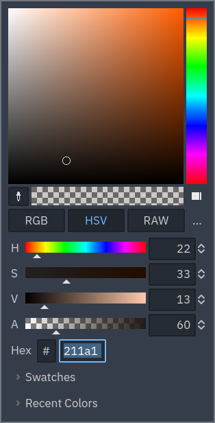
After