Tile Card
custom:adaptive-cover-pro-tile-card
The tile card is a single-row chip optimised for dense dashboards where you might have eight or more ACP instances side-by-side. It strips the full panel down to the bits you read at a glance: icon, name, position, an ↑■↓ control row, and one contextual badge that follows the live decision.
It is one of the three cards in the Adaptive Cover Pro Card bundle. Installing the bundle registers all three; see Dashboard Cards → Installation.
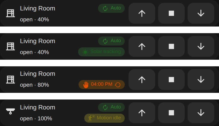
The same custom:adaptive-cover-pro-tile-card in four states. The badge on the right follows the live decision: Auto (automatic control, no specific handler), Solar tracking (with the target inline), Manual (override with expiry time and a ↺ to resume), and Motion (motion handler holding the cover). Force, weather, glare, climate, cloud, and custom-position slots get their own badges too.
Drop the card onto a dashboard and the visual editor opens automatically — you don't have to touch YAML. The form is built on Home Assistant's standard ha-form, so the entry picker, icon picker, cover picker, and tap / hold / double-tap action editors are the same controls you see on built-in cards.
type: custom:adaptive-cover-pro-tile-card
entry_id: YOUR_CONFIG_ENTRY_ID           # required; pick from the visual editor dropdown
name: Living room                        # optional; override the discovered title
icon: mdi:blinds-horizontal              # optional; override the auto-resolved cover icon
cover: cover.living_room                 # optional; explicit cover entity when the entry manages several
show_position: true                      # optional; defaults to true
show_decision_summary: false             # optional; render the plain-English summary under the title
show_controls: true                      # optional; defaults to true. Hide the ↑■▼ row when false
show_badge: true                         # optional; defaults to true. Master toggle for the contextual badge
badges:                                  # optional; per-kind toggles, each defaults to true (see "Per-badge toggles")
  cloud: false                           #   hide just the Cloudy badge, etc.
tap_action:                              # optional; full HA ActionConfig — default opens the ACP more-info dialog
  action: more-info
hold_action:                             # optional
  action: call-service
  service: cover.open_cover
  service_data:
    entity_id: cover.living_room
double_tap_action:                       # optional
action: toggletap_action, hold_action, and double_tap_action accept the standard Home Assistant ActionConfig shape: more-info, navigate, url, call-service, toggle, or none. The visual editor exposes each one through the same ui_action selector you see elsewhere in HA. When tap_action is unset, tapping the tile opens the ACP-specific more-info dialog (the historical default).
For backwards compatibility, the legacy short-form values tap_action: dialog and tap_action: none are still accepted — setConfig normalizes them to the new object form (dialog becomes the default, none becomes {action: 'none'}).
show_badge is the master switch. Within it, each badge kind can be hidden individually under the badges: map — every key defaults to true (shown):
badges: key |
Badge |
|---|---|
auto |
Auto |
solar |
Solar tracking |
cloud |
Cloudy |
weather |
Sun protection |
force |
Force |
manual |
Manual |
custom_position |
Custom · … |
motion |
Motion |
climate |
Climate |
glare_zone |
Glare |
badges:
  cloud: false      # hide just the Cloudy badge
  motion: false     # hide just the Motion badge
In the visual editor these are grouped under a collapsible Badges section.
Combine show_controls: false, show_badge: false, and show_position: false to reduce the tile to just an icon + name + optional summary — handy when you're stacking many instances in a narrow column and only need the headline.
When you do keep the controls, the tile measures its own width (a CSS container query, not the viewport) and drops the ↑■↓ control row onto its own line below a narrow threshold. This keeps the icons and labels from truncating when the card lands in a narrow Sections column, where viewport-based breakpoints can't see the actual column width.
Each tile carries exactly one contextual badge, derived from the integration's pipeline winner:
| Badge | When it shows |
|---|---|
Auto (green) |
Default operation, no override is constraining the cover. |
Manual · HH:MM (orange) |
Manual override is active. HH:MM is the local-time clock at which the override expires. |
Force (red) |
A force-override sensor is asserting position. |
Sun protection (red) |
The weather safety handler is keeping the cover closed against wind / rain / heat. |
Glare (red) |
A glare-zone is currently being shielded. |
Climate (teal) |
The climate handler is in control (e.g. winter open-when-cold-and-sunny). |
Cloudy (blue) |
Cloud-suppression is active, defaulting the cover during low-irradiance periods. |
Custom · Table extension · 60% floor (purple) |
A custom-position slot is constraining the cover. The friendly name comes from the slot's bound binary sensor (integration v2.22.1+); falls back to Custom #N · 60%. floor appears only when the configured floor is actively raising the position above the autonomous calculation right now. |
Solar tracking (green) |
Solar tracking is the active handler. |
Motion (yellow) |
Motion-timeout is holding position. |
The standalone Resume pill was removed. While a manual override is active, the badge itself becomes tappable and shows a ↺ icon; tapping it presses the integration's Reset Manual Override button — same effect as Resume Auto in the more-info dialog. The badge sits right-aligned inline on the state line, so the tile stays two rows tall whether or not a badge is showing. When the Motion-idle badge is suppressed, the tile falls back to the Auto badge rather than going blank (unless Auto is also disabled).
With tap_action unset, tapping anywhere on the tile body (everywhere except the ↑■↓ buttons and the tappable badge) opens the ACP more-info dialog with the full diagnostic surface — the sky compass, pipeline trace, cover bars, forecast strip, and overrides. See Panel Card → More-info dialog for everything the dialog carries.
Configure tap_action to route to anything else: {action: more-info} opens HA's native more-info on the resolved cover, {action: navigate, navigation_path: /dashboard/blinds} jumps to another view, and {action: none} makes the tile inert. hold_action and double_tap_action work the same way and run independently of tap_action.
Open Settings → Devices & Services, click the Adaptive Cover Pro instance you want to show, and the URL ends in config_entry=…. That value is your entry_id. The visual editor lists them all in a dropdown, so you typically don't need to look this up manually.
Card issues → https://github.com/jrhubott/adaptive-cover-pro-card/issues Integration issues → https://github.com/jrhubott/adaptive-cover-pro/issues
When filing a card issue, a browser devtools console screenshot is almost always the fastest path to a fix; the card logs its version and detailed diagnostics on every render.
🏠 Home · ✨ Features · 📰 What's New
🚀 Getting Started
- Installation
- Migrating from Custom Repository
- Migrating from Adaptive Cover
- First-Time Setup
- Cover Types
🧠 Core Concepts
📐 Cover Types
⚙️ Configuration
- Sun Tracking
- Position
- Glare Zones
- Automation
- Custom Position
- Force Override
- Weather Safety
- Climate
- Blindspot
- Summary Screen
- Debug & Diagnostics
🔌 Entities & Services
- Entities
- Proxy Cover Entity
- Position Verification
- My Position Support (Somfy RTS)
- Runtime Configuration Services
🛠️ Operations
🔧 Advanced Use Cases
- Dynamic Temperature Thresholds
- Dynamic Tracking Window
- Bedroom Sleep Mode
- Handling Variable Cloud Cover
- Venetian Tilt-Only on Overcast Days
🎨 Dashboard
🧪 Testing & Simulation
📚 Reference
👩💻 For Developers