070_030_Pie
Previous Chapter Previous Page Next Page Next Chapter Table of content
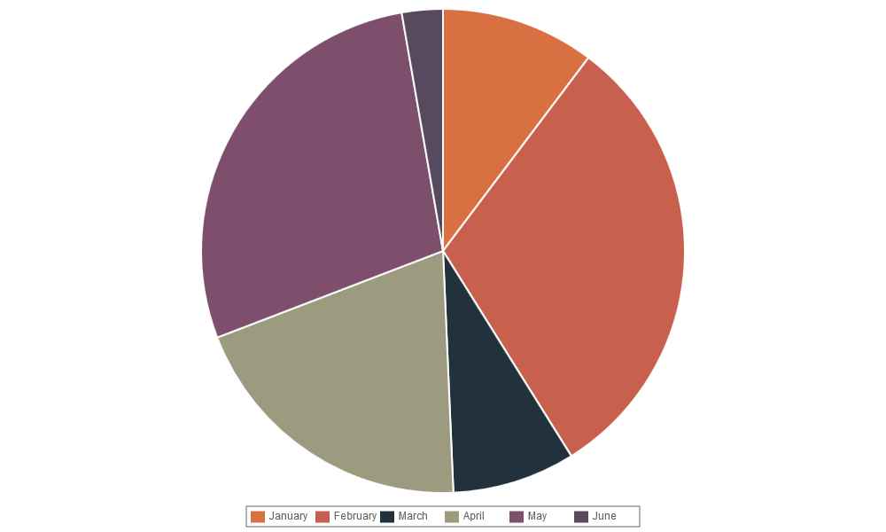
var data = {
datasets : [
    {
        fillColor : "#D97041",
        data : [30],
        title : "January"
    },
    {
        fillColor : "#C7604C",
        data : [90],
        title : "February"
    },
    {
        fillColor : "#21323D",
        data : [24],
        title : "March"
    },
    {
        fillColor : "#9D9B7F",
        data : [58],
        title : "April"
    },
    {
        fillColor : "#7D4F6D",
        data : [82],
        title : "May"
    },
    {
        fillColor : "#584A5E",
        data : [8],
        title : "June"
    }
]
Since ChartNew.js version 3, the Pie/Doughnut/PolarArea chart has a very similar data structure to the line chart with an array of datasets. Each dataset specifies a color and a data. Colors are in CSS format.
However, the old datastructure (as specified for Pie/Doughnut/PolarArea for Nick's Version of Chart.js) is still supported (see https://github.com/FVANCOP/ChartNew.js/wiki/033_version_3).
For each piece, you may supply a “title” (see the example).
If you specify more than one number for the data array, you got a multi-layer chart.
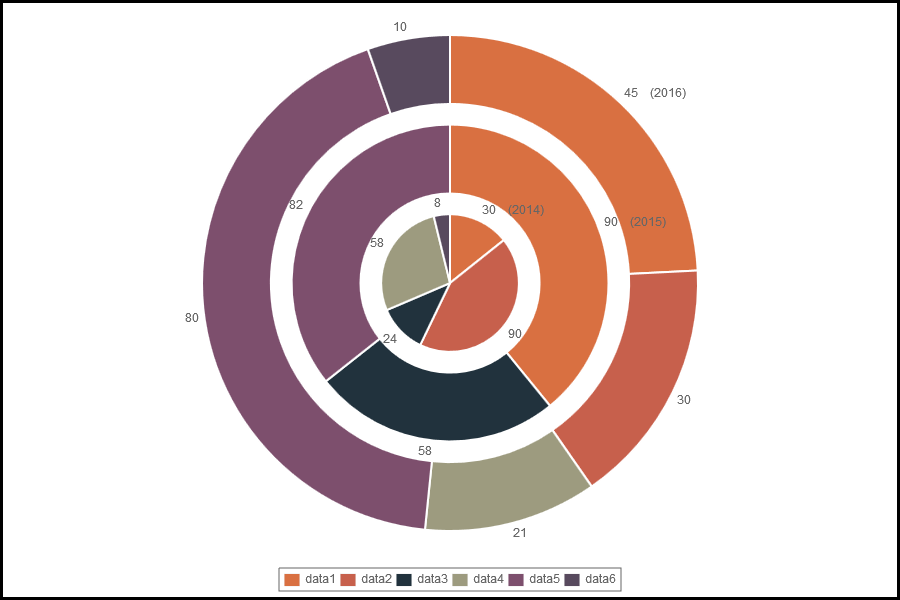
   var data = {
        labels : ["2014","2015","2016"],
        datasets : [
       {
         data : [30,90,45],
         fillColor : "#D97041",
         title : "data1"
       },
       {
         data : [90,,30],
         fillColor : "#C7604C",
         title : "data2"
       },
       {
         data : [24,58],
         fillColor : "#21323D",
         title : "data3"
       },
       {
         data : [58,,21],
         fillColor : "#9D9B7F",
         title : "data4"
       },
       {
         data : [,82,80],
         fillColor : "#7D4F6D",
         title : "data5"
       },
       {
         data : [8,,10],
         fillColor : "#584A5E",
         title : "data6"
       }
   ]
   };

   var options = {
         canvasBorders : true,
         canvasBordersWidth : 3,
         canvasBordersColor : "black",
         legend : true,
         inGraphDataShow : true,
         inGraphDataTmpl: "<%=v3 + (i==0 ?  '    ('+v2+')' : '')%>"
    };
##expandInRadius and expandOutRadius
For Pie and Doughnut charts, you can emphasize a piece by specifying expandInRadius (not available for Pie) and expandOutRadius for one or more data elements. This will expand outside (expandOutRadius) and/or inside (expandInRadius) of the data element.
As value, specify the proportion to add/reduce : 1 will duplicate the size; -0.5 will reduce the radius to the half.
Example :
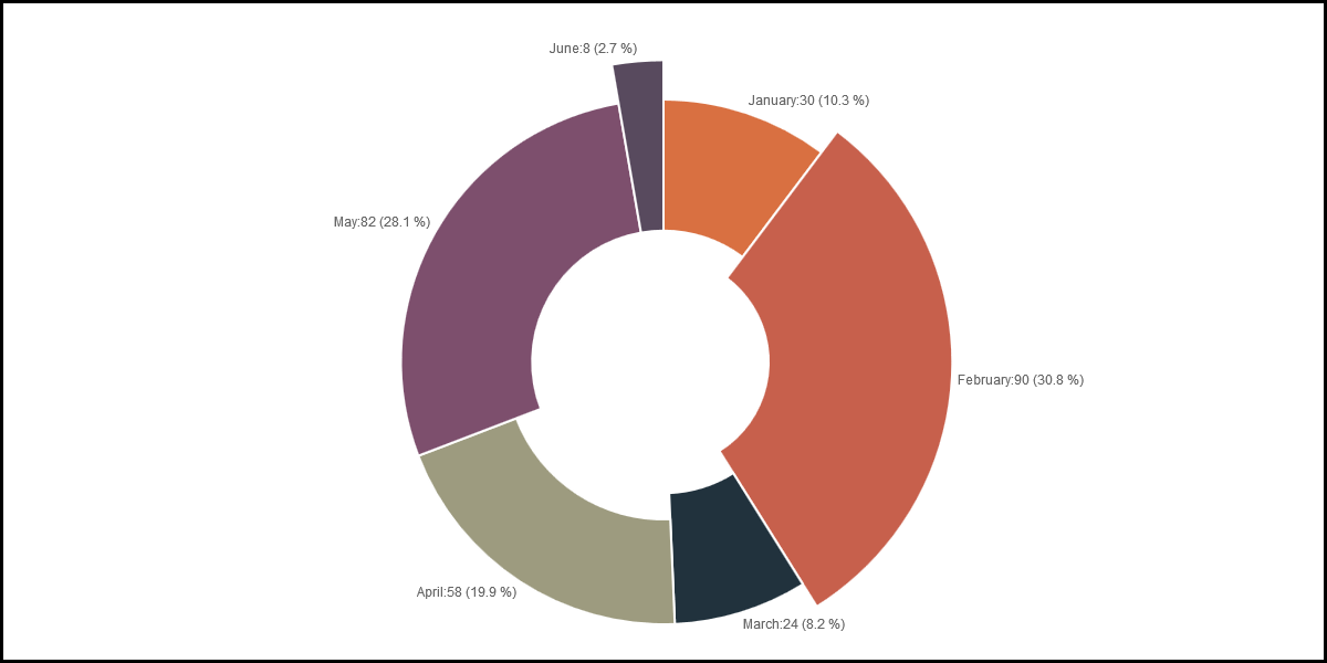
var data = {
datasets : [
    {
        fillColor : "#D97041",
        data : [30],
        title : "January"
    },
    {
        fillColor : "#C7604C",
        data : [90],
        title : "February",
        expandInRadius : 0.2,
        expandOutRadius : 0.2
    },
    {
        fillColor : "#21323D",
        data : [24],
        title : "March"
    },
    {
        fillColor : "#9D9B7F",
        data : [58],
        title : "April",
        expandInRadius : -0.2
    },
    {
        fillColor : "#7D4F6D",
        data : [82],
        title : "May"
    },
    {
        fillColor : "#584A5E",
        data : [8],
        title : "June",
        expandOutRadius : 0.3
    }
]
#OLD DATA STRUCTURE
Up to version 2.0 of ChartNew.js, the structure was the same as the data structure in Nick's version of Chart.js. Since version 3.0, it is strongly recommended to use the structure described here before, but it is still possible to use the data structure specified for Chart.js.
var data = [
{
    value : 30,
    color: "#D97041",
    title : "January"
},
{
    value : 90,
    color: "#C7604C",
    title : "February"
},
{
    value : 24,
    color: "#21323D",
    title : "March"
},
{
    value : 58,
    color: "#9D9B7F",
    title : "April"
},
{
    value : 82,
    color: "#7D4F6D",
    title : "May"
},
{
    value : 8,
    color: "#584A5E",
    title : "June"
}
]
As you can see, for the chart data you pass in an array of objects, with a value and a color. The value attribute should be a number, while the color attribute should be a string. Similar to CSS, for this string you can use HEX notation, RGB, RGBA or HSL.
For each piece, you can give a “title” (see the example).
##Array and function values (for Old structure)
The value associated to "color" can be a single value or a function.
##expandInRadius and expandOutRadius (Old Structure)
For Pie and Doughnut charts, you can emphasize a piece by specifying expandInRadius (not available for Pie) and expandOutRadius for one or more data elements. This will expand outside (expandOutRadius) and/or inside (expandInRadius) of the data element.
As value, specify the proportion to add/reduce : 1 will duplicate the size; -0.5 will reduce the radius to the half.
Example :
 var mydata = [
{
    value : 30,
    color: "#D97041",
    title : "January"
},
{
    value : 90,
    color: "#C7604C",
    title : "February",
    expandInRadius : 0.2,
    expandOutRadius : 0.2
},
{
    value : 24,
    color: "#21323D",
    title : "March"
},
{
    value : 58,
    color: "#9D9B7F",
    title : "April",
    expandInRadius : -0.2
},
{
    value : 82,
    color: "#7D4F6D",
    title : "May"
},
{
    value : 8,
    color: "#584A5E",
    title : "June",
    expandOutRadius : 0.3
}
]
Previous Chapter Previous Page Next Page Next Chapter Top of Page