Repository navigation
Mobile
English · Español
Proxy Builder also runs on Android phones and tablets. It is the same app, not a second one: one React interface that rearranges itself by screen format, the same Rust core, the same decks and the same .pbdeck files. This page is the reference for everything that exists only because of the touch screen or the Android system: the three formats, the touch rules, the back button, the app life cycle, files, the extra Android plugin, TLS, memory limits, what is missing and how to test it. Each area has its own page for the details; this one says how the pieces fit and why they are the way they are.
| Fact | Value | Where |
|---|---|---|
| Platform | Android 8.0 or newer (minSdk 26) |
src-tauri/tauri.android.conf.json (bundle.android.minSdkVersion), src-tauri/gen/android/app/build.gradle.kts
|
| Application id | com.estigio.proxybuilder |
src-tauri/gen/android/ |
| Architectures | the release APK is aarch64 (arm64) only; debug builds for the emulator are x86_64
|
Releases and Auto-Updates |
| Distribution | an .apk attached to each GitHub release; no app store
|
Releases and Auto-Updates |
| Updates | the app checks, downloads and hands the APK to the system installer | Settings and Shell |
| Launcher icon | made from the app's own icon (the desktop one, src-tauri/icons/), as an adaptive icon (mipmap-anydpi-v26/ic_launcher.xml) whose foreground sits on #1D1B19 (values/ic_launcher_background.xml), plus the PNG per density for older launchers |
src-tauri/gen/android/app/src/main/res/ |
| iOS | not built (see "What is not there") |
The Android project (src-tauri/gen/android/) is committed, unlike Tauri's usual generated folder: it carries the manifest with the app's intent-filters (proxybuilder:// links and .pbdeck files), the FileProvider and the signing configuration. Android-only configuration lives in src-tauri/tauri.android.conf.json, which Tauri merges over tauri.conf.json as a JSON patch (lists such as app.windows are replaced whole, so that file repeats the window). Capabilities are split by platform: capabilities/default.json is shared, escritorio.json has what only exists on desktop (the window-state plugin) and movil.json what only exists on a phone (the camera for the QR scanner).
Why one interface (and not separate mobile screens): duplicating screens would double every change and all 15 dictionaries. The cost is that every component has to answer "what does this look like at 400 px and with a finger?", which the rules below make mechanical.
useFormato() (src/lib/formato.ts) returns { tamano, tactil, horizontal } and writes data-formato and data-tactil on <html> (the CSS reads those). The hook listens to resize, orientationchange and the (pointer: coarse) media query, so rotating a tablet changes the format on the spot.
flowchart TD
    A["innerWidth / innerHeight (CSS px = dp on Android)"] --> B{"VITE_PB_FORMATO set (dev only)?"}
    B -->|yes| F["tamano = that value, tactil = true"]
    B -->|no| C{"touch? (pointer: coarse, Android/iOS)"}
    C -->|no| D["by width: under 640 movil, under 1024 tableta, else escritorio"]
    C -->|yes| E{"short side under 600 dp?"}
    E -->|yes| M["movil"]
    E -->|no| D
tamano |
Width | Typical device | Layout |
|---|---|---|---|
movil |
under 640 (or touch with a short side under 600) | phone | one pane at a time, bottom tab bar, full-screen dialogs |
tableta |
640 to 1023 | tablet, narrow desktop window | two panes, side sheets |
escritorio |
1024 or more | computer, wide tablet | the original three-pane layout, unchanged |
-
The short-side rule. With a finger, a short side under 600 dp means a phone even when it is on its side: a phone in landscape is about 914 x 411 dp, wider than 640, and by width alone it would be classed as a tablet. This is Android's own
sw600dprule. The game table is played in landscape, so without it the table would never get its phone layout. -
tactilis separate from the size. A narrow desktop window with a mouse istabletabut nottactil; a touch laptop isescritorioandtactil. Layout that depends on the finger (tablet panes, Export in a sheet) is checked withtamano === "tableta" && tactil; layout that depends only on room (a narrow window) usestamano. -
plataforma()/esMovil()(src/lib/plataforma.ts) answer a different question, "is this really Android or iOS?", from theapp_plataformacommand. Use it for things that exist only on a phone (Share, the system file picker), never a narrow window or a touch screen. -
Forcing a format in development.
VITE_PB_FORMATO=movil|tableta(read only whenimport.meta.env.DEV), because the desktop window hasminWidth: 960and could never show the phone layout. -
Desktop with a mouse does not change. Whatever was added for the finger is gated on
tactil(or on the pointer of the event), never on the width alone. So a desktop window between 960 and 1023 px, which istabletaby width, keeps the Design layout of always (the card list moves to a sheet only withtamano === "tableta" && tactil,disenar-screen.tsx), and on the table the zone labels, the large card view and the Crop dialog behave with the mouse as before (see Game Table and Designer UI). -
Touch changes the base size. Under
html[data-tactil](src/index.css) the root font size is 108 % (text-xsgoes from 12 to about 13 px; everything inremgrows with it),touch-action: manipulationremoves the 300 ms tap delay, tap highlight and overscroll are off, and buttons, inputs, selects and menu rows are at least 2.5 rem (about 43 px at 108 %). Why not more: at 116 % with 2.75 rem targets a phone screen filled up with huge buttons and the library spilled out sideways. A button inside aWithTooltiploses its owndata-slot="button"(the tooltip trigger sets its own), so the minimum also coversbutton[data-slot="tooltip-trigger"]; without it such buttons stayed at 24 px. A bar that needs to be more compact on purpose (the game table's phone bar) overrides the minimum with!classes, because theindex.cssrule outweighs a plain class. -
Sheets and dialogs always scroll with a finger. Two rules in
index.css: everyScrollAreainside adialog-contentbecomes a grid (grid-template-columns: minmax(0, 1fr),min-height: 0), because aScrollAreawhose root is not a grid does not scroll inside a dialog (its viewport asks forheight: 100%against an "auto" height) and theminmax(0, 1fr)column keeps a horizontal one from widening the dialog; and thedialog-contentitself getsoverflow-y: autowithoverscroll-behavior: contain, the net for a dialog withoutDialogCuerpoor a phone on its side. With a finger the native scroll is the right one (its bar floats and is not themed; theScrollArearule exists for the desktop bar of WebKitGTK). The result: a sheet or dialog never cuts off what does not fit. -
Overflow traps found by testing every screen (each one made content spill out of a phone dialog; the test method is below). (1) The touch minimum size (
html[data-tactil] button[data-slot="tooltip-trigger"], 2.5 rem) would not let a chart's bars shrink, because they are tooltip triggers in a row: a tooltip-trigger button that has to shrink carriesmin-w-0, which the rule respects for the width only. (2) The RadixScrollAreawraps its content in adivwithdisplay: table, which takes the width of what it holds, sotruncateandminmax(0, 1fr)grids did not shrink: inside a touch dialog thatdivis forced todisplay: block. (3) A<button>withflex-colgetsalign-items: flex-startfrom the browser, so its children do not stretch andtruncatenever cuts: it carriesitems-stretch. (4) The sheets' zoom fit ran once per session, so after rotating the phone the sheet was cut off: it refits whenever the width changes unless the person has pinched. (5) With touch, aFilalabel wraps instead of being cut with an ellipsis. -
Phone on its side. About 360 dp of height. Besides the rail and the one-row bars (see Shell), a dialog's description stays only for the screen reader and its footer is one row (
index.css,orientation: landscapeunderdata-formato="movil"); Statistics puts the section bar on the selector's row and shows the sections in two columns. -
How a phone screen is verified. Never by eye alone, and in every case: each screen and dialog, upright (411 x 914) and on its side (914 x 411), with data (results, long lists), with the keyboard open and after rotating. In the emulator, over Chrome's remote debugging, a script walks the open dialog and reports
scrollWidthgreater than the width, elements outside the viewport, scroll containers withoverflow-xthat actually scroll and buttons cut by a clipping ancestor; screenshots are then looked at by eye for what a script cannot see (text cut with an ellipsis, overlapping, a footer eating the height).
Hover and right click do not exist on a touch screen, so anything reachable only through them would be unreachable. pnpm check:tactil (scripts/sin-hover-solo.mjs, part of pnpm check) fails if any .ts/.tsx in src/ uses onMouseEnter, onPointerEnter, onMouseLeave, onPointerLeave, onMouseOver, onPointerOver or onContextMenu (as a prop) or addEventListener of mouseenter, pointerenter, mouseover, pointerover or contextmenu, unless the same line or one of the three before has a comment // táctil: <how it is done with a finger>. components/ui/ and components/tooltips-nativos.tsx are read-only and skipped. The comment is the design record: long press, one tap, or a "..." button.
-
"Finger" means
pointerType === "touch"only. A pen behaves like the mouse: it has a real hover and a native double click, sohayEncima(features/mesa/leer-en-grande.ts) treats"mouse"and"pen"as "something can be over this", and the drag threshold is 8 px only for"touch"(umbralDeinfeatures/mesa/gestos.ts; 5 px for mouse and pen). Why: a tablet with a fine pen would otherwise lose hover reading and get the coarse finger tolerances. -
Long press = right click. 500 ms with the finger still, tolerance 8 px (
MS_PULSACION,TOLERANCIA_PULSACIONinsrc/lib/pulsacion-larga.ts).crearDetectoris the pure part;usePulsacionLargagives the pointer handlers (only for finger and pen, the mouse keeps the right click) and swallows the click that follows the long press so it does not also act as a tap.PulsacionLarga(src/components/pulsacion-larga.tsx) wraps a container. A RadixContextMenuneeds none of it: it already opens at 700 ms. - One gesture per element. An element never mixes "hold to drag" with "hold for the menu": both would compete for the same finger. Cards of the deck sheets are dragged by a handle and open their menu with a tap; table cards drag once the finger moves more than 8 px and open their menu on a long press; library decks use the long press to enter selection mode and the "..." button for their menu.
-
A global
keydownmust treate.targetas possibly thedocument. The syntheticEscapethat "back" sends (below) is dispatched on the focused element, and ondocumentwhen nothing has focus, soe.targetmay not be anElement; handlers checkinstanceof Elementbefore callingclosestormatches.
On Android the app is always full screen: there is no status bar and no navigation bar (a swipe from the edge shows them for a moment). The activity does it, not the web: MainActivity.kt (src-tauri/gen/android/app/src/main/java/com/estigio/proxybuilder/) hides systemBars() with BEHAVIOR_SHOW_TRANSIENT_BARS_BY_SWIPE in onCreate and asks again in onResume and whenever the window regains focus (onWindowFocusChanged), because a system dialog, the keyboard or coming back from another app bring the bars back. The window background is black, so the moment before the WebView paints does not flash.
The camera notch is not solved in CSS either. A WindowInsets listener on the content view (android.R.id.content) pads that view by the displayCutout() insets and hands the WebView the insets with the cutout and the system bars set to zero. So inside the WebView env(safe-area-inset-*) is 0 and the notch is not counted twice. The keyboard (ime) is passed on: with it the visualViewport shrinks, which is what lib/teclado.ts measures (below).
Consequences in the web side:
-
html[data-tactil] #rootpads itself with plainenv(safe-area-inset-*); the old minimums of 24 px at the top and 14 px at the bottom (for WebViews that did not report the bars) are gone, since the bars are hidden. The rule stays for other platforms. The shell height ismin(100%, var(--alto-visible, 100dvh) - env(safe-area-inset-top)). Sheets and the tutorial card add the same insets (Hoja,Recorrido), which are 0 on Android. -
There is no full-screen button on a phone. The table bar's "Full screen" button and menu entry exist only off Android (
useEsMovil()inbarra-mesa.tsx; on desktop it is the window'ssetFullscreen). Theapp_pantalla_completacommand andandroid::pantalla_completaare still registered, but the screen no longer calls them. -
No phone screen scrolls sideways. The phone shell is
w-full overflow-clip(app-shell.tsx): nothing inside (a bar that does not fit, a grid) can widen the document. It isclipand nothiddenso it is not a scroll container the browser could move when something takes focus. Every phone screen is checked withscrollWidth === innerWidth.
Edge to edge (mandatory from Android 15) the system no longer resizes the window for the keyboard, so MainActivity.kt adds the keyboard's height to the padding of the view holding the WebView, as it does for the cutout, and passes the WebView the ime inset as zero; without this the keyboard covered what was being typed and the WebView never knew. On a phone on its side with the keyboard only about 150 dp remain, so whatever is not the field hides itself with landscape:[[data-formato=movil][data-teclado]_&]:hidden (Design's tabs and footer, Deck's list bar and footer, the game list editor's title and footer, the collection editor's bar and footer). engancharTeclado() (src/lib/teclado.ts, started by AppShell when the format is touch) measures the visual viewport and leaves two things on <html>: --alto-visible (the visible height in px, used by the shell) and data-teclado while the keyboard is open (the bottom tab bar hides itself so it does not eat room exactly when it is needed). The keyboard counts as open when the viewport shrank by more than 120 px (UMBRAL_TECLADO) against the tallest height seen at that width and a text field (input, textarea, select or contenteditable) has the focus (editando): without a field there can be no keyboard, so a split screen or a floating window that shrinks the view is not mistaken for one (and, with nothing to type, a change of window height resets the measure). Rotating resets it too. When it opens, the focused input is scrolled into view (a textarea is not: the card-list field grows with its text and the browser already follows the cursor). The Design screen has its own variant for its phone layout (see Designer UI). crearVigilaTeclado is pure and unit-tested.
src/lib/atras.ts handles Android's back button and gesture (enlazarAtras, called from main.tsx only on Android, which uses onBackButtonPress and so removes Tauri's default). One call to atras() does the first thing that applies:
-
An open Radix layer (
[role="dialog"],alertdialog,menu,listbox, each withdata-state="open"): the top one is closed by dispatching a syntheticEscape, which is what Radix understands. Only Radix layers count (they carrydata-state): arole="dialog"of our own whereEscapemakes a choice (the sparring ghost's reaction) is not one, because "back" must never take a game decision. TheEscapegoes to the focused element (document.activeElement, which Radix keeps inside the layer), not todocument, so the screen's shortcuts, which check whether the key comes from a dialog or a menu, do not also act on it (for example dropping the selection). -
The last registered handler (
registrarAtras, newest first; one that can do nothing returnsfalseand the next one is tried): the table's panels, the table itself, Design. -
The default (
fijarAtrasPorDefecto, set byAppShellwithatrasPorDefectoofshell/atras-shell.ts): "Press again to leave"; a second press within 2 s saves the deck and the card being designed and callsapp_salir. With a long job running or an update downloading (pendientes()oflib/cierre.ts) it does not leave: it says "Hay un trabajo en marcha; espera a que termine." instead, as closing the window on desktop asks first. From Design, back first returns to Deck (destinoDeAtras).
Why dialogs with sections cannot use registrarAtras: with a dialog open, step 1 consumes the back press and never reaches the registered handlers. A dialog that shows a list of sections (Settings, Statistics) therefore intercepts the Escape itself with onEscapeKeyDown={volverConEscape(enSeccion, volver)} (src/lib/seccion-movil.ts): inside a section it goes back to the list, not out of the dialog.
On Android there is no "close". The system freezes the process about 10 s after the app goes to the background (Android 14 and later) and may kill it afterwards, and it gives no warning before. So everything is saved on the way out:
-
src/lib/ciclo-de-vida.tssaves the deck and the card open in Design onvisibilitychangetohidden(the first signal, before the JS can be frozen) and on theciclo://pausaevent. The deck-name field commits its text first (a capture-phase listener inAppShell), because it keeps focus when the app leaves. -
src-tauri/src/ciclo.rs(on_window_event) reacts toWindowEvent::Suspended: it saves the open table game (guardar_si_toca) and emitsciclo://pausa. OnWindowEvent::Resumedit emitsciclo://vueltaand tells the iroh node the network may have changed (network_change()), so an online game reconnects by itself as after a network drop. -
Why not
install_android_jni_context: iroh offers it so its network monitor can see Android's connectivity, but tao (Tauri's window layer) already installs that context and a second call panics. Onlynetwork_change()is called. - On desktop none of this runs (the handlers are
#[cfg(mobile)]).
The phone shell also skips the "discard changes?" prompt that desktop and tablet show when leaving Design with an unsaved card: on a phone the card is saved on the spot and then the screen changes (Settings and Shell).
| Piece | Use |
|---|---|
DialogoAdaptable (src/components/dialogo-adaptable.tsx) |
The DialogContent of always on desktop and tablet; full screen on a phone with safe areas, a 44 px close button, the title not under it and the footer buttons stacked at the bottom with the main one last. compacto keeps a short notice as a centred card. Full screen also cancels every sm:max-w-* … 2xl:max-w-* a dialog brings (sm:max-w-none md:max-w-none …): a phone on its side is already sm: wide, and a dialog's own sm:max-w-lg would otherwise shrink the "full screen" to a box. A new dialog uses it, never a bare DialogContent (Confirmar is the exception: it stays a centred card). |
Hoja (src/components/hoja.tsx) |
A panel that rises from the bottom (lado="abajo", phone) or enters from the right (lado="derecha", tablet). It is a DialogContent with another placement, so it inherits focus, Escape, the back button and the unsaved-changes prompt. On a phone it is used through HojaMenu (below); directly, for the Design card list and Export on a tablet. |
Context menus (ContenidoContextual, ContextMenuSubContent) |
On a phone (data-formato="movil") they rise from the bottom as a full-width sheet with the page dimmed behind, and a submenu rises as a second sheet over it, instead of opening at the finger. Radix places a context menu beside the touch point and can only shift it vertically: an 18 rem menu on a 411 dp screen fits neither right nor left of a touch between roughly 25 % and 65 % of the width, so it left the screen and its texts were cut. The rule is CSS in src/index.css (components/ui/ is read-only) on Radix's popper wrapper, with !important because Radix writes the position inline, and will-change: auto because Radix's will-change: transform would make the dimmed backdrop relative to the wrapper instead of the screen. Height is capped at 75 dvh and scrolls; width at 28 rem, centred (landscape). Any new ContenidoContextual gets it for free; do not size one with the pointer in mind. Tablet and desktop keep the menu at the pointer. |
ListaSecciones + BarraSeccion (src/components/lista-secciones.tsx) |
Replaces tabs or stacked sections in a phone dialog: a list of big rows, each entering a section, with a bar to go back. Settings and Statistics use it. |
cambiosSinGuardar={false} |
A dialog or sheet made of switches and checkboxes passes it so closing never asks "discard changes?". |
Tailwind arbitrary variants are written as whole class names ([[data-tactil]_&]:min-h-11), because the class scanner cannot see built-up strings.
So that every phone screen looks the same, the top bar, the menus and the panels that rise from the bottom are always the same components:
| Piece | Use |
|---|---|
BarraSuperior (src/components/barra-superior.tsx) |
The top bar of a phone screen: 3 rem high, the title on the left (truncated if it does not fit), the actions on the right as icon buttons (size="icon-sm" with aria-label), the main one with text and the secondary ones in a "..." (BotonMenu). It never spills sideways: the title shrinks, the actions do not. Library, Deck → List and the shell's header of Deck use it; Library on its side and «Play» leave it out and keep one row with the search field (enUnaFila). (The shell header is the same 3 rem bar with the deck name as an editable field and the save indicator as an icon, SaveIndicator compacto.) |
HojaMenu (src/components/hoja-menu.tsx) |
The pattern of every phone sheet: it rises from the bottom (it is a Hoja, which is not touched), with a 3 rem header (title on the left, the X always in the same place on the right) and below it a body that scrolls with the finger (DialogCuerpo). Optional pie (buttons fixed at the bottom, outside the scroll) and sinRelleno (a list of rows that brings its own padding). It does not focus anything when it opens, because the first button would show its tooltip. A menu is a HojaMenu of FilaMenus; an options panel is a HojaMenu with whatever it holds. |
CabeceraHoja, CLASES_HOJA_MENU
|
The same header and X placement for a sheet that does not use HojaMenu whole (a body with its own scroll: the card list in Design). |
FilaMenu |
A menu row inside a HojaMenu: icon, text and, on the right, whatever it needs (a count, a switch, a mark such as the update dot). Tapping it closes the sheet unless mantener. |
BotonMenu |
The "..." of a phone bar: an icon button that opens a HojaMenu with the secondary actions. |
ItemHoja, SeparadorHoja, SubHoja, SubHojaFila, SubHojaContenido, CasillaHoja
|
The pieces of a Radix menu (Item, Separator, Sub, SubTrigger, SubContent, CheckboxItem) drawn as HojaMenu rows, so that one menu definition opens as a dropdown with the mouse and as a sheet on a phone. A submenu unfolds below its row; onSelect receives an event and preventDefault() keeps the sheet open, as in Radix. |
BotonMenuDeck (features/library/menu-deck.tsx) |
The "..." of a deck: a dropdown with the mouse and, on a phone, a HojaMenu titled with the deck's name, built from the same Items through those pieces. |
useNombreDeck() (src/lib/use-nombre-deck.ts, src/lib/nombre-deck.ts) |
A deck's name as it is shown. A new deck is born as "Untitled deck" in the interface language of that moment; the app starts in English the first time, so after switching language it would keep saying "Untitled deck". While it has not been renamed it is shown in the current language: nombreVisible recognises the factory name in any of the 15 languages (NOMBRES_SIN_TITULO, checked by a test against the dictionaries). Display only, what is saved does not change; the file name (nombreSeguro in features/export/acciones.ts) and the name of a duplicate use it too. |
Why components and not just conventions: the phone screens were drifting apart (headers of different heights, menus as dialogs, sheets as dropdowns, the X in different places). With the pieces, a new screen is consistent by construction.
A Radix Tooltip does not appear on a tap. Three replacements, depending on what the tooltip says:
-
Information of substance (an explanation, a warning):
ConAyuda(src/components/con-ayuda.tsx). On desktop it is the usual tooltip (the wrapper isdisplay: contents, so layout is untouched); with touch it adds an "i" (AyudaTactil, shown only under[data-tactil]) that opens aPopoverwith the same text;claseAyudagives that "i" its own classes (Design makes it bigger next to a big button,AYUDA_GRANDE).Filaincomponents/campos.tsxuses it for the help of a setting; withapilarEnMovilthe label goes above its control on a phone (at 411 px both do not fit on one line) and, with touch, a long label wraps instead of being cut. On desktopapilarEnMovilchanges nothing. -
Marks and icons without an action of their own that carry information (whose damage a commander counter is, who is watching):
AyudaAlTocar(src/components/ayuda-al-tocar.tsx), aPopoveron tap. -
Icon-only buttons: their name goes in
aria-label(tooltips-nativos.tsxalready moves atitletoaria-labelfor them) and holding the button shows a small label above it, as Android does (src/components/etiquetas-tactiles.tsx, mounted once inmain.tsx). Menu shortcut hints (ContextMenuShortcut,DropdownMenuShortcut) are hidden by CSS with touch: there is no keyboard.
A tutorial step that names the mouse or the keyboard carries tactil: { texto } (Tutorials).
-
Shell. Phone: a 3 rem header with the deck name and the save indicator as an icon (Deck only; Design's own bar says both), a bottom bar of Deck, Design, Library, Play and "More" (a
HojaMenuwith Settings, the screen's tutorial and the update button), and Deck as three tabs (List, Sheets, Export). On its side the bar becomes a rail on the left (lado) and Deck's tabs go inside the header (enCabecera): about 360 dp of height do not bear stacked rows. Tablet with touch: two panes and Export in a side sheet. Desktop: unchanged. See Settings and Shell. -
Library. A
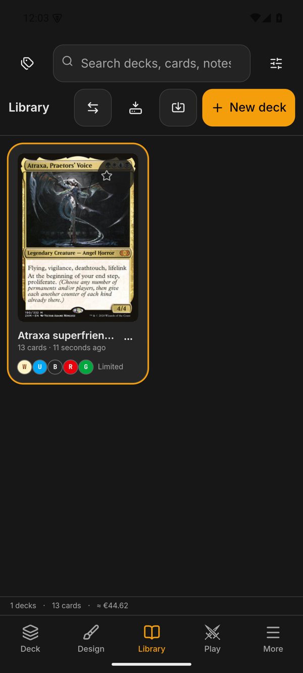
BarraSuperiorwith "New deck" and a "..." (Send / Receive, Import .pbdeck, Free up space); below it the search field with Tags and "Filters and sort", bothHojaMenus. Two columns (one under 360 px; cards of about 170 px with the phone on its side), the deck menu as a sheet (BotonMenuDeck), selection by long press. See Deck Library. -
Deck → List. A
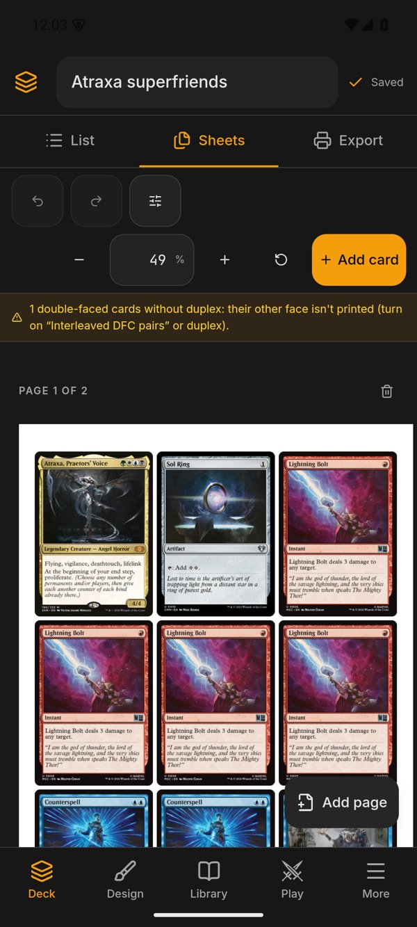
BarraSuperior"Card list" with the set browser and a "..." (example list, clear the box), and everything below in one column that scrolls (no resize handle: with a finger the height is not shared out). See Decklist Panel. - Deck → Sheets. The sheets bar is one 3 rem row (undo, redo, "View options" and "Add card"); the zoom and the rest of the bar's actions are in the "View options" sheet. Pinch zoom on the sheets (the first time sheets appear on a phone, the zoom fits the sheet to the screen width), a handle to drag a card, a tap on a selected card opens its menu. See Live Preview.
- Deck → Export. The same panel without its "Export" heading (the tab above already says it). See Export.
-
Design. The same
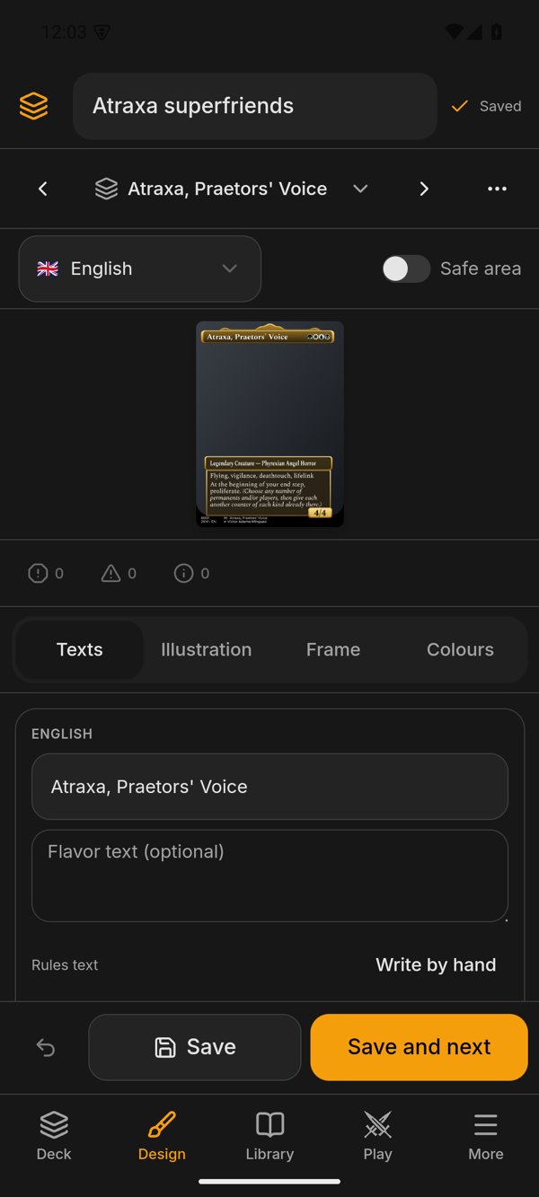
Formulario, six tabs and options as on desktop. Upright, the card on top with its controls floating beside it and the form below; on its side, the card at full height and the form on its right. The toolbar's tools (renumbering, designing the deck, PNG export, collections, fonts and packs) are in the "..." sheet. Tablet: the card list moves into a sheet. Illustration moves with fingers: one drags, two pinch. See Designer UI. -
The game table on a phone (
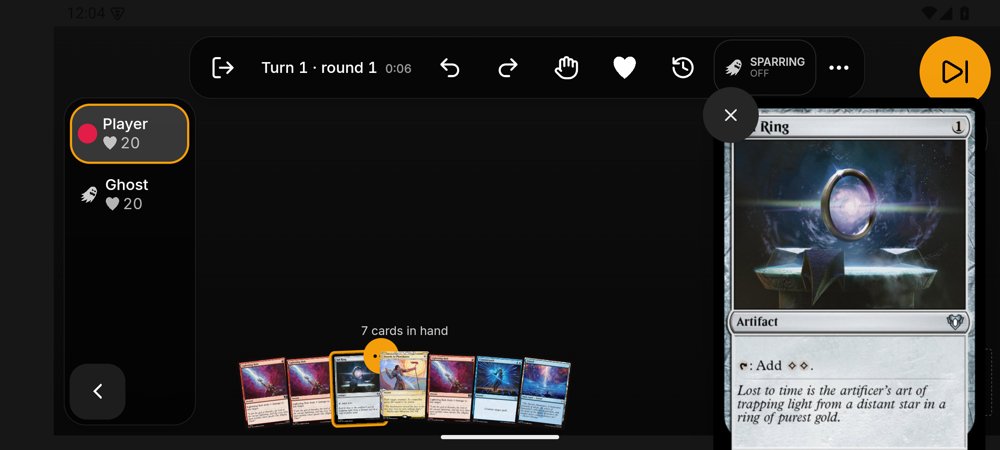
useMesaMovil(), short side under 600 dp): one board at a time with a seats bar, a full-screen "Hand" and life screen, round "Pass turn" button, the table taking the whole screen (shell bars hidden,useMesaAPantallaCompleta) and a "Rotate the phone" notice in portrait (not during the mulligan: the opening hand reads well upright). The table bar is compact on purpose (BOTON_MOVIL, 36 px buttons) and in portrait it is a single row up to "Pass turn", with hand, life, log and chat in its "..."; a card read large isLecturaMovil(the whole card, X outside it); the mulligan on its side is one row (cartaEnFila); "Play" keeps name, format and list in view and the rest in the "Game options" sheet (PanelEmpezarMovil,entrada-movil.tsx). Card gestures: moving more than 8 px drags, 500 ms opens the menu, a tap reads the card large (useLeerEnGrande, never a bareonPointerEnter), a double tap acts. Two fingers zoom and pan the battlefield (touch only; the mouse never had it). Cards sit in a zoomed layer, so positions are never converted by hand withdisp.campo;touch-action: noneis set only on the board. With zoom, the cards and what is drawn over the battlefield (counters, arrows, the other players' ghosts) are clipped to the visible part of the battlefield (Recortadointablero.tsx), so they never cover the zones. With shared life (Two-Headed Giant) a team is one target for life on the life screen (objetivoQueCuentainfeatures/mesa/movil/cuentas-vida.ts): choosing both partners does not change it twice. Touch factory values: shadows off and dice in CSS 3D (mesaDeFabricaPara), and the screen stays on while a game is open (pantalla_encendida, the window flagFLAG_KEEP_SCREEN_ON). Details in Game Table and Online Play. - Tutorials run on every format (Tutorials).
Android's file pickers do not give paths but content:// URIs: a permission the system grants to that one file, with no folder and often no extension. The rule is every command that reads or writes a file the person chose goes through src-tauri/src/fichero.rs, never std::fs on a dialog path.
-
Reading a
content://copies it to the cache (app_cache_dir/fichero/) and works on the copy, which is deleted when theCopiais dropped. Why a copy: a cloud provider can hand over a pipe with noSeek, and the ZIP inside a.pbdeckneeds it. -
Writing writes to the cache and copies to the destination, because a
content://cannot be renamed (the atomic write of desktop does not apply). The destination is opened withtauri-plugin-fsfrom Rust only (app.fs().open), so nofs:permissions are exposed to the webview. -
Name and format come as parameters: a
content://has no extension, so the display name is asked from Android (android::nombre_de_uri) and commands that depend on the format (image, font, text list) take it from that name. File dialogs on Android use MIME types instead of extensions (Android does not know.pbdeckor.ttf) and remember no folder (src/lib/dialogos.ts). -
Folders do not exist. The picker cannot choose a folder, so a split PDF (every N sheets) and PNG export come out as one ZIP (
export_pdfwith itszipparameter,fichero::zip_de_lista). -
Share replaces "Show in folder" and "Open": after saving, the notice offers Share, which opens the system sheet (
compartir_fichero). That command only shares acontent://URI (copied to the cache first) or a file insideapp_cache_dir(a file elsewhere in the cache is copied to the share folder); any other path, also one that leaves the cache through..or a link (both sides are canonicalised), fails withInvalidInput,motivo: compartir_fuera(fichero.rs::para_compartir_con). Why: the command is open to the webview, and without the check it could hand any of the app's files (the network identity's key, the database) to another app;export_openalso shares on Android becauseACTION_VIEWwith a file path throwsFileUriExposedException. The export menu has "Share the PDF", "Share the list (text)" and "Share the deck (.pbdeck)" (features/export/menu-exportar.tsx). A game invitation code is shared as a small text file (app_compartir_texto); some messaging apps attach it instead of pasting it. Inferred: a dedicated text-share command in the plugin would paste it; not done. -
Opening a
.pbdeckfrom another app (Files, Drive, a message): anACTION_VIEWintent-filterin the manifest..pbdeckhas no MIME type of its own, so the filter accepts zip and generic binary types with a path ending.pbdeck. It lists fourpathPatterns, with zero to three extra dots before.pbdeck(.*\\.pbdeck,.*\\..*\\.pbdeck…): Android'sPatternMatcherdoes not backtrack,.*stops at the first dot, and a name such asmy.deck.pbdeckwould not match a single pattern. A second filter, limited to the Downloads provider (com.android.providers.downloads.documents), covers URIs like.../document/msf:1234that carry no name. Side effect: the app appears in "Open with" for any binary in Downloads, and Rust rejects what is not a package when it reads it. The plugin picks up the URI andsrc-tauri/src/abrir.rskeeps it and emitspbdeck://abierto; if the app was started by that file the screen is not listening yet and asks for it withpbdeck_pendiente, which returns it once. The plugin ignores the start intent when it carriesFLAG_ACTIVITY_LAUNCHED_FROM_HISTORY(loadinAndroidExtraPlugin.kt): reopening the app from Recents after the system killed the process delivers again the intent it was first opened with, and that.pbdeckwas already imported. Nothing is imported without asking: the import dialog (the one used to receive a deck from another device) shows what the package holds and asks how to import it (Deck Sharing, Deck Package Format). -
Dropping files onto the preview does not exist on a phone (
useArrastrarFicheroschecksesMovil()); "Add images" opens the picker.
What only Android does is written in Kotlin in one small plugin of our own, src-tauri/plugins/android-extra/ (AndroidExtraPlugin.kt), and is called only from Rust through src-tauri/src/android.rs. The screen never calls the plugin: it asks a Rust command, which calls crate::android::*.
Function (android.rs) |
What it does |
|---|---|
compartir(ruta, tipo) |
ACTION_SEND of a file already written in the cache, through the app's FileProvider
|
pantalla_encendida(si) |
keeps the screen on while a table game is open |
pantalla_completa(si) |
hides or shows the system bars. Kept, but the screen no longer calls it: MainActivity.kt keeps the app full screen all the time |
multicast(uso, si) |
holds a Wi-Fi MulticastLock (without it Android filters the multicast packets that "devices nearby" discovery needs) while the nearby search or «Recibir» is open. The Kotlin side has a single lock with no counter, so Rust counts who uses it (UsoMulticast::Buscar / Recibir, a set: asking twice for the same use does not count twice) and only takes it with the first use and releases it with the last, so closing «Recibir» does not leave the search without it |
instalar_apk(ruta) |
hands the downloaded APK to the system installer; if the app may not install packages it opens that setting instead and fails with Unsupported, motivo: instalar_permiso
|
nombre_de_uri(uri) |
the display name of a content://
|
nombre_equipo() |
the device's name, or else make and model, to introduce itself to other devices |
(escucharAbiertos, onNewIntent) |
pick up the URI of a file opened from another app |
On desktop each one is a no-op (Ok) when there is nothing to do (screen, bars, multicast) or returns Unsupported when it makes no sense without Android; a command that uses them treats Unsupported as "nothing to do" when that is the case. Why our own plugin and not tauri-plugin-sharekit or tauri-plugin-android-installer: they were pre-release or very new, and these are three short intents; our own depends on no third party and is the place where an iOS equivalent would live (an ios/ folder in Swift).
src-tauri/src/tls.rs is the only place that builds TLS configuration: no reqwest::Client::builder(), with_platform_verifier or CaTlsConfig:: anywhere else (a test enforces it). Its consumers are the HTTP clients (the updater included), the WebSocket of the rooms server and the iroh node. On desktop it is the system verifier (rustls-platform-verifier). On mobile it is the Mozilla root certificates embedded in the app (webpki-root-certs, and CaTlsConfig::embedded() for iroh). Why: the system verifier panics on Android unless it is initialised with its own Kotlin part; embedding the roots needs no Kotlin and no JNI at start-up, and with three consumers an initialisation failure would have taken all three down. The price is that certificate authorities a person installs by hand on the phone are not trusted, which this app does not need.
A phone has far less memory than a computer, and the system kills the app instead of swapping.
-
Export.
export_estimatereturns, besides size and image count,files(how many PDFs will come out),memory(roughly what composing will need) andlowMemory.lowMemoryis true when the need exceeds 60 % of the memory the machine reports free (sysinfo), because the system and other apps use the rest. The "The PDF will be very large" notice then adds that the device is low on memory and the app could close, and offers "Lower to JPEG 90". Export quality is not lowered by default on mobile (600 DPI is the factory value everywhere): the warning is the protection. -
Touch factory values (
src/stores/ui-store.ts, only the starting point; what a person saved wins): preview thumbnail width 244 instead of 488 on a phone or tablet with touch (calidadVistaDeFabrica; a touch laptop is desktop and keeps 488), and the table with shadows off and CSS 3D dice (mesaDeFabricaPara), since three.js and Rapier are heavy on a modest phone. - OCR keeps its model-download notice as on desktop.
-
Pasting images from the clipboard. Tauri's clipboard plugin gives text only on Android, so reading an image fails with
Unsupported(diseno/portapapeles.rs;arboardis built only for Windows and macOS). Pick the image with the file picker instead. - Dropping files onto the app: no drag from other apps; "Add images" opens the picker.
- Choosing a folder: not offered by the Android picker; exports become ZIPs.
- Show in folder: replaced by Share.
-
Window-state and single-instance are desktop-only plugins (Android has no window position to remember, and the system already keeps one instance).
proxybuilder://links do work on Android: the deep-link plugin is built for both and its mobile configuration (plugins.deep-link.mobileintauri.conf.json, custom scheme, no app links) generates the manifest'sintent-filter. - Bluetooth for passing decks: deliberately not built. WebKitGTK has no Web Bluetooth, Rust Bluetooth libraries behave badly on desktop (and the computer must be able to act as the sender), and Bluetooth is very slow for several MB of images. Decks travel over iroh (nearby devices, QR or code), which is the same piece the game table uses; the system's own Bluetooth is still reachable by hand through Share. See Deck Sharing.
-
iOS. Not built. The code is kept portable (
#[cfg(mobile)]and"platforms": ["android", "iOS"]wherever nothing is Android-specific; Kotlin isolated in the plugin;esMovil()is true for iOS too), but nothing has been compiled or run on it. To publish it, the following is missing: a Mac or a macOS runner in the CI; an Apple developer account (paid, yearly); code signing and provisioning profiles; the Swift plugin equivalent toandroid-extra; and no in-app updater outside the App Store or TestFlight. App Store review might also object to an app for printing proxies. Inferred: a first compile for iOS would surface further gaps in code that has never been built for it.
-
Environment.
. scripts/android-env.shsets the Android SDK, JDK 21, the NDK 28.2 and the Rust cross-compilers (CC_*, linkers foraarch64andx86_64). Android Gradle needs JDK 21 (the lint step fails on 17) and a stable NDK. -
Checks.
pnpm checkincludescheck:tactil;pnpm check:clippy-androidruns clippy on the library foraarch64-linux-androidso thecfg(mobile)branches are checked too; both desktop checks keep their usual meaning. See Testing and CI. -
Build.
pnpm tauri android build --apk --target aarch64gives the release APK;pnpm tauri android devruns a debug build on a connected device or emulator. An emulator isx86_64, so debug builds for it use that target. -
Emulator. Create two virtual devices defined in dp, because the format cut-offs are CSS px, which are dp on Android: a phone around 411 x 914 dp and a tablet of 1280 x 800 dp. A tablet in landscape at 1280 dp is
escritorioby the cut-offs on purpose; test it also in portrait (800 dp,tableta). Start it headless withemulator -avd <name> -no-window -no-audio -no-snapshot -gpu swiftshader_indirect, wait foradb shell getprop sys.boot_completed= 1, install withadb installand take screenshots withadb exec-out screencap -p. Chrome's remote debugging can inspect the WebView. -
Layout without Android.
VITE_PB_FORMATO=movil pnpm tauri devshows the phone layout on desktop (no safe areas, no keyboard, no system back button). - Two things an emulator cannot show: device-to-device discovery by multicast (the emulator's network does not pass it and a computer cannot call the emulator, so between a desktop and an emulator the emulator always calls) and real camera scanning of a QR code; those need a physical phone.
- Release signing. An APK signed with another key does not install over an installed one, and uninstalling erases the library; the signing key is as irreplaceable as the updater's. See Releases and Auto-Updates.
- Never decide "mobile" by the window width: use
useFormato()for layout andesMovil()for platform features. - A hover or right-click handler without a
// táctil:comment breakspnpm check. - A new dialog uses
DialogoAdaptable; a panel,Hoja; a dialog with sections,ListaSeccionesandvolverConEscape. - A phone screen's top bar is
BarraSuperior; a menu or panel that rises isHojaMenu(rowsFilaMenu, secondary actions in aBotonMenu); a deck's menu isBotonMenuDeck; a deck's name on screen goes throughuseNombreDeck(). - Do not add a full-screen toggle for Android, nor safe-area minimums in CSS: the activity hides the bars and leaves out the notch. Check a new phone screen for sideways scroll (
scrollWidth === innerWidth). - Any file chosen by the person goes through
fichero.rs; any Android-only feature goes through the plugin andandroid.rs, called from Rust. - Do not call
install_android_jni_context; do not add a TLS client outsidetls.rs. - Scroll must still be tested in the target WebView: Android's is Chromium, not WebKitGTK, and its scroll and keyboard behaviour differ.