Repository navigation
Customization
A "wall" is a public, unauthenticated display page (/wall/:slug) meant for a TV or
kiosk display. Everything below is configured per wall in the admin's Wall Editor:
Screens → Walls → Edit wall (editor role or higher). This doc explains what each option
actually does, sourced from the wall config schema (src/server/core/wallConfig.ts).
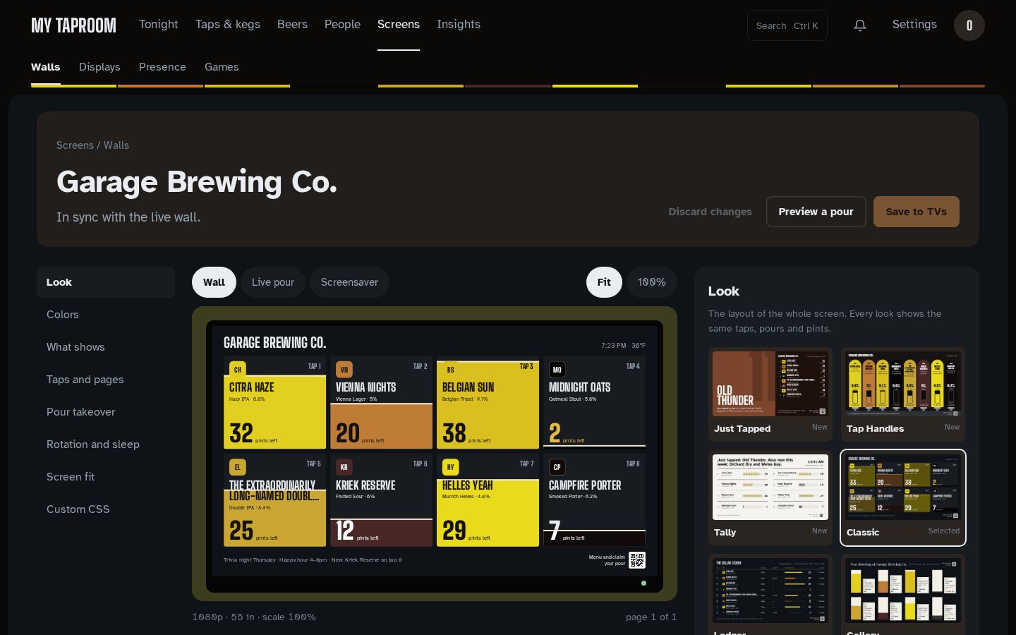
The editor is a studio in three parts:
- A rail of eight sections on the left: Look, Colors, What shows, Taps and pages, Pour takeover, Rotation and sleep, Screen fit, Custom CSS. A dot marks every section with unsaved changes; Undo in a section puts just that section back, Discard changes puts back everything.
- A live 16:9 stage in the middle, drawn from the draft with this wall's own taps (the taps on the monitors it's assigned). Switch it between Wall, Live pour (a pour held half-way in the chosen takeover style) and Screensaver, between Fit and 100%, and between pages. Preview a pour plays one whole pour; nothing is recorded. Under the stage: which taps the wall shows, which paired screens get it on save, and the spotlight.
- The inspector on the right: the 14-look gallery, theme swatches (individual colors under a disclosure), plain fields elsewhere, and custom CSS checked before it saves.
Nothing reaches a TV until Save to TVs. Leaving with unsaved changes asks first.
Screens → Walls draws each wall as a small TV showing its own taps and look, with a strip of its beers above and a light that's on while a paired screen plays it. Edit wall opens the editor; More holds Open the wall, Copy link, the full-size view and Delete. In the editor the preview hangs on a wall tinted by the leading beer, with a power light that's lit when the TVs have your changes and amber while they aren't saved yet.
Screens → Presence shows each wall's lamp (lit when awake, half lit on the screensaver, a ring when off), and once several walls never rest or sleep they fold into one line. Screens → Games reads like a specials board, with the game being played on top.
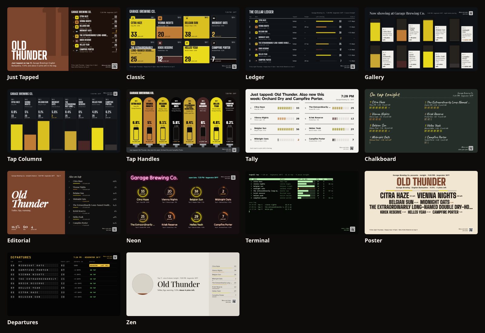
A wall's look is its whole layout. Kegwall 2.0 redraws the looks so a wall reads like a taproom board rather than a dashboard. Every redrawn look:
- shows each beer's real color (from its SRM) and a tap marker: the beer's color, its initials and its tap number. Uploaded label art replaces the initials;
- states what's left twice: as a picture (a fill, a bar, a plate) and in servings, for example "≈ 32 pints left". Servings use Settings → Site → Serving size: a pint-sized serving (440–600 mL) reads as pints, anything else as pours;
- is drawn on a fixed 1920 × 1080 layout scaled to the screen, so a 720p, 1080p or 4K TV shows the same composition (letterboxed in the theme's background if the screen isn't 16:9). Display fit → UI scale still enlarges the type;
- uses the Kegwall type (Big Shoulders Display and Atkinson Hyperlegible) whatever the theme's own fonts are, and picks text colors that meet WCAG contrast in every theme.
| Look | What it is | Taps per page |
|---|---|---|
just-tapped (default for new walls) |
The spotlight keg owns half the screen as a field of its own color, with its tap number set huge. The rest are listed beside it with pints left. Kicked kegs move to a sentence in the footer | 12 |
classic |
Every card is its keg, filled from the bottom to the level, pints left as the big number. 1–4 taps show as large cards, 5–8 as two rows of cards, 9–12 as board rows | 12 |
ledger |
The cellar ledger: when each keg went on, what poured tonight, a level bar with pints left, and when it will kick | 12 |
columns |
Each column is the keg, filled in the beer's color | 8 |
gallery |
A museum wall: each beer a framed plate painted to its level, with a wall label | 8 |
handles (new) |
The bar back: each tap is a handle in its beer's color with a sight glass showing the level; a pouring handle tips forward. The drip tray carries the wall's headline sentence | 8 |
tally (new) |
A tally board: the night written as a sentence, each keg's remaining pints as tally marks (one mark = five pints for very large kegs) | 12 |
chalkboard |
The chalk menu: prices when you show them, pints left as chalk tally gates | 8 |
editorial |
A magazine feature on the spotlight keg, with the others as the contents page | 12 |
neon |
A wall of bar signs; each neon ring is drawn as far round as the keg is full | 8 |
terminal |
top for the taps: ASCII level bars, pours in the last hour, tonight's volume, the pour log |
12 |
poster |
A festival line-up: the spotlight keg headlines, the rest billed below with pints left | 12 |
departures |
A split-flap board: kegs sorted by when they'll kick; low kegs are boarding, kicked kegs have departed | 11 |
zen |
One beer at a time: the spotlight keg's orb holds what's left, with a quiet list beside it | 12 |
Just Tapped, Classic, Ledger, Columns and Gallery take their colors from the wall's theme. The others are drawn in their own material (slate, paper, a black board, neon on brick) and look the same whatever theme is picked. Editorial, Poster, Zen and Just Tapped feature the spotlight keg.
Spotlight: by default the most recently tapped keg leads. Pin a tap to keep one beer in the spotlight; if that tap is empty or kicked, the newest keg leads instead.
Kick forecast and tonight. "Tonight" counts pours since 4 am, so a late night stays one night. The kick forecast divides what's left by the keg's pour rate over the last 7 days (or since it was tapped, if that's sooner).
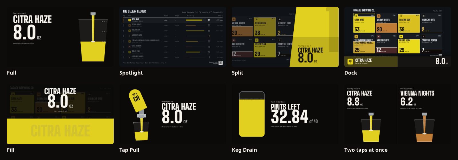
When a tap pours past the wall's trigger (Pour takeover → trigger, 60 mL / about 2 oz by default, so foam blips never flash the screen), the wall reacts in the chosen style:
| Style | What happens |
|---|---|
full |
The screen becomes the beer: its name, a large live counter, and a glass filling by measured volume over your serving size (8/12/16 oz marks on a pint), with a stream of beer from the spout. The head forms past half a glass; when a pour fills the glass (85 % of a serving or more) the head rises to the rim and spills over at the finish |
spotlight |
The wall stays; every pouring row or card lifts and the rest dim |
split |
The wall slides aside and a panel in the beer's color rises with the counter |
dock |
A bar rises from the bottom and fills left to right; the wall shrinks toward the top to make room, so its header stays on screen |
fill |
The screen floods with the beer to the measured level, then drains |
off (Badge) |
Nothing moves: the pouring row shows "Pouring now · 8.0 oz" in the look itself |
tappull |
A giant handle in the beer's color swings forward on its pivot; the glass starts tilted, straightens as it fills, and slides off down the bar at the finish |
kegdrain |
The other side of the pour: the keg empties live, pints left count down to two decimals, a dashed line marks where the keg stood, with the kick forecast |
gameon |
Only while a drinking game runs: the standings stay up during the pour, and when it's recorded the pourer's bar moves and a new leader is called out. With no game running it behaves like full
|
Finish — Recorded volume (default) or Cheers: a single full-screen pour (Full, Split,
Fill, Tap Pull, Keg Drain) ends with two glasses meeting, "Cheers, Alex", the recorded volume
and the pourer's passport pour number.
Keg Drain and Tap Pull show one pour; with several taps pouring they fall back to Full lanes.
Opt in per wall (all off by default). Each takes the screen for about six seconds:
- Just kicked — a KICKED stamp slams down over the beer, and the next keg from the on-deck queue slides in.
- Just tapped — a curtain of the new beer's color wipes up and its name stamps in.
- Pour milestones — the house's every-100th pour, or a pourer's own 100th, 200th…, rolls over with a burst of rings.
A wall that shows the kicked or milestone moment skips the matching celebration banner.
Every style follows the same rules:
- Several taps at once. Each pour gets its own lane: one pour fills the screen, two split it, three make thirds, four make a 2 × 2 grid, and more show as "+N more pouring". Lanes open and close on their own as pours start and finish.
- Measured, never invented. The counter eases toward each Kegtron reading and never shows more than was measured.
- The finish shows the recorded pour. When the pour is saved, the lane shows its recorded volume (and who poured it, if anyone claimed it at the kiosk or tap), then the wall returns within 6 seconds.
- Reduced motion. With the TV's reduce-motion setting on, every move becomes a fade and the numbers still update.
- Pages — group taps into rotating pages. With no pages set, a wall with more taps than its look holds (see the table above) splits into pages automatically.
- Rotation — seconds between page rotations, minimum 3s.
-
Transition —
crossfade,slide, ornonebetween page rotations. - Header — optional title text, and toggles for a live clock and the kegerator temperature (from a bound Kegtron Pro monitor's sensor, if any).
- Ticker — optional footer text.
- QR code — show a scannable code for the phone menu and claiming pours.
- Columns, card template, fields, glyph style and fill style no longer change the wall: every look chooses its own composition. They are kept in the stored config (nothing is lost on upgrade or downgrade) and sit under Custom CSS → Kegwall 1.x card settings.
Ten built-in themes (src/web/themes/themes.ts): midnight-slate (default), cream,
cellar-teal, taproom-green, amber-glow, arcade, taproom, chalkboard, bright
and mono. Each defines a set of CSS custom-property tokens (colors, fonts). On the redrawn
2.0 looks a theme sets the background, surfaces and text colors; secondary text and warning
colors are adjusted automatically so they stay readable on that theme. Pick a base theme,
then optionally override individual tokens (color pickers/text fields in the editor) without
writing CSS — token overrides are applied as scoped CSS custom properties on the wall,
validated against a safe --custom-property: value shape before being written to the page
(so a stray value here can't break out of its own CSS declaration).
The Wall Editor's Custom CSS section is a raw stylesheet, with this warning shown under it:
Custom CSS runs on every screen showing this wall — only paste CSS you trust.
Take that literally. This field is genuinely raw CSS, injected as the last stylesheet in
the page (so it wins the normal cascade over every theme token and built-in style),
scoped under the wall's theme wrapper element. It is rendered as React children inside a
<style> tag — meaning it's inserted as plain text content, not via
dangerouslySetInnerHTML or any HTML-parsing path, so it cannot smuggle an actual
</style> tag to break out into the surrounding page and inject arbitrary HTML/script (this
was specifically checked; see the phase 3 review notes). But within CSS itself, it is
otherwise completely unrestricted — full cascade power, content: tricks,
background: url(...) for a request to any URL of the author's choosing (visible to
anyone watching network traffic, and enough to leak when a wall is being viewed and by
what layout), aggressive position/z-index/transform tricks that can visually hide or
relocate elements. None of that is sandboxed.
The practical takeaway: this is edit access to a <style> tag on a page that's often shown
on a shared TV in a public space. Anyone with editor or admin credentials can set it — it's
gated by the same role as the rest of the wall editor, not by anything stricter. Treat this
the same way you'd treat handing someone <style> access to your public site: fine for
your own CSS, or CSS from a source you actually trust, not something to paste blindly from
a random forum post.
The 2.0 looks use generated class names, which change between releases, so don't target them. Use the stable hooks instead:
| Hook | On |
|---|---|
.kegtron-theme-scope |
The wall's theme wrapper (unchanged) |
[data-look="just-tapped"] (and every other look id) |
The look's root |
[data-surface="wall"] |
The 1920 × 1080 stage |
[data-tap-state="ok" | "low" | "pouring" | "kicked" | "empty"] |
Each tap's row, card or column |
[data-testid="tap-marker"] |
Each tap marker |
Every wall look is drawn on the stage, so the pre-2.0 look class names (.ledger-look,
.tap-card on the wall, …) no longer exist on walls.
Custom CSS is per wall, so only wall selectors matter here; the phone menu and kiosk take no custom CSS.
| Gone in 2.0 | Use instead |
|---|---|
.tap-card, .tap-card__*, .liquid-fill*, .keg-fill*
|
[data-tap-state] on each tap, [data-testid="tap-marker"]
|
.ledger-look, .gallery-look, .columns-look, .chalk-look, .neon-look, … (one per look, and their __ children) |
[data-look="<look id>"] |
.wall-grid, .wall-header, .ticker, .ticker__*
|
[data-surface="wall"] and the look root |
.qr-overlay |
The QR now sits inside each look's footer |
Since 2.1 the Classic look paints each keg in the beer's true color on every theme (it used to
darken it on dark themes and pale it on light ones), with a foam line where the beer ends. To keep
every word readable wherever the level falls, a card's words are drawn twice:
[data-ink-layer="wall"] in the theme's ink above the liquid and [data-ink-layer="beer"] in the
beer's ink below it. Custom CSS that restyles a card's text should target both.
When a pour finishes, its beer sweeps the takeover behind the result for under a second, then settles to a light tint; in the dock style the beer grows across the dock as the ounces climb. The Zen look fills its disc with the featured beer's true color, Gallery's empty glass is dark glass, and Tally strikes every fifth mark like Chalkboard. Chalkboard now has its own slate background instead of sharing Taproom Green's.
The leaderboard board (/board) is a tally: a row per pourer with their pours as tally marks and
a strip of the beers they drank, the leader's row larger and tinted with their beer, and the
superlatives written as sentences.
Theme token overrides (--bg, --surface, --text, --accent, …) work as before. Every theme
now uses the Kegwall type, so a --font-display / --font-body override is the only way to
change the typeface.
The Wall Editor's Rotation and sleep → Sleep settings (also on Screens → Presence → Sleep timers) control a server-owned idle/wake state machine (the presence engine), independent per wall:
- Screensaver after (minutes, blank = never) — after this many minutes of no activity, the display drops into a dimmed screensaver stage: a dim clock overlay over the wall's title, rotating a highlighted tap every few seconds and drifting the whole layout by a subpixel or two — an OLED-friendly idle mode that reduces static-pixel burn-in risk on displays left running 24/7. Leave it blank and the wall never screensaves.
- Screens off after (minutes, blank = never) — after this many minutes of no activity (the same idle-since-last-activity clock as Screensaver above, not stacked on top of it — set it larger than the screensaver minutes and the wall simply passes through the screensaver stage on its way to off), the display goes to a full black "soft off" overlay. Leave it blank and the wall never goes to the off stage. If both fields are blank, the wall stays active indefinitely.
- Camera motion wake (tablet) — opt in to have the kegerator tablet's front camera (frame-differencing in the browser, no ML, nothing leaves the device) count as activity too, alongside touches and pours.
"Activity" resets the idle clock and wakes an already-dimmed/off display back to
active: a tap or pour on any wall, a touch/tap on the tablet or the screensaver/off
overlay itself, camera motion (when enabled), or an external motion sensor wired up via
MQTT or the presence webhook (Settings → Kegtron and sources → MQTT motion topics /
Settings → Integrations and alerts → Presence).
This is a display-content-level idle mode — the browser tab keeps rendering, it just shows a dim clock or a black overlay — separate from your OS/browser's own screen-blanking settings; see docs/install/raspberry-pi.md#kiosk-mode-wall for disabling X11 screen blanking so the two don't fight each other (you generally want this app's display power, not the OS one, actually engaging). It's also separate from actually powering down the physical panel (backlight/HDMI) — see docs/install/display-agent.md for wiring the "off" stage up to real screen power control (HDMI-CEC, DPMS, a tablet's Fully Kiosk API, Home Assistant, etc).
The TV's pairing screen shows the code box large enough to read from across the room, on the same warm black as every other Kegwall screen.
Screens → Displays (Pair a screen) mints a short pairing code per screen; the TV opens
/display and types it to learn which wall it shows. Each paired screen can also override its
wall's look and pour takeover (any of the 14 looks and 9 styles). Unpairing asks first. Rules
to know:
-
Codes expire 15 minutes after they're minted. If the TV reports an expired code
(or you're pairing a display created before this rule existed), press New code on
the Displays page (or
POST /api/displays/:id/regenerate-code, editor role) and type the fresh one. Expiry only gates pairing — a screen that's already paired keeps its own token and stays connected through code regeneration. - Pairing-code values are never written to the app log, and the Displays page shows them to editors and admins only.
- docs/install/display-agent.md — real panel power-off (not just the in-browser dim/black stages above) driven off the same presence engine.
- docs/install/raspberry-pi.md — kiosk-mode display setup.
- docs/recovery.md — backups cover wall configs too (they're stored in the same database as everything else).
Mirrored from docs/customization.md. Edit the repo copy; this page is regenerated from it.