UI Theming
Enyo offers a first-class UI widget set called Onyx, which contains a wide variety of native-quality controls for building Enyo applications, and Moonstone, which offers controls tuned for use on Smart TVs. While you are certainly welcome to use Onyx and Moonstone controls straight out of the box to develop your app, we know that many developers will want to adapt the look and feel of these widgets to meet the design requirements of their particular projects. To that end, we offer three discrete "theming" strategies.
Which strategy will work best for you depends largely on the degree of customization you need. In this document, we discuss the three approaches to theming, proceeding in order from least-effort-and-least-flexibility to most-effort-and-most-flexibility:
- Variable-Based Theming: Customization of pre-defined variables that control styling
- Rule-Override Theming: Free-form overriding of rules that control styling
- Library-Based Theming: Creation of new Enyo kinds, extending Onyx, Moonstone or the Enyo core UI
In variable-based theming, you simply override the default values of certain
variables that are used to generate CSS stylesheets. For example, you
could set the @onyx-toolbar-background variable to orange to make all of
your app's onyx.Toolbar controls orange.
Since release 2.1, Enyo has included support for LESS, a dynamic stylesheet language that extends CSS with features such as variables, mixins, operations, and functions. Enyo's variable-based theming leverages LESS to break out common styling parameters into semantically-named, easy-to-override variables.
If you include .less files alongside .css files in your package.js, they
can be transparently compiled into traditional CSS, either in the client during
development (by including LESS's client-side less.js library in
Bootplate's debug.html
file, a process detailed below), or as part of the minification process (via
LESS's Node.js-based compiler, which is now integrated into the Bootplate
deploy script). This capability is enabled right out of the box, without any
additional tools or setup.
By the way, if you're wondering how this affects backward compatibility, please
note that using LESS with Enyo is completely optional. Pre-compiled .css
files for both widget sets are provided alongside the top-level .less files; if the
client-side less.js library is not loaded and Enyo's loader finds a .less
file while parsing a package.js file, it will fall back to loading the .css
file of the same name. As such, you are free to modify CSS directly, or use a
server-side tool such as CodeKit to pre-compile your LESS to CSS instead of
using the client-side compiler. Additionally, you may pass the "-c" flag to
Bootplate's deploy script to enable similar CSS-fallback behavior when
deploying your app.
Onyx's CSS lives inside two key files: onyx-variables.less and
onyx-rules.less. Onyx's default theme is built from these two files and
pulled in when you include $lib/onyx in your app's package.js file.
That being said, if you're using the Bootplate app template, you can easily create and use a custom theme for Onyx as follows:
-
In
source/package.js, include"$lib/onyx/source"instead of"$lib/onyx". This will cause your app to load only the JavaScript source; the default CSS will be ignored. -
In
source/style/package.js, uncomment the entry for"Theme.less". -
Within
source/style/Theme.less, insert your variable overrides between the import rules foronyx-variables.lessandonyx-rules.lesswhere indicated:@import "../lib/onyx/css/onyx-variables.less"; /* Place your Onyx variable overrides here. */ @import "../lib/onyx/css/onyx-rules.less";The Onyx defaults will now be overridden by the values you supply.
The following is a high-level overview of the types of variables that you may define in your theme to control the look and feel of Onyx. Refer to onyx-variables.less for a complete list of the available variables and their default values.
-
Font:
@onyx-font-family -
Font-size:
- High-level:
@onyx-font-size-small,@onyx-font-size-medium,@onyx-font-size-large - Widget-level:
@onyx-<widget-name>-font-size`
- High-level:
-
Text color:
- High-level:
@onyx-text-color - Widget-level:
@onyx-<widget-name>-text-color
- High-level:
-
Background color:
- High-level:
@onyx-background-color - Widget-level:
@onyx-<widget-name>-background-color
- High-level:
-
Border radius:
- High-level:
@onyx-border-radius,@onyx-border-radius-tight - Widget-level:
@onyx-<widget-name>-border-radius
- High-level:
-
Padding
- Widget-level:
@onyx-<widget-name>-lr,@onyx-<widget-name>-tb
- Widget-level:
-
Icon Size:
@onyx-icon-size -
Disabled Opacity:
@onyx-disabled-opacity -
Gradient Overlays:
@onyx-gradientand@onyx-gradient-invert -
Images:
@onyx-<widget-name>-image,@onyx-<widget-name>-image-width,@onyx-<widget-name>-image-height
Similar to moonstone, Moonstone's CSS is split between variables and rules. However, Moonstone includes both
a light and a dark theme and, consequently, has an additional variable file for each. For the light theme, the variable file is called moonstone-variables-light.less and the dark theme file is called moonstone-variables-dark.less. Both themes use a common variable file, moonstone-variables.less and the same rule file, moonstone-rules.less.
When using the Bootplate Moonstone app template, you can easily create and use a custom theme as follows:
-
In
source/package.js, include"$lib/moonstone/source"instead of"$lib/moonstone". This will cause your app to load only the JavaScript source; the default CSS will be ignored. -
In
source/style/package.js, uncomment the entry for"Theme.less". -
Within
source/style/Theme.less, insert your variable overrides between the import rules for the variables and the rules as indicated:/* Moonstone theme variable definitions: */ @import "../../lib/moonstone/css/moonstone-variables-light.less"; /* @import "../../lib/moonstone/css/moonstone-variables-dark.less"; */ /* Moonstone default variable definitions: */ @import "../../lib/moonstone/css/moonstone-variables.less"; /* Place your Moonstone variable overrides here --------------- */ /* ------------------------------------- end variable overrides */ /* Moonstone rule definitions: */ @import "../../lib/moonstone/css/moonstone-rules.less";The Moonstone defaults will now be overridden by the values you supply.
Moonstone employs a much finer-grained approach to specifying defaults for various controls than Onyx does. Refer to moonstone-variables.less and the corresponding light or dark less file for a complete list of the available variables and their default values.
As a quick illustration of how the variable-override syntax works, if you were
to create a simple "My Little Pony"-inspired theme, the Theme.less file might
look like this:
@import "../lib/onyx/css/onyx-variables.less";

@onyx-text-color: pink;
@onyx-toolbar-text-color: pink;
@onyx-button-text-color: pink;

@onyx-background: pink;
@onyx-popup-background: pink;
@onyx-toolbar-input-background: pink;

@onyx-button-background: purple;
@onyx-groupbox-background: purple;
@onyx-progressbar-bar-background: purple;
@onyx-toolbar-background: purple;
@onyx-toolbar-button-background: purple;
@onyx-tooltip-background: purple;

@onyx-border-radius: 15px;
@onyx-border-radius-tight: 15px;

@import "../lib/onyx/css/onyx-rules.less";
If we take this custom theme and apply it to the Bootplate template--following the four steps outlined above--the results (or lack thereof) may be surprising:
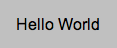
The absence of custom styling makes sense, however, when we realize that
Bootplate does not contain any Onyx controls, so there are no UI elements that
will reflect our variable overrides. The lone control in Bootplate's App.js
file has no kind specified, and thus defaults to being an unstyled
enyo.Control:
{name: "hello", content: "Hello World", allowHtml: true, ontap: "helloWorldTap"}
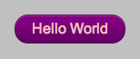
If, instead, we define this control as an onyx.Button...
{name: "hello", kind: "onyx.Button", content: "Hello World",
    allowHtml: true, ontap: "helloWorldTap"}
...our custom styling becomes readily apparent:
Whenever you check in changes to .less files in Onyx, you'll also need to
rebuild and check in the top-level onyx.css file (i.e.,
lib/onyx/css/onyx.css) to maintain backward compatibility for environments
that don't wish to use LESS. (This is true whether you are using LESS for
variable-based theming or for rule-based theming, which is discussed below.)
To rebuild onyx.css, run the lessc script from the command line.
On Mac/Linux:
cd lib/onyx/css
../../../enyo/tools/lessc.sh ./package.js
On Windows:
cd lib\onyx\css
..\..\..\enyo\tools\lessc.bat .\package.js
Please note that, since LESS generates relative URLs, it's important to run the
lessc script from the lib/onyx/css folder.
Also note that you only need to regenerate onyx.css when you're ready to check
in your changes. Before that point, you won't need to run lessc if you
include "less-<version number>.min.js" in your app's debug.html file, e.g.:
<script src="enyo/tools/minifier/node_modules/less/dist/less-1.3.0e.min.js"></script>
This causes the LESS code to be compiled on the client side during loading.
When no variable exists for the piece of CSS you want to customize, your next
option is to use a CSS rule override. Rule overrides go in the aforementioned
Theme.less file, after the @import statement for onyx-rules.less:
@import "../lib/onyx/css/onyx-variables.less";

/* Place your Onyx variable overrides here */

@import "../lib/onyx/css/onyx-rules.less";

/* Place your Onyx rule overrides here */
Let's say you want to change the color of the glow that surrounds a focused
input. Input.less doesn't break that value out into a variable, but we can
look up the name of the relevant style in Input.less and write a custom rule
to override the default color.
To override a rule globally (so the override applies to all widgets), simply define the rule overriding the property (or properties) whose styling you wish to customize. In the case of the input glow color, that might look like the following:
@import "../lib/onyx/css/onyx-variables.less";

@import "../lib/onyx/css/onyx-rules.less";

/* Add a nice red glow to input decorators */
.onyx-input-decorator.onyx-focused {
    box-shadow: inset 0px 1px 4px rgba(255,0,0,0.3);
}
Of course, you may wish to be more selective about where your rule overrides are
applied. In that case, simply define your rule override using a compound
selector; that is, add an additional class to the definition, such as
.red-glow below:
@import "../lib/onyx/css/onyx-variables.less";

@import "../lib/onyx/css/onyx-rules.less";

/* Add a nice red glow to input decorators */
.red-glow.onyx-input-decorator.onyx-focused {
    box-shadow: inset 0px 1px 4px rgba(255,0,0,0.3);
}
Now the rule override will only affect instances of
onyx.InputDecorator that have the
selecting class ("red-glow") applied, e.g.:
components: [
    {kind: "onyx.InputDecorator", classes: "red-glow", components: [
        {kind: "onyx.Input"}
    ]}
]
Alternatively, you may apply the selecting class to a parent component, which will cause all of its child input decorators to receive the override:
components: [
    // Standard Input
    {kind: "onyx.InputDecorator", components: [
        {kind: "onyx.Input"}
    ]},
    // Both input decorators will have "red-glow" applied
    {classes:"red-glow", components: [
        {kind: "onyx.InputDecorator", components: [
            {kind: "onyx.Input"}
        ]},
        {kind: "onyx.InputDecorator", components: [
            {kind: "onyx.Input"}
        ]}
    ]}
]
As mentioned above, when you're ready to check in your rule overrides, remember
to also rebuild and check in lib/onyx/css/onyx.css.
Finally, there may be situations in which the look-and-feel changes you want to implement lie beyond the styling capabilities of CSS. This is often the case when DOM or behavioral changes are required.
For example, you might want to implement a "Slider" as a rotary dial instead
of a horizontal track with a handle. Even if your new Slider has the exact
same API as onyx.Slider (i.e., the same
published properities and bubbled events), it will still require completely
different DOM, CSS, and internal event tracking.
In this scenario, the idea of "theming" grows to encompass the building of a new library, made up of (one or more) Enyo kinds that implement your desired look-and-feel, while allowing you the freedom to implement custom DOM, CSS, and behavioral logic as needed.
In keeping with Enyo's emphasis on reusability, we encourage you to follow certain best practices when creating alternate UI libraries:
-
When possible, extend from Enyo's base UI library, found under
enyo/source/ui. That folder contains an assortment of unstyled Enyo kinds that wrap common HTML form elements, such as:- Button
- Checkbox
- Image
- Input
- Popup
- RichText
- TextArea
-
When providing an alternate implementation of a higher-level UI component not supplied in the base UI (such as a Menu or Slider), consider extending from the equivalent Onyx kind (and thus starting from the same API for published properties, events, and functions) and overriding where necessary.