Repository navigation
11 Ful inputs
The text-like fields: ful-input (and its textarea flavor), ful-checkbox, ful-radio-group. For files see files, for dates and times temporals, for combos select.
All three share the protocols every field follows: disabled claims, readonly, required → aria-required, setCustomValidity, change events with { value } details, input-* forwarding; Enter submits the surrounding form from all three (a textarea takes the newline instead, see Enter submits the form).
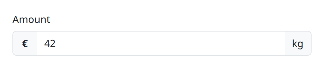
A single-line input of any native type, a numeric keypad type, or a textarea. It is form-associated, with its inner control detached from outer forms.
The attributes are listed under ful-input in the element reference. type defaults to text, or to number under v-type="number", a blank value reads as null, and every input-* attribute is forwarded to the inner control (see Autofill for the ones that do not survive).
<ful-input name="vat" keep="[0-9A-Z]" required>
    VAT number
    <template slot="info">as printed on the invoice</template>
</ful-input>keep and reject are the same filter described from either side, so declare whichever reads straight:
<ful-input keep="[0-9]">Digits only</ful-input>
<ful-input reject="\s">No whitespace</ful-input>
Reach for keep when you are naming what is allowed, which is most of the time, and reject when you are naming what is not. Spelling an allowed set as a rejection is a double negative, which reads backwards.
keep matches rather than negating, so it takes a pattern and not only a character class: keep="^[A-Z]{0,2}[0-9]*" keeps an optional two-letter prefix and the digits after it, and drops whatever breaks that shape. The filter runs over the whole value on every input event, so the pattern must also match each partial value typed on the way to a complete one: keep="[0-9]{2}" drops the first digit as soon as it is typed, and the field cannot be filled. Both are configuration, read once when the element upgrades, so they say how the control treats what is typed into it rather than tracking a value that changes. A pattern that does not compile is warned once and then behaves as no filter at all, and declaring both warns once and applies keep.
type="numeric" and type="decimal" are fml's own type values, as textarea already is: they render an <input type="text"> carrying inputmode="numeric" or inputmode="decimal". The type names the keyboard rather than the control, so the rendered markup stays valid html.
inputmode="numeric" asks for a keypad of the digits 0 to 9 with no decimal separator, and inputmode="decimal" asks for one with the separator the locale uses. So numeric is the integer field and decimal the one for money and measures.
Each filters what can be typed, through the same per-keystroke mechanism keep and reject use, caret restored the same way. numeric keeps the digits and a leading minus. decimal keeps those and the first separator, dropping any that follow, a second separator being a slip while typing rather than a value. A keep or reject you declare yourself wins over the type's own filter.
unsigned refuses the minus as well, for the count or the amount that cannot be negative:
<ful-input name="packages" type="numeric" unsigned>Colli</ful-input>
<ful-input name="grossWeight" type="decimal" unsigned>Peso lordo</ful-input>
It narrows the type's own filter instead of standing in for it, which is what separates it from keep. A keep that spelled the same thing out, keep="[0-9.,]" on a decimal, would replace the filter and take the one-separator rule with it, so 1,2,3 would survive. unsigned leaves every other rule in place. A declared keep or reject still outranks both, which is the way to widen past a type rather than narrow it.
On type="number" and the rest it does nothing: there the sign is the native control's business and min still works.
A decimal answers its value with a dot whatever separator was typed. An operator typing 1,5 goes on seeing 1,5 in the box and the value is 1.5: the server wants one form and it is never the locale's.
v-type stays orthogonal and decides string or number. type="decimal" on its own answers the string "1.5", and with v-type="number" it answers the number 1.5. The separator is a dot either way.
<ful-input name="quantity" type="numeric" v-type="number">Quantity</ful-input>
<ful-input name="price" type="decimal" v-type="number">Price</ful-input>
type="number" renders the native widget, and it is the only one of the three that enforces min, max and step, which a text input leaves to the server. What numeric and decimal trade that for is the rest of the native widget's behaviour: it changes its value when the wheel turns over a focused field, it hides what was actually typed behind a value that reads empty, and it takes only a dot. On iOS neither of the two keypads reliably offers a minus sign, so a field that genuinely takes negative values is another reason to stay on type="number".
Neither type localises the display. A value of 1.5 arriving from the server renders as 1.5 with a dot, while an operator typing the same number types 1,5 and sees a comma until the page reloads. Both are correct on the wire.
Every field renders its control with form="" so that the host is the only thing that submits, and a control with no form owner cannot inherit autocomplete the way the platform resolves it. The library closes that itself: a field reads the token off the nearest form when it declares none of its own, so <ful-form autocomplete="off"> and a plain <form autocomplete="off"> both reach the fields inside them. A field that names its own token keeps it. A form-autocomplete on the ful-form is forwarded to the form it renders like any other form-* attribute, and has the last word over autocomplete there, as input-autocomplete has on a field.
<ful-form autocomplete="off">
    <ful-input name="reference">Reference</ful-input>
    <ful-input name="note">Note</ful-input>
</ful-form>
Per field:
<ful-input name="address.street" autocomplete="street-address">Street</ful-input>
<ful-input name="address.postalCode" autocomplete="postal-code">Postal code</ful-input>
<ful-input name="otp" autocomplete="one-time-code">Code</ful-input>
<ful-input name="search" autocomplete="off">Search</ful-input>
The library declares no default. A correct token is a statement only the page can make, and neither of the defaults that suggest themselves works. off everywhere would take a real convenience away from everyone, and it is not even dependable: Chrome does not honour autocomplete="off" on a control it has classified into an address or payment section, so it goes unread on exactly the fields an author reaches for it on. A token derived from the field's name is worse than useless: the attribute takes a closed vocabulary, and a value outside it reads as on, so autocomplete="customer.taxCode" asks for autofill rather than declining it.
Give the address and identity fields their real tokens rather than reaching for off. A completely typed section is what stops the browser guessing at the fields around it, which is usually what the stray suggestions are.
Which is the general shape of it. off is a request, not a switch: it is honoured on a control the browser has not classified, and overruled on one it has. chrome://autofill-internals says which of the two a given field is, and is the only way to be sure rather than guessing.
ful-select is the exception: its combobox is fixed at autocomplete="off" and takes no token, a filled combobox showing text that matches no key.
input-autocomplete also reaches the control and wins over autocomplete. That is particular to autocomplete, which is passed through as written: an input-* twin of an attribute the field observes, being placeholder here and step, min and max on the temporal inputs, is overwritten by the field's own setter and does not survive. Write those on the host.
before and after render inside ful-affix cells, for icons, buttons and @ signs.
The info slot is placed, not announced: content there is read by anyone who can see it, and reaches a screen reader only if something adds it to the control's description. A ful-tooltip does that under its describes attribute, and anything of your own can through describedBy.
change, with { value } in its detail, when the user commits a new value: the inner input's change, republished from the host. A date, time, datetime-local, month or week control fires its native change while its segments are typed, as soon as they make a valid value, so for those types the field waits for the commit a text input waits for: it reports when the field is left or Enter is pressed, at once for a value picked from the browser's picker, never with the dates a year passes through while it is typed, and not for a value the page wrote while the field had the focus. A field left incomplete reads as null, as the native control does.

A checkbox or a switch, its label beside the control stretched across the row and pointed at it with for/id (the whole row is the hit area).
The attributes, slots and events are listed under ful-checkbox. type="switch" gives the input the switch role; absent, or any other value, renders a checkbox. readonly refuses the gesture on the whole choice, label included: clicks do not toggle, the box stays focusable and readable, and the value still submits. Every input-* attribute is forwarded to the inner input, and the change detail is { value: boolean }, exactly one per toggle.
<ful-checkbox name="marketing" type="switch">
    Send me the newsletter
</ful-checkbox>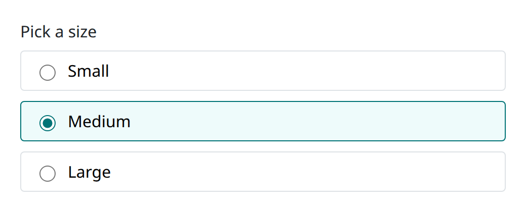
A fieldset of radios authored as placeholder children. The text of each ful-radio is its label, and its attributes land on the native input.
<ful-radio-group name="size" value="m">
    Pick a size
    <ful-radio value="s">Small</ful-radio>
    <ful-radio value="m">Medium</ful-radio>
    <ful-radio value="l">Large</ful-radio>
    <template slot="header">sizes run one small</template>
</ful-radio-group>
The attributes, slots and events are listed under ful-radio-group. The default slot becomes the <legend> and hosts the ful-radio placeholders. readonly refuses picking inside the fieldset; the radios stay focusable and the value still submits. Every input-* attribute is forwarded to every generated input.
An absent name is auto-generated (a unique id): groups never leak into each other, and the generated inner inputs carry a -ignore suffix plus form="" so only the host submits. The change detail is { value }, carrying the checked radio's value, a boolean under type="boolean", and null when none is checked.
The default slot is the label, rendered as a real <label> wired to the control with for and id, or as the <legend> of the radio group's <fieldset>. The association is in the markup, so assistive technology, an accessibility audit and the browser's autofill all see it, and clicking the text toggles or focuses the control the way it does in a plain form.