Repository navigation
13 Ful files
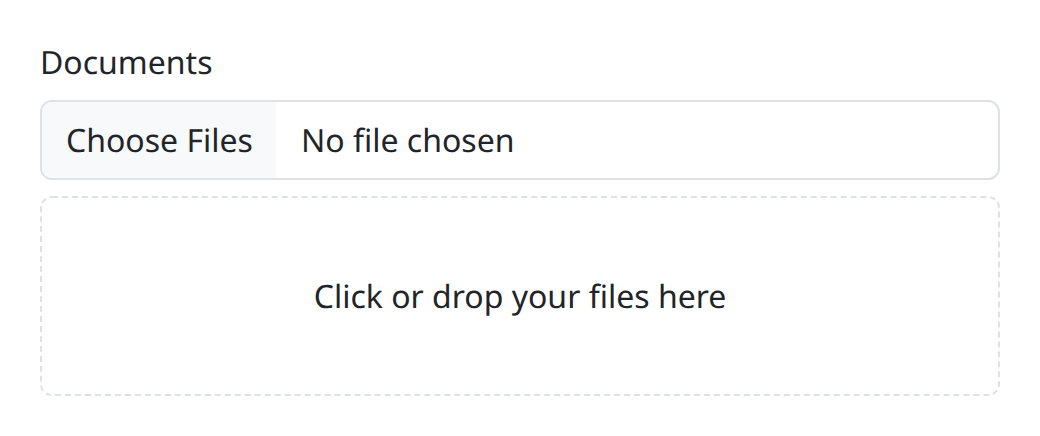
A file field with a themed dropzone, an item list, and size/count/type constraints that enforce themselves with localized warnings.
<ful-input-file name="attachments" multiple accept=".pdf,.png" max-files="5" max-file-size="5242880">
    Attachments
    <template slot="info">pdf or png, up to 5 files, 5MiB each</template>
</ful-input-file>The attributes, slots and events are listed under ful-input-file in the element reference. accept takes the native picker's vocabulary: an extension is matched against the end of the file name, a mime type against the file's type with any parameters ignored, and a family such as image/* against the start of it, case ignored throughout. The three limits are inclusive: a file of exactly max-file-size bytes, or a selection of exactly max-files files, is accepted.
Beyond the label, info and affix slots every field takes, two slots shape the field:
-
dropzone: a fully custom drop area, shown only when the host also carries thedropzoneattribute. Slot content replaces the default; the host still receives adragoverattribute while a drag hovers, as the styling hook, and drops anywhere on it land in the field. -
items: a template replacing the stock row of theful-item-list, the same wayful-selecttakes one.
Without the slot, dropzone renders the default: a themed dashed area carrying the localized files.dropzone-label. Clicking anywhere in either kind opens the native picker, so both carry a pointer cursor.
no-input (the noInput property) takes the picker control out of sight, for a field carried by its dropzone and its item list:
<ful-input-file name="scans" multiple dropzone item-list no-input>Scans</ful-input-file>The control is hidden from the eye only. The dropzone takes clicks and drops and nothing from the keyboard, so the native input stays in the tab order, still named by the label and still carrying the description and the error: Tab reaches it, Enter or Space opens the picker from it, and the dropzone shows the focus ring while it holds the focus. Declare no-input together with dropzone, since without one a sighted user has nothing left to click.
A field that is readonly or disabled shows no dropzone at all: it is an affordance for a gesture the field refuses, and unlike the input beside it holds nothing to read. The picker button parts with the two claims: readonly drops it, the value being fixed, and disabled keeps it dimmed, the way the platform dims its own. The remove button on each row goes with them. With item-list the two claims differ: a readonly field is its list, the control group going because the value is fixed and the rows already carry the names, the way ful-select behaves. A disabled one keeps its control, dimmed, since disabled says the control is unavailable rather than absent. Without an item list the input stays under either claim, being then the only place a name appears.
The template renders once over the whole selection, with files bound to the live FileList, so each iteration carries a real File:
<ful-input-file multiple item-list accept="image/*,.pdf">
    Attachments
    <template slot="items">
        <ful-item data-tpl-each="files" data-tpl-var="file" data-tpl-data-name="file.name">
            <img data-tpl-if="file.type.startsWith('image/')" data-tpl-src="#blob:url(file)" alt="">
            <ful-icon data-tpl-if="!file.type.startsWith('image/')" name="inbox"></ful-icon>
            <span>{{ file.name }}</span>
            <small>{{ #l10n:bytes(file.size) }}</small>
            <button type="button" data-tpl-aria-label="#l10n:t('files.remove')">
                <ful-icon name="x-lg" aria-hidden="true"></ful-icon>
            </button>
        </ful-item>
    </template>
</ful-input-file>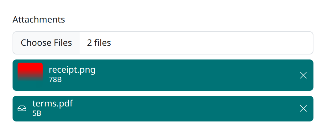
Two things your template must keep, and one it gets for free:
-
one
ful-itemper file, rendered as direct children of the item list in the order of the files, since the field matches an item back to its file by its position. -
a
<button>per item, which the field's own click handler treats as the remove control. You do not wire it. - the registry's modules resolve inside the template, so
#l10n:bytesand#l10n:twork exactly as in the stock row.
Because the whole File is in scope, anything a File carries is reachable, type and size included, and file.type.startsWith('image/') evaluates because the expression language allows method calls on data.
Thumbnails need an object URL, and nothing revokes it. There is no built-in blob helper: register one module and it is available to the template.
ftl.registry
    .plugin(new ful.Plugin())
    .defineModule('blob', { url: (f) => URL.createObjectURL(f) })
    .configure();
Define it before configure(). The slotted template is bound to the registry's modules when the field upgrades, and a field in the page's markup upgrades at configure(), so a module defined later is missing from its template.
The item list re-renders on every selection change, so each add or removal mints a fresh URL for every image and the old ones stay alive for the life of the document. That is acceptable for a short-lived form with a handful of files, and it is not acceptable for a long-lived page, where the preview belongs in a subclass that can revoke what it created.
A last styling note: the stock ful-item paints on --ful-active-bg, so secondary text in a muted colour disappears inside it. A richer item wants its own colours. See Theming.
| Member | Description |
|---|---|
files |
get/set the FileList, the source of truth |
file |
the first file, or null (setter replaces the whole selection) |
value |
the names: an array when multiple, else the first name or null
|
totalSize |
sum of the sizes |
input.files;                 // FileList
await form.submit();          // the default loader posts json: the field contributes its value, the file names;
                              // give the form a loader that submits multipart to send the files themselves
Sending files has a form loader that does.
On every selection change (picker, drop, programmatic), violations are enforced and reported:
| Violation | Enforcement | Warning key |
|---|---|---|
extension outside accept
|
offending files dropped |
files.unacceptable-file-type ({types}) |
one file over max-file-size
|
offending files dropped |
files.max-file-size-exceeded ({size}) |
total over max-total-size
|
whole selection cleared |
files.max-total-size-exceeded ({size}) |
count over max-files
|
whole selection cleared |
files.max-files-exceeded (plural {count}) |
Sizes render localized through #l10n:bytes (1,5MiB in Italian). Warnings appear in ful-field-warnings and dismiss themselves; they do not block submission, since the invalid files are already gone. setCustomValidity still applies, as on every field.
change, with { value } in its detail, fires on every selection gesture: the native picker, a drop on the dropzone, an item-removal button. It fires once the constraints have run, so its value names the accepted files only, as el.value does. Programmatic files/value assignments and the form's reset stay silent, like a native input's: watch the property (or the warnings) for those.