Repository navigation
16 Ful disclosures
The five overlay components. Each is built on a platform feature rather than reimplementing it: tooltips and menus on the Popover API, dialogs and drawers on <dialog>, toasts on an ARIA live region. Light dismiss, Escape, focus trapping and the announcements therefore come from the browser.
All five theme through --ful-*, localize their own chrome, and anchor most of their styling on the structure they render rather than on their host tag, so a subclass that overrides the template keeps the look. The exceptions are keyed on the host tag: the menu (ful-menu[popover]), the hiding of an empty ful-toasts region, and the loading state of the dialog and the drawer. The dialog and the drawer can also fill themselves on open; that is the async section protocol, shared with the navigation family. The last section, your own anchored popover, covers ful.Anchors, the placement the library's popovers are built on, for a popover of your own.
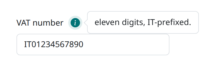
An icon button that toggles a short explanation. Its usual home is a field's info slot, where it sits on the label's line.
<ful-input name="vat">
    VAT number
    <ful-tooltip slot="info">the Italian VAT identifier: eleven digits, IT-prefixed.</ful-tooltip>
</ful-input>
The explanation is a native popover, so the platform provides light dismiss and Escape; the wiring announces the open state through aria-expanded, and a second click on the marker closes it. placement picks the side, top being the default, since a note opening downwards covers the control the marker explains, and bottom, left and right the alternatives.
The marker is an info circle, which Tooltip.config.icon changes for the whole page. A single tooltip that means something else takes icon, naming a ful-icon:
<ful-tooltip slot="info" icon="exclamation-circle">prefilled from the quote, check it before submitting.</ful-tooltip>describes is for the tooltip in a field's info slot, which is where nearly all of them live:
<ful-input name="vat">
    VAT number
    <ful-tooltip slot="info" describes>eleven digits, IT-prefixed.</ful-tooltip>
</ful-input>
The note joins the accessible description of the field's control, so a screen reader reads it on arriving at the field instead of only on opening the marker, and the marker leaves the tab order, so walking a form whose fields carry hints costs no extra keystrokes. Without describes a field does nothing at all with its info slot: the content is placed and never announced.
The marker stays clickable, so the explanation is a click away for everyone, and it keeps its tab stop wherever the note was not taken, a describes tooltip standing outside a field among them, which warns. The stop only goes where something else delivers the content. What this does cost is the keyboard user who is not running a screen reader, who cannot open the note at all, so describes suits a short hint rather than something the user has to read to fill the field in; that belongs in visible text.
A field takes descriptions through describedBy(el), and describable(el) answers the nearest ancestor that accepts one, so an element of your own can offer itself the same way.
The library paints a small set of names, listed under theming. A name outside it is yours to declare, which is one rule: ful-icon[name='exclamation-circle'] { mask-image: url("..."); }. The library deliberately does not grow its icon set on a page's behalf, so an application's own iconography stays in the application's stylesheet.
The library places the note itself on every platform, rather than leaving it to CSS anchor positioning as the select's dropdown and the filter menus do. The reason is the callout below: it has to point at the trigger wherever the viewport left room for the note, and a pseudo-element cannot read an anchor outside its own containing block, so the position is measured rather than declared. The note is placed on the side placement picks, centred on the trigger, clamped into the viewport and following the trigger on scroll and resize.
For styling, the bubble is the ful-note tag (or the .ful-note class on anything), and the trigger is the .ful-tip class, which the tooltip renders on a span role="button". In markup of your own the class can be left out on a button, since the chrome also matches the button that precedes a note.
A note holds more than a line where it needs to. Block content sits flush inside the padding, the leading margin of the first child and the trailing margin of the last being trimmed, while the spacing between them stays. Page css that sets margins on p or ul outside a cascade layer overrides that, as it overrides everything else the library paints.
An open note carries a small callout pointing back at its trigger, on whichever edge faces it, drawn from the note's own border and background so a retheme takes it along. Where the viewport pushes the note off its trigger, the callout stays on the trigger and slides along the note's edge, stopping short of the rounded corners. Two properties size it: --ful-note-gap is the space the callout points across, --ful-note-callout-size the square it is cut from. A callout larger than the gap would reach the trigger, so raise the gap with it.
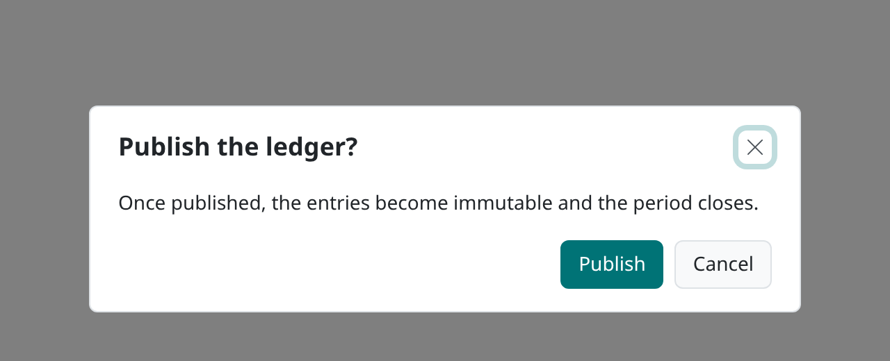
A centred modal that asks a question: a header, a body, and buttons that answer it.
<ful-dialog id="confirm" header="Publish the ledger?">
    Once published, the entries are immutable.
    <template slot="buttons">
        <button type="button" data-result="published">Publish</button>
        <button type="button" data-result="cancelled">Cancel</button>
    </template>
</ful-dialog>
ask() and open() both return a promise that resolves with how the dialog ended, one object for every ending:
{ dismissed: true,  result: null,        response: null }   // Escape, the close button, a backdrop click, or a data-result="" button
{ dismissed: false, result: 'published', response: null }   // the data-result of the button pressed
{ dismissed: false, result: null,        response: {…} }    // a submit, under close-on-submit
dismissed is the question to ask first, and often the only one:
const { dismissed, result } = await document.querySelector('#confirm').ask();
if (!dismissed && 'published' === result) {
    await publish();
}
Three facts do not fit in one slot, which is why the answer is an object rather than a bare result. A save that answers with no body at all, a 204, is a null response, and a null that also had to mean "cancelled" could not tell the two apart.
A dialog with a header names itself through its heading, which is what a reader announces on opening; one without a heading is yours to name, through aria-label of your own on the host. The header slot puts content in the header before the title.
requires-answer is for a dialog that must be answered: the close button is not rendered, and Escape and a backdrop click do not close it, so it closes only through a button carrying a data-result or from code, through close() or dismiss().
close(result) closes the dialog from code. A result answers as the button carrying that data-result would; no result, or an empty one, is a dismissal.
A data-result button answers the dialog it stands in: one inside a dialog nested in the body of a ful-dialog, or in the content of a ful-drawer, belongs to that nested dialog and leaves the outer one open.
Before the close button, Escape or a backdrop click closes it, the dialog dispatches dialog:dismiss on itself: cancelable, not bubbling, with detail.reason set to button, escape or backdrop. Calling preventDefault() keeps the dialog open:
dialog.addEventListener('dialog:dismiss', (e) => {
    if (uploading) {
        e.preventDefault();
    }
});
dismiss(reason) is the same dismissal made from code, for a page that closes the dialog on the user's behalf, on a navigation for instance: it dispatches dialog:dismiss with the reason it is given, goes through the same guard, and resolves whether the dialog closed.
if (!await dialog.dismiss('navigation')) {
    history.back();
}
Unsaved edits. The edits of a form under track-changes need no listener: guard-dismiss has a dismissal nobody refused, while a ful-form of the dialog is dirty, first ask the user, through Dialog.confirm, whether to close and drop them. The question is localized (dialog.discard.header, dialog.discard.body, dialog.discard.confirm, dialog.discard.cancel), and a form of a dialog nested in this one is that dialog's to guard.
<ful-dialog header="Edit the entry" guard-dismiss close-on-submit>
    <ful-form action="/entries/42" method="PUT" track-changes>…</ful-form>
</ful-dialog>
A data-result button, close-on-submit, close() and update() answer the dialog or are the page deciding, so they dispatch nothing and ask nothing. The platform lets a page refuse Escape once per interaction: a second Escape with no click or keystroke in between closes the dialog whatever the page does, requires-answer and guard-dismiss included. That close is still announced, by a dialog:dismiss that is not cancelable, so a listener can tell it did not keep the dialog.
The dialog above lives in the page. A question asked from code, with no markup of its own, is two static calls: Dialog.ask builds, shows, answers and removes a transient one, and Dialog.confirm asks a yes/no question where the cancel button, the close button and Escape all answer the negative.
if (await ful.Dialog.confirm('Delete this page?', 'It is removed from client sites.', { confirm: 'Delete' })) {
    await deletePage();
}
const answer = await ful.Dialog.ask('Publish?', 'The ledger becomes immutable.', [
    ['later', 'Later'],
    ['publish', 'Publish', 'ful-button'],
]);
ask takes [result, label, className?] tuples and resolves the outcome object; confirm resolves a boolean, its labels defaulting to the localized dialog.confirm and dialog.cancel. A string body is text, never markup: render into a node and pass that when a question needs more than a sentence.
Both take an options object last, whose className dresses the transient dialog the way a declared one is dressed, which is how it is sized. A button can also be a node you built, beside the tuples, for anything a tuple cannot say:
const answer = await ful.Dialog.ask('Pick a page', tree, [
    ['cancel', 'Cancel'],
    spacer,
    pickButton,
], { className: 'widest' });
The body is yours, so there is no hook to read it through: you still hold the node after the promise resolves, and a detached field keeps its value.
Without a buttons slot, a localized acknowledge button is rendered, answering acknowledged, so a dialog that only announces something still closes properly. A dialog that closes on its form renders none, and no empty footer either, since its answer comes from there.
Any element carrying dialog-target="confirm" opens it, clones included, which is what makes a dialog usable from a table row without wiring each row. The close event, which does not bubble, carries the same object the promise resolves with, and fires before the pending calls resolve.
A dialog that leaves the document while open answers its waiters with a dismissal rather than leaving them pending forever. One the page moves elsewhere while open opens as a modal again on the next ask(), open() or update().
Its width is --ful-dialog-width and its scrim --ful-backdrop-color, set wherever the page likes: on :root, or on one dialog, a class of yours on it included (see Theming).
ful-dialog.wide { --ful-dialog-width: min(90vw, 60rem); }Opening fires section:requested on the host, with the body as detail.section, so a dialog can fetch its own content; every open asks again, with detail.first false once a delivery has succeeded.
update(callback) is the imperative half of the same thing, and the drawer's method on this surface. It opens the dialog on a loading ring, awaits your callback and shows what it returns, or the problems of a rejection, which still reaches you.
const body = await dialog.update(async () => {
    const response = await http.get('/ledgers/42').fetchJson();
    return renderLedger(response);
});
It resolves with the body, already in the document, which is where you wire what you just rendered. Overlapping updates claim the opening, so a superseded delivery paints nothing, and its call resolves null rather than handing over the body the newer call filled. The title stays the header attribute, so what the call owns is the body.
close-on-submit is for the dialog whose answer is a form succeeding rather than a button being pressed:
<ful-dialog id="edit" header="Edit the entry" close-on-submit>
    <ful-form action="/entries/42" method="PUT">
        <ful-input name="label">Label</ful-input>
        <footer class="ful-dialog-footer">
            <button type="button" data-result="">Annulla</button>
            <button type="submit">Save</button>
        </footer>
    </ful-form>
</ful-dialog>
The dialog closes when that form succeeds, answering with its response. Its buttons live inside the form, because the buttons slot renders into the dialog's own footer, outside the body: a submit button put there owns no form and submits nothing. Such a dialog renders no acknowledge button either, its answer coming from the form, so the footer you write is the only one. A cancel is a button carrying data-result="", which closes with a dismissal. Give that footer the ful-dialog-footer class and it is dressed like the dialog's own, the body holding the side padding for it so its buttons line up with the header above them. A dialog taller than the viewport scrolls its body alone: the header stays at the top, and the dialog's footer, or that last footer of the body, stays at the bottom. A plain <dialog class="ful-dialog"> whose header, body and footer sit inside a form of its own scrolls the same way. Success alone closes it: submit is cancelable and fires before the work happens, and a failure leaves the dialog open, the form having just pinned the problems onto its own fields, where a closed dialog would throw them away. So refusing to close is refusing to succeed, either by preventing the submit or by throwing from a submit:requested listener.
The form is the body's own: every ful-form standing directly in the body closes the dialog when it succeeds, and a form nested deeper does not. A ful-table in the body wraps its filter slot in a ful-form of its own, and that form's events bubble through the body, but it stands inside the table, so searching the table does not answer the dialog. A listener of your own on the dialog hears those submits too, and checks e.target (see ful-form).
One platform detail worth knowing when you place a dialog. Form ownership follows the DOM, and a modal <dialog> stays where it sits in the tree, so bare fields inside a dialog declared within another form join that form's values. Give the dialog its own ful-form, as above, or declare it outside the page's form.
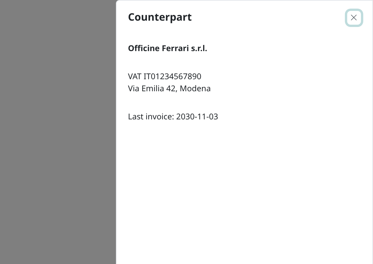
The same <dialog> platform, shaped as a side panel: a header with a title and a close button, and a body that update() opens in a loading state. The title is the header attribute, as on the dialog, and the panel names itself through its heading.
update(header, callback) is the method that makes it useful. It opens the drawer, runs your callback, and shows what it returns.
The header slot puts content beside the title, before it: an icon, a badge, a status. It sits outside the heading rather than inside it, because update() sets the title through textContent and would take anything nested there with it.
<ful-drawer header="Dati nave">
    <i slot="header" class="bi bi-water" aria-hidden="true"></i>
</ful-drawer>
const content = await drawer.update('The counterpart', async () => {
const response = await http.get('/counterparts/42').fetchJson();
return renderCounterpart(response);
});It resolves with the content section, already in the document, which is where you wire up whatever you just rendered. A rejection instead renders the problems' reasons in the drawer's alert section.
Overlapping updates do not interfere: a superseded delivery paints nothing at all and its call resolves null, so a caller wiring what it rendered checks for it rather than wiring the newer call's content; a superseded rejection still reaches its own caller without touching the drawer.
const content = await drawer.update('Edit', render);
if (content === null) {
    return;
}
wire(content.querySelector('ful-form'));
update() owns its whole open-answer-deliver cycle and fires no event. A declarative open, whether through dialog-target or a bare open(), fires section:requested on the host instead, with the content section as detail.section, so the two ways of filling a drawer never both fire.
The content section scrolls under the header. Its last footer, whether a direct child or the last child of the ful-form the content holds, stays at the bottom of the panel: below a short form rather than under its last field, and in view while a long one scrolls.
close-on-submit works here too, on the same terms as the dialog's, its buttons living inside the form for the same reason: every form the content holds directly closes the drawer when it succeeds. A form delivered by update() is covered as well, the listener sitting on the content section rather than on any one form. A drawer is where an application usually edits, so this is the attribute that removes the hand-written close after every save.
<ful-drawer id="edit" header="Edit the entry" close-on-submit>
    <ful-form action="/entries/42" method="PUT">
        <ful-input name="label">Label</ful-input>
        <footer><button type="submit">Save</button></footer>
    </ful-form>
</ful-drawer>
The drawer ends as the dialog does. open() and ask() resolve with the same { dismissed, result, response }, which the close event carries too: response is what the form answered with under close-on-submit, and result the data-result of a button inside the drawer, or the argument of close(result), that closed it. A drawer that leaves the document while open answers its waiters with a dismissal, and one the page moves while open opens as a modal again on the next call. An ask() on a drawer that is already open shows nothing new and waits for the ending of that opening, which is how a caller learns how the drawer update() opened ended, with no listener left behind for the next opening:
await drawer.update('Edit the entry', () => renderEntry(entry));
const { dismissed, response } = await drawer.ask();
if (!dismissed) {
    table.reload();
}
placement picks the side: end is the default, start its mirror, and the slide follows the writing direction. The width is --ful-drawer-width, the scrim --ful-backdrop-color, set wherever the page likes, as the dialog's are (see Theming).
Dismissing works as the dialog's does (see Refusing a dismissal): before the close button, Escape or a backdrop click closes it, the drawer dispatches drawer:dismiss, with the dialog's shape, and preventDefault() keeps it open; dismiss(reason) makes the same dismissal from code, and guard-dismiss asks before a dismissal drops the unsaved edits of its forms. A data-result button, close-on-submit, close() and update() dispatch none and ask nothing. A second Escape with no interaction in between closes it at once, without the slide, announced by a drawer:dismiss that is not cancelable.
The drawer slides out the way it came in, on every route out of it: the close button, Escape, a click on the backdrop, dismiss(), a data-result button, close-on-submit and close() alike. It carries a closing attribute on its native <dialog> while the animation runs, and the dialog closes and the close event fires only when the animation ends, so close() returns before the panel is gone and page css keyed on dialog.ful-drawer sees that attribute for a fifth of a second on the way out. Where nothing animates, a reader who asked for reduced motion among them, the drawer closes at once. A slide the page cancels, by hiding the drawer or something around it while it leaves, closes it as one that ended does, so the close event and the pending ask() always arrive. A drawer opened again while it slides out forgets the result it was closing with, so a later dismissal answers a dismissal.
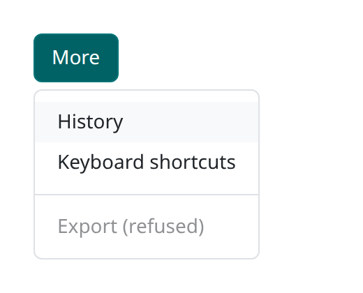
A button and the list of commands it opens, with the keyboard navigation a menu owes its user. for names the invoker by id:
<button id="more">More</button>
<ful-menu for="more">
    <button data-action="history">History</button>
    <button data-action="shortcuts">Keyboard shortcuts</button>
    <hr>
    <button data-action="export">Export</button>
</ful-menu>
The items are the buttons and links you write inside it, left as they are: the element gives each one the menuitem role and takes it out of the tab order, so the menu is one tab stop walked with the arrows. Activation is the item's own click, which the menu only follows by closing, so a page listens where it already listens:
document.addEventListener('click', (e) => {
    const action = e.target.closest('[data-action]')?.dataset.action;
    ...
});
The keyboard is the ARIA menu protocol: the focus moves onto the first item as the menu opens, ArrowDown and ArrowUp walk the items and wrap at both ends, Home and End jump to the ends, typing walks to the item whose text starts with what you typed (one letter repeated cycles the items sharing it), Enter and Space activate the focused item, and Escape closes with the focus back on the invoker. A close of any other kind hands the focus back only where the menu held it, so a click elsewhere leaves the focus where it went. The invoker carries aria-haspopup and an aria-expanded kept in step.
The menu is the popover itself, so the platform gives it light dismiss and Escape, and ful-menu is placed against its invoker the way the library's own menus are. A disabled or hidden item stays an item to a reader and leaves the walk. The items are the menu's own children: a wrapper between the menu and an item would have to carry role="none" to keep the menu's semantics, which is more markup than a menu is worth.
That sets the limits of what a menu holds. Its items are its direct button and a[href] children, and nothing else is walked; an <hr> between them draws a rule. There are no submenus, no group headers, and no checkable items: the menu keeps no checked state, so an item with aria-checked is the page's to keep in step.
for is read once, when the menu upgrades, and a for naming nothing is an error rather than a menu nobody can open, so the invoker must already be in the page by then. The usual order, the button and then the menu, does that on its own.
A list where every row has its own "more" button wants one menu, not one per row. Leave for out and open it from the page with showFor(invoker):
<ul class="invoices">
    <li>2026/001 <button type="button" data-row="2026/001" aria-label="Actions for 2026/001">⋯</button></li>
    <li>2026/002 <button type="button" data-row="2026/002" aria-label="Actions for 2026/002">⋯</button></li>
</ul>
<ful-menu id="row-menu">
    <button data-action="open">Open</button>
    <button data-action="duplicate">Duplicate</button>
</ful-menu>
const menu = document.getElementById('row-menu');
document.querySelector('.invoices').addEventListener('click', (e) => {
const invoker = e.target.closest('[data-row]');
if (invoker) {
menu.showFor(invoker);
}
});showFor places the menu below that invoker, or above it where there is no room below, and opens it; called while the menu is open for another row, it moves it there. The keyboard is the same as above, and Escape gives the focus back to the invoker that opened it. The invoker carries aria-haspopup and an aria-expanded that reads true while the menu is open for it. A second press on the same button closes the menu, as a for invoker's does. The placement is made once, the way Anchors.show makes it, so the menu does not follow a scroll while open. Which row the command is for is the page's to remember: keep it as you call showFor, as the example in examples/ful/disclosures.html does. A menu with for belongs to its invoker, and showFor on it is an error.
A menu whose items a page fills later needs no rewiring: they are read on every gesture, and one added after the render is walked and marked like the rest.
For styling, the menu is the ful-menu tag, its items the buttons and links inside it, and hr draws a separator.
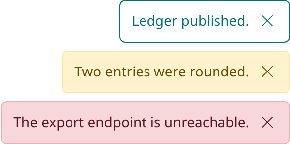
One transient feedback region per page. show() stacks a toast that retires on its own timer or its dismiss button, so concurrent messages never cut each other short.
document.querySelector('ful-toasts').show('Saved.', { severity: 'success' });Anything on the page can raise one without holding a reference, through a document event:
document.dispatchEvent(new CustomEvent('show-toast', {
    detail: { message: 'Saved.', severity: 'success' },
}));
That event is wired once per document and forwarded to every live region, so a second region shows each toast once rather than twice, and a region removed from the page stops answering.
severity picks both the theme and the announcement: info is the default, success and warning announce politely as a status, and error announces as an alert. A Failure passed as the message shows its problems' reasons.
timeout sets the timer, as an attribute on the region or an option on a single toast; five seconds is the default. The timer holds while the toast is hovered or holds the focus, so an actionable toast waits to be read instead of expiring under the pointer.
action renders a button beside the message, whose click answers and retires the toast. The same option travels in the show-toast event's detail:
document.dispatchEvent(new CustomEvent('show-toast', {
    detail: { message: 'Block deleted.', action: { label: 'Undo', onClick: () => undo() } },
}));
The region is a manual popover, whatever popover the page declared, and every show() shows it again, so a toast raised while a ful-drawer or ful-dialog is open shows above it. The page outside an open modal is inert, the region included, so such a toast can be read but not clicked: it retires on its timer, and its buttons answer once the modal closes. A page that used to declare popover="manual" on the region and raise it by hand drops both.
The region announces itself through a localized label, each toast item is the ful-toast tag, and the width is --ful-toasts-max-width.
A button revealing a plain list of links needs no element at all: it is a disclosure, not a menu, and the platform already toggles and light-dismisses one for you:
<button popovertarget="downloads">Scarica</button>
<ul popover id="downloads">
    <li><a href="/reports/summary.pdf">Riepilogo</a></li>
    <li><a href="/reports/detail.pdf">Dettaglio</a></li>
</ul>
Tab walks the links, Escape closes, clicking outside closes. Do not reach for role="menu" here, and do not reach for ful-menu: the role takes the links out of the tab order and puts them behind the arrow keys, which is what a list of commands wants and a list of links does not.
What the platform does not give you is placement. Anchors.wire is the piece the library uses for its own popovers:
ful.Anchors.wire(button, menu, { prefix: 'app-downloads', invoke: true, expanded: true });It names the invoker as an anchor and points the popover at it, makes the invoker toggle the popover under invoke (a popovertarget on a button or input, a click and Enter and Space on anything else, where a second click closes it as on a button), keeps aria-expanded in step under expanded, and where the platform has no css anchor positioning it places the popover beside its invoker itself, clamped into the viewport and following it on scroll and resize.
Writing the css is your half. Where anchor positioning works the library sets the names and your stylesheet does the placing, the way ful's own menus do:
#downloads {
    inset: auto;
    margin: 0;
    top: anchor(bottom);
    left: anchor(left);
}
inset: auto and margin: 0 clear the user agent's popover defaults, inset: 0 and margin: auto, which centre it in the viewport: without them the popover keeps those offsets and margins and does not land against the anchor.
Without it the popover lands wherever the user agent puts one, which is not beside the button. stretch: true, in the script placement, widens the popover to at least its invoker, capped by its own max-width, and flips above where the viewport leaves no room below, which is what a combobox dropdown wants; handPlace: true takes the placement in script on every platform, which a popover needs only when it has to know where its invoker ended up.
wire pairs a popover with one invoker for its lifetime. A popover shared by many invokers, each open handing over its own, wants the one-shot Anchors.show instead (for a menu of commands that is already a ful-menu without for), and so does an anchor that is a rectangle rather than an element, one read out of an iframe being the case a paired invoker could never cover:
ful.Anchors.show(menu, button, { flip: true, gap: 4 });
ful.Anchors.show(picker, new DOMRect(x, y, w, h));
It places the popover below the anchor, start-aligned and clamped into the viewport, flip moving it above where no room is left below and gap setting the distance. The popover is shown and placed before the call returns, so the first position anybody sees is the right one and the next line can move the focus into it:
ful.Anchors.show(menu, button, { flip: true, gap: 4 });
menu.querySelector('button').focus();
Nothing else is wired and nothing follows a later scroll or resize: closing is yours, or the platform's for a light-dismissing popover.
A popover Anchors.wire places in script, on a platform with no css anchor positioning, is held back for a moment as it opens: a popover is display: none until the platform shows it, and every measurement of it reads zero until then, so it is hidden through its own visibility, measured once the platform has shown it and revealed in place, all before the toggle event. A stylesheet of yours setting visibility on such a popover will fight that inline value.