Repository navigation
12 Ful select
A combobox-style select: a searchable single field or a chip-based multiple, fed by slotted options or a remote loader, keyboard-complete, and form-associated like every ful field.
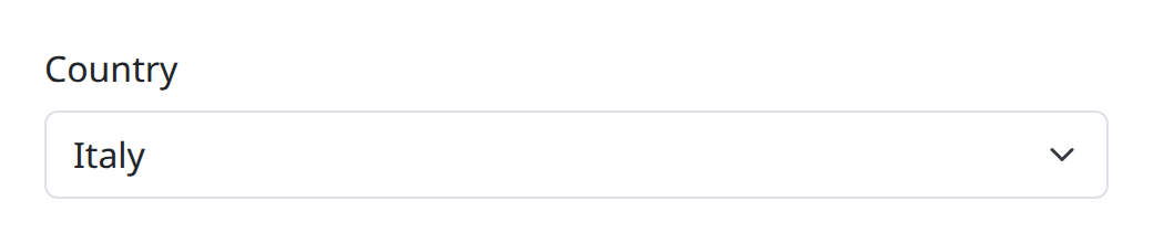
<ful-select name="country" required>
    Country
    <select slot="options">
        <option value="it">Italy</option>
        <option value="fr">France</option>
        <option value="de">Germany</option>
    </select>
</ful-select>Where options come from is the loader attribute (registry component key, default loaders:select). The built-in loader picks its strategy from the element's attributes:
| Setup | Strategy |
|---|---|
<select slot="options"> slotted |
in-memory: the options are the data, one { key, label, metadata } entry per <option>: the key is its value (its text when absent), the label its text, no metadata |
src (+ method, default POST) |
remote: fetched once through the http-client component, kept in memory |
src + mode="chunked"
|
partial remote: one request per search (load(needle)) and one per key lookup (exact(...keys)) |
In chunked mode each request goes to src with the configured method and carries its question as query parameters: a search sends the typed text as s (an empty s, ?s=, for the empty search), a key lookup sends every key as a repeated k (?k=it&k=fr). The response goes through the same mapping as a whole-vocabulary fetch.
The remote attributes, preload, revision, the k-expr, l-expr, m-expr and d-expr expressions and response-mapper, are listed under ful-select in the element reference.
Two shapes, do not confuse them. What a loader answers is always an entry object, { key, label, metadata }, which is the vocabulary the element, the templates and the change detail all speak. What a server sends is up to the endpoint; the stock remote loader assumes the positional row [key, label, metadata] and maps it to an entry for you.
That default is what the three mapping knobs replace:
-
k-exprandl-exprtogether: each row ofd-expr's result is evaluated into an entry, sok-expr="id" l-expr="description"reads a json array of objects directly. The expression mapping engages only when both are present. - otherwise
response-mapper, a registry component taking the whole response and answering entries. - otherwise the positional default above.
A remote vocabulary is cached in VersionedLocalStorage under the key method@url together with the revision, and a load under a different revision is a miss that evicts what was stored. The attribute has three states:
| Markup | Effect |
|---|---|
no revision
|
nothing is cached |
revision="r7" |
cached under r7
|
revision with no value |
cached under what the registry's revision component answers |
A page has one build to key its caches on, and every element naming that build by hand is another place to forget it or to spell it differently. State it once:
ftl.registry.defineComponent('revision', document.querySelector('meta[name="revision"]')?.content);<ful-select src="/api/countries" revision name="country">Country</ful-select>The component is a string, or a function answering one. A function is called every time a loader is built, so the identifier can be decided when the select upgrades rather than when the component is registered. Either way it is read from the registry that defined the element, not from a global.
A valueless revision with no revision component defined logs a console warning and caches nothing. Markup asking for a cache while nothing is being cached is a failure nothing else would show, so it is reported rather than left silent.
k-type="number" or "boolean" coerces keys at every boundary (attribute, assignment, loader answers, dropdown picks), so the value, the change detail and the submitted payload all carry real numbers or booleans. Undecodable keys are kept as they are; the default is strings. A key matches the option whose key reads as the same text (String(a) === String(b)), so k-type="boolean" value="true" selects the option keyed true, and a number 0 does not also mark the '' option picked.
loader names a component of your own in place of loaders:select:
<ful-select loader="loaders:countries" name="country">Country</ful-select>Its load, exact, prefetch and invalidate methods, and a complete remote one, are under the select loader. exact is the one that is easy to forget, and it is required: the select calls it to label every value assigned without going through the list, form.values included, and with a loader that lacks it each such assignment throws.
Live access from javascript: await select.withLoader(async loader => loader.load('ita')). The in-memory loader also exposes update(data).
select.query answers the text typed to search, what the dropdown was last asked to match, and '' while the field shows its selection instead. A "create a new one" action next to a select prefills from it rather than reading the inner input.
When one select's options depend on another control, the linkage is yours: one change listener. Where the vocabulary lives at an address that depends on the other control, write src, which stays live after the upgrade, as does method:
citta.addEventListener('change', () => {
    cap.src = `/api/cap?citta=${citta.value}`;
});
Writing either, as an attribute or as a property, closes the dropdown, builds the loader again through the same loader component and reloads. ful-filter-in takes the same live src.
reconfigure({ src, method }, { notify }) writes both at once and reloads once, answering a promise that settles with the reload, so a failed fetch can be caught. A name left out keeps its value and null removes the attribute. With notify: true it fires change when the reload dropped a selected key, which is what a ful-filter-in inside a table's filters wants: the form sees the value it lost and the table is asked again.
region.addEventListener('change', () => {
    kind.reconfigure({ src: `/api/kinds?region=${region.value}` }, { notify: true });
});
Where the address stays the same and the endpoint reads the dependency from elsewhere, such as a session or a header an interceptor adds, what the field owes you is a way to drop what the loader is holding and ask again, which is reload():
citta.addEventListener('change', () => cap.reload());reload() invalidates whatever the loader caches, re-runs the prefetch if the select declares preload, asks the loader about the current selection again and, when the dropdown is open, runs its search again, so the list shows the new vocabulary.
That last step is the part that matters. A selected key the new vocabulary does not know is dropped, so a value invalidated by the change does not survive it, while a key still known keeps its place with a fresh label. You do not have to clear the value yourself, and you do not have to decide whether clearing is safe.
Both answer the new vocabulary this way. reload() asks nothing of you about which loader you have: invalidate() exists on all three, doing nothing where there is nothing cached.
A reload, and a change of src, does not fire change, the same way a programmatic assignment does not: the caller made it happen and already knows. reconfigure under notify is the one exception, and only when a key was dropped.
The value attribute is always a comma separated list of keys, single or multiple alike. The value property is not: it answers a key for a single select and an array of keys for a multiple one, and it accepts either shape.
<ful-select value="it">…</ful-select>              <!-- one key -->
<ful-select multiple value="it,fr">…</ful-select>  <!-- two keys -->
Before the select has rendered, value answers the declared keys the same way, coerced by k-type; a value assigned then is applied at the render over the attribute, which stays as written, so a reset still restores it.
A key never contains a comma. The attribute is the list, so a comma in a key is a key that cannot be written back into markup, and a server-rendered page could never preselect it. value="a,b" is two keys, and keys are trimmed.
An empty attribute is not the same as an absent one. A single select reads a present but empty attribute as the key '', the one an <option value=""> carries, where an absent attribute stays no selection; a multiple select reads it as no keys. A server-rendered "no category" needs no sentinel key mapped back on the client.
A single select keeps only the first key of a comma separated attribute, and turning multiple off keeps only the first selected key; toggling multiple redraws the chips, the item list and the field at once. The property does not split, since splitting there would quietly truncate a single select to its first key. It warns instead, once per element, so an illegal key is loud rather than silently unable to round-trip.
This matters most where the value is text somebody typed rather than a key from a vocabulary. Strip or refuse the comma where the entry is built, which is the loader, and the label can still carry whatever they typed: an entry's key and label are separate fields.
value is the key (or null); the field mirrors the label at rest, selected-on-focus so typing replaces it whole. Clicking anywhere on the field toggles the dropdown, and a click on its label opens it; opening from rest offers every option, and the displayed label is never the search needle.
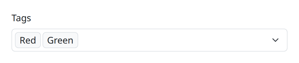
multiple switches to chips: the value is an array of keys (comma-separated in the attribute), each selected key a ful-badge before the input, removable in place; chips that do not fit on one line wrap onto more, the control growing with them. The open dropdown marks the options already picked, with a picked attribute and aria-selected="true". item-list renders the selection as a ful-item-list under the field in place of the chips, which it hides. An empty multiple select submits [].
With item-list, a readonly select is its list: the control group goes, the value being fixed and the rows already carrying it. A disabled one keeps its control, dimmed, disabled saying the control is unavailable rather than absent. The remove button on each row goes under either claim, both refusing the gesture behind it.
A <template slot="items"> reshapes each item-list entry over the entries overlay the stock chip renders from: each entry is a { key, label, metadata } object, the same vocabulary the change detail speaks, and the remove button keeps its wiring.
<template slot="items">
    <ful-item data-tpl-each="entries" data-tpl-var="entry" data-tpl-data-key="entry.key">
        <div><em>{{ entry.label }}</em><button type="button" data-tpl-aria-label="#l10n:t('select.remove')"><ful-icon name="x-lg" aria-hidden="true"></ful-icon></button></div>
    </ful-item>
</template>
entry reads back the resolved selection as { key, label, metadata } (an array of them when multiple): the same vocabulary the change detail and the items overlay speak.
<ful-select multiple name="tags" value="a,b">
    Tags
    <select slot="options">...</select>
</ful-select>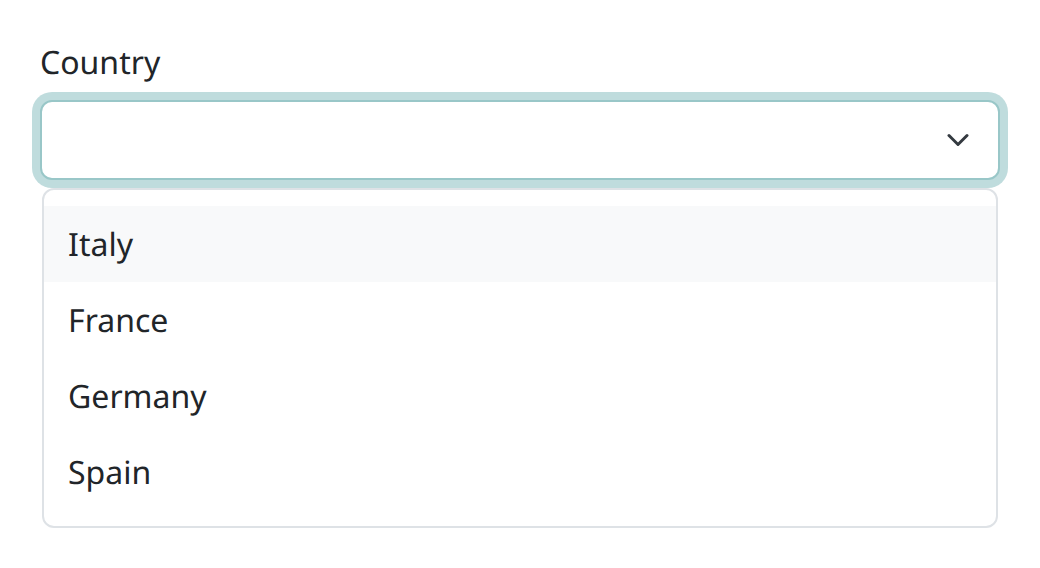
| Key | Behavior |
|---|---|
| click on field | toggle; the label stays and is selected, so typing replaces it |
ArrowDown/ArrowUp
|
open and move the highlight (move when open) |
Alt+ArrowDown / Alt+ArrowUp
|
open / close without moving |
Home / End
|
first / last option |
PageUp / PageDown
|
page through, one visible page at a time |
Enter |
open: accept the highlighted option; closed: submit the form |
Escape |
close and restore the current selection's label (aborts a pending search, as a pick, Enter, Alt+ArrowUp or a click closing the dropdown do) |
Tab |
leave the field, committing an emptied box as a clear |
| typing | the needle, throttled 400 ms into load(needle); while a newer search loads, Enter, the arrows, Home, End, PageUp and PageDown do nothing |
Backspace (caret at 0) |
remove the last chip (multiple) / clear the selection (single) |
ArrowLeft (caret at 0) |
focus the last chip; arrows walk the chips, Enter/Space/Backspace/Delete remove the focused one, Escape returns to the field |
Clearing a single select is emptying its box. The label stays on screen while
the dropdown is open, selected rather than blanked, so the control never shows
nothing while holding a value and the first Backspace is the one that does
something. Leaving the field with the box empty commits that as a clear;
Escape reverts instead, and any other text is a search that matched nothing
and reverts too, since a label is the only thing the field can commit. Browsing
is unaffected: the query the loader is asked for is empty until you type, which
is a separate thing from the text on screen. A multiple select keeps its box
empty by design, so leaving one never clears its chips.
A disabled or readonly claim landing while the dropdown is open closes it and drops the pending search. The highlighted option is announced through aria-activedescendant; opening highlights the current selection; empty results announce a localized "No results" with no empty listbox exposed.
An entry whose metadata.disabled is truthy is refused: its row carries aria-disabled, metadata.reason rides as the row's title, the arrows, Home/End and the page walk step past it, opening highlights the first enabled row, and a click on it, or Enter on it while it is highlighted, changes nothing. A tree picker reads better with the invalid parents greyed in place than with them quietly missing from the list, and both fields are in the dropdown template's scope, so a custom row renders them however it likes. A picked key the vocabulary still carries keeps its place: assigning a disabled key through the property stays your call.
The dropdown opens above the control where the viewport leaves no room below, and it grows past the control for a long option, at least the control's width up to --ful-dropdown-max-width (30rem by default). Where the platform anchors in css but cannot try positions (as in Firefox), the dropdown always opens below the control; the growth works everywhere.
The attributes, slots and events are listed under ful-select. Two slots that list leaves out: options holds the <select> whose <option> elements are an in-memory vocabulary, and items is the template for each row of the item-list (see Multiple). Every input-* attribute is forwarded to the combobox input.
The dropdown slot replaces the built-in option row. The template is rendered once per open, over the whole result list: self is the array of entries, each one { index, key, label, metadata }, so the template iterates it itself:
<template slot="dropdown">
    <li data-tpl-each="self" data-tpl-value="index" role="option">
        <ful-icon name="star"></ful-icon> {{ label }}
    </li>
</template>
Two things your template must keep:
-
data-tpl-value="index", because the click handler reads the option'svalueattribute to find which entry was picked. Without it nothing selects. -
role="option"on the row, inside the listbox the dropdown owns, so the highlight can be announced througharia-activedescendant.
The dropdown supplies the rest: it toggles selected on the highlighted row, picked and aria-selected on the rows already in the selection, and hides the whole listbox when there are no results in favour of the localized empty state, which is a ful-empty and styles like the one an empty table raises. Style [picked] and [selected] to match your row.
Since the entry's metadata is in scope, this is how a row carries more than a label. See Extending loaders for a loader that fills it.
change bubbles on every pick or removal. Its detail carries two views of the same selection:
| detail | single | multiple |
|---|---|---|
value |
the key, or null
|
the array of keys, [] when empty |
entry |
{ key, label, metadata }, or null
|
an array of those, [] when empty |
value is the key, exactly what select.value answers and exactly what the form extracts. Every ful field's change detail carries value, so el.value === evt.detail.value holds here too. entry is the select's own addition, the labelled selection beside the keys, and it is also readable at any time as select.entry.
select.addEventListener('change', (e) => {
    console.log(e.detail.value);        // 'it'
    console.log(e.detail.entry.label);  // 'Italy'
});