Repository navigation
15 Ful tables
ful-table renders paginated, sortable, filterable data from a loader, remote or in-memory, with ful-pagination and ful-sorter integrated and a ful-form-wrapped filter slot. No javascript is required to assemble it.
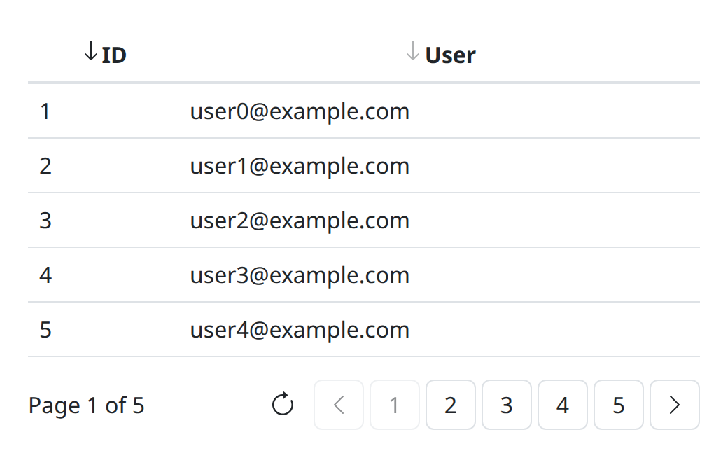
<ful-table src="/api/users" autoload page-size="10">
    <div slot="filters">
        <ful-filter-text name="byName">Name</ful-filter-text>
        <ful-filter-boolean name="byActive">Active</ful-filter-boolean>
        <button type="submit">Search</button>
    </div>
    <template slot="schema">
        <schema>
            <column title="ID" sorter="id" order="asc">{{ id }}</column>
            <column title="Email">{{ email }}</column>
            <column title="Created">{{ createdAt }}</column>
        </schema>
    </template>
</ful-table>loader, autoload, page-size, src, method and the filters, caption, empty and footer slots are listed under ful-table in the element reference. The table reads a few more with getAttribute at the upgrade, which the reference does not list:
| Attribute | Default | Description |
|---|---|---|
response-mapper |
registry component key, (response) => ({ data, size }), applied to the remote loader's parsed json body |
|
table-* |
forwarded, stripped, onto the inner <table> (table-class merges) |
The schema slot is required: a <template slot="schema"> holding one <schema>, described below. The content of the filters slot is wrapped in a generated ful-form.
page-size, src and method stay live after the upgrade. Writing page-size, as an attribute or as the pageSize property, reloads from the first page, since the page index means nothing under a new size. That is what a rows-per-page control is:
picker.addEventListener('change', (e) => { table.pageSize = e.detail.value; });The size may be a number or a string holding one, as a select's value is; a value that is not a number is ignored. A table that has not been asked to load yet, one with no autoload and no reload() behind it, only records the size instead of starting a load. Removing the attribute restores the default of ten. Everything else about the request, the sort and the filters included, survives the change.
Writing src or method, as attributes or as properties, builds the loader again through the same loader component and reloads from the first page, keeping the size, the sort and the filters. That is how one table follows a selection:
customers.addEventListener('change', (e) => { shipments.src = `/api/customers/${e.detail.value}/shipments`; });As with the size, a table that has not been asked to load yet only builds the new loader.
reconfigure({ src, method }) writes both at once and loads once, answering the load's promise. A name left out keeps its value and null removes the attribute. Unlike a write, it loads a table that has not loaded yet.
<template slot="schema">
    <schema class="tight">
        <column title="ID" sorter="id" order="asc">{{ id }}</column>
        <column sorter="email">
            <title>{{ #l10n:t('app.email') }}</title>
            <a data-tpl-href="`mailto:{email}`">{{ email }}</a>
        </column>
    </schema>
</template>-
<schema>attributes land on both the header and the row<tr>. -
<column>attributes land on the matching<th>/<td>, excepttitle(header text, or a<title>child element for templated headers),sorter(the sort key) andorder(asc/desc: the first column declaring bothorderandsortergives the initial sort;orderwithoutsorterdraws the arrow and sorts nothing). - a column with
sorterorordergets its title wrapped in aful-sorter. - the column's children are the cell template.
The cell template is a full ftl template: the row object is the context ({{ id }} reads row.id), rows the page's data, and inHeaders/inRows discriminate header from cell when a column needs both.
The rows come from the component loader names, loaders:table by default. Its one method, load(pageRequest, sortRequest, filterRequest), and the { data, size } it answers are under the table loader, with a worked example.
The built-in remote loader issues exactly:
GET /api/users?page=0&size=10&sort=id,asc&filters={"byName":["CONTAINS","IGNORE_CASE","ada"]}
sort and filters are omitted entirely when unset; filters is a json object keyed by each control's name, with falsy values dropped. A response-mapper turns whatever the endpoint answers into { data, size }; without one the body must already have that shape.
In-memory: no src, then await table.withLoader(async l => l.update(rows)) and await table.reload(): update only replaces the loader's rows, and the table shows them at its next load. The loader slices and sorts, by the column's sorter key with missing values last in either direction; filtering is yours, or the server's over src.
| Method | Description |
|---|---|
load(pageRequest, sortRequest, filterRequest) |
a full explicit load |
reload() |
repeat the last request; before any load has loaded, submit the filter form instead (see Filters) |
reconfigure({ src, method }) |
write both, rebuild the loader and load once, from page 0 when either changed |
resetWithFilter(filterRequest) |
page 0, keep size and sort |
withLoader(async loader => ...) |
live access to the loader instance |
Loading states are built in: a localized "start searching" row until the first load, a spinner, an error row (the problems' reasons, one per line, when the loader throws a Failure) and a "no data" row. A load failure renders and rethrows, so client-errors hears about it.
| Event | Fired | Detail |
|---|---|---|
load:success |
a load settled: the rows are in place, the elements in them have rendered and aria-busy is gone |
{ pageRequest, sortRequest, filterRequest, response } |
load:failure |
a load rejected, after the error row is shown and before the rethrow | { pageRequest, sortRequest, filterRequest, exception } |
Both bubble and neither is cancelable. A load a newer one superseded fires
nothing: it owns neither the table nor the outcome, which is the same rule that
leaves its aria-busy alone.
Listen to these rather than watching aria-busy. The attribute says a load is
running and nothing more, so an empty result, a failure and a superseded request
all look the same once it goes: a page hiding an empty table by counting rows
after the attribute clears will hide the error row too, the table having emptied
the body to show it. The event says which of the three happened, and the detail
carries the response, so the row count comes without reading the dom.
table.addEventListener('load:success', (e) => {
    card.toggleAttribute('hidden', e.detail.response.data.length === 0);
});A load that comes back with no rows raises a panel in place of them, the same height as the loading and error panels so the table does not collapse and grow back between states. It carries a ful-icon and one localized line, table.no-data.
That line is the same sentence on every table in the application. Where a table wants its own, the empty slot replaces it:
<ful-table src="/api/customers/42/shipments" autoload>
    <template slot="schema"><schema>...</schema></template>
    <ful-icon slot="empty" name="inbox" aria-hidden="true"></ful-icon>
    <p slot="empty">No shipments for this customer yet.</p>
    <p slot="empty">They will appear here once the first booking is confirmed.</p>
</ful-table>
Several elements may carry slot="empty" and they land together, as above: a wrapper around them is not needed and costs the icon its size, ful-empty sizing the one that is its own child. The content is rendered per load, in the rows' own scope, so its expressions read schema, pageRequest, filterRequest and pageResponse: an empty state can tell nothing-there from a filter that matched nothing, which a static panel cannot. It may hold anything, a button that clears the filters included. ful-empty centres and mutes it, so the markup above needs no css of its own.
<p slot="empty">{{ filterRequest.byName ? `Nothing matches "{filterRequest.byName[2]}"` : 'No pages yet' }}</p>The panel is one of four states and only ever one shows: the initial panel before the first load, the spinner, this one, and the error. A load that fails empties the rows but shows the failure, not an absence of results.
ful-pagination and ful-sorter are ordinary elements the table composes, usable alone by listening to their events:
-
ful-pagination:total,current,pages(max rendered page buttons, default 5). Emitspage:requested, with{ value: <0-based page> }, from page buttons, prev/next and the reload button. The page being shown carriesaria-current="page"and is filled with--ful-active-bg. It stays enabled: clicking it asks for nothing rather than being a dead control. -
ful-sorter:sorter(key),order(asc/desc/unset, reflected, mirrored to the header cell'saria-sort). Click/Enter/Space cyclesasc → desc → unsetand emitssort:requested, with{ value: { sorter, order } }.
Inside a table: paging keeps sort and filters; sorting keeps page and filters (and clears the other sorters); a filter submit resets to page 0 keeping the sort. These are the usual grid semantics. The filters a page, a sort or a size change carries are those of the last load asked for, even one still running or one that failed, so they are the ones the filter form shows. A ful-table nested in a cell or the footer of another one pages and sorts alone: its pager and its sorters do not drive the outer table.
Used alone, neither moves itself: a click only asks. The page:requested listener shows the page and then calls pagination.update({ current, total }), the zero-based page shown and the number of pages, in one repaint (the current and total properties set one each); the sort:requested listener sorts and then sets the sorter's order to detail.value.order.
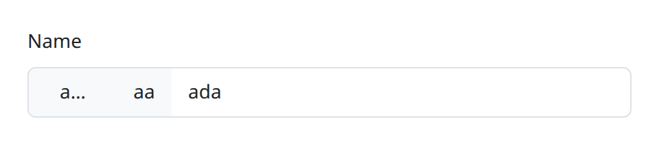
ful-filter-* are form fields like any other: give them a name, put them in the table's filters slot (any other named control works there too, plain inputs and multiple selects included), and their value joins the request. Their change fires as usual; the filter request is what the slot form submits. The first load goes through that submit too: autoload, or a reload() before any load has loaded (and so a src or method write that reloads), submits the filter form, so pre-filled controls participate at once and a submit listener rewriting detail.request shapes the first load as it does the later ones. The filter form fires submit and submit:success for it, and a filter submit that is cancelled or fails loads nothing.
To load again with the filters as they are now, after code has set one or cleared them all, submit the ful-form the table wraps its slot in: it loads the first page with the current values, exactly as the search button does.
table.querySelector(':scope > ful-form').submit();Once a load has loaded, reload() repeats the last request, filters included, so it does not see a value written since; resetWithFilter(values) loads the first page with values you pass rather than the form's. Reaching for the native <form> inside ful-form and calling requestSubmit() on it also works today, but depends on markup the element renders; submit() is the documented call.
| Element | Widget | Operators | Default | Value tuple |
|---|---|---|---|---|
ful-filter-text |
text | EQ NEQ LT GT LTE GTE BETWEEN CONTAINS STARTS_WITH ENDS_WITH |
CONTAINS |
[op, sensitivity, operand(s)] |
ful-filter-number |
number | EQ NEQ LT GT LTE GTE BETWEEN |
EQ |
[op, operand(s)] |
ful-filter-local-date |
date | compare set | EQ |
[op, 'YYYY-MM-DD'(s)] |
ful-filter-instant |
datetime-local | compare set | LTE |
[op, ISO-UTC(s)] |
ful-filter-boolean |
button menu | EQ NEQ |
EQ |
`[op, 'true' |
ful-filter-in |
select, multiple optional |
fixed, optional |
[key(s)] or [op, key(s)]
|
The operator is a menu on the field (glyph + localized name, keyboard-navigable popover); BETWEEN reveals a second operand, which takes the same placeholder, autocomplete, keep/reject and input- attributes as the first (input-id excepted); an unfilled filter yields null and contributes nothing, as does a half-filled range or a boolean set to "Any". Sensitivity (IGNORE_CASE/CASE_SENSITIVE) is a second menu on the text filter.
A compare filter (text, number, local date, instant) whose operator is not a choice takes the singular spelling: operator="GTE" fixes it for the element's life, no menu and no button render, and every tuple carries it, which is what makes ful-filter-text operator="CONTAINS" sensitivity="IGNORE_CASE" a bare search box. The plurals stay the menus' whitelists, a single entry among them still pinning the tuple while showing its glyph, which says what the field does; the singular beside its plural warns, the singular winning, and an unknown name warns and pins the filter's default. ful-filter-boolean has no singular: a single entry in its operators pins it.
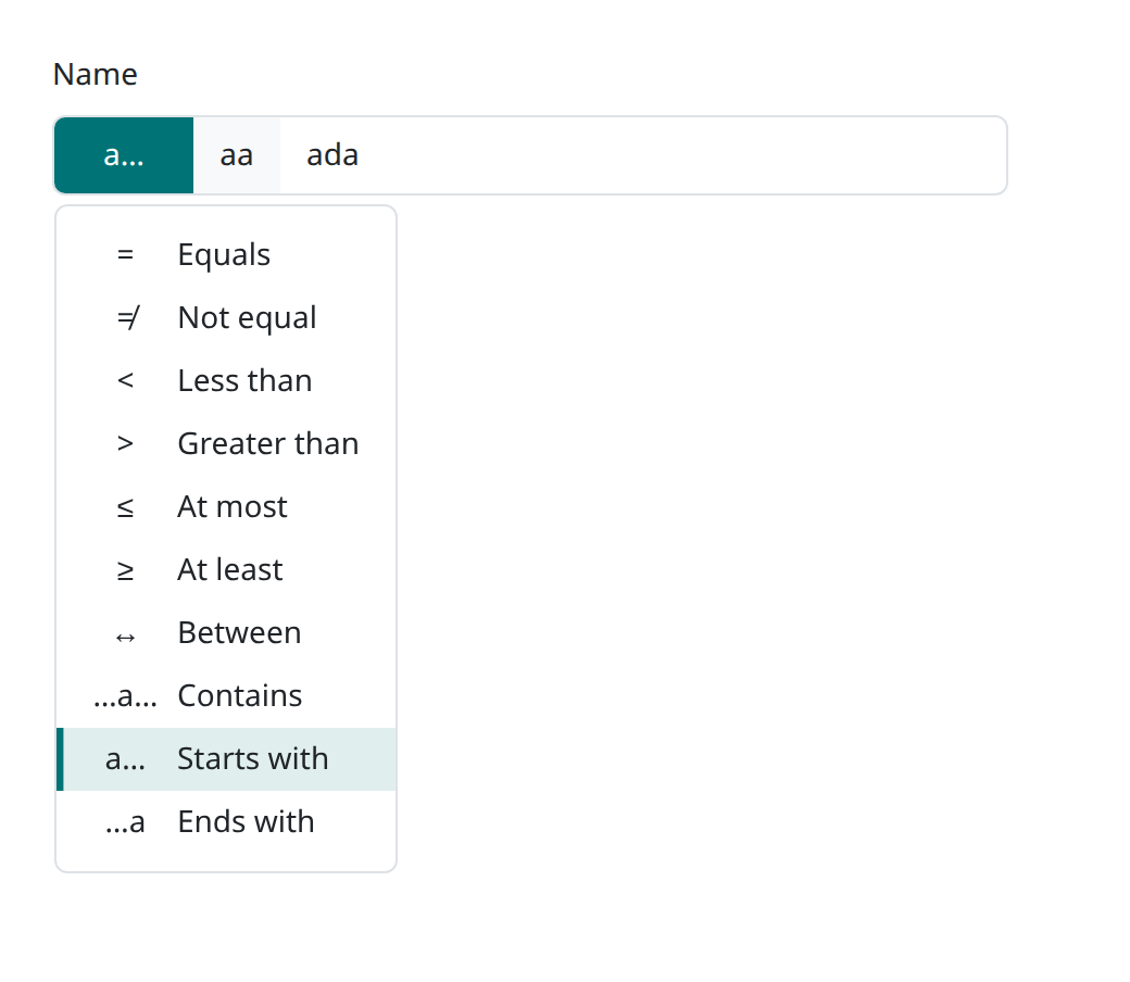
<ful-filter-text name="byName" value='["STARTS_WITH","IGNORE_CASE","ada"]'>Name</ful-filter-text>operators="CONTAINS,EQ" narrows the menu to a comma-separated subset of the filter's vocabulary (unknown names drop; an empty result keeps the full set). A single entry pins it: the button keeps its glyph, documents the choice, and every emitted tuple carries the pinned operator regardless of assignments. This mirrors the optionfactory data-jpa filter annotations (TextCompare, NumberCompare, BooleanCompare, operators(), caseSensitivity()), which these tuples match one-to-one. sensitivities="CASE_SENSITIVE" does the same on the text filter. Both are live: re-assigning rebuilds the menu, and narrowing it past the operator in force replaces that operator with the first one listed. An assigned tuple naming an operator outside the list, or none, shows the first allowed one. ful-filter-in renders no operator menu, so neither attribute means anything on it; its operator attribute is a different thing, below.
ful-filter-in is the one filter that does not map onto a single annotation. InEnum and InList take the same bare array of values and no operator at all, differing only in what the server converts them to, enum constants for the first and the attribute's java type for the second, so one element answers for both and the client never has to know which the endpoint declared.
It is a ful-select underneath, so its vocabulary comes from wherever a select's does, slotted <option> elements or a loader, with the same src, method, mode, preload, revision, k-expr, l-expr, d-expr, m-expr, response-mapper, k-type, loader and item-list attributes. See select for all of them.
<ful-filter-in name="byKind" src="/api/kinds" value="DRAFT,SENT">Kind</ful-filter-in>It picks one key unless multiple is declared, exactly as a ful-select does. The value is an array either way, a set of one still being a set, so a single filter answers ["DRAFT"] and never a bare key. The value is a comma-separated list of keys in markup and an array of keys as a property, and an empty selection answers null rather than [], since the remote loader drops a falsy filter from the request while an empty array would travel and match nothing. A null among the values reads as "or is null" on the server, where the annotation whitelists it; there is no control on the client for putting one there.
Some fields want a vocabulary picker but a comparison, an id chosen from a list of carriers where the server declares a NumberCompare. The operator attribute sends a fixed operator in front of the keys:
<ful-filter-in name="byCarrierId" operator="EQ" src="/api/carriers">Vettore</ful-filter-in>The value becomes ["EQ", "7"] instead of ["7"], and assigning either shape back works, so what the getter answers is assignable. No menu appears: the operator is the author naming what the endpoint declared, not a choice offered to whoever is filtering, which is what separates the singular operator from the plural operators that narrows a menu on the compare filters. criterion reports it, so a chip shows it like any other. With multiple the operator still leads, ["EQ", "a", "b"], which most endpoints will not understand; the library does not stop you, since an endpoint taking ["IN", "a", "b"] is perfectly reasonable.
Every filter answers a criterion: null while it contributes nothing, which is the same question the table asks when it drops falsy filters (and null before the filter has rendered), and otherwise { label, operator, operands }. A filter's value does work before the render: it answers the tuple the rendered filter would, from the tuple written or the value attribute, and a tuple written then is applied at the render.
| Key | Value |
|---|---|
label |
the text of the filter's own <label>, null when it has none |
operator |
the token in force ('CONTAINS', 'EQ'), null where there is none, which is ful-filter-in unless it declares one |
operands |
the words the reader chose, not the keys the wire carries |
ful-filter-boolean gives 'Yes', not 'true'; ful-filter-in gives the chosen labels, not the chosen keys; an instant filter gives what is in its control rather than the ISO string it sends. This is for the summary drawn beside the table: a page painting a chip per active filter otherwise has to read the operands back out of the controls, which cannot work for the set filter, whose input is empty by design while the selection shows as badges.
//the box holding the filters, not the ful-form around it: a form renders a real
//<form> between itself and its children
const paint = () => {
    const chips = [...box.querySelectorAll('[name]')].map((f) => f.criterion).filter((c) => c);
    …
};
//when the table applies them, not when they change: a filter submits on Enter,
//and until it is submitted the table is still showing the rows it had
form.addEventListener('submit:success', paint);
Paint on submit:success rather than on change wherever the chips sit beside a
table. A filter is an input, so Enter submits it, and the table reloads on that
event and no other. Chips painted on change claim a filter the table has not
applied yet.
The autoload submits the filter form too, so the same listener paints the chips of the first load. The form is generated at the upgrade, which is also when the autoload starts, so a listener meant to hear that first submit sits on an ancestor in place beforehand, the document for instance, and checks the target, since every form in the page bubbles there:
document.addEventListener('submit:success', (e) => {
    if (e.target === table.querySelector(':scope > ful-form')) {
        paint();
    }
});
Anything else in the slot, a submit button or a plain input, has no criterion and drops out of the same pass. The shape is structured rather than a finished sentence because which operators are worth showing, and how to join operands, are the page's decisions: a CONTAINS usually reads better left out. It is a criterion and not a description because a field already carries an accessible description, through describedBy.
The pagination icons, the initial search icon and the empty-state icon are ful-icon masks named by static config on the classes (Table.config.searchIcon, Table.config.emptyIcon, Pagination.config); the sorter arrows are ::before masks on ful-sorter itself. The four state panels sit in a tbody named by data-ref: the initial and the empty panel are ful-empty, the loading one a ful-spinner, the error one a div[role=alert], and the current page button is button[aria-current="page"]. Colors, borders and density follow the shared --ful-* custom properties.
A table that should fill a panel instead of growing with its rows carries the ful-fill class: it takes the height its container gives it, as a flex item or through a height of its own, scrolls its rows inside that height in both directions, and keeps its filters above and its pagination below in view. The header then sticks to the top of the scrolled rows.
<section style="display: flex; flex-direction: column; height: 60vh">
    <ful-table class="ful-fill" src="/api/tasks" autoload>…</ful-table>
</section>
It is a class and not the default because a scrolling wrapper becomes what the sticky header sticks to: on a table left to grow, the header follows the page as it scrolls, and a wrapper of its own would stop that. Like every ful rule it sits in a layer, so a page rule of yours giving ful-table a display of its own outside a layer overrides it.
The header cells are sticky: in a scrolling container they stay at its top while the rows scroll under them, and on a page that scrolls they stay at the top of the viewport. They are painted with --ful-bg so the rows do not show through; a table on a surface of another colour sets the background of ful-table-wrapper thead th to match. A page with a fixed header of its own offsets them with inset-block-start on the same selector.