Repository navigation
17 Ful navigation
Three ways to show one section at a time. All three take their structure from the markup you write, keep the platform's own keyboard behaviour, and can fill their sections on demand through the async section protocol.

Tabs are declared as <tab> elements in the tabs slot, pairing with the slotless panels in order.
<ful-tabs active="0">
    <template slot="tabs"><tab>Shipping</tab><tab>Invoices</tab></template>
    <section>…</section>
    <section>…</section>
</ful-tabs>
The rendered tabs are real buttons with a roving tabindex and automatic activation. Arrow keys move and wrap, Home and End jump to the ends. The visible panel joins the tab order immediately after its tab; hidden panels stay out of it.
active is the claim that picks the panel, and it answers to all four of the attribute, the property, a click and a key. It reflects, it clamps to the range, and every move fires a tabs:change event carrying detail.active and detail.previous, except the first, which the element applies when it renders. The event does not bubble: listen on the ful-tabs element. The name is its own rather than the fields' change, because the panels are the host's children: every native change of an input inside them bubbles through the host, and a listener on one name would have to inspect e.target to tell the two apart. A panel that already carries an id keeps it, and the tab adopts it rather than minting a new one.
Entering a panel fires section:requested on the tabs, with the panel as detail.section, in the generic and #index forms, panels having no names. refresh(index) or refresh(panel) asks again.
The tablist stays on one line, however many the tabs. When they do not fit it scrolls sideways, by touch, trackpad or wheel, and a previous and a next button appear at the side that has more tabs, the side being mirrored under dir="rtl", chevrons and fade included:
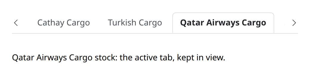
Each button brings the next hidden tab wholly into view, one tab at a time, rather than paging by the tablist's width, so the tab you were reading never jumps away. The buttons are for the pointer and stay out of the tab order: the keyboard already walks the tabs with the arrow keys, Home and End. The active tab is kept in view, whether it changed through a click, a key or the active property, and when the tablist changes width. Tabs that fit show no button and look as they always did, so there is nothing to switch on.
The fade under the buttons is painted with --ful-tabs-scroll-bg, which falls back to --ful-bg: tabs laid on a surface of another color set it to that color, on the host or anywhere above it.
The chrome anchors on the ful-tablist tag, so a subclass or foreign markup built from the same structure keeps the look. Next to it the host renders the two scroll buttons, .ful-tabs-scroll: select the tabs by [role="tab"], not by button.
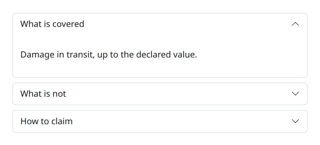
Chrome over the native <details>/<summary> platform. The semantics, the keyboard and the toggling are the browser's; the library adds the card styling and the chevron that turns on open.
<ful-accordion exclusive>
    <details><summary>What is covered</summary><p>…</p></details>
    <details><summary>What is not</summary><p>…</p></details>
</ful-accordion>
exclusive is a live claim, as an attribute or a property. It names the group the platform's own way, so opening one panel closes the others without any script of the library's own.
The card rings when its summary holds the focus, and the group is the ful-accordion-group tag.
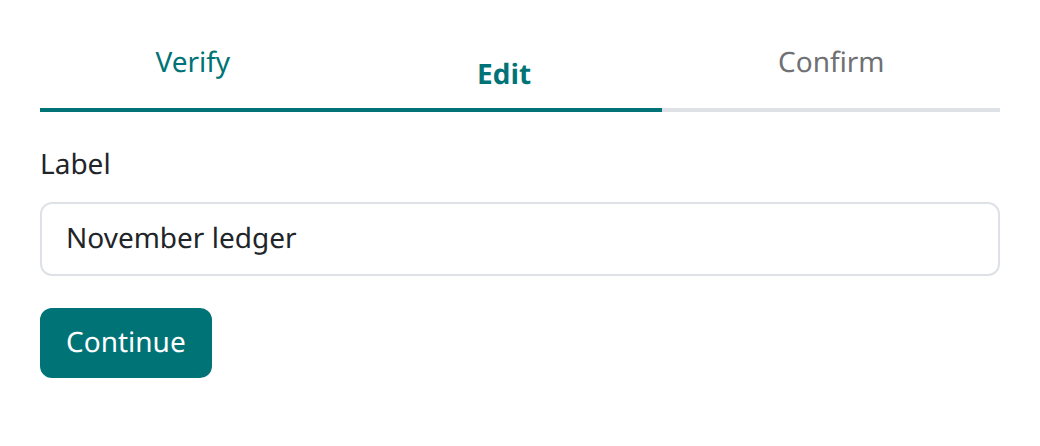
A progress of steps over one-of-N sections.
<ful-wizard>
    <template slot="steps"><step>Verify</step><step>Edit</step><step>Confirm</step></template>
    <section data-step="verify">…</section>
    <section data-step="edit">…</section>
    <section data-step="confirm">…</section>
</ful-wizard>
The current step is the aria-current="step" claim, carried in lockstep by a step and its section. Which section shows follows that claim alone, so a section that already carries it when the page arrives keeps it: server-rendered state wins. Done steps carry the accent, future ones stay muted but legible.
next() and prev() walk and clamp at the ends; move(name) goes to a section by its data-step; a name no section carries, or one carried by a section with no <step> paired to it, warns on the console and stays where it is. Each landing moves the focus to the section that just became current, since the control that moved it has usually left the document, and fires a wizard:change event carrying detail.index and detail.step, which does not bubble. It is named apart from change for the reason ful-tabs uses tabs:change: a field's change bubbles out of the sections, and would otherwise reach the same listener.
The moves resolve when the entered section is painted and reject when its delivery failed, which is what makes submit:success → await move(...) sequence honestly. Entering a step fires section:requested in all three forms: generic, #index, and its data-step name. refresh(name) or refresh(section) asks again for a section, current or not; like move, it warns and delivers nothing for a section with no <step> paired to it.
By default the progress shows the current step alone; a counter or any other dressing is the page's own. progress picks another shape over the same claims:
| value | shape |
|---|---|
| (unset) | the current step alone |
timeline |
the full done / current / future timeline |
dots |
one dot per step |
none |
no progress chrome |
The moves, the focus handling and the wizard:change events are identical in every shape. The progress announces itself through the localized wizard.progress, and the chrome anchors on the ful-steps tag.
This is the usual shape of a wizard: each step hosts a ful-form, failures pin to their own step, and successes move where the response says.
for (const form of wizard.querySelectorAll('ful-form')) {
    form.addEventListener('submit:success', (e) => wizard.move(e.detail.response.next));
}
Three things make it work. A rejected submit pins its FIELD_ERRORs to the step's own fields and nothing moves, which is the wizard's default behaviour on failure rather than something you arrange. A Back button inside a ful-form must carry type="button", or it submits the step instead of leaving it. And Enter submits the step's form through the field base, so Continue-by-Enter works per step without any wiring.