Repository navigation
Theme and Interface Review
Select Preferences → General → Theme to preview the entire workspace immediately. Reset preview restores the saved choice. Save preferences keeps the selected theme for your account across devices. Reloading or leaving without saving discards the preview. Changing a theme does not change your accessibility or notification settings.
| Light workspaces | Dark workspaces | Automatic |
|---|---|---|
| Classic Light, Executive Navy, Slate, Forest, Ocean, Indigo, Sandstone | Dark, Graphite, Midnight | Match system |
Status and priority colors keep their meanings. High contrast, reduced motion and font scale remain independent account settings.
Captured with isolated test accounts and no production records.
| Desktop Midnight preview | Mobile Indigo preview |
|---|---|
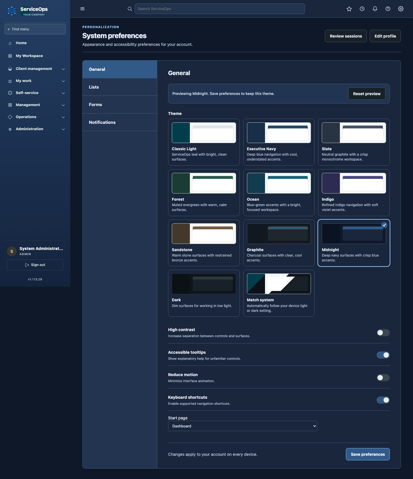 |
 |
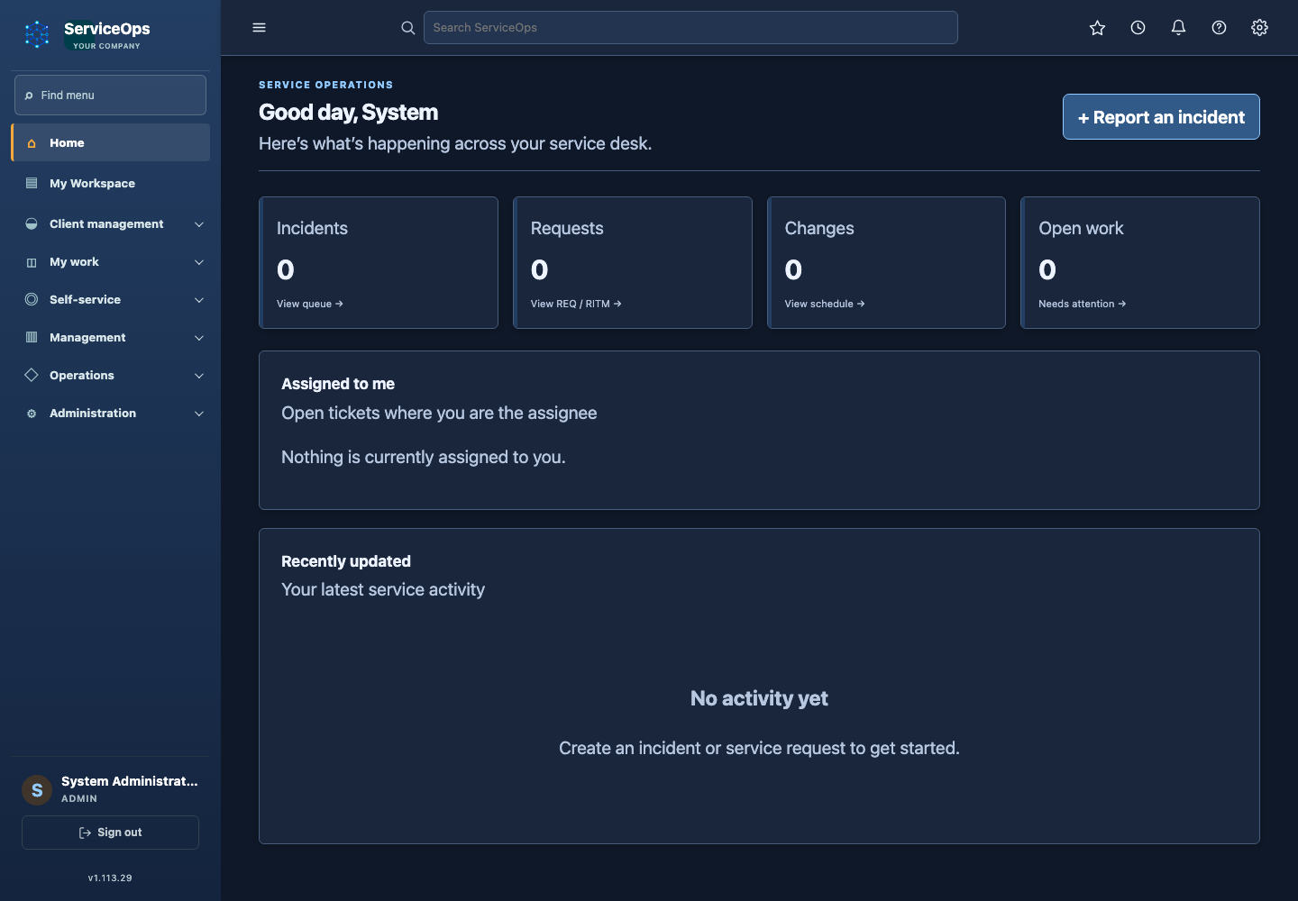
Reviewed 11 October 2026 against the current theme selector, application shell, shared list styles, dark stylesheet generation, account preference route and embedded rack view.
| Finding | Result |
|---|---|
| Selecting a radio changed the card only; the workspace changed after save. | Selection previews the document immediately. A live status explains whether the displayed palette is saved or temporary. |
| Dark styles were available only when the saved choice was dark/system. | Preferences loads an inactive dark stylesheet that can be enabled without a reload. Other light pages retain their existing asset-loading behavior. |
| Theme IDs were duplicated between the model and base template. | The template receives the server's accepted theme IDs and dark-theme classification. Preview values are restricted to that list. |
| Three professional choices covered only light palettes. | Added Ocean, Indigo and Sandstone for light workspaces, plus Graphite and Midnight for dark workspaces. |
| Toolbars and preference navigation retained hard-coded light fills. | Shared surfaces now follow the selected palette; operational status signals retain their existing colors. |
| Selection relied on a colored border. | Selected cards include a checkmark, native radio semantics and visible keyboard focus. |
| Large preference grids needed predictable narrow-screen layout. | Cards use a compact horizontal mobile layout; descriptions wrap, the footer wraps, and the preview controls stack. |
| Embedded rack views recognized only Dark and Match system. | Saved dark palettes are recognized, and the embed loads account palette tokens. |
The preview uses DOM classes and a stylesheet media condition. It sends no preference write request and stores no preview in cookies or local storage. The existing CSRF-protected form remains the persistence boundary. Browser-cache restoration resets the displayed choice to the saved theme. Normal authorization, tenant behavior, account ownership and operational data remain unchanged. No database migration is required.
Desktop and mobile Chromium checks exercise all eleven choices, native keyboard selection, immediate background changes, description contrast, reset, reload/navigation without saving, save/reload persistence, operating-system light/dark changes, and preservation of high-contrast/reduced-motion settings. The same browser checks cover dashboard, incident lists and CMDB at maximum account font scale. Ten theme checks and 43 localization/existing-theme checks passed locally; the full suite passed with 1,705 tests and 141 environment/opt-in skips. Signed v1.113.30 passed hosted quality/security and all five RPM build/install gates, with independently verified image and RPM provenance/checksums. It is deployed at MicroK8s Helm revision 179: all three workloads are ready, health/readiness and Helm test pass, and database/uploads storage is retained. Delivery evidence.
Theme-card text is checked against the WCAG 4.5:1 normal-text threshold. These checks do not establish a complete accessibility certification or every possible customer branding combination. Physical-device Safari acceptance remains a separate check.