Results and Visualization
After running the analysis (see FRET Analysis), the FRET tab presents efficiency maps, per-cell and per-image statistics, histograms, and box plots, both for the current image and aggregated across all images and groups. This page explains each output and the statistics behind it.
The results panel has two View levels — Current Image and All Images — each with Summary, Histogram & Box Plot, and Distribution Analysis sub-tabs.
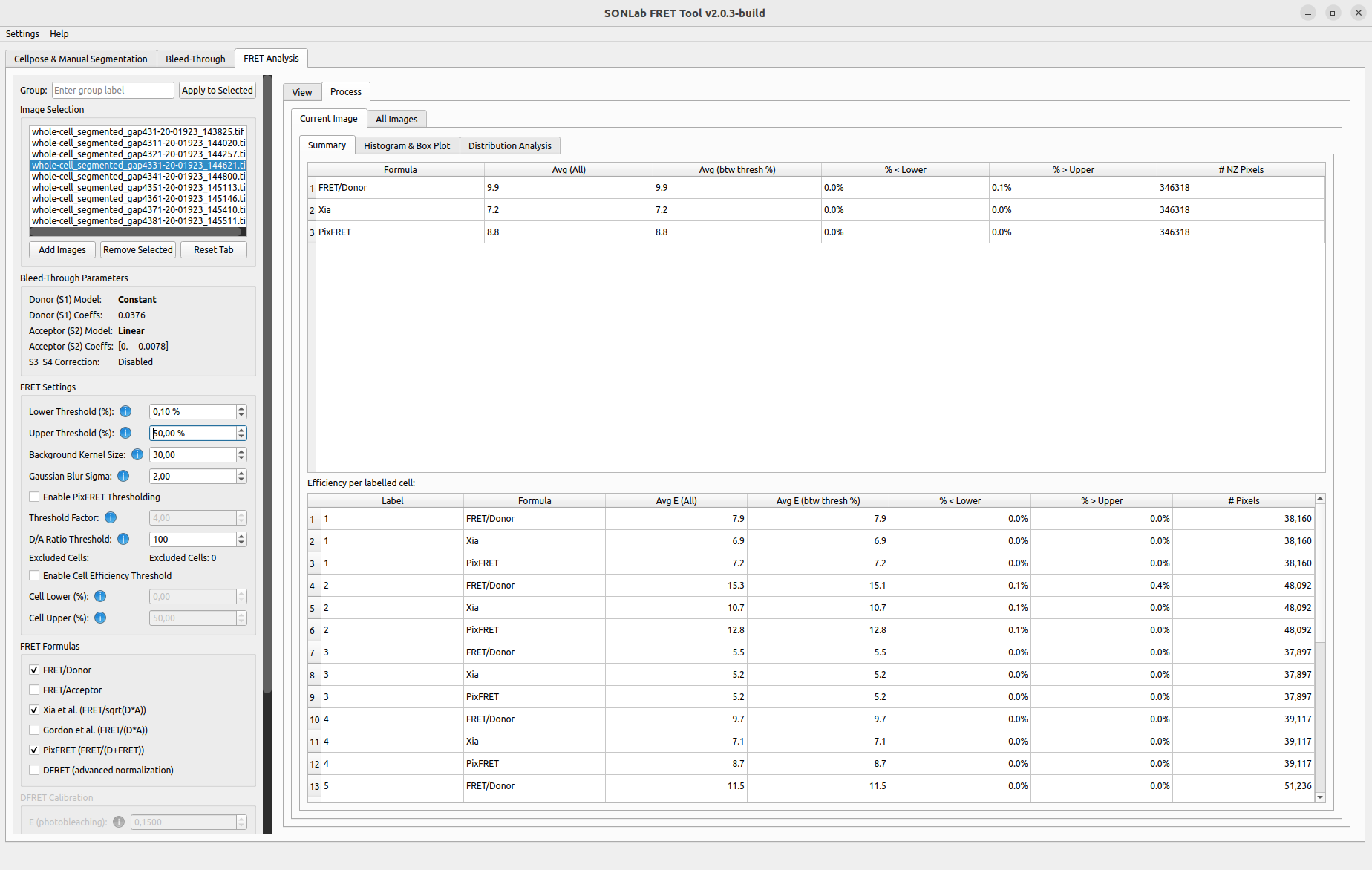 Current Image ▸ Summary: the per-formula statistics table (top) and the per-cell breakdown (bottom).
Each selected FRET formula is rendered as a color-coded efficiency map of the current image, scaled to the Lower/Upper thresholds set in the FRET settings. Values above the upper threshold are clamped to the top of the color scale for display. Use the matplotlib toolbar to zoom/pan, the ↗ pop-out button to open a larger window, and Save to export the figure.
A per-formula summary table with the columns:
| Column | Meaning |
|---|---|
| Avg (All) | Mean efficiency over all non-zero pixels of the cells, independent of the display threshold. |
| Avg (btw thresh %) | Mean efficiency over pixels within the Lower–Upper threshold range. |
| % < Lower | Percentage of non-zero pixels below the lower threshold. |
| % > Upper | Percentage of non-zero pixels above the upper threshold. |
| # NZ Pixels | Number of non-zero pixels. |
A second per-cell (binned) table breaks the same metrics down by individual cell label.
Avg (All) vs Avg (btw thresh): these are deliberately distinct. Avg (All) is the true non-zero mean across the full data; Avg (btw thresh) restricts to the display window. They differ whenever cells contain pixels outside the threshold range, which is exactly what makes the below/above percentages meaningful.
An aggregate table summarizes every analyzed cell across all images:
| Column | Meaning |
|---|---|
| Image / Group | Source image and its assigned group. |
| Avg E (%) | Non-zero average efficiency. |
| Avg E (btw thresh %) | Thresholded average efficiency. |
| % Below Low / % Above High | Out-of-threshold percentages. |
| Non-Zero Pixels | Pixel count. |
Aggregate results can be exported to CSV for downstream analysis.
 All Images ▸ Plots: the aggregate histogram and box plot (shown popped out) compare groups across every analyzed image, with a statistics summary alongside.
- Histogram — distribution of efficiency values; the aggregate version averages per-cell histograms and shows an error band.
- Box plot — distribution of per-cell average efficiencies. The aggregate box plot places groups side by side for comparison.
- SEM / SD toggle — choose whether error bands/bars represent the standard error of the mean or the standard deviation.
- Titles and axis labels are editable, and every plot has ↗ pop-out and Save controls for publication-quality export.
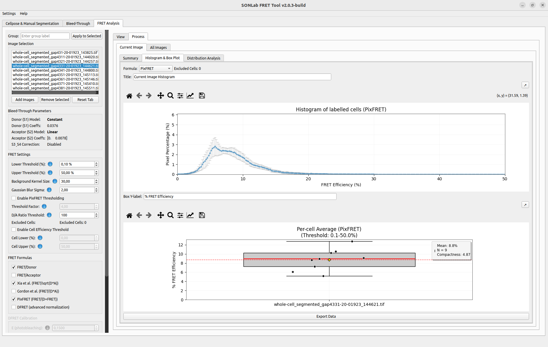 Current Image ▸ Histogram & Box Plot: the efficiency histogram of labelled cells and the per-cell average box plot, each with editable titles and pop-out/save controls.
When two or more groups are compared, the tool draws significance bars between them and chooses the test from the data rather than always using the ordinary (normality-assuming) forms:
- Each group is screened for normality (Shapiro–Wilk).
- If all groups look normal → parametric tests: Welch's t-test for pairs (robust to unequal variances) and Welch's ANOVA as the omnibus test for >2 groups.
- If any group departs from normality → non-parametric tests: Mann–Whitney U for pairs and Kruskal–Wallis as the omnibus test.
- For more than two groups, post-hoc pairwise comparisons are corrected with Holm–Bonferroni, and are only reported when the omnibus test is significant.
| Symbol | Meaning |
|---|---|
**** |
p < 0.0001 |
*** |
p < 0.001 |
** |
p < 0.01 |
* |
p < 0.05 |
ns |
not significant |
Click Stats info (or the Stats ℹ button) on a box plot to open a read-only dialog summarizing exactly how the result was produced: per-group descriptive statistics (n, mean, SD, median, IQR), the normality and equal-variance checks, the test family chosen, the omnibus result, and each pairwise comparison. The summary can be copied to the clipboard.
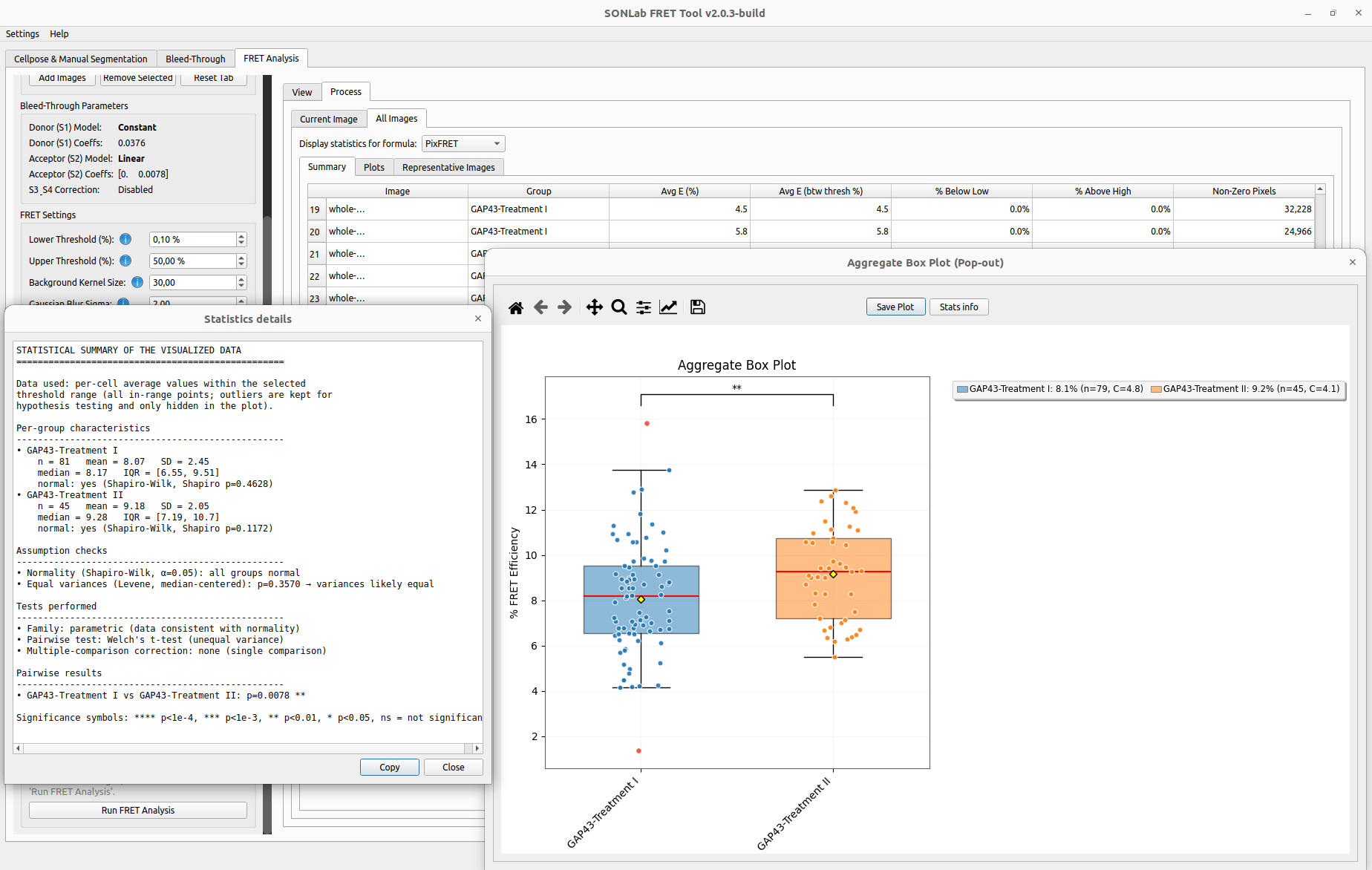 The aggregate box plot comparing two groups, with the Statistics details dialog reporting the descriptive statistics, assumption checks, the chosen test, and the pairwise result.
The Distribution Analysis sub-tab decomposes a cell's efficiency distribution into Gaussian components, which helps reveal sub-populations within a cell or condition.
- Tick Enable Distribution Analysis.
- Choose the Efficiency Formula and the Max Components (1–5, default 3) to fit.
- Click Update Analysis.
- Click a cell on the efficiency map to select it; the Selected Cell label updates.
The panel shows the efficiency map, the Gaussian Mixture Model decomposition of the selected cell's efficiency distribution (the smoothed distribution and its individual Gaussian components), and the cell efficiency distribution histogram.
 Distribution Analysis: the efficiency map (top), the Gaussian-mixture decomposition of the efficiency distribution (bottom left), and the cell efficiency distribution (bottom right).
Use Find Rep Image to automatically pick the image whose efficiency distribution best represents its group — handy for choosing figures for publication. Select the target group first, then run the finder.
| Output | How |
|---|---|
| Efficiency maps (TIFF) | Enable efficiency saving before running the analysis. |
| Statistics (CSV) | Export from the aggregate statistics table. |
| Figures (PNG/PDF) | Save button on any plot or its pop-out window. |
See File Formats for the structure of the exported files.