Cards
The most common content type. A card template holds any dashboard card — built in,
custom, or a stack containing others — and can be used anywhere a card goes.
decluttering_templates:
  room_light:
    card:
      type: tile
      entity: '[[light]]'
      name: '[[room]]'
      features:
- type: toggletype: custom:decluttering-card-plus
template: room_light
variables:
- light: light.living_room
- room: Living RoomAnywhere Home Assistant accepts a card:
- a view's
cards:list - a section's
cards:list in a sections view - inside
vertical-stack,horizontal-stack,grid,conditional - inside another template
Cards are at their most useful when the thing you are repeating is complicated. This template is a heading plus a two-column grid — five nested levels, written once:
decluttering_templates:
  room_summary:
    card:
      type: vertical-stack
      cards:
        - type: heading
          heading: '[[room]]'
          icon: '[[icon]]'
        - type: grid
          columns: 2
          square: false
          cards:
            - type: tile
              entity: '[[light]]'
              name: Light
              features:
                - type: toggle
            - type: tile
              entity: '[[temperature]]'
              name: Temperature
    default:
      - icon: mdi:home-outline
Four rooms, four uses:
- type: custom:decluttering-card-plus
  template: room_summary
  variables:
    - room: Living Room
    - icon: mdi:sofa
    - light: light.living_room
    - temperature: sensor.living_room_temperature

- type: custom:decluttering-card-plus
  template: room_summary
  variables:
    - room: Kitchen
    - icon: mdi:silverware-fork-knife
    - light: light.kitchen
    - temperature: sensor.kitchen_temperature

# …and so on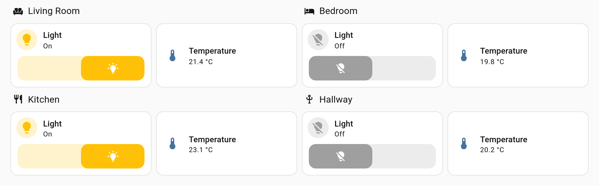
A card's grid_options are passed through to the layout, so templated cards size
themselves exactly as they would if you had written them inline.
Combine that with a variable and the width becomes part of the template's interface:
decluttering_templates:
  sized_tile:
    card:
      type: tile
      entity: '[[entity]]'
      name: '[[name]]'
      hide_state: true
      grid_options:
        columns: '[[cols]]'
        rows: 1
    default:
      - cols: 6
- type: custom:decluttering-card-plus
template: sized_tile
variables: [{ entity: sensor.solar_power, name: Solar, cols: 12 }]
- type: custom:decluttering-card-plus
template: sized_tile
variables: [{ entity: sensor.house_power, name: House, cols: 6 }]
- type: custom:decluttering-card-plus
template: sized_tile
variables: [{ entity: sensor.kitchen_temperature, name: Kitchen, cols: 4 }]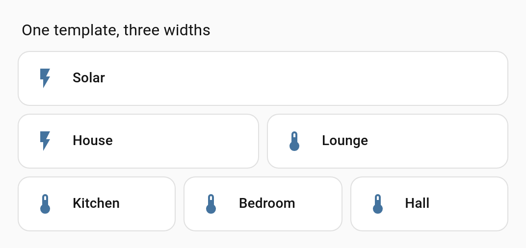
'[[cols]]' is a whole value, so the number stays a number — see
Variables.
Cards that use the older layout API are supported too; whichever one the wrapped card implements is the one that gets reported.
A card set to fill its container — a tile with vertical: true in a fixed-height grid, for
example — measures itself against the space the layout gave it, not against the wrapper.
Templated cards behave the same as inline ones here.
If the wrapped card hides itself — through visibility conditions, a conditional card with
no matching condition, an inline style, a stylesheet rule or the hidden attribute — the
wrapper collapses with it and leaves no gap in the layout.
See Visibility.
type: divider inside an Entities card is technically a row rather than a card. It is
handled correctly whichever key you put it under.
| Key | Where | Description |
|---|---|---|
card: |
template | The card configuration, with [[variables]]
|
default: |
template | Fallback variable values |
style: |
template | CSS to inject — see Styling |
template: |
instance | Name of the template |
variables: |
instance | Values to substitute |
style: |
instance | Extra CSS, appended after the template's |