Defining Templates
A template is a named, reusable piece of dashboard content with holes in it. There are two places to define one, and you can use both on the same dashboard.
| Method | Best for | Editable by clicking? |
|---|---|---|
decluttering_templates at the root |
Most cases. Keeps every template in one place. | No, YAML only |
A decluttering-template-plus card |
Building a template visually, or keeping it next to where it is used. | Yes |
Both produce exactly the same thing. A template defined either way can be used by any card on that dashboard.
Add a decluttering_templates mapping at the root of the dashboard configuration —
the same level as views:, not inside it.
Get there with ⋮ → Raw configuration editor while editing the dashboard.
decluttering_templates:
  room_light:
    card:
      type: tile
      entity: '[[light]]'
      name: '[[room]]'
      features:
        - type: toggle

  temperature_row:
    row:
      entity: '[[entity]]'
      name: '[[name]]'
      icon: mdi:thermometer

  power_badge:
    badge:
      type: entity
      entity: '[[entity]]'
      name: '[[name]]'
      show_name: true

views:
  - title: Home
    cards:
      - type: custom:decluttering-card-plus
        template: room_light
        variables:
          - light: light.living_room
          - room: Living Room
The shape is always:
decluttering_templates:
  <template name>:
    <card|badge|row|element>:
      # the content, with [[variables]] in it
    default:
      # optional fallback values
    style: |
      # optional CSS
If you keep your dashboard in YAML mode, this goes in your ui-lovelace.yaml (or whichever
file that dashboard uses) and you can split it out with !include:
decluttering_templates: !include decluttering_templates.yaml

views: !include_dir_list views/Add a Custom: Decluttering Template Plus card to any view — including inside a stack or a grid, if you would rather keep your definitions together. The card defines the template and is only visible while the dashboard is in edit mode — normal users never see it.
type: custom:decluttering-template-plus
template: quick_light
card:
  type: tile
  entity: '[[light]]'
  name: '[[room]]'
  features:
    - type: toggle
default:
  - light: light.living_room
  - room: Living Room
In edit mode it renders with a blue outline and its name in the corner, showing a preview
built from the default values:
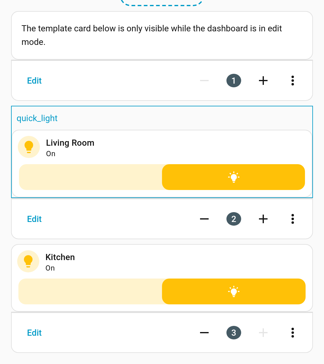
The card below it in that screenshot is an ordinary
custom:decluttering-card-plus using the same template with different variables.
Leave edit mode and the outlined card disappears entirely, leaving no gap.
Template cards are found in any view of the dashboard, including inside the sections of a sections view — so you can keep them all together on a hidden "templates" view if you prefer.
See Visual Editors for building one of these by clicking rather than typing.
One content type per template. A template must have exactly one of card, badge,
row or element. Two of them, or none, and the card reports:
You must define one card, badge, element, or row in the template
Names must be unique. If the same name is defined twice on one dashboard, the last one found wins, and which that is depends on config order. Don't do it.
Templates are per dashboard. A template defined on dashboard A is not visible to dashboard B unless B explicitly borrows it — see Sharing Templates Between Dashboards.
Naming. Anything valid as a YAML key works. snake_case is conventional and easy to
read in the template dropdown.
→ Using Templates — putting them on the dashboard → Variables — filling in the holes