Styling
The style option injects CSS, with your variables substituted into it. That means a
template can expose its colours and dimensions as variables, and each instance can look
different without card-mod or any other helper.
decluttering_templates:
  fancy_room:
    card:
      type: tile
      entity: '[[light]]'
      name: '[[room]]'
      features:
        - type: toggle
    style: |
      :host {
        --ha-card-border-color: [[accent]];
        --ha-card-border-width: 2px;
        --ha-card-border-radius: 18px;
      }
    default:
      - accent: '#2E5EA8'
- type: custom:decluttering-card-plus
template: fancy_room
variables:
- light: light.living_room
- room: Living Room
- type: custom:decluttering-card-plus
template: fancy_room
variables:
- light: light.kitchen
- room: Kitchen
- accent: '#c2410c'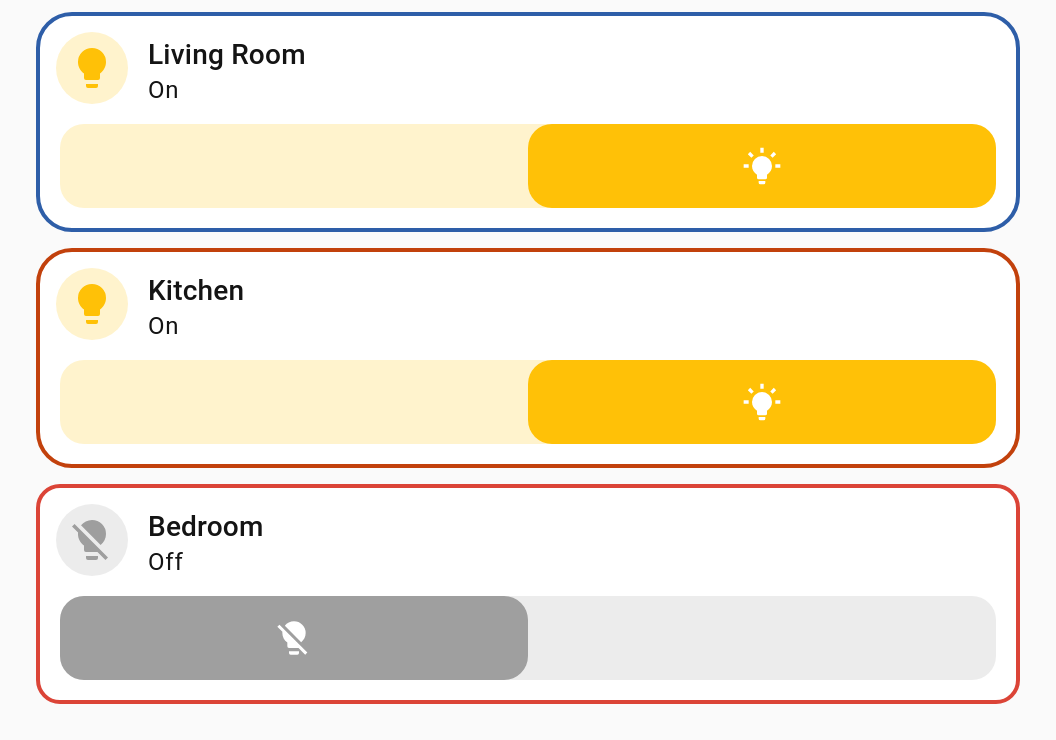
The first card takes the default blue, the second overrides accent to orange. The third
in the screenshot uses instance-level style, below.
This is the part that trips everyone up, and it is worth two minutes.
Your CSS is injected into the wrapper's shadow root. Home Assistant's cards each live in a shadow root of their own, nested inside that. CSS does not cross a shadow boundary, so an ordinary descendant selector cannot reach into the card.
decluttering-card-plus            <- your CSS is injected here
└─ hui-card                       <- reachable
   └─ hui-tile-card               <- reachable
      └─ #shadow-root
         └─ ha-card               <- NOT reachable by a selector
| Selector | Reaches the card? |
|---|---|
ha-card { border: 2px solid red; } |
❌ No. ha-card is inside the card's own shadow root. |
:host { --ha-card-border-color: red; } |
✅ Yes. Custom properties inherit through shadow boundaries. |
:host(.decluttering-container) { opacity: 0.5; } |
✅ Yes — styles the wrapper itself. |
hui-card { outline: 2px dashed red; } |
✅ Yes — hui-card is in the wrapper's shadow root. |
So: style with CSS custom properties. That is the supported, forward-compatible way to change a Home Assistant card's appearance, and it is what the examples here use.
If you have seen
ha-card { … }in older documentation for this card, that is why it appeared to do nothing.
A starting set — Home Assistant has many more, and cards define their own.
| Property | Effect |
|---|---|
--ha-card-background |
Card background |
--ha-card-border-color |
Border colour |
--ha-card-border-width |
Border width (0 removes it) |
--ha-card-border-radius |
Corner rounding |
--ha-card-box-shadow |
Drop shadow |
--primary-text-color |
Main text |
--secondary-text-color |
Secondary text |
--state-icon-color |
Icon colour |
--mdc-icon-size |
Icon size |
To find others, inspect the card in your browser's dev tools and look at the custom
properties on ha-card.
Applies to every instance:
decluttering_templates:
  soft_card:
    card:
      type: entity
      entity: '[[entity]]'
    style: |
      :host {
        --ha-card-border-width: 0;
        --ha-card-box-shadow: 0 2px 8px rgba(0, 0, 0, 0.15);
}Applies to that one card. Handy for a one-off tweak without touching the template:
- type: custom:decluttering-card-plus
  template: room_light
  variables:
    - light: light.bedroom
    - room: Bedroom
  style: |
    :host(.decluttering-container) {
      --ha-card-border-color: var(--error-color);
      --ha-card-border-width: 2px;
    }
Both at once is allowed. The template's CSS is injected first, the instance's after it, so the instance wins on equal specificity.
Variables are substituted into both.
The wrapper element carries a class you can target:
| Class | On |
|---|---|
decluttering-container |
Card, row and element templates |
decluttering-badge |
Badge templates |
decluttering-card (v1.1.0+)
|
Card templates only |
decluttering-fit-contents (v1.1.0+)
|
A card set to fit: contents
|
:host(.decluttering-container) {
  display: flex;
  justify-content: center;
}
For badges the wrapper deliberately takes up no space in the badge row, so there is nothing to paint on the host — style the badge through custom properties instead.
Anything in the CSS string is substituted, so whole rules can be parameterised:
decluttering_templates:
  themed:
    card:
      type: tile
      entity: '[[entity]]'
    style: |
      :host {
        --ha-card-background: [[bg]];
        --ha-card-border-radius: [[radius]];
      }
    default:
      - bg: var(--card-background-color)
- radius: 12pxvariables:
- bg: '#1e293b'
- radius: 24pxNote that a variable's value can itself be a CSS function such as var(--card-background-color).
A card that sizes itself — a custom:button-card given a width, say — is narrower than the
share of a row this card is handed, and sits at the left of it. Three of them in a
horizontal-stack end up evenly spread instead of packed together, which is not what the
same three cards do on their own.
fit: contents takes this card out of the layout, so the card inside becomes the stack's
own child and lays out exactly as it would without any of this:
type: custom:decluttering-card-plus
template: nav_button
fit: contents
fit |
Result |
|---|---|
absent, or box
|
Keeps a box of its own — how it has always worked |
contents |
Gives that box up |
It is not the default, and cannot be. A card with no box of its own has nothing for
style to paint on: :host(.decluttering-container) { border: ... } simply stops showing,
and the card editor warns if you set both. The height: 100% this card normally carries
stops applying too, which matters for a card sized against its container.
Everything else is unaffected — cards in a grid, in a sections view, and cards that fill the width they are given all lay out identically either way. Reach for it when a stack comes out looking spread out, and leave it alone otherwise.
A card hidden by its visibility conditions still disappears completely
either way, leaving no gap in the row.
type: custom:decluttering-card-plus
template: room_tile
for_each_from: { domain: light }
columns: 3
gap: 16
gap is the space between copies, in pixels. Leave it out and they sit at whatever
Home Assistant uses everywhere else, which is 8px at the time of writing.
It works by setting --grid-card-gap and --stack-card-gap on the card, which is what
Home Assistant's own grid and stack read. That matters for the reason at the top of this
page: those rules live inside their shadow root, where a stylesheet of yours could never
reach, and a custom property is what crosses that boundary.
A template that knows how much of a sections-view grid it wants can say so, instead of every card using it repeating the same block:
type: custom:decluttering-template-plus
template: wide_tile
grid_options:
  columns: 12
  rows: 2
card:
  type: tile
  entity: '[[entity]]'
A card can still override it, and either beats whatever the wrapped card would have asked
for on its own. Needs Home Assistant 2024.11 or newer, which is when grid_options arrived.
style covers the common cases without another dependency. For anything deeper —
restyling a card's internals, :hover states inside a card — card-mod is still the right
tool, and works normally on templated cards.