Repository navigation
Mobile App
The web app is the recommended way to use LENA for everyday planning and organization — the sidebar sections under "Web (Recommended)" cover it. The mobile app is built for the moments you're not at a desk: cooking (cook mode), shopping, scanning barcodes, and standing in front of the pantry — and on tablets it grows into a full two-pane experience. Sign in on the companion login screen — Google uses the system sign-in, Sign in with Apple runs the native iOS sheet, and Discord/Microsoft/Facebook open the provider's page in a secure browser that returns to the app (each needs the provider configured server-side, or the button explains). Accounts are created on the website, never in the app — the same sign-in then shares your household on both.
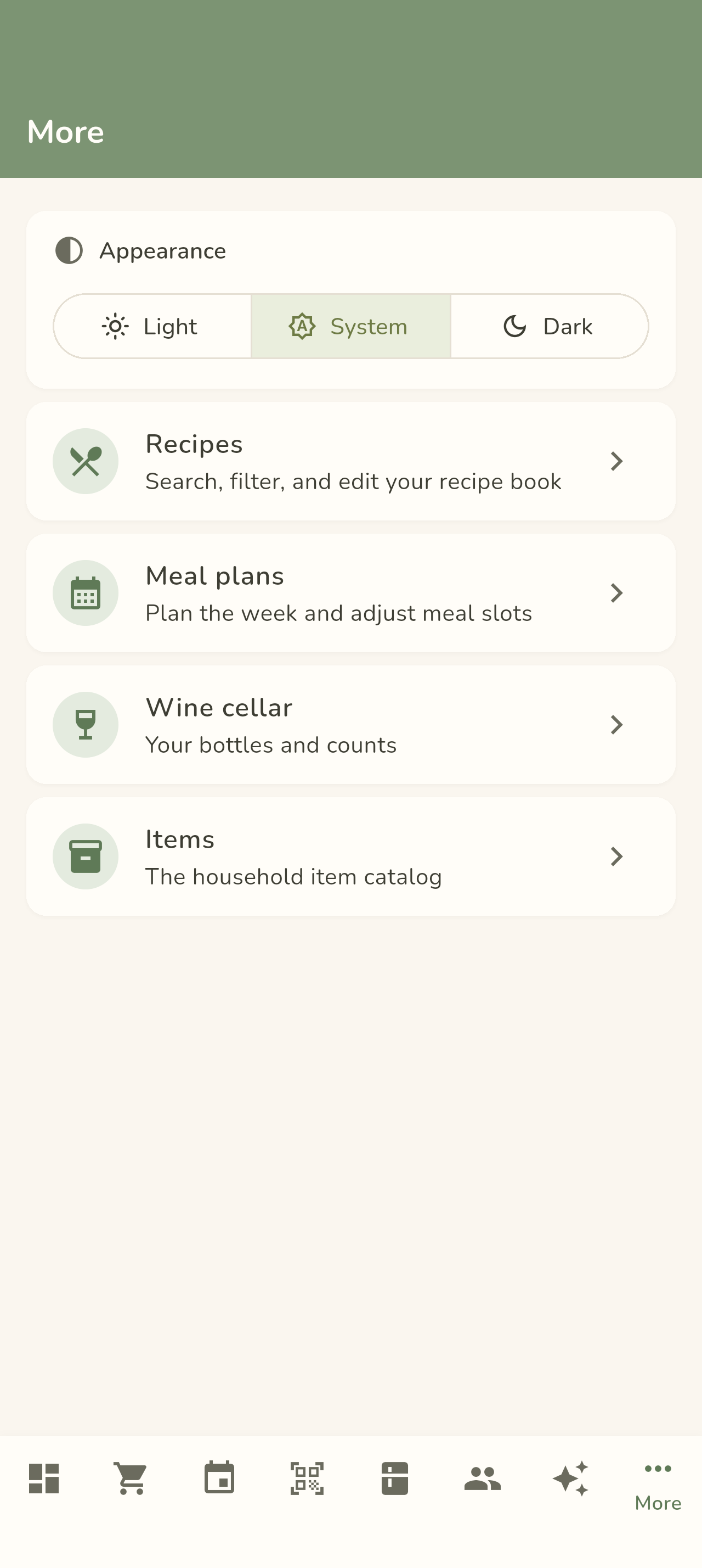
The app shares the web client's look: a sage header and navigation bar over a warm cream background, rounded white cards, and the same friendly Nunito typeface. It also follows your device's light/dark setting — or pick your own under More → Appearance (Light / System / Dark), the same choices the web offers under Profile → Appearance and the header toggle.


Eight tabs is a lot for a phone's bottom bar, so only the tab you're on shows its label — the rest sit there as icons until you need them.
| Tab | What it's for |
|---|---|
| Home | Your day at a glance — a greeting header, Today's meals, and Delicious ideas for tonight → details |
| Grocery | Your grocery lists — open one and check items off as you shop → details |
| Events | Food events and their cooking timelines → details |
| Scan | The barcode scanner — add to / remove from pantry stock by UPC → details |
| Pantry | What's in stock: quantities, minimums, notes → details |
| People | Members, invites, and the notification feed → details |
| Ask Dot | The same "Ask Dot" chat as the web — free-form questions about your household's data → details |
| More | The planning-and-browsing surfaces: recipes, meal plans, wine cellar, and the item catalog → details |
Two small kindnesses worth knowing about: the camera permission is only asked for when you first open Scan, never at launch, and on Android notifications get a one-time explainer sheet — why they're needed — before the OS permission prompt appears (push is Android-only for v1). Forms you didn't type in (like an edit screen that loads a bottle's details) always float their labels above the values instead of drawing through them.
Allergy warnings travel with you too — recipes, meal plans, grocery lines, and event dishes show the same member-named flags as the web, and you can edit your own records from the People tab. See Allergy Tracking.
Turn the app sideways — or run it on a tablet — and it stops stretching the phone layout. Past ~600dp wide the bottom bar becomes a NavigationRail; past ~840dp list screens go two-pane with the detail beside the list. See Tablet & Landscape Layouts for the full tour, including the adaptive meal-plan week grid and tablet cook mode.

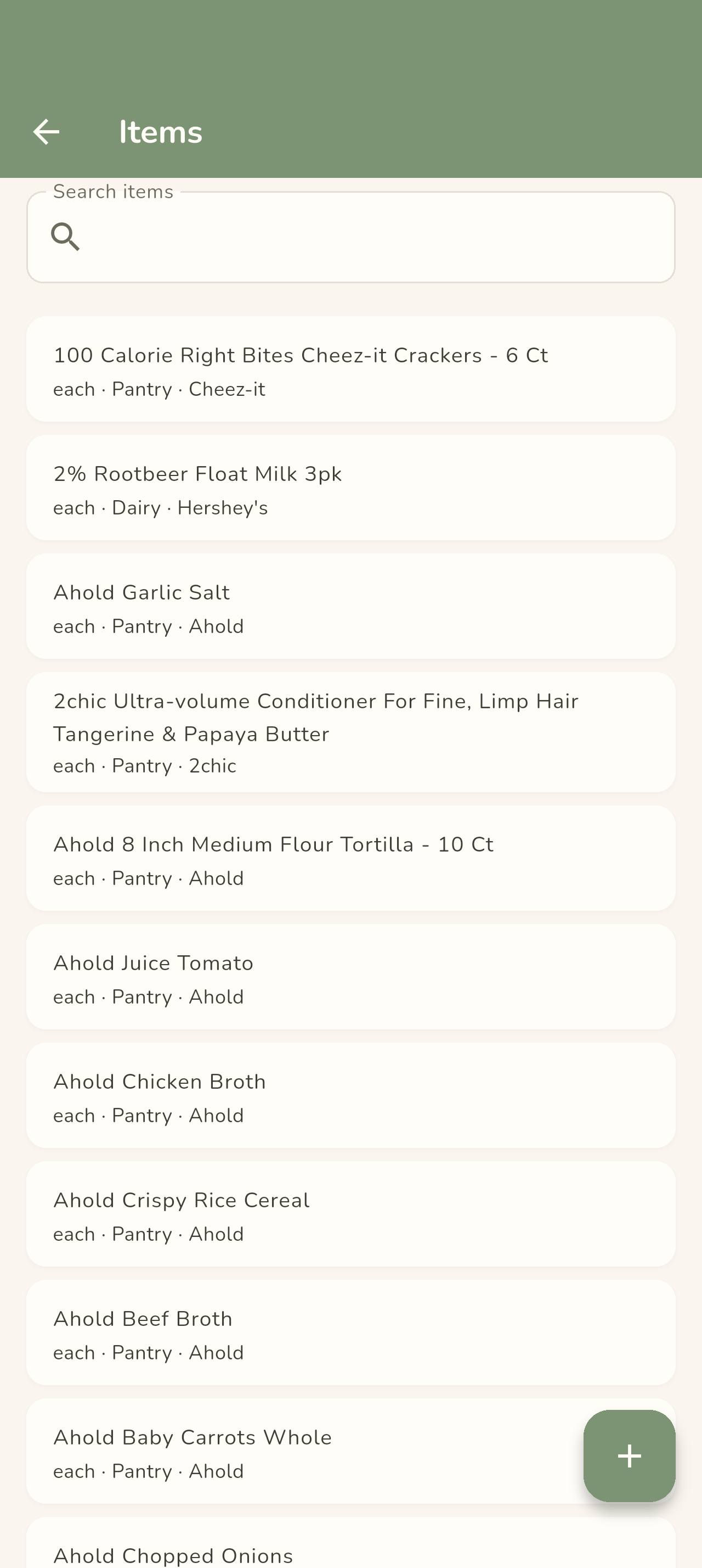
Under More → Items the whole catalog is browsable and editable — item names, brands, categories, UPCs, and the household ingredient override.

A few surfaces stay web-first:
- All administration — mobile has no admin screens at all. User management, pending-item and recipe-import reviews, and every reference catalog (brands, categories, nutrient types, allergens, the wine tables, and the rest) are admin-only on the web; mobile edits individual items and bottles.
- Event snapshot editing — per-step and per-ingredient edits to event copies are on the web event page.
The plan is to keep mobile focused on fast, in-the-moment tasks while the web stays the home for planning and organization — with the gaps filled in over time.