Widgets NDT Cards
Card lists and card types for news, events, people, and media mentions. Index: Widgets.
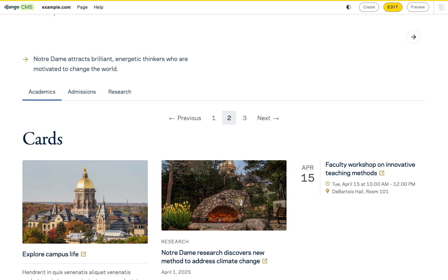
Shared on most cards:
| Field | Options | Notes |
|---|---|---|
| Link | CMS page | Internal destination. |
| External link | URL text | External destination. |
Shared style (on Default, News, and People cards):
| Field | Options | Notes |
|---|---|---|
| Style | Default, Horizontal, Compact, Border, Small image, Stacked, Image right | Card chrome / image placement. |
Cards may also be children of Widgets-NDT-Layout#Banner when Banner layout is Cards.
Container that holds one or more card widgets.
When to use: Any grid or stack of cards in the main content (not only under Banner).
| Field | Options | Notes |
|---|---|---|
| (none) | — | Add card children. |
Children: Default, News, Event, Featured, People, Media mention, Media mention quoted.
Tips: Mix card types only when the section story needs it; a single type often looks cleaner.
General-purpose title/summary/image card.
When to use: Feature tiles, generic related links, and non-news teasers.
| Field | Options | Notes |
|---|---|---|
| Title | Text | Required. |
| Summary | Rich text | Optional. |
| Image | Image upload | Optional. |
| Alt text | Text | For the image. |
| Style | Default, Horizontal, Compact, Border, Small image, Stacked, Image right | Shared card style. |
| Link | CMS page | Optional. |
| External link | URL text | Optional. |
Children: None. Parent: Optional Card list or Banner (cards layout).
Tips: Keep Summary to a sentence or two.
News/story teaser with label, author, and publish date.
When to use: News landings and “latest stories” rows. See News.
| Field | Options | Notes |
|---|---|---|
| Label | Text | Optional kicker (section or type). |
| Title | Text | Required. |
| Summary | Rich text | Optional. |
| Image | Image upload | Optional. |
| Alt text | Text | For the image. |
| Author name | Text | Optional. |
| Publish date | Date | Optional. |
| Style | Default, Horizontal, Compact, Border, Small image, Stacked, Image right | Shared card style. |
| Link | CMS page | Optional story page. |
| External link | URL text | Optional. |
Children: None.
Tips: Match Publish date to Page-Meta when the card mirrors a CMS story page.
Event teaser with date/time, location, and recurring flag.
When to use: Manually composed event highlights. For auto listings see Widgets-Legacy#Event List / Widgets-Legacy#Events Insert.
| Field | Options | Notes |
|---|---|---|
| Title | Text | Required. |
| Description | Long text | Optional. |
| Event date | Date | Required start date. |
| Start time | Time | Optional. |
| End date | Date | Optional. |
| End time | Time | Optional. |
| Location | Text | Optional. |
| Recurring | On / off (default off) | Marks recurring events. |
| Link | CMS page | Optional event page. |
| External link | URL text | Optional. |
Children: None.
Tips: This card does not pull from Events admin by itself — you enter the fields (or link to an event page).
Emphasized title/image card with optional label.
When to use: Hero features inside a card list or banner cards layout.
| Field | Options | Notes |
|---|---|---|
| Label | Text | Optional kicker. |
| Title | Text | Required. |
| Image | Image upload | Optional but recommended. |
| Alt text | Text | For the image. |
| Link | CMS page | Optional. |
| External link | URL text | Optional. |
Children: None.
Tips: Use sparingly so “featured” stays meaningful.
Person teaser with name, job title, summary, and photo.
When to use: Manually built people grids. For auto child-page directories see Widgets-Legacy#Person List (Grid).
| Field | Options | Notes |
|---|---|---|
| Title | Text | Required — person name. |
| Job title | Text | Optional. |
| Summary | Rich text | Optional bio blurb. |
| Image | Image upload | Optional. |
| Alt text | Text | For the photo. |
| Style | Default, Horizontal, Compact, Border, Small image, Stacked, Image right | Shared card style. |
| Link | CMS page | Optional person page. |
| External link | URL text | Optional. |
Children: None.
Tips: Link to the person page when one exists so directories stay navigable.
Press/media mention with publication branding, summary, date, and optional bylines.
When to use: “In the news” sections citing outlets.
| Field | Options | Notes |
|---|---|---|
| Publication name | Text | Required outlet name. |
| Publication slug | Text | Optional CSS class for outlet styling (for example npr, nyt). |
| Publication logo | Image upload | Optional logo. |
| Title | Text | Required mention headline. |
| Summary | Rich text | Optional. |
| Mention date | Text | Optional display date. |
| Meta heading | Text (default “Mentions”) | Small meta label. |
| Link | CMS page | Optional. |
| External link | URL text | Usually the article URL. |
Children: Card byline only.
Tips: Prefer External link for the original article. Add Card byline children when authors or speakers should appear.
Media mention focused on a pull quote plus article link.
When to use: Highlighting a quoted passage from coverage.
| Field | Options | Notes |
|---|---|---|
| Publication name | Text | Required. |
| Publication slug | Text | Optional outlet class. |
| Publication logo | Image upload | Optional. |
| Quote | Rich text | Required quotation. |
| Link text | Text (default “Read article”) | CTA label. |
| Link | CMS page | Optional. |
| External link | URL text | Usually the article URL. |
Children: Card byline only.
Tips: Keep Quote faithful and attributed; use Card byline for speakers when needed.
Byline row inside a media mention card.
When to use: Child of Media mention or Media mention quoted.
| Field | Options | Notes |
|---|---|---|
| Name | Text | Required. |
| Title | Text | Optional role or affiliation. |
| Image | Image upload | Optional portrait. |
| Link | CMS page | Optional. |
| External link | URL text | Optional. |
Children: None. Parent: Media mention or Media mention quoted.
Tips: For stand-alone bylines in article bodies use Widgets-NDT-Content#Byline instead.