Repository navigation
AVD Button Fields
Back to Advanced Virtual Device · Common field settings
A Button field can be a momentary command, an on/off control, or an indicator, depending on Show as. A button can trigger a Flow, or a compatible reflected writable property can use React. Creating the button alone does not operate a real device.
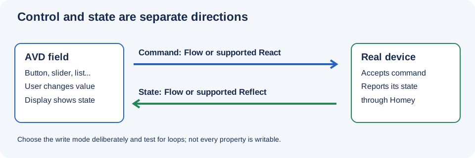
Illustration, not a Homey screenshot.
- One-off command: Push Button (Default). A press is an event, not necessarily a lasting state.
- Persistent switch: On/Off or On/Off (Button Tab). Its value represents state and can be synchronized.
- Visual status: Indicator Only, where offered. Treat the displayed state as feedback, not automatically as a real-device command.
- Command with separate indication: Pushbutton and separate Indicator, where offered. Configure command and indicator paths separately.
-
Standard device control: a relevant capability such as
speaker_playing,speaker_next,locked, orwindowcoverings_closed. Match the representation to the real command or state and verify its cards.
The first Button field offers extra tile-oriented modes not offered for later buttons, including Indicator Only, Pushbutton and separate Indicator, and On/Off (Hidden). Available controls and placement also depend on Homey.
The complete Button Show as reference lists the app-defined modes and all currently bundled settable Boolean capabilities, including their UI components and minimum Homey versions.
Some Button modes offer Create real field and Default Flowcards. Button 1 and later Buttons are handled differently for certain app-defined modes; selecting the option does not guarantee every Button has the same unsuffixed standard capability. See Real fields and default Flow cards.
For explicitly selected Push Button (Default) and On/Off, the field Icon selector is available only while that checkbox is off. Enabling it clears the selected field icon. On/Off (Button Tab) has an Icon selector but no real-field checkbox; the first-Button indicator/hidden modes and standard Homey Button capabilities have no field Icon selector. See the full availability table.
- In repair choose Create Button, enter a name, and choose the desired Show as behavior.
- Where offered, decide whether to create Homey's default capability Flow cards. Choose a field icon only if the resulting combination offers the Icon selector.
- Save. Create an AVD Button pushed trigger for this field and connect the appropriate real-device action. For persistent controls, choose the trigger's set/changed and value options intentionally.
- If the real device can also be operated elsewhere, add a separate feedback Flow that updates the button or use compatible reflection.
- In a feedback Set Button action, choose Nothing else if the state update should not execute button When cards. Test on, off, repeated presses, and direct changes on the real device.
Where Reflect and React are offered, a suitable writable property may provide a direct connection instead of a command Flow. Avoid configuring both mechanisms to issue the same command unless that is intentional.
The shared three-light AVD example combines buttons and associated Flows. To build a similar layout:
- Create an AVD and add one named on/off-style button per light.
- For each button, create separate on and off command paths to its corresponding light, using the button state/trigger options offered by Homey.
- Add feedback from each light's actual state to the matching AVD button, with Nothing else for the feedback Set Button actions.
- Turn a light on from the AVD, then turn it off using its physical control or own Homey tile. Verify that the indicator follows in both cases.
- Review the shared example's template and screenshots for layout ideas; remap its devices and Flows if importing rather than assuming they match yours.
For a single group button, first decide whether its state means any light on or all lights on. Use an appropriate aggregate Yes/No reflection or explicit Flow logic; one light's state is not necessarily the group's state.
The Living Room tutorial shows media, TV, Xbox, and curtain controls together. Create a speaker_next (Next (media, speaker_next) in English) or push button for a one-off next-track command, and a separate playing/on-off representation if a persistent playback state is needed. Add Text fields for track information and a Number field for volume.
You can use a push button to start an audio URL through the Music URL Converter app:
- Install Music URL Converter and check that the target device supports Homey's speaker feature.
- Add a push Button field to the AVD, then create a Flow with its Button pushed trigger.
- Add Music URL Converter's Play URL action. Enter a URL that the speaker can reach, or connect a compatible URL token from an earlier card. Test the Flow with a short sample first.
The converter checks the response's Content-Type header—the server's label for the file type—and requires the exact supported audio type; a filename extension alone is not enough. See its formats and limits: WAV files must be no larger than 900,000 bytes. For MP3, the 15,000,000-byte limit applies to the advertised Content-Length; it is not a hard cap on downloaded bytes. A split-MP3 card finishing means its request completed, not necessarily that the full track finished playing.
Some button representations offer Non-Clickable. The repair screen says to restart the Device Capabilities app after changing this setting. Where offered, Checked determines the light/dark appearance of a non-clickable button. Verify the resulting appearance in your Homey client; do not use a disabled control as the only means of operating a critical device.
- Button does nothing: Confirm its Flow is enabled, listens to the right field and state, and has an actual device action; or check the selected writable React property.
- Indicator does not follow the real device: Add a feedback Flow or supported reflection; a command is not proof of the physical device's final state.
- Repeated toggling: Check set-versus-changed trigger mode, feedback action mode, and whether both React and a command Flow are active.
- Expected option is missing: Check whether it is available only on the first Button or on a different representation.