Repository navigation
AVD Field Configuration
Back to Advanced Virtual Device
The field guides explain each field's own controls. This page explains the settings that recur throughout the AVD repair screen. Not every option appears for every field or display type, and names and layouts can vary between versions.
Illustration, not a Homey screenshot.
- Plan before adding fields
- Add, change, and order fields
- Show as, icons, and Flow cards
- When each control is shown
- Before changing a working field
- Tags, Insights, and hidden fields
- Reflect a device property
- Formatting and excluding old values
- React to field changes
- Using Flows instead
- Related guides
For each item, decide:
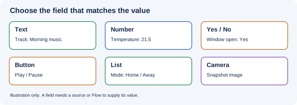
- What is it? Words, a number, a Boolean, a button, a choice, or an image? Pick the corresponding field type.
- Where does the value come from? A user, a real device, a supported reflected source, or a Flow?
- Does it control something? If so, define the command path separately from the feedback path.
- Will it be used elsewhere? Choose tags, Insights, and generated cards where needed.
An AVD is a virtual interface, not a physical sensor. Naming a field after a device does not connect the two automatically.
- Open the AVD's repair screen, scroll to the desired field section, and choose its Create button.
- Enter a recognizable Name. Extra settings for that field appear after it is named.
- If the field offers Show as, select a representation and configure any relevant options, then choose Save Device.
- Return to the device and test. To reorder saved fields, use Order Fields in the repair screen.
Choose names that make sense in Flow selectors, for example Kitchen temperature, not just Value. Several fields may share a type. Adding many at once takes longer; save and verify a few at a time.
Removing a field, changing its representation, or changing the device class can alter Homey capabilities and break dependent cards, tags, or Insights. Inspect existing automations and record their configuration before changing a working AVD. The Create Hidden Fields option described below can help keep some links stable; it is not a guarantee that every change or deletion preserves all data.
Show as determines the kind of Homey capability or control presented for the field. For example, a Number may look like a measurement or slider; a Button can be a push button or on/off control. Select the semantic type that matches the real value. The same field can appear differently across Homey clients and device classes.
The app combines its own choices with compatible standard capabilities from homey-lib. Your Homey version, language, and app version affect which choices and labels appear. See the complete Show as reference for the current snapshot, capability IDs, UI components, and minimum Homey versions.
Where shown, choose a field Icon. Available field icons are managed through App Settings; the icon for the whole AVD is separate. The field selector is not offered for every Show as choice, and on some Buttons it disappears when the real-field option is enabled. See the table below.
Some representations offer Create real field and Default Flowcards. For standard Show as types, this can expose the unsuffixed standard Homey capability, helping Homey recognize it and offer its default Flow cards. Repeated fields and certain temperature and Button modes have exceptions. The Number Sensor (Default) instead has Create Default Flowcards for an app-defined numeric capability; it does not become a specific standard sensor. Custom lists have AVD List cards without this checkbox.
Homey's default cards differ from Device Capabilities' AVD-specific cards, such as Set Text and Number set. Changing the option can replace a capability and affect existing automations or history. Read Real fields and default Flow cards before enabling it or changing a working field.
These are the current AVD repair-screen conditions, not settings that apply to every AVD at once. First create the field and enter a Name; its controls appear under that field. Show as is available for named Text, Number, Yes/No, Button, and List fields. Camera fields have no Show as selector.
-
Text
- Sensor (Default): no real-field checkbox; the Field Icon selector is available.
- Standard capabilities, such as Artist or Track: Create real field and Default Flowcards; no Field Icon selector.
-
Number
- Sensor (Default): Create Default Flowcards; the Field Icon selector is available whether it is on or off.
- Slider or a standard capability: Create real field and Default Flowcards; no Field Icon selector.
-
Yes/No
- Sensor (Default) or Alarm (Custom): no real-field checkbox; the Field Icon selector is available.
- Standard capabilities, such as Motion Alarm: Create real field and Default Flowcards; no Field Icon selector.
-
Button
- Push Button (Default) or On/Off: Create real field and Default Flowcards appears when the Show as choice is explicitly selected. The Field Icon selector is available only while that checkbox is off.
- On/Off (Button Tab): no checkbox; the Field Icon selector is available.
- Button 1's Indicator Only, Pushbutton and separate Indicator, and On/Off (Hidden) modes: no checkbox or Field Icon selector.
- Standard capabilities, such as Playing or Locked: Create real field and Default Flowcards; no Field Icon selector, even when the checkbox is off.
-
List
- Picker (Default), Ternary, or Custom list: no checkbox or Field Icon selector.
- Standard capabilities, such as Thermostat mode: Create real field and Default Flowcards; no Field Icon selector.
- Camera: no checkbox or Field Icon selector. For a Button with no Show as value selected yet, the checkbox is hidden and the Icon selector is shown. Select Push Button (Default) explicitly to show its checkbox. A List with an unset Show as value can display the checkbox even though the app falls back to its app-defined picker; select the intended representation explicitly before deciding whether the checkbox applies.
For Number Sensor (Default), the checkbox uses an app-defined numeric capability rather than turning the field into a standard temperature or power sensor. Slider is app-defined too, despite the broader checkbox label. Button 1 has additional tile modes; see Button fields. Show as reference lists the available representations, which depend on field type, Homey version, and app version.
- Switching to a representation without a field Icon clears the field's icon selection in the repair settings. On Push Button (Default) and On/Off, enabling the real-field checkbox also clears the field icon; disabling it later does not automatically restore the earlier choice. Choose an icon again if you return to a supported combination.
- When a Show as choice no longer offers the real-field checkbox, the screen clears or resets that setting. If you switch back, check it again rather than assuming it stayed enabled.
- Changing Show as, the checkbox, or a supported field icon can change the underlying capability. Before saving, note the existing configuration and dependent Flows, tags, Insights, and integrations; after saving, inspect and test them. Export a template first if you need a reference copy. Hidden fields may help retain some tag/Insights links, but do not guarantee lossless changes.
- Field icon availability is separate from the whole-device icon. Missing a field Icon selector does not mean you cannot change the AVD's device icon through its supported settings.
Tags, Insights, and hidden fields
- Create Tag makes the field value available as a tag for other Flows. It is useful for constructing messages or copying a measurement.
- Create Insights, available for some numeric, Yes/No, and button representations, records the value for Homey Insights. Enable it when you actually need history.
- Create Hidden Fields, where offered after enabling a tag or Insights, creates separate hidden capabilities intended to keep those links from being unlinked when settings change. These cost additional resources. For some Boolean, button, and list configurations the app warns that the user or origin of a change cannot be determined with hidden fields.
Do not enable history or hidden capabilities indiscriminately for a large AVD. Decide which values you will actually use and verify their tags and history after saving.
Illustration, not a Homey screenshot.
When Reflect is offered, the field can follow a compatible source automatically:
- In the field settings, select Reflect → Devices.
- Select a Device and one of its Properties. Check the property type in the selector and choose a field that can represent it.
- Save, change or wait for the real source, and check that the AVD shows the expected value. If the device does not report a value, reflection cannot invent one.
- Where available, add additional devices and choose an appropriate Calculation. Number fields offer aggregate operations; Yes/No fields offer any/all variants. Text and List multi-device calculations use a BLL expression.
Some types also offer sources from optional apps such as Better Logic Library or Chronograph, when those integrations are available. For example, a Text field can select a Chronograph timer's remaining duration or a stopwatch's elapsed duration and format it with an expression. See the Timer and Stopwatch setup pages. The app or BLL expression features involved must be available; ordinary AVDs and ordinary Flows do not require them.
Where shown, BLL expression can format a value. The UI describes the variables available for that particular source, such as $value and $values. Multiple reflected Text values can use the screen's example $values.join(',') as a calculation. Better Logic Library is required for its expressions. Test with actual input types and decide how to handle missing values.
For reusable calculations, the app's JavaScript expression cards can call functions saved in App Settings; Better Logic Library is another option where supported. See Flowcards for the expression cards and App Settings for optional reflection integrations.
Exclude (seconds) can exclude a source value once it is older than the chosen number of seconds. This is useful for a source that is expected to report frequently but may stop reporting. A perfectly valid battery sensor may update only when its value changes or at a long interval: an aggressively short cutoff can exclude it even when it works. Leave the setting unset unless exclusion is wanted, and choose a threshold based on how that specific device reports.
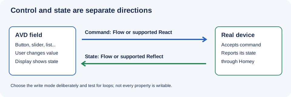
When a selected device property can be set and the option is offered, React (set properties) can send a changed AVD value to the selected device property. The screen offers Yes and Yes, only React; the latter is for sending changes without using that selection as a reflection source. Check the field type and the real device's allowed values first.
For example, a compatible reflected brightness slider can show a light's current value and, with React enabled, request a new value when the slider is moved. Not all devices expose a writable property; some need a Flow instead. If using a Flow as well as React to control the same property, avoid sending each command twice.
A common two-way pattern is:
- Command: AVD field When card → real device action.
- Feedback: real device state changes → AVD Set field action.
- On the feedback action, select Nothing else if it should update the display without executing AVD When cards again. Choose Execute flowcards (When) only when downstream field-triggered Flows should run.
- Where the trigger offers it, distinguish set from changed: set can run for repeated identical values; changed runs when the value changes.
Nothing else suppresses the explicit AVD When-card execution; it does not disable a field's separately configured React behavior. If a feedback Flow sets a field that also has React enabled, test whether it sends the value back to the real device and adjust the design if necessary.
Test a change made from the AVD and a separate change made directly on the real device. They should converge without repeated commands. See Flow Triggers and Flow Actions.
For detailed connection patterns, calculations, a two-light example, and loop troubleshooting, see Reflection and React.