UI blocks
Source: src/components/editor/BlockRow.tsx (599), SlashMenu.tsx (94), block-types.ts, MermaidDiagram.tsx (97)
Reach: / → open a page → the block list
States: 14 block types × (rest / reveal), plus the slash menu and its empty state
Every block is one row: data-block-id + data-block-type on the wrapper, hover
handles absolutely positioned -left-12 outside it, and the content itself.
One structural attribute carries the variant. data-block-type={block.type} makes
all fourteen types addressable and countable through one selector, and stays correct
when a type is added — the alternative is fourteen testids, or reading type off class
names, which breaks on any restyle.
That claim was false for three of the fourteen until a real capture caught it.
BlockRowreturns early fordivider,aiandmermaid, roughly 130 lines above the wrapper that sets the attributes, and none of those three wrappers had them. The blocks rendered perfectly; only selector-based tooling could tell. The existing e2e check passed the whole time because it only inspected rows that already carrieddata-block-type— a row missing both attributes satisfied it trivially.
e2e/a11y.spec.tsnow compares the rendered row count against the store, so a fourth early return fails loudly. The lesson generalises: a test that filters by the thing it is checking for cannot detect absence.
Rubric each row by the Distinguishing mark column. That mark is the entire assertion; everything else about a block is shared chrome.
data-block-type |
Slash label | Distinguishing mark |
|---|---|---|
paragraph |
Text | Body text, no ornament. The default and the fallback. |
heading1 |
Heading 1 | Largest text on the page after the title |
heading2 |
Heading 2 | Between h1 and h3 — assert ordering, never a px value |
heading3 |
Heading 3 | Smallest of the three, still heavier than body |
bullet |
Bulleted list | Leading •, hanging indent |
numbered |
Numbered list | Leading N. from listNumbers — resets after any non-numbered block
|
todo |
To-do list | Checkbox, aria-label="Mark complete" / "Mark incomplete"; checked strikes the text |
toggle |
Toggle | Chevron, aria-label="Expand" / "Collapse"; collapsed hides children |
quote |
Quote | Left border rule, indented, muted |
callout |
Callout | Filled panel with an emoji, text-base leading-relaxed
|
code |
Code | Mono, min-h-16, filled surface |
mermaid |
Mermaid | Rendered <svg>, with a source/preview toggle |
ai |
AI | The generate panel — see ai-panels.md |
divider |
Divider | A horizontal rule. No text, no focus target. |
Assert relative type scale, not absolute sizes: heading sizes are Tailwind utilities and a point-release font-metric change moves every one of them together.
BlockHandles is [data-hover-reveal], opacity-0, made opacity-100 when the row
is hovered or focused. Two controls:
-
+—aria-label="Add block below" -
⠿—aria-label="Block menu", opening: Edit with AI (only whencanAiEdit), Move up, Move down, a Turn into submenu listing all 14 types, separator, and a destructive Delete.
opacity-0 is not hidden: the handles are clickable in both states. Only a
screenshot can tell whether someone converted one into the other, which is what the
-rest / -reveal pair exists to catch.
Focus also reveals them. A row that has focus shows its handles in a rest capture, correctly. Click the empty append area rather than a block before capturing rest state, or the focused row will look like a reveal-mode leak.
Typing / in a block opens a fixed, w-72, max-h-72 popover, role="listbox",
heading "Basic blocks", one role="option" per type with icon, label, and description.
filterBlockTypes matches label, description, and a keyword list — so h1 finds
Heading 1 and hr finds Divider though neither string appears on screen. No match
renders a smaller panel reading No matching blocks.
Two positioning details: left is clamped to window.innerWidth - 300, so a menu
opened near the right edge shifts left; and selection uses onMouseDown with
preventDefault(), not onClick, to keep the editor's focus.
MermaidDiagram renders asynchronously and its SVG contains generated ids. Assert
that a rendered <svg> is present — never its internals, and never the
loading or error state. Everything inside the SVG is an Acceptable Difference by
standing decision.
| What | Selector |
|---|---|
| Any block | [data-block-id] |
| By type |
[data-block-type="todo"] etc. |
| Count of a type |
[data-block-type="bullet"] length |
| Handles |
[data-hover-reveal] inside the row |
| Add below | role=button[name="Add block below"] |
| Block menu | role=button[name="Block menu"] |
| Turn into | menu item text Turn into → submenu |
| Todo checkbox | role=button[name=/Mark (complete|incomplete)/] |
| Toggle chevron |
role=button[name=/Expand|Collapse/] — same names as the sidebar's
|
| Slash menu |
role=listbox with heading Basic blocks
|
| Slash option |
role=option, selected one aria-selected=true
|
| Slash empty | text No matching blocks
|
| Mermaid | [data-block-type="mermaid"] svg |
Expand/Collapse and Add block below repeat per row. Always scope to a
[data-block-id] first — an unscoped query matches the sidebar tree too.
1. seed localStorage["forgenotes-ui-freeze"] = "1"
   (+ ["forgenotes-ui-reveal"] = "1"  for the -reveal variant)
   (+ ["workspace-v1"] = {"state":{"theme":"dark"},"version":0} for dark)
2. load /, viewport 1280x800
3. open the page holding one of each type, wait for [data-block-type="mermaid"] svg
4. click [aria-label="Add block at end"]   ← moves focus OFF any block
5. webview_screenshot
Step 4 matters: without it the last-focused row shows its handles and the rest capture is wrong.
For the slash menu: focus a block, type /, wait for role=listbox. For the empty
state, type /zzzz.
Scope webview_dom_snapshot with --selector "[data-block-id]". Unscoped it times
out on this app's DOM.
| State | Wireframe |
|---|---|
| 1 · All 14 types (rest) | 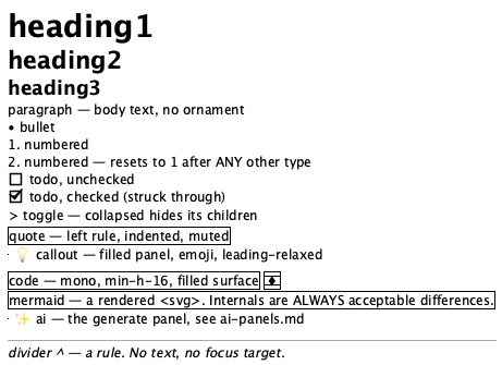 |
| 2 · Hover handles revealed | 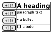 |
| 3 · Slash menu | 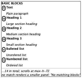 |
| 4 · Block menu | 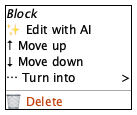 |
One wireframe for all fourteen types, deliberately. Fourteen wireframes would be fourteen files to re-approve on any shared-chrome change, for a distinction the table above already carries.
Tokens and always-acceptable items: tokens.md.
- Every type shows its distinguishing mark from the table
- Heading scale strictly decreases h1 > h2 > h3, and h3 > body
- Numbered runs restart at 1 after any interrupting block
- Todo checkbox left of its text; checked items struck through
- Quote carries a left rule; callout is a filled panel
- Code is monospace on a filled surface
- Mermaid shows a rendered
<svg>, not source or a spinner - Divider is a rule with no text
- Indent steps are uniform and capped at 4 levels
- Slash menu: heading
Basic blocks, 14 options, exactly onearia-selected
- All block text, list lengths, todo checked/unchecked mix
-
Everything inside a Mermaid
<svg>— generated ids, layout, fonts - Callout emoji
- Slash menu vertical position, and horizontal shift near the right edge
- Code block soft-wrapping
-
+or⠿handles in a rest capture — theopacity-0→hiddencanary - A Mermaid loading or error placeholder
- A visible
/left in the block after a slash selection - Handles on a focused row in a rest capture (click the append target first)
- Handles overlapping block text instead of sitting in the
-left-12gutter - Two adjacent types visually indistinguishable (h2 vs h3, quote vs callout)
- Slash menu clipped by the viewport or by the block list's overflow
-
data-block-typeabsent, or not matching what is rendered - Indent beyond 4 levels
AiBlockPanel and AiEditDialog (ai-panels.md), the page frame
(page-editor.md), markdown conversion (unit-tested in
src/lib/markdown/convert.test.ts), and Mermaid's own rendering correctness.