UI page editor
Source: src/components/editor/PageEditor.tsx (354 lines)
Reach: / → select any page in the sidebar
States: 4 — default, with cover, icon picker, page-actions menu
The page frame: everything above the block list, plus the list container itself. The blocks are specified separately in blocks.md.
A max-w-3xl centred column, px-4 sm:px-12, with pb-32 of trailing space so the
last block is never flush against the viewport bottom.
Four regions, top to bottom:
-
Cover — only when
page.coveris set. A 144 px band (176 px atsm), bled-mx-4wider than the column, carrying a hover-revealed Remove cover button in its bottom-right. -
Icon + action row — a 64 px emoji button opening a popover grid, then Favorite,
AI block, Cover, and a
⋯Page actions menu. -
Title — a
textarea, not an input. It isrows={1}and auto-grows via ascrollHeighteffect on every title change, so a long title wraps and pushes the body down rather than scrolling internally. PlaceholderUntitled. Enter moves focus to the first block instead of inserting a newline. -
Block list —
pl-10 sm:pl-12, leaving a gutter for the hover handles, which are positioned-left-12outside each row.
Below the list is a click-to-append target: a 64 px-tall invisible button
(aria-label="Add block at end") spanning the column. It is the large empty area under
the last block; clicking it focuses the trailing empty paragraph if one exists, and
otherwise creates one. It has no visible styling at all — a rubric will not see it, and
should not expect to.
Cover — one item per COVER_PRESETS entry, each with a colour swatch, plus a
Remove cover item that appears only when a cover is set.
Page actions (⋯) — Add sub-page, Duplicate, separator, then a destructive
Move to trash. Note the wording: the sidebar's row menu says Delete for the same
archive operation. Both are correct; they disagree, and that is current behaviour.
Icon picker — a w-72 popover, heading "Page icon", PAGE_ICONS in an 8-column
grid; the current icon is bg-muted with a ring-1.
listNumbers walks the block array and increments only across a consecutive run of
numbered blocks — any other type in between resets the counter to zero. So two
numbered lists separated by a paragraph both start at 1. That is intended; a rubric
seeing "1,2,3 … 1,2" is looking at correct behaviour.
The header star (app-shell.md) and this row's labelled Favorite / Unfavorite button toggle the same field. Both are visible at once with a page open, and both change label/fill together.
| What | Selector |
|---|---|
| Title |
role=textbox with placeholder Untitled — a textarea
|
| Icon button | role=button[name="Change page icon"] |
| Icon grid | popover, heading text Page icon
|
| Favorite |
role=button[name=/^(Favorite|Unfavorite)$/] — also matches the header star
|
| AI block | role=button[name="AI block"] |
| Cover | role=button[name="Cover"] |
| Page actions | role=button[name="Page actions"] |
| Remove cover |
role=button[name="Remove cover"] — two of them: the hover button and the menu item |
| Block list | the div holding [data-block-id] children |
| Append target | role=button[name="Add block at end"] |
| Cover hover button |
[data-hover-reveal] inside .group\/cover
|
Two names are ambiguous by construction — Favorite (header + action row) and
Remove cover (hover overlay + menu item). Scope to main or to the open menu.
1. seed localStorage["forgenotes-ui-freeze"] = "1"
   (+ ["forgenotes-ui-reveal"] = "1"  to force the cover button visible)
   (+ ["workspace-v1"] = {"state":{"theme":"dark"},"version":0} for dark)
2. load /, viewport 1280x800
3. click a sidebar page, wait for [data-block-id]
4. webview_screenshot
| State | Extra |
|---|---|
| Default | a page with no cover |
| With cover | Cover → pick a preset; add forgenotes-ui-reveal for the Remove button |
| Icon picker | click the emoji, wait for text Page icon
|
| Page actions | click ⋯, wait for Move to trash
|
The title textarea shows a caret. .ui-freeze blanks it (caret-color: transparent),
which is why the freeze flag matters here even with no animation on screen.
| State | Wireframe |
|---|---|
| 1 · Default | 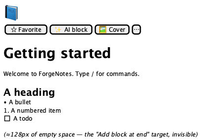 |
| 2 · With cover | 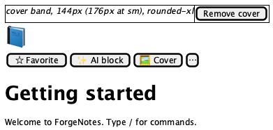 |
| 3 · Icon picker | 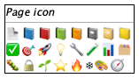 |
| 4 · Page actions | 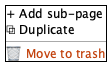 |
Tokens and always-acceptable items: tokens.md.
- Column centred, capped near 768 px, generous left padding at
smand up - Icon button 64 px, emoji rendered large, left of the action row
- Action row order: Favorite, AI block, Cover,
⋯— all ghost, all muted - Title at
text-4xl font-bold, no visible border or background - Blocks indented
pl-10/pl-12, leaving a clear left gutter - Cover, when present, bleeds wider than the text column and is rounded
- Roughly 128 px of empty space below the last block
- Numbered runs restart at 1 after any interrupting block
- Title text, icon, cover preset colour, block content and count
- Title wrapping to 2+ lines — the textarea auto-grows
- Favorite label — reflects state
- The cover Remove cover button in a rest capture (
opacity-0) - Block hover handles in a rest capture (see blocks.md)
- A scrollbar inside the title
- A visible border on the append target
- Title scrolls internally instead of growing
- Block handles overlapping text instead of sitting in the gutter
- Cover clipping the icon or the action row
- Icon-picker popover rendering off-screen
Individual block rendering and the slash menu (blocks.md), AiBlockPanel
and AiEditDialog (ai-panels.md), and cover-preset colour values,
which belong to src/lib/seed.ts.