Appearance Settings
Tune how TREK looks — colour mode, accent scheme, readability, and which dashboard widgets you see.
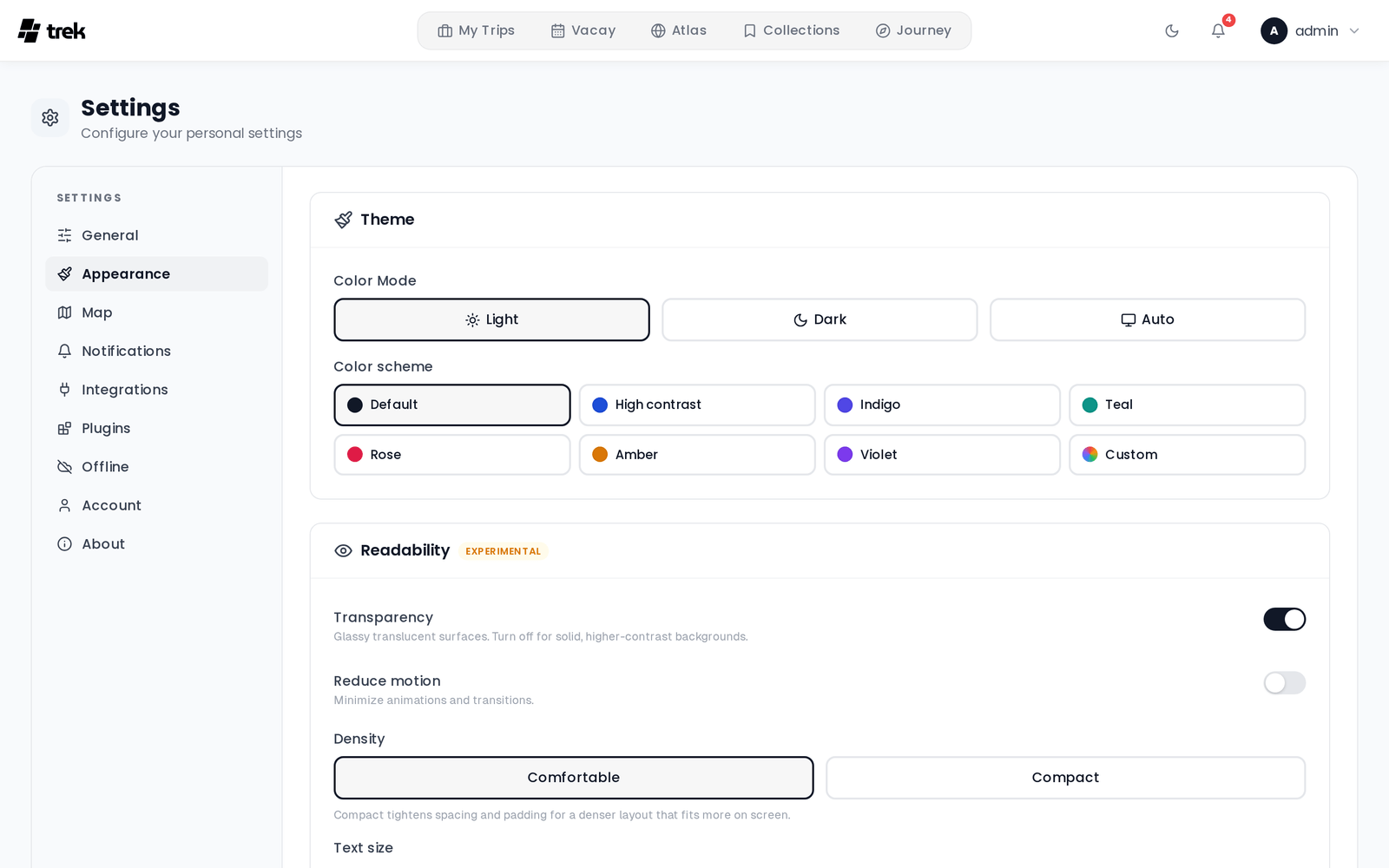
Open Settings and select the Appearance tab.
Changes preview instantly and are saved to your account a moment later, so they follow you to every browser you sign in with. A Reset to defaults button at the bottom of the tab restores everything on this page in one click.
These are personal settings — no permission and no admin toggle gate them.
Three segmented buttons: Light, Dark, and Auto. Auto follows your operating system's light/dark preference.
A grid of accent schemes, each with a colour dot that previews in your current mode:
- Default — TREK's monochrome look.
- High contrast — raises text and border contrast.
- Indigo, Teal, Rose, Amber, Violet — coloured accents.
- Custom — pick your own accent (below).
Choosing Custom reveals a Custom accent picker:
- Click one of the ten preset swatches to set light and dark to the same colour, or
- Use the Light and Dark colour inputs to pick a different accent for each mode.
Next to the pickers, a live contrast badge evaluates the accent you are currently seeing against white and shows the ratio:
- Good contrast (n.n:1) — the ratio meets WCAG AA for normal text (4.5:1 or better).
- Low contrast (n.n:1) — below 4.5:1; white text on that accent will be hard to read.
The badge is advisory. TREK will still let you apply a low-contrast accent.
This whole section carries an Experimental badge.
- Transparency — Glassy translucent surfaces. Turn off for solid, higher-contrast backgrounds.
- Reduce motion — Minimize animations and transitions.
- Density — Comfortable or Compact. Compact tightens spacing and padding for a denser layout that fits more on screen.
Text scaling works on four axes plus one master control. Every slider runs from 80% to 160% in 5% steps, and shows its current percentage on the right.
- Everything — a global scale applied on top of the per-tier values.
- Large — Headings, big numbers
- Medium — Sub-headings
- Normal — Place names, descriptions
- Small — Addresses, labels
Each of the four rows renders a live sample in that tier ("Large heading", "Medium subtitle", "Normal body text", "Small caption / address"), so you can see the effect while dragging.
Show or hide dashboard widgets independently on desktop and mobile. This does not detect your current device — it sets two independent layouts, and the dashboard picks the one matching the viewport it is rendered at. Both layouts are stored on your account, so a change made on your laptop also changes what your phone shows.
- Below the hero — Atlas / countries, Trips total, Days traveled, Distance flown.
- Right sidebar — a master toggle (The whole right column. Turn off and the dashboard centers.) with four widgets nested under it: Currency, Collections, Timezones, Upcoming reservations. Turning the master off greys the nested toggles out; their individual states are remembered for when you turn it back on.
- Below the hero — Trips total, Days traveled.
- Bottom of page — Currency, Collections, Timezones, Upcoming reservations.
Hiding a widget here only affects your own dashboard. Widgets that depend on an addon (for example Collections) also need that addon enabled by an admin — see Dashboard-Widgets and Admin-Addons.
None. Every setting on this tab applies only to your own account.