Repository navigation
Design System
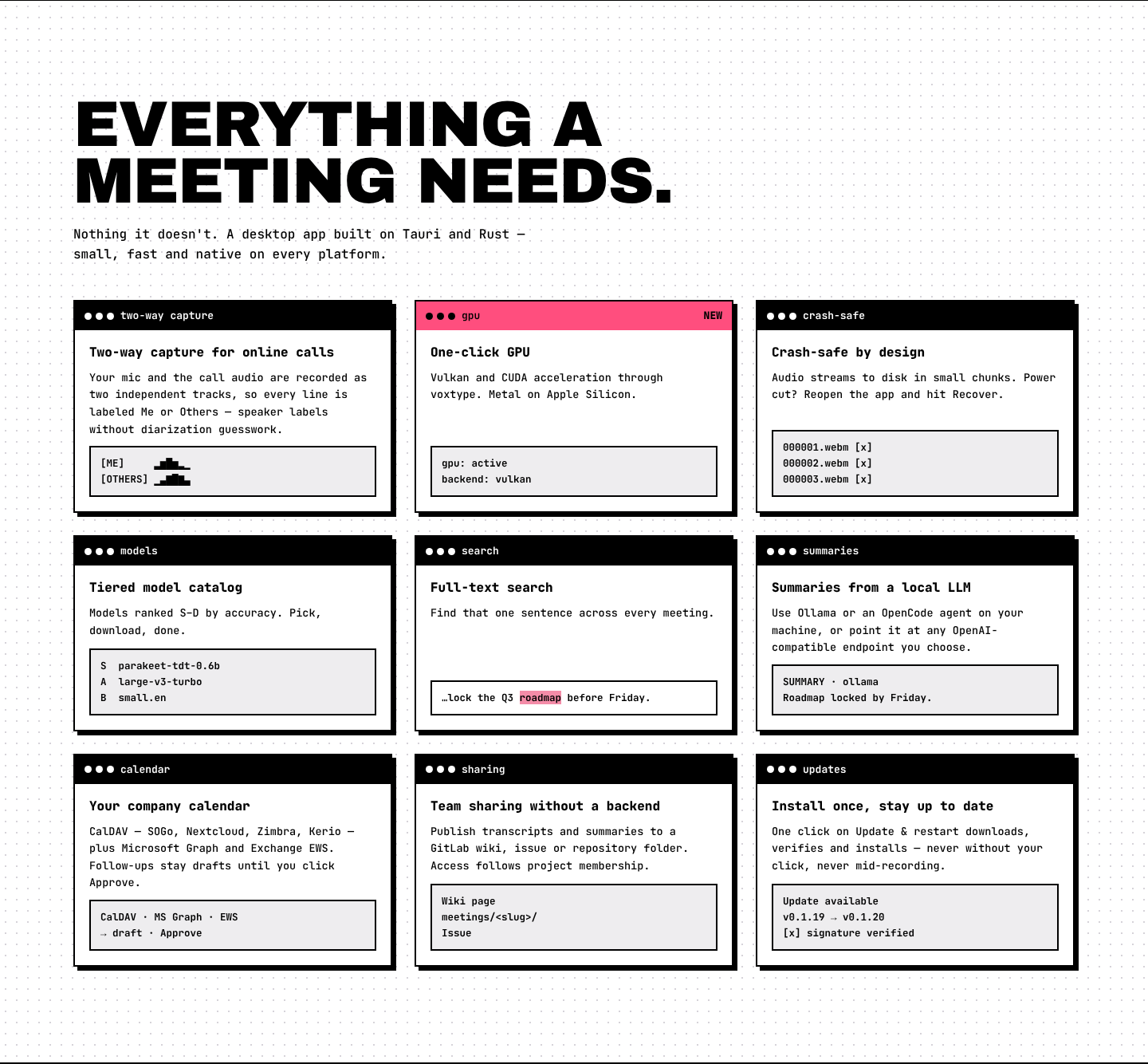
Both the website and the app follow Halftone Window, specified in DESIGN.md (tokens in its front matter). Every box is a framed window — 2px black frame, a black title bar with three dots, a hard offset shadow — on a white desk with a dot grid. A pink brand field carries halftone dot textures, and one hot-pink accent marks the primary action. Fonts are self-hosted: Archivo Black for uppercase display type and JetBrains Mono for everything else.
| Token | Hex | Used for |
|---|---|---|
pink |
#f48ca8 |
Brand field: hero, download section, page heads, open rows |
pink-deep |
#d6336c |
Halftone dots on pink — never text |
pink-wash |
#fff3f6 |
Hovered rows, the theme preview |
hot |
#ff4e7e |
The one accent: primary action, REC lamp, focus ring, selected-tab underline |
berry |
#c2185b |
Accent as text on white: links, timestamps |
ink |
#000000 |
Frames, title bars, primary buttons, text |
paper |
#ffffff |
Window bodies, the desk |
panel |
#eeedef |
Grey window areas, table heads |
mute / faint / rule
|
#5c5a60 / #8a8790 / #d6d3d9
|
Secondary text / placeholders / row dividers and the dot grid |
Text on pink and hot is always black.
| Role | Font | Size |
|---|---|---|
| Hero / section headline | Archivo Black, uppercase |
clamp(52px, 9.6vw, 150px) / clamp(40px, 5.6vw, 84px)
|
| Card title, step number, big figures | Archivo Black | 22–40px |
| Body | JetBrains Mono 500 | 14px, line-height 1.6 |
| Labels, buttons, tags | JetBrains Mono 700–800 | 12.5–16px |
- Square everything (0 radius). Only the title-bar dots and the REC lamp are round.
- Hard shadows: 4 / 5 / 7 / 9px black offsets, never blurred. Buttons press into their shadow.
- Sections are full-width bands with a 2px rule between them; content max-width 1320px.
| Component | Description |
|---|---|
| Window |
.win + .bar: framed box with a black title bar and three dots. Hot or pink bars mark the emphasised one. |
| Nav window | Sticky framed bar: brand cell, links, dotted filler, Theme, hot Download · free |
| Big button / button |
.go (58px, black, hover hot) and .btn (framed, hover pink) |
| Tag | Framed chip: white, black, pink or hot |
| Step module | Black number cell, title and text, grey visual cell |
| Segmented tabs | Platform tabs, filters, the EN/ES switch: the selected cell is black with a hot underline |
| Expandable row | FAQ items and release versions: +/− box, pink when open |
| Halftone | Dot texture masked to a corner of pink/black bands; animated canvas in the hero |
See DESIGN.md for the full list. When you add UI, reuse these tokens and components rather than inventing new styles.