Repository navigation
PsTheme
Home › All Categories › PsControls › PsTheme
The shared theme for PsControls. A theme is a set of semantic roles, not a colour for each field of each control. Each control derives its own colours from the roles, so one theme switch restyles every control in the program.
dim t as PSTHEME_COLORS = PsTheme_Dark( )
t.Accent = BGR( 0, 120, 215 )
app.SetTheme( t ) ' every control and every form repaints
PsButton_SetColors( hDanger, @myRed ) ' pins this one button: the theme leaves it alone
PsButton_UnpinColors( hDanger ) ' ...until it is handed backIn a PsApp program you do nothing: the theme follows the Windows
light/dark setting (Settings › Personalisation › Colours) and switches live. You choose the mode
with PSAPP_OPTIONS.ThemeMode or app.SetThemeMode( PSAPP_THEME_LIGHT ).
examples/PsControls/PsTheme is a gallery of the common controls with a theme switch:
| Dark | Light |
|---|---|
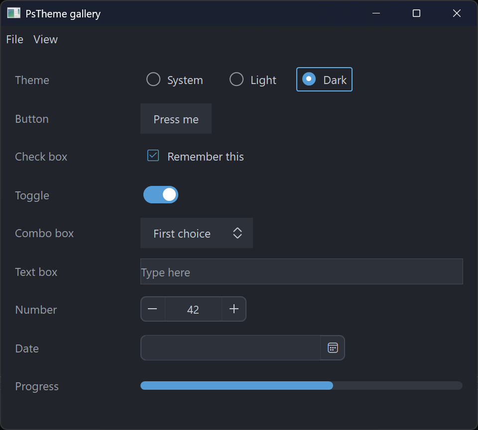 |
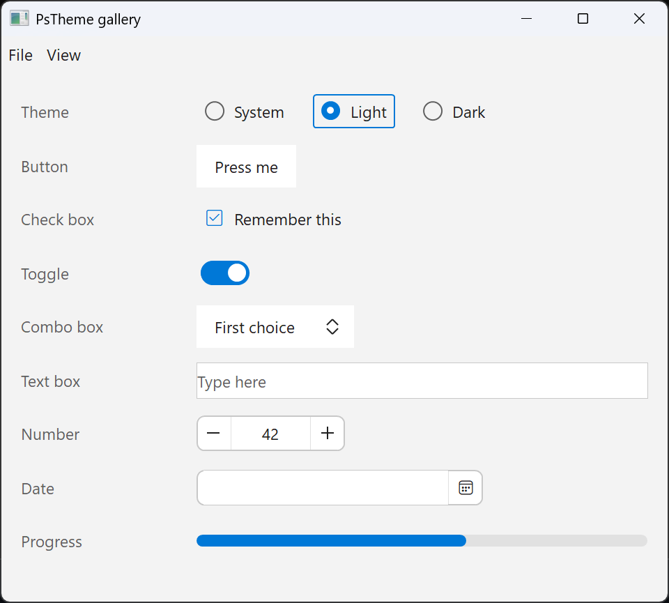 |
| Role | Used for |
|---|---|
IsDark |
dark chrome (the title bar), and for the app's own choices |
Window |
the form background, and controls that sit flat on it |
Surface, SurfaceHot, SurfaceDisabled
|
control faces: buttons, fields, bars |
Text, TextHot, TextStrong, TextDim, TextDisabled
|
text: normal, under the mouse, emphasised (titles, pressed), secondary (captions, placeholders), disabled |
Accent, AccentHot
|
checked, on, progress, today |
FocusRing |
focus rings and focused borders |
Border, BorderDisabled, Divider
|
outlines, separators, grid lines |
Selected, SelectedText
|
selection and pressed fill |
Popup, PopupText
|
menus, dropdowns, tooltips |
Track |
the unfilled part of a track (toggle off, progress) |
Success, Warning, Error
|
status colours |
| Function | Theme |
|---|---|
PsTheme_Dark( ) |
The family's built-in look. Every control's default colours are dark, and this preset is those defaults expressed as roles. A control default that uses a shade the roles do not have moves to the nearest role. |
PsTheme_Light( ) |
Light |
PsTheme_System( ) |
Dark or Light, following Windows. PsTheme_SystemIsDark( ) tells you which. |
The caption follows the theme. Every captioned top-level window that hosts a themed control gets a dark or light caption and frame to match: when the theme is set or switched, and when a control registers while a theme is current. That covers PsApp's forms and a program's own windows alike. A popup, menu or tooltip has no caption and is left alone. A switch repaints the caption at once, Windows 10 included.
PsTheme_ApplyTitleBar( hwnd, bDark ) does it for one window, and does nothing when the caption
already matches. PsTheme_ApplyCaptionOf( h, bDark ) does it for the top-level window that h
sits in.
PsTheme_Equal( a, b ) compares two themes.
Every control has these, beside its own SetColors:
-
Ps<X>_ThemeColors( t ): the adapter. It returns the control's colour set derived from the roles. Only controls with aPS<X>_COLORStype have it. -
Ps<X>_ApplyTheme( h, t ): applies the theme, unless the colours are pinned. -
Ps<X>_UnpinColors( h ): hands the control back to the theme and applies the theme at once. -
Ps<X>_ApplyFonts( h, hText, hGlyph ): PsApp uses it to give a new control the fonts of its form.
Pinning. Any colour setter the program calls (SetColors, SetBackColor, and the rest)
pins the control's colours, and the theme then leaves that control alone. Item-level colours,
such as a chart series or a toolbar item's foreground, are data rather than theme: they are never
pinned and never themed.
Without a theme (no PsApp, or PSAPP_THEME_NONE), nothing changes: controls keep their
built-in colours, exactly as before.