Repository navigation
Meters Reference
Every theme folder holds a meters.txt. Each [section] in it is one meter: the pictures it draws, where the needles or bars sit, and the elements Glass draws around them: album art, texts, times, indicators, artwork layers, a record and tonearm, a pair of reels, a spectrum. The keys are the ones PeppyMeter Screensaver read, so existing themes run unchanged; this page is the reference as Glass reads them. The Themes page is the guide to putting a theme together.
Glass paints a whole meter as one plan and repaints only the boxes that change, so nothing on this page costs a redraw of the screen. Keys Glass does not read are marked as such.
Values are written as in the examples: numbers plain, positions as x,y, sizes as width,height, colours as r,g,b with each from 0 to 255, switches as True or False. A switch is on for True, 1, yes or on, in any case, and off for anything else.
[Studer A810]
meter.type = circular
channels = 2
bgr.filename = background.png
fgr.filename = foreground.png
indicator.filename = needle.png
screen.bgr = screen.png| Key | Meaning |
|---|---|
meter.type |
circular (needles) or linear (bars). |
channels |
1 for one needle or bar from the mixed signal, 2 for left and right. |
bgr.filename |
The meter's background picture. Its size is the meter's size. |
fgr.filename |
A foreground picture drawn last, above everything: bezels, glass, frames. |
indicator.filename |
The needle or bar picture. |
screen.bgr |
A full screen picture behind the meter, when the meter is smaller than the screen. |
ui.refresh.period |
Not read. Glass draws at the frame rate set on the Settings page. |
meter.preview |
Not read. The Manager draws every meter's preview itself. |
start.angle = 51
stop.angle = -51
distance = 140
left.origin.x = 313
left.origin.y = 720
right.origin.x = 973
right.origin.y = 720
meter.x = 0
meter.y = 0| Key | Meaning |
|---|---|
start.angle, stop.angle
|
The needle's angle at silence and at full scale, in degrees; 0 points up the needle's own axis, positive to the left, negative to the right. left.start.angle, left.stop.angle, right.start.angle and right.stop.angle set them per channel. |
distance |
From the origin, the point the needle turns about, to the centre of the needle picture, in pixels. |
left.origin.x, left.origin.y, right.origin.x, right.origin.y
|
The needles' origins inside the meter; meter.x and meter.y are added. |
mono.origin.x, mono.origin.y
|
The one origin of a channels = 1 meter, inside the meter as the others. |
meter.x, meter.y
|
Where the meter's background sits on screen. |
left.needle.flip, right.needle.flip
|
True mirrors that needle's picture, for a needle drawn for the other side. |
steps.per.degree |
Not read. Glass turns the needle picture to the exact angle. |
The needle picture is drawn upright, pointing up its own axis: Glass turns it by start.angle at silence and on to stop.angle at full scale, about a point distance pixels below the picture's centre, and puts that point on the origin.
A mono meter:
channels = 1
start.angle = 75
stop.angle = -75
mono.origin.x = 401
mono.origin.y = 157meter.type = linear
channels = 2
left.x = 6
left.y = 4
right.x = 6
right.y = 4
position.regular = 24
step.width.regular = 16
position.overload = 0
step.width.overload = 0
direction = left-right
indicator.type =
flip.left.x =
flip.right.x =| Key | Meaning |
|---|---|
left.x, left.y, right.x, right.y, mono.x, mono.y
|
Where each bar starts inside the meter. |
position.regular, step.width.regular
|
How many regular steps the bar has and how wide each is, in pixels. |
position.overload, step.width.overload
|
The same for the overload steps at the end; 0 for none. |
direction |
Which way the bar grows, from the table below. |
indicator.type |
single moves the indicator picture along the bar instead of growing the bar. |
flip.left.x, flip.right.x
|
True mirrors that channel's picture. |
direction |
The bar grows |
|---|---|
left-right |
from the left, the default |
right-left |
from the right |
bottom-top |
upwards |
top-bottom |
downwards |
edges-center |
the left channel from the left edge inwards, the right one from the right edge inwards |
center-edges |
both from the middle outwards |
config.extend = True
meter.visible = True
config.extend = True is needed for meter.visible, the spectrum, the playback indicators, the buttons, interactive and touch.margin. Album art, texts, times, the type area, artwork, the record, the tonearm and the reels are read with or without it; set it all the same, as PeppyMeter Screensaver themes do. meter.visible = False hides the needles or bars and keeps the rest, for a theme that is all artwork and text.
albumart.pos = 27,28
albumart.dimension = 432,432
albumart.rotation = True
albumart.rotation.speed = 1.5
albumart.mask = mask.png
albumart.border = 2| Key | Meaning |
|---|---|
albumart.pos, albumart.dimension
|
The art's box. |
albumart.rotation |
True turns the art as a record label, at albumart.rotation.speed, which must be above 0. Without albumart.mask the art is cut round. Turning art carries a spindle and a thin ring at its centre in font.color. |
albumart.rotation.speed |
Turns a minute, for the art and the record, times the Vinyl rotation speed of the settings page when the Rotation quality there is Custom. Absent, 0: neither turns. |
albumart.mask |
A picture that cuts the art's shape, a round label, a cassette window: where the mask is black the art shows, where it is white it is cut away, greys in between. The mask's own transparency is not read. |
albumart.border |
A border of that many pixels in font.color: a frame round still art, a ring round turning art. |
The art comes from the player for whatever plays, a file, a stream or a service.
A theme can show up to five pictures from the folder of the playing track, a back cover behind the meters, a logo above them. Each layer names its candidate files and its box; the first file found in the folder is shown, scaled into the box, and changes when the folder changes.
folderlayer.1.files = back.png,Back.png,back.jpg,Back.jpg
folderlayer.1.pos = 40,40
folderlayer.1.dimension = 300,300
folderlayer.1.scale = fit
folderlayer.1.zorder = background

folderlayer.2.files = logo.png,Logo.png
folderlayer.2.pos = 980,40
folderlayer.2.dimension = 240,120
folderlayer.2.zorder = overlay
folderlayer.2.border = 2| Key | Meaning |
|---|---|
folderlayer.N.files |
Candidate file names, tried in order, case as on disk. N is 1 to 5. Absent, back.png,Back.png,back.jpg,Back.jpg,logo.png,Logo.png. |
folderlayer.N.pos, folderlayer.N.dimension
|
The box. Both are required; they are what enables the layer. |
folderlayer.N.scale |
fit (keep the shape, centred in the box), stretch (fill the box) or cover (fill the box keeping the shape, the middle cut out). Default fit. |
folderlayer.N.zorder |
background (over album art, the record and the reels, behind the needles or bars) or overlay (above everything but the foreground picture). Default overlay. |
folderlayer.N.border |
A border in font.color around the box, in pixels. 0 or absent for none. |
The unnumbered form, folderlayer.enabled = True with folderlayer.files, folderlayer.pos, folderlayer.dimension, folderlayer.scale, folderlayer.zorder and folderlayer.border, is read as one more layer. PNG, JPEG, GIF and WebP pictures are read. Streams and web radio have no folder, so nothing is shown for them; a remote display gets the picture from the player. From 0.8.60, where the track's folder has none of a layer's names, the same names are looked for in the theme's own folder and the first found there stands in: a skin that brings CoverSamp.jpg and lists it last (folderlayer.files = back.png, Back.png, back.jpg, CoverSamp.jpg) shows the album's back cover where there is one and its own sample where there is none.
A theme offers a fanart box; the listener turns the slideshow on in the Manager's Appearance tab. Pictures come from the artist's fanart folder in the library, from a personal folder on the player, from fanart.tv with a key, or from Volumio's artist art; the Artwork page has the order, the folders and the settings.
fanart.pos = 0,0
fanart.dimension = 1280,720
fanart.scale = fit
fanart.zorder = background| Key | Meaning |
|---|---|
fanart.pos, fanart.dimension
|
The box. Both are required; there is no fanart.enabled. |
fanart.scale |
fit, stretch or cover (fill the box keeping the shape, the middle cut out). Default fit. |
fanart.zorder |
background (default) or overlay. The slideshow's fade or merge applies to both. |
A background box lies behind the needles or bars and the texts, and over album art, the record and the reels: a full screen backdrop suits a meter that has none of those, and beside them the box is kept clear of theirs. overlay suits a small framed photo above the meters.
vinyl.filename = vinyl_disc.png
vinyl.center = 466,242
vinyl.dimension = 432,432
vinyl.direction = cw| Key | Meaning |
|---|---|
vinyl.filename |
The record picture. Three forms: vinyl_disc.png is the theme's file; disc.png,vinyl_disc.png looks for disc.png in the track's folder first and falls back to the theme's file; ,vinyl_disc.png is the theme's file only. |
vinyl.center |
The point it turns about, on screen: the picture's own centre sits here. Required, as vinyl.filename is. |
vinyl.pos |
Not used. The record is placed by vinyl.center. |
vinyl.dimension |
Scale the picture to this size before the album art is laid on it. Absent, the picture's own size. |
vinyl.direction |
cw or ccw. Absent, the Reel rotation direction of the settings page. |
With albumart.rotation = True the album art turns with the record as its label; with it False the record turns under a still label. albumart.rotation.speed sets the speed of both.
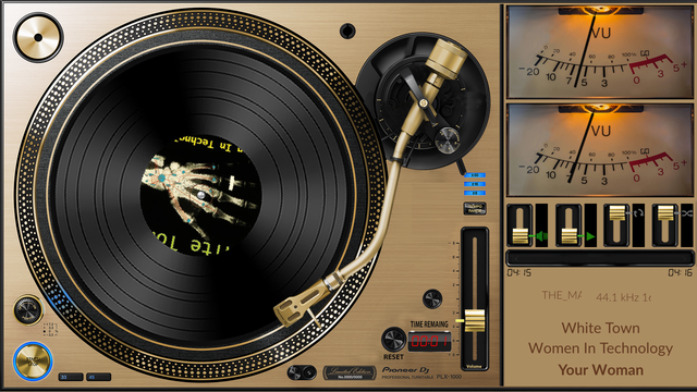
The tonearm rests, drops onto the record when playback starts, follows the track's progress from the outer groove to the inner one, and lifts at the end or when playback stops. A track change while it plays lifts it and drops it again. A source without a length, a web radio stream, drops the arm to its start angle and leaves it there.
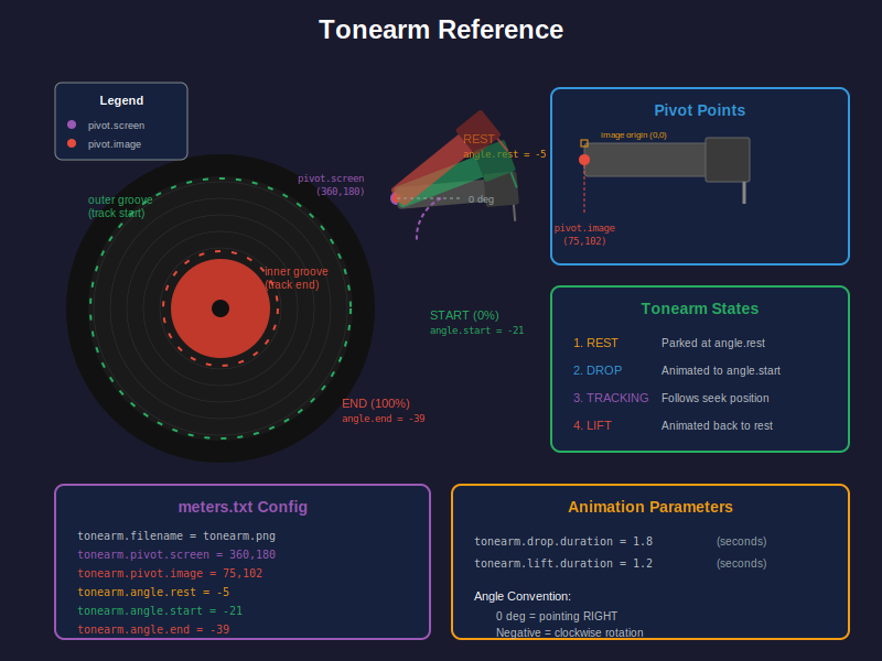
tonearm.filename = tonearm.png
tonearm.pivot.screen = 727,129
tonearm.pivot.image = 75,102
tonearm.angle.rest = -5
tonearm.angle.start = -21
tonearm.angle.end = -39
tonearm.drop.duration = 1.8
tonearm.lift.duration = 1.2| Key | Meaning |
|---|---|
tonearm.filename |
The arm's picture, drawn as it lies at 0 degrees. |
tonearm.pivot.screen |
The pivot on screen. The picture is placed so that its own pivot sits here; there is no separate position key. |
tonearm.pivot.image |
The pivot inside the picture. |
tonearm.angle.rest |
Parked. Default -30. |
tonearm.angle.start |
On the first groove, at the start of the track. Default 0. |
tonearm.angle.end |
On the last groove, at the end. Default 25. |
tonearm.drop.duration, tonearm.lift.duration
|
The two moves, in seconds. Defaults 1.5 and 1.0. |
tonearm.filename, tonearm.pivot.screen and tonearm.pivot.image are all three required; without one of them no arm is drawn. Angles: 0 points right, negative angles turn clockwise, -90 points down. The Playback Behavior section of the Settings page decides whether the arm follows one track or the whole queue.
reel.left.filename = reel_left.png
reel.left.center = 137,187
reel.right.filename = reel_right.png
reel.right.center = 355,187
reel.rotation.speed = 1.5
reel.direction = ccw
spool.adaptive = true| Key | Meaning |
|---|---|
reel.left.filename, reel.right.filename
|
The reel pictures. The same three forms as vinyl.filename: cdart.png,reel.png takes cdart.png from the track's folder first, scaled to the theme reel's size. |
reel.left.center, reel.right.center
|
The point each turns about, on screen: the picture's own centre sits here. A reel needs its filename and its center. |
reel.left.pos, reel.right.pos
|
Not used. Each reel is placed by its center. |
reel.rotation.speed |
Turns a minute, times the Left spool speed or the Right spool speed of the settings page when the Rotation quality there is Custom. Absent, 0: the reels stand still. |
reel.direction |
ccw (the tape path at the bottom, the usual) or cw (the tape path at the top). Absent, the Reel rotation direction of the settings page. |
spool.adaptive |
true or false; overrides the settings page for this theme. |
With adaptive spools the reels turn as real ones do: the tape runs over the head at one speed, so a full reel turns slowly and an empty one fast. In ccw the left reel starts full and slow and ends empty and fast, the right one the other way round; in cw the roles are swapped. Progress is the track's, or the queue's when the Playback Behavior section says so.
Reels are drawn in a section that has neither a complete tonearm nor a vinyl.center. In a section with a tonearm and no vinyl.filename, the left reel, or the right one when there is no left, is the record under the arm: it turns about its center at albumart.rotation.speed, or at reel.rotation.speed when that is absent.
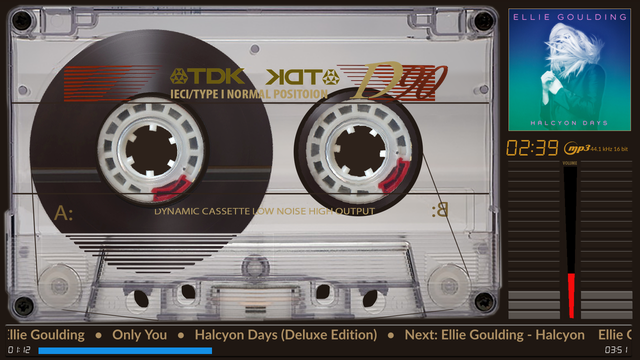
playinfo.title.pos = 830,205,bold
playinfo.title.color = 255,255,255
playinfo.title.maxwidth = 441
playinfo.artist.pos = 830,40,bold
playinfo.artist.color = 255,255,255
playinfo.artist.maxwidth = 441
playinfo.album.pos = 830,123,bold
playinfo.album.color = 255,255,255
playinfo.album.maxwidth = 441
playinfo.align = left| Key | Meaning |
|---|---|
playinfo.<field>.pos |
x,y or x,y,style. The style is light, regular, bold, italic or digi (the digital font); it picks the font and its size from font.size.<style>. Without a style the title is bold, the artist and the album light, and the next track's fields regular. |
playinfo.<field>.color |
Absent, font.color. |
playinfo.<field>.font |
A font file of the field's own (from 0.8.70): an absolute path, a file in the theme folder (fonts/MyTitle.ttf), or a file under the display's font.path. Absent or not found, the font of the field's style. The Face tab and Anymote draw it from 0.9.1 with glass-evo 0.2.1; before that they set the field in its style's font. |
playinfo.<field>.fontsize |
The field's own size in pixels (from 0.8.70). Absent, font.size.<style>. |
playinfo.<field>.maxwidth |
The box width in pixels. Longer text scrolls inside it. Absent, playinfo.maxwidth; absent too, 60 percent of the screen's width when the texts are centred, else the width from the position to 20 pixels short of the screen's right edge. |
playinfo.align |
left (default), center or right, when the text fits its box. playinfo.center = True and playinfo.text.center = True are the older ways of saying center. The position is always the box's left edge: a centred field is centred inside its box, so a title meant to sit in the middle of a column takes the column's left edge as its position and the column's width as its maxwidth. |
playinfo.maxwidth |
Older themes' one width for every field; read when a field has none of its own. |
italic uses the italic face, font.italic in the display's configuration: true italics for Latin, Cyrillic and Greek, upright for scripts that have none, and the regular face when no italic face is installed. font.size.italic sets its size and defaults to font.size.regular.
The same keys with next. in the middle show the next track in the queue:
playinfo.next.title.pos = 830,405,bold
playinfo.next.title.color = 200,200,200
playinfo.next.title.maxwidth = 441
playinfo.next.artist.pos = 830,440,regular
playinfo.next.album.pos = 830,470,regular
A field without a pos is not shown. The album is the exception: without a position of its own it is appended to the artist's line, Artist - Album. Next track fields scroll and align as the others do.
One line that carries artist, title and album, and the next track when asked, and scrolls without end.
playinfo.ticker = True
playinfo.ticker.replace = False
playinfo.ticker.direction = rtl
playinfo.ticker.append_next = True
playinfo.ticker.pos = 40,420,regular
playinfo.ticker.color = 255,255,255
playinfo.ticker.maxwidth = 720
playinfo.ticker.speed = 40
playinfo.ticker.separator =  -
playinfo.ticker.space_between = 1
playinfo.ticker.end_spaces = 8| Key | Meaning |
|---|---|
playinfo.ticker |
True (also 1, yes, on) turns the ticker on. |
playinfo.ticker.replace |
True hides the separate artist, title, album and next fields; False shows both. |
playinfo.ticker.direction |
rtl (default) or ltr. The line loops without a pause. |
playinfo.ticker.append_next |
True adds "Next: artist - title" when there is a next track. |
playinfo.ticker.pos |
x,y,style, as for the fields; regular unless said. The ticker starts at its position whatever playinfo.align says. |
playinfo.ticker.color |
Absent, the title's colour, else font.color. |
playinfo.ticker.maxwidth |
The box width. Always kept inside the screen; absent, the width to the screen's edge. |
playinfo.ticker.speed |
Pixels a second. Absent, playinfo.scrolling.speed.ticker, then playinfo.scrolling.speed, then 40. The Text Scrolling section of the settings page does not change the ticker. |
playinfo.ticker.separator |
What sits between the parts. Values are trimmed, so the spaces around it come from space_between, not from the value. Absent, a middle dot with a space each side. |
playinfo.ticker.space_between |
Spaces on each side of the separator. Default 0. |
playinfo.ticker.end_spaces |
The gap, in spaces, before the line repeats. Default 8. |
The line is artist, separator, title, separator, album, non-empty parts only; then "Next: artist - title" when asked; repeated with the end spaces between copies.
playinfo.scrolling.speed = 40
playinfo.scrolling.speed.artist = 15
playinfo.scrolling.speed.title = 25
playinfo.scrolling.speed.album = 20
playinfo.scrolling.speed.ticker = 30
Pixels a second, for all fields, per field, or for the ticker. The Text Scrolling section of the Settings page can take the theme's values, the default of 40, or its own, for the fields; the ticker keeps the theme's.
The type area shows what plays: the format of a file (FLAC, MP3, DSD) or the service of a stream (Tidal, Qobuz, Spotify, web radio), as an icon, as text, or both. The sample rate line shows the rate and bit depth the player reports, the bitrate for a stream that has one, or nothing.
playinfo.type.pos = 838,285
playinfo.type.dimension = 53,53
playinfo.type.color = 204,176,97
playinfo.type.mode = icon
playinfo.type.fontsize = 18
playinfo.type.align = center
playinfo.samplerate.pos = 1030,300,bold
playinfo.samplerate.maxwidth = 100
playinfo.samplerate.color = 180,180,180| Key | Meaning |
|---|---|
playinfo.type.pos |
The area's top left. Required for any type display. |
playinfo.type.dimension |
The area's box. See the table below. 1,1 counts as no box. |
playinfo.type.color |
The text's colour, and the tint of SVG icons. |
playinfo.type.mode |
icon (default), text, or both. The theme's value wins over the settings page's, which is playinfo.type.mode in the display's configuration. |
playinfo.type.label |
What the label says: format (default), the format's name, or samplerate (also sample, rate), the sample rate line (rate and depth, else the bitrate), so an icon and the rate sit on one line, centred as one when the box is aligned centre. When the sample rate line is empty the label falls back to the format's name. The label is set in the style the sample rate line's position names, light unless said. |
playinfo.type.fontsize |
The label's size. Absent: the sample rate line's size, or, with a real box, at most 45 percent of the box's height and at least 10. |
playinfo.type.align |
left, center (default) or right inside a real box, for the icon and the text; in both, the icon and the label move together as one. Ignored without a box. |
playinfo.samplerate.pos, playinfo.samplerate.maxwidth
|
The sample rate line: x,y[,style], light unless said. maxwidth is its box: the line is aligned in it and cut at it, and does not scroll. In its box the line is placed as the meter's texts are, by playinfo.align or playinfo.center (from 0.8.33; before, always at the left), so a centred theme centres the rate under its format icon by giving the line a box as wide as the icon's and the same x. Without a maxwidth, in a meter that sets playinfo.maxwidth, the box is as wide as -44.1 kHz 24 bit- set in the line's own type, and does not cut; with neither, the line starts at its position. |
playinfo.samplerate.align |
left, center or right: the line's own alignment in its box, over the meter's (from 0.8.33). |
playinfo.samplerate.color |
Absent, playinfo.type.color, else font.color. |
| Mode | pos |
dimension |
|---|---|---|
text |
required | optional: without it the label is drawn at pos in its own size; with a real box the label is clipped to the box and aligned |
icon |
required | required, a real width and height, or nothing is drawn |
both |
required | required; the icon at the left, the text at the right, a small gap between, the text clipped |
Icons are looked for in this order: format-icons/<key>.png in the theme folder (drawn as authored), format-icons/<key>.svg in the theme folder (tinted with playinfo.type.color), the plugin's own format-icons/<key>.svg, Volumio's stock icons, then the text label. <key> is the format or service in lower case: flac, mp3, dsd, tidal, spotify, radio (web radio), dab, fm, upnp. In the theme's folder an icon may also be named as the player names the type, where that differs from the key (from 0.8.47): webradio.png is found as radio.png is, the key's file first.
Remaining time (a countdown), elapsed time and the track's length can each have their own position, colour, font and size.
time.remaining.pos = 585,605
time.remaining.color = 255,255,255
time.remaining.font = fonts/MyDigi.ttf
time.remaining.fontsize = 32
time.elapsed.pos = 400,605
time.elapsed.color = 255,255,255
time.elapsed.fontsize = 28
time.total.pos = 520,605
time.total.font = fonts/Another.ttf
time.total.fontsize = 30| Key | Meaning |
|---|---|
time.remaining.pos |
The countdown. x,y draws it in the digital font; x,y,style with light or bold draws it in that text font, digi says the digital font, and any other word, regular included, the regular text font. |
time.elapsed.pos, time.total.pos
|
Elapsed time and the track's length, as MM:SS, with the same forms. Absent, not shown. |
time.<field>.color |
Elapsed and total fall back to the remaining time's colour, then font.color. |
time.<field>.font |
A font file for the digital style: an absolute path, a file in the theme folder (fonts/font.ttf), or a file under the display's font.path. Absent, the digital font. A text style (light, regular, bold) draws in that style's font and ignores this key. The Face tab and Anymote draw it from 0.9.1 with glass-evo 0.2.1. A font with no outline for the colon draws the time without one: the glyph is the font's own. |
time.<field>.fontsize |
The size in the digital style; absent, font.size.digi. A text style takes font.size.<style> and ignores this key. |
A track with a length counts down from it, from the whole seconds the player reports. A stream with no length clears the countdown; the previous track's time does not linger. The countdown turns red in a track's last ten seconds. With "Time display during persist" set to the countdown, in the Playback Behavior section of the Settings page, the remaining time field counts down in orange to when the display leaves, while playback is paused or stopped. Older themes that set only positions and colours draw all three in the digital font at font.size.digi, as before.
font.size.light = 25
font.size.regular = 20
font.size.bold = 25
font.size.italic = 20
font.size.digi = 30
font.color = 255,255,255| Key | Meaning |
|---|---|
font.size.light, font.size.regular, font.size.bold, font.size.italic
|
The size each text style takes: the fields, the ticker, the next track. Absent: light 30, regular 35, bold 40, italic as regular. |
font.size.digi |
The digital font's size, for every time field that has no size of its own. Absent, 40. |
font.color |
The colour of any text without one, and of borders. Absent, white. |
The font files, font.light, font.regular, font.bold, font.italic and font.digi, and font.path, are set once in the display's configuration and serve every theme. Volume and progress numbers and the type label have size keys of their own.
config.extend = True
spectrum.visible = True
spectrum.name = black-white
spectrum.size = 400,200
The box's place on screen is the spectrum section's own spectrum.x and spectrum.y. spectrum.name may list several sections, left, right, one box each, with spectrum.2.size and so on for a box of another size; a section says which channel it draws with channel. The Spectrum page has these keys, the spectrum theme's own file and the analyser.
Indicators show what the player is doing. Each is a LED, a coloured shape with an optional glow, or a set of pictures, one per state, with an optional glow around the picture.
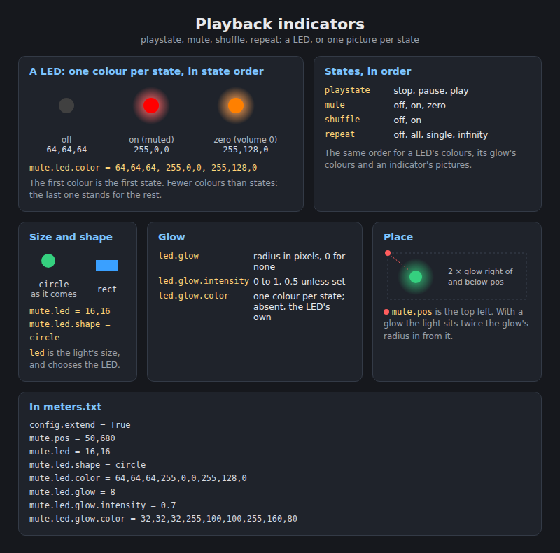
| Indicator | States, in order | From |
|---|---|---|
playstate |
stop, pause, play | the player's status |
mute |
off, on, zero | volume and mute: zero is a volume of 0 without mute |
shuffle |
off, on | random |
repeat |
off, all, single, infinity | repeat and repeat single; infinity is the fourth state |
volume |
0 to 100 | volume |
progress |
0 to 100 percent | seek and duration |
mute.pos = 50,680
mute.led = 16,16
mute.led.shape = circle
mute.led.color = 64,64,64,255,0,0,255,128,0
mute.led.glow = 8
mute.led.glow.intensity = 0.7
mute.led.glow.color = 32,32,32,255,100,100,255,160,80| Key | Meaning |
|---|---|
<indicator>.pos |
Top left. With a glow the light sits twice the glow's radius right of and below the position. |
<indicator>.led |
The LED's size. Setting it chooses LED mode. |
<indicator>.led.shape |
circle (default) or rect. |
<indicator>.led.color |
One r,g,b per state, in state order: nine numbers for three states, twelve for repeat with infinity. Fewer colours than states: the last one stands for the rest. Two exceptions: fewer than two colours take the indicator's own default colours, and shuffle with exactly two colours reads them as on, off, as older themes wrote them. |
<indicator>.led.glow |
The glow's radius in pixels; 0 for none. |
<indicator>.led.glow.intensity |
The glow's opacity, 0 to 1. Default 0.5. |
<indicator>.led.glow.color |
The glow's colours per state. Absent, the LED's own. On shuffle, exactly two are read as on, off, as its colours are. |
playstate.pos = 50,640
playstate.icon = stop.png,pause.png,play.png
playstate.icon.glow = 4
playstate.icon.glow.intensity = 0.6
playstate.icon.glow.color = 64,64,64,255,200,0,0,255,0| Key | Meaning |
|---|---|
<indicator>.icon |
One file per state, in state order. Fewer files than states: the last one stands for the rest. An empty entry is a state with no picture: stop.png,,play.png shows nothing while paused. |
<indicator>.icon.glow, <indicator>.icon.glow.intensity, <indicator>.icon.glow.color
|
A glow around the picture's edge, as for a LED. Without a colour for a state the glow is white. |
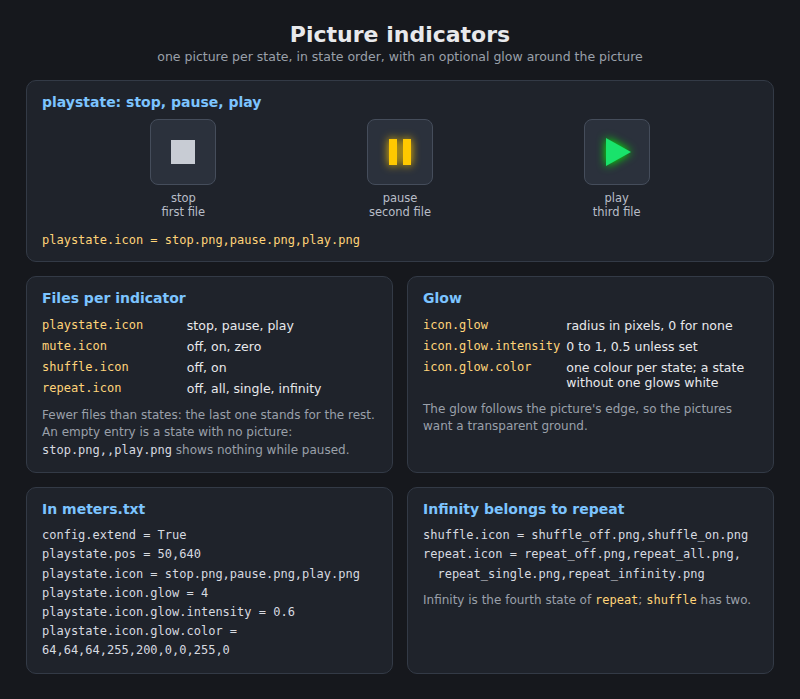
Infinity playback is a player setting of its own; Glass shows it on repeat as a fourth state. Put infinity on repeat as its fourth file or its fourth colour, and leave shuffle with two:
shuffle.pos = 420,223
shuffle.icon = shuffle_off.png,shuffle_on.png

repeat.pos = 344,223
repeat.icon = repeat_off.png,repeat_all.png,repeat_single.png,repeat_infinity.png
A third file on shuffle.icon is read for older themes: when repeat has no fourth state, infinity shows on shuffle, while repeat still shows all or single beside it. That is what those themes asked for, not a fault of the drawing. To fix such a theme, move the infinity picture to repeat.icon as the fourth file and drop it from shuffle.icon.
volume.pos = 100,50
volume.style = numeric
volume.color = 255,255,255
volume.font.size = 32| Style | Keys |
|---|---|
numeric |
volume.color, volume.font.size. The number with a percent sign, 65%, in the regular font. |
slider, drawn |
volume.dim, volume.color (the fill), volume.bg.color, volume.slider.orientation, volume.fill.radius. |
slider, from pictures |
volume.slider.tip (required), volume.slider.track, volume.slider.orientation, volume.slider.travel, volume.slider.tip.offset, and the fill keys. |
knob |
volume.knob.image, volume.knob.angle.start, volume.knob.angle.end. |
arc |
volume.arc.width, volume.arc.angle.start, volume.arc.angle.end, volume.color, volume.bg.color. |
Without volume.style the volume is numeric; volume.dim is 100,20, volume.color white and volume.font.size 24 unless set. A knob's picture is volume_knob.png unless volume.knob.image names another, and a knob whose picture is not in the theme folder is drawn as the arc; a knob and an arc both sweep from 225 to -45 unless their angles say otherwise; an arc's stroke is 6 pixels unless volume.arc.width says, and the track behind it is drawn only when volume.bg.color is set.
Whatever the style, volume.value.pos = x,y[,style] writes the volume as a number, beside the gauge or on its own: it needs neither config.extend nor a volume gauge. Every other key is optional:
| Key | Meaning | Absent |
|---|---|---|
the style in pos
|
light, regular, bold, italic (from 0.8.65) or digi
|
light |
volume.value.fontsize |
The size. | the style's size |
volume.value.color |
r,g,b. |
font.color |
volume.value.font |
A font file of its own, found as a time field's is. | the style's font |
volume.value.maxwidth |
A box the number is aligned in. | no box: the number starts at its position |
volume.value.align |
left, center or right in that box (from 0.8.65). |
as the meter aligns its texts (playinfo.align) |
volume.value.format |
Words around the number, {} where it goes: VOL {} % shows "VOL 45 %" (from 0.8.65). A pattern with no {} is none. |
the number alone |
volume.value.mute |
What stands in the number's place while the player is muted, such as MUTE (from 0.8.65). |
the number shows as ever |
volume.value.pos = 581,371,bold
volume.value.fontsize = 48
volume.value.color = 171,171,171
volume.value.maxwidth = 116
volume.value.align = right
volume.value.format = VOL {} %
volume.value.mute = MUTE
A drawn slider needs no pictures:
volume.pos = 100,50
volume.dim = 200,20
volume.style = slider
volume.slider.orientation = horizontal
volume.color = 0,200,255
volume.bg.color = 40,40,40
volume.fill.radius = 10
volume.slider.orientation is vertical (fills from the bottom) or horizontal (fills from the left). Absent, a volume bar is vertical and a progress bar horizontal, whatever the box's shape, so a wide volume bar names horizontal, as above. volume.fill.radius rounds the ends of the background and the fill, in pixels; about half the bar's width gives a pill.

A slider from pictures moves a tip along a track:
volume.pos = 580,150
volume.dim = 42,256
volume.style = slider
volume.slider.track = fader_track.png
volume.slider.tip = fader_tip.png
volume.slider.orientation = vertical
volume.slider.travel = 5,211
volume.slider.tip.offset = 0,0
volume.fill.color = 200,0,0
volume.fill.width = 10
volume.fill.offset = 0,0
volume.fill.radius = 5| Key | Meaning |
|---|---|
volume.slider.track |
The track picture, optional; it may be part of the background. |
volume.slider.tip |
The tip picture. Setting it chooses the picture slider. |
volume.slider.travel |
Where the tip's top (vertical) or left (horizontal) edge sits at the two ends of the travel, relative to volume.pos. Vertical: 100 percent at the first value, 0 at the second. Horizontal: 0 percent at the first, 100 at the second. Absent, from 0 to the box's length less the tip's. |
volume.slider.tip.offset |
A nudge of the tip, dx,dy. |
volume.fill.color |
A fill from the zero end up to the tip, as a progress bar has. Absent, tip only. |
volume.fill.width |
The fill's thickness across the track. Absent, the tip's. |
volume.fill.offset |
A nudge of the fill, dx,dy, to lay it in the groove when the tip picture is not centred on it. |
volume.fill.radius |
Rounded ends of the fill. |
The travel is worked out from the pictures: for a vertical slider, the first value is the top padding, the second is the box height minus the tip height minus the bottom padding. A 256 pixel track with a 40 pixel tip and 5 pixels of padding gives 5,211. The tip is centred across the track.


A knob turns a picture:
volume.pos = 100,100
volume.dim = 80,80
volume.style = knob
volume.knob.image = volume_knob.png
volume.knob.angle.start = 225
volume.knob.angle.end = -45
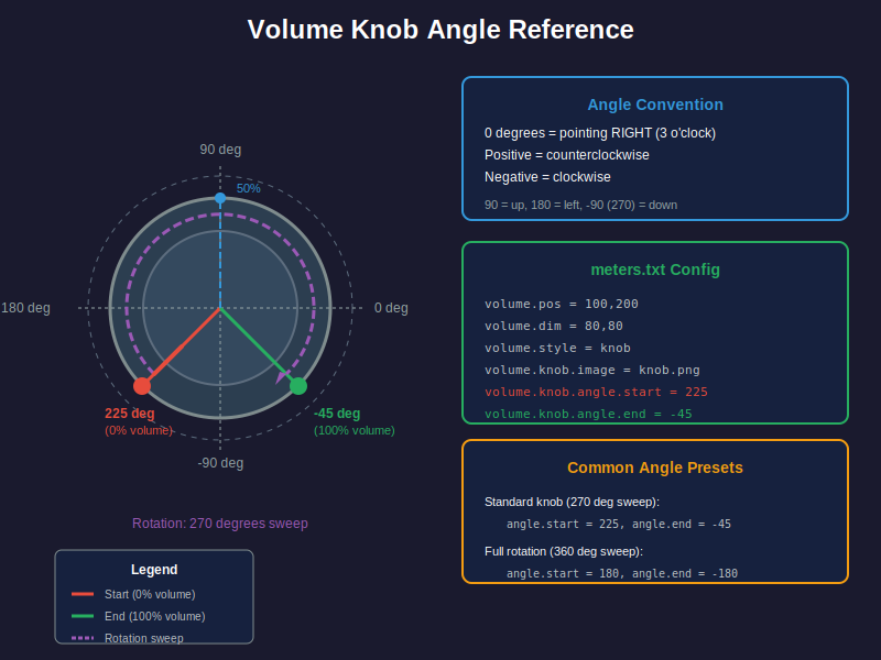
The knob picture has its mark pointing right, on a transparent background, and turns about its centre from the start angle at 0 percent to the end angle at 100. Angles: 0 points right, positive turns counter clockwise, so 90 is up and -90 is down; a real knob sweeps 270 degrees from 7 o'clock (225) to 5 o'clock (-45).
An arc draws a gauge with no pictures:
volume.pos = 100,100
volume.dim = 160,160
volume.style = arc
volume.color = 0,255,100
volume.bg.color = 50,50,50
volume.arc.width = 12
volume.arc.angle.start = 225
volume.arc.angle.end = -45
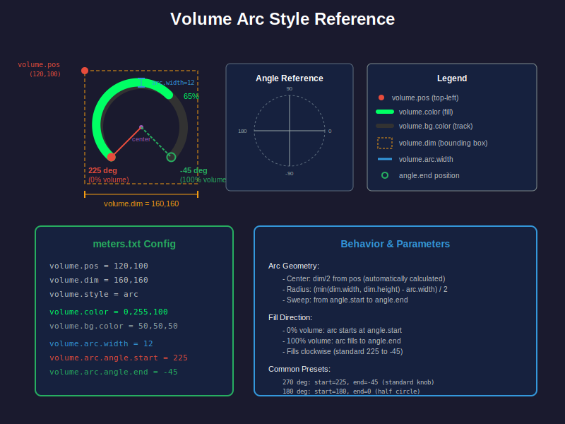
The arc's centre is the middle of the box, and the arc follows the box, the stroke lying inside its edge; give it a square box for a circle. The fill grows clockwise from the start angle towards the end angle, with the knob's angle convention. Common sweeps: 225 to -45 (a knob's 270 degrees), 180 to 0 (the top half, left to right), 0 to -180 (the bottom half, right to left). The start angle is always the larger.
progress.pos = 50,700
progress.dim = 400,6
progress.color = 0,200,255
progress.bg.color = 40,40,40
progress.border = 1
progress.border.color = 100,100,100
progress.fill.radius = 3
Progress takes the same styles and keys as volume with progress. in front: progress.style is slider (default), arc, knob or numeric, with progress.slider.orientation, progress.slider.track, progress.slider.tip, progress.slider.travel, progress.slider.tip.offset, progress.fill.color, progress.fill.width, progress.fill.offset, progress.fill.radius, progress.arc.width, progress.arc.angle.start, progress.arc.angle.end, progress.knob.image, progress.knob.angle.start, progress.knob.angle.end, progress.font.size and progress.color. Progress needs progress.dim; its colour is 0,200,255 and its track 40,40,40 unless set, and its knob picture is volume_knob.png unless progress.knob.image names another. Three keys more, of which the marks and the head are read for volume as well, as volume.marker.N.* and volume.head.*:
| Key | Meaning |
|---|---|
progress.border, progress.border.color
|
A border of that many pixels around the drawn bar, in 100,100,100 unless the colour is set. |
progress.marker.N.pos, progress.marker.N.image, progress.marker.N.label, progress.marker.N.fontsize
|
Up to ten fixed marks along the bar, N from 1 without gaps, each at a percentage with a picture or a label. |
progress.head.image, progress.head.offset
|
A picture that rides at the current position, nudged by dx,dy. |
A vertical bar fills from the bottom; a horizontal one from the left. The picture slider's travel runs 0 percent at the first value to 100 at the second for a horizontal bar, and 100 at the first to 0 at the second for a vertical one.
progress.marker.1.pos = 0
progress.marker.1.label = |
progress.marker.2.pos = 100
progress.marker.2.label = |
progress.head.image = progress_head_arrow.png
progress.head.offset = 0,0| Style | Pictures | Keys |
|---|---|---|
slider, drawn |
none | orientation, colour, background colour, radius, border |
slider, from pictures |
a tip, and a track if wanted | travel, tip offset, orientation, the fill keys |
arc |
none | width, start and end angle |
knob |
a knob | start and end angle |
numeric |
none | font size, colour |
| any | marker pictures, a head picture | markers, head |
A meter meant for fingers says so, and its indicators and buttons act when tapped: on the player's screen and on a remote alike, through the player. The display's setting, "Interactive controls" on the settings page and on the Manager's System tab, takes the theme's word by default, or turns the controls on for every theme that draws them, or off for every theme. A tap outside a control does what the touch settings say, as before.

[dash]
config.extend = True
interactive = True
button.play.pos = 20,400
button.play.image = play.png, play_on.png
button.play.action = toggle
button.next.pos = 100,400
button.next.size = 64,64
button.next.action = next
button.nextmeter.pos = 700,400
button.nextmeter.image = arrow.png
button.nextmeter.action = meter.next| Key | Meaning |
|---|---|
interactive |
True: this meter's controls act, with the setting on "as the theme says". A meter with buttons is interactive by itself. |
button.<name>.pos |
The button's top left, x,y. <name> is any word without a dot. |
button.<name>.image |
A picture drawn at the position, from the theme's folder; its size is the button's. Two pictures, rest.png, active.png, give the button an active look: the second shows while the button is active, which its action decides: play, pause and stop while the player plays, pauses or is stopped, toggle while it plays, mute, random and repeat while that is on, and next, previous, meter.next, meter.previous and dismiss while a finger is on them. Three pictures or more are one per state, in the order the action's indicator uses: repeat off, all, single, infinity; mute off, muted, zero volume; random off, on; play, pause, stop and toggle by the play state, stop, pause, play; a state past the list shows the last picture. One picture shows throughout. |
button.<name>.size |
The region's size, w,h, for a button without a picture, or over one; a bare region on a background that already shows the control. |
button.<name>.action |
What a tap does, from the table below. A button without an action is not a button. |
touch.margin |
Half the least size of a control's touch region, in pixels: a control drawn smaller than twice this answers to a finger within a region of that size centred on it, and a bar reaches half a margin past both ends. 24 unless set, so every control is at least 48 pixels to a finger; 0 keeps every control to its drawn box. |
| Action | What it does |
|---|---|
toggle (also playpause, play.pause) |
Play or pause. |
play, pause, stop
|
As named. |
next, previous (also prev) |
The next or the previous track. |
meter.next, meter.previous (also meter.prev) |
The next or the previous meter of the theme's rotation; in a random rotation another meter. Pressed on the player's screen, the Manager's Face tab and every remote that follows the player move with it; from 0.8.71, pressed in the Face tab, the player's screen moves too and the other views with it. |
mute |
Mute or unmute. |
random (also shuffle) |
Random on or off. |
repeat |
Off, all, single, round again. |
dismiss (also exit) |
What a touch does with exit.on.touch: the display leaves. |
Actions are read in any case. The playback indicators act without any key of their own once the meter is interactive: a tap on the play state indicator plays or pauses, on mute mutes or unmutes, on shuffle turns random on or off, on repeat moves it round; a tap on the volume bar sets the volume to where it lands, left to right along a box at least as wide as it is tall or bottom to top along a taller one, whatever its orientation key says, and a tap on the progress bar seeks the same way. A finger down on either bar drags it: the knob follows the finger, the volume goes to the player as the finger moves and the seek when it lifts. A LED's region is its size; a picture's is the picture's; both grow to the touch margin. Buttons are drawn after the state indicators and before the volume and progress gauges. A tap is tested against the drawn boxes first, buttons before indicators, then against the grown regions, where the nearest control wins.
From the back to the front: the screen picture, the meter background, reels, the record, album art, background artwork (folder layers, then fanart, with zorder = background), the needles or bars, the spectrum, texts and times, the tonearm, the state indicators, the buttons, the volume and progress gauges, the format's type area, overlay artwork (folder layers, then fanart), the foreground picture.
These are not theme keys. They live in the display's own meter.txt, are set from the Settings page and the Manager, and apply to every theme: meter.folder and meter (the theme and the meter selection), random.meter.interval and random.change.title, screen.width and screen.height (the screen's size when both are set, in place of the size the theme folder's name starts with), frame.rate and frame.rate.governor, smooth.buffer.size, scrolling.mode and the three scrolling speeds, rotation.quality (custom is what lets rotation.speed and the two spool speeds apply), rotation.speed, spool.left.speed, spool.right.speed, spool.adaptive, reel.direction, start.animation, transition.type, transition.duration, transition.color, transition.opacity, queue.mode, position.type, position.fit, position.x, position.y, exit.on.touch and stop.display.on.touch, touch.interactive, touch.matrix, screen.driver, screen.rotation, screen.pointer.shown, face.size and the face.<name> keys (the Screen page has these), volume.gain.db, playinfo.type.mode (the type area's mode for a theme that does not say), the font files with font.path and use.system.fonts, and the [data.source] section that shapes the levels. rotation.fps is not used: a turning picture is redrawn at every frame, whatever the rotation quality.
| Key | Read as |
|---|---|
playinfo.center = True, playinfo.text.center = True
|
playinfo.align = center |
playinfo.maxwidth |
the width of any field without one of its own |
folderlayer.enabled with the unnumbered layer keys |
one more folder layer |
a third file on shuffle.icon
|
infinity on shuffle when repeat has no fourth state |